
TypeTalk is a regular blog on typography. Post your questions and comments by clicking on the Comments icon above. If Ilene answers your question in the blog, you’ll receive one Official Creativepro.com T-Shirt!
Q. I love the proportional figures that come with many OpenType fonts, but my older Type1 fonts usually have only tabular lining figures, which have very uneven spacing (Figure 1). Is there an easy way to fix the spacing when not setting tables, or is kerning the only way?
Figure 1. To demonstrate the difference between tabular lining figures (upper) and proportional old style figures (lower), I set numbers one through zero in Chaparral Pro.

A. Kerning (adding or subtracting space between pairs of characters) is the best way to have total control over the spacing of the tabular numerals that are most common in Type1, TrueType, and even some OpenType fonts, as you can adjust each combination to your liking.
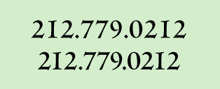
However, if you use Adobe InDesign or Illustrator, there is a short cut that might do the trick, or at least get you closer to a more evenly spaced result. Highlight the numerals in question, open the Character panel, and choose Optical in the dropdown Kerning menu. Since this option overrides the font’s built-in metrics and adjusts the spacing between characters based on the character shapes and negative spaces, it usually results in more evenly spaced tabular figures (Figure 2 and 3). You can always use kerning to fine-tune if necessary.
Figure 2. Cachet (a Type1 font) has tabular lining figures (upper), but you can improve its spacing for non-tabular settings with the Optical kerning setting (lower).
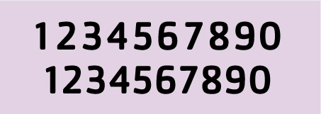
Figure 3. The upper version of this phone number is the original tabular version .The new and improved version (lower) uses Optical kerning. The bottom version could still use some tweaking, but it’s an improvement over the tabular version. Both are set in the Type1 version of Centaur.
Love type? Want to know more? Ilene Strizver conducts her acclaimed Gourmet Typography workshops internationally. For more information on attending one or bringing it to your company, organization, or school, go to her site, call The Type Studio at 203-227-5929, or email Ilene at info@thetypestudio.com. Sign up for her e-newsletter at www.thetypestudio.com.
This article was last modified on January 8, 2022
This article was first published on June 19, 2008
Commenting is easier and faster when you're logged in!

Recommended for you

RTF Stern: A New Font in TrueType, PostScript OpenType & Hot Metal!
Stern was created at the Pie Tree Press & Type foundry in collaboration with...
TypeTalk: Creative Indents
TypeTalk is a regular blog on typography. Post your questions and comments by cl...

TypeTalk: Customizing Type Settings in InDesign
Q Is there a way to change the type-related default settings in InDesign? If so,...