
Optical Kerning and Scaling Surprises
Q. From what I can tell, Adobe Illustrator’s Optical Kerning feature is adding space at the smaller font sizes to keep the spacing between letters distinct. My problem with this is that it changes layouts, rags, etc., but “scaling in proportion” by definition isn’t supposed to change anything except for the overall size. Auto Kerning (or Metrics, in InDesign) doesn’t cause the same problem.
A. You’re an acute observer. What you call a problem is actually a rather sophisticated feature of Adobe InDesign and Illustrator, but unless you know about it and how it behaves in certain situations, it certainly can become a problem!
As you’ve already noted, there are two kerning options in InDesign and Illustrator: Auto (Illustrator) and Metrics (InDesign), and Optical. Auto and Metrics are basically the same thing; that is, they both use the font’s built-in kern tables. This is the default kerning setting, and it works well for high-quality, well-designed fonts with good kern tables.
Optical Kerning essentially overrides the font’s built-in kern values and adjusts the spacing between characters based on the character shapes and negative spaces. This can be useful when a font contains only minimal or inadequate built-in kerning, or if you use two different typefaces or sizes in one or more words on a line.
Optical takes into consideration the point size of the setting to give smaller type more open spacing than larger type (Figure 1). This function is meant to imitate one of the landmark features of metal type, in which small, almost imperceptible changes were made in each point size of type to compensate for the ways in which type visually changes as it gets larger (or smaller).

Figure 1. The text on the left is set with Auto kerning, while the text on the right uses Optical kerning; the smaller text blocks below them both have been optically scaled. Notice how the scaled down Auto setting (bottom left) is identical to its original, while the scaled Optical setting (bottom right) is set slightly more open, resulting in an additional line. Excerpted from The Wonderful Wizard of Oz by Frank Baum and set in Adobe Hypatia Sans.
So, going back to your original query, if you scale type set at Optical Kerning, it will readjust the overall spacing along with the point size as it is intended to do, often resulting in different line breaks and copy depth. The only way to avoid this is to change the kern setting to Auto (or Metrics in InDesign) before scaling the type, then turn on Optical as desired.
For more on optical type, see “Optical Fonts Harken Back to Metal Type” later in this column.
Editing PDFs
Q. Can I make changes to a PDF if I don’t have the original file?
A. Yes, but with limitations.
As long as the PDF isn’t protected with security restrictions, you can edit some elements once you open the PDF in Adobe Acrobat Professional (not Acrobat Reader). Use either the TouchUp Object tool or the TouchUp Text tool. The TouchUp Object tool can rotate and scale objects. You can even open images in Photoshop, edit them, and relink them to the PDF document.
Using Acrobat’s TouchUp Text tool, you can make text edits if you have the proper font installed and activated, and the text hasn’t been converted to outline. I don’t recommend major copy editing because text reflow ability is limited. In other words, fixing typos is fine; rewriting an entire paragraph is best done in the original application.
If you don’t have Acrobat Professional, you may want to open the PDF in Illustrator. (I say “may” because Illustrator has a few PDF blind spots, which I’ll go over in a bit.) You’ll be prompted for the fonts used in the PDF if they’re not loaded and active on your machine. If you don’t have them, the document will display with a substitute font, which you can then change to another font, but it obviously will look different from your original and might change the layout and flow of the text.
Changing object color, position, or scale is a piece of cake. Text edits are a bit more challenging because Illustrator treats the PDF type as individual lines and parts of lines, not text boxes or blocks. But if your individual edits are contained in one line and don’t require the text to rewrap, small copy edits are fairly easy. For more extensive type edits, select all the bits of type you want and use Edit > Cut to place them on the Clipboard. Click on the page where you want your type to appear and choose Edit > Paste. The pasted type reconstitutes into a single line of text.
You can then save the document as an Illustrator file, or back to a PDF.
Now, about Illustrator’s blind spots. According to Acrobat expert Ted Padova, you may lose the following when you open a PDF in Illustrator:
- Multiple colorspaces
- PDF transparency
- Certain complex smooth shadings
- Subset fonts using custom encodings
- Bookmarks, hyperlinks, metadata, and annotations
Optical Fonts Harken Back to Metal Type
Q. The Adobe Arno Pro family has 32 different fonts. In addition to the Regular weights (Roman, Italic, Bold, and Bold Italic), there are other versions named Display, Caption, Subhead, and Text. Under what circumstances should I use these versions? What about the dictum “If you use a different font style, use a very different font style”? For example, because Arno Pro Caption is so similar to Arno Pro Regular, is it acceptable to use them on the same page?
A. Adobe Arno Pro is a robust type family that includes a series of weights in five distinct optical size ranges: caption, small text, regular, subhead, and display.
These optical versions reintroduce one of the features of hand-cut metal type, in which a separate font is cut for each point size and is often optically adjusted. The objective of optical sizing is to maintain the integrity and legibility of the underlying typeface design throughout a range of point sizes. This is an advantage over the current common practice of scaling a single digital type design to different point sizes, which may reduce legibility at smaller sizes or sacrifice subtlety at larger sizes (Figure 2).

Figure 2. Notice the variations in weight, width, contrast, and other details in these five optical versions of Arno Pro Italic.
These optical versions are intended to be treated as one typeface as they would have been if they were hand-cut in metal, so feel free to blend the different versions in one document, keeping in mind their intended point size ranges:
Caption: 5 to 8.5 point
SmText: 8.6 to 11 point
Regular: 11.1 to 14 point
Subhead: 14.1 to 21.5 point
Display: 21.5 point or larger
Proofreader’s Marks
Q. What are those funny marks that copyeditors and proofreaders make on my page, and what am I supposed to do about them?
A. Those are proofreaders’ marks, which are symbols used to indicate instructions, changes, and corrections on documents and typeset copy. It’s usually the responsibility of the designer/typesetter/production person to make these changes in the typeset copy.
Figure 3 includes the most common proofreaders’ marks. For a complete listing, go to the online Chicago Manual of Style.
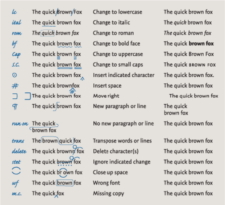
Figure 3. This chart is set in Adobe Caflisch Script Pro and TypeCulture Expo Sans.
This article was last modified on January 9, 2022
This article was first published on November 20, 2007
Commenting is easier and faster when you're logged in!

Recommended for you

Using Illustrator’s Live Paint Selection Tool
If you’re an Illustrator user, you are probably familiar with the Live Pai...

ALAP Releases Update to InTools for Adobe InDesign CS2
A Lowly Apprentice Production, Inc. (ALAP), announced today an updated version o...

New Contest! Identify the Adornments
Hey folks, it's time for another contest and a chance to win an awesome prize!