TypeTalk: Five Common Typographic Blind Spots

TypeTalk is a regular blog on typography. Post your questions and comments by clicking on the Comments icon above.
Q. What are the most common typographic blind spots that you come across?
A. Great question, as this gives me an opportunity to get on my typographic soapbox and reinforce some important and useful points.
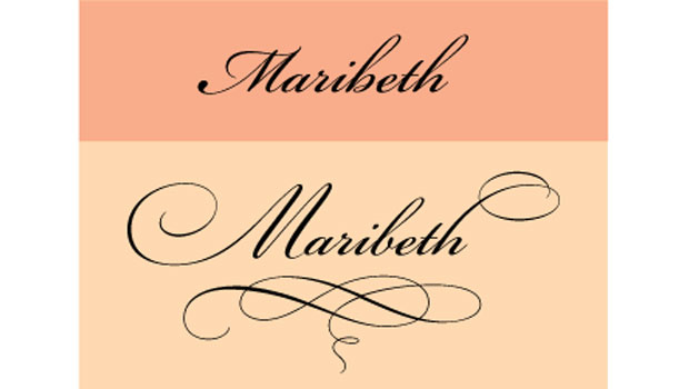
Ignored OpenType features. OpenType can give designers a lot more features and flexibility, but I find that while most designers have heard of OpenType, and even use it, many are unaware of the powerful features available in some OpenType fonts. True-drawn small caps; oldstyle and lining figures in both tabular and proportional spacing; and a range of ligatures, swashes, ornaments, and alternates can widen your creative horizons and make your work look more professional (Figure 1).
Figure 1. I achieved an elegant, hand-lettered look below with Adobe Bickham Script, which contains lots of swashes, alternates, and flourishes.

Read more about OpenType here:
“Opening Up About OpenType”
“Unplumbed Depths”
“Spot OpenType Fonts Fast”
“What Makes a Font a Pro?”
“Good-looking Figures”
Underused Style Sheets. The paragraph and character styles in InDesign and QuarkXPress let you apply preselected formatting in a single click (Figure 2). Styles are a huge time-saver for repeated formatting, such as headings, subheads, captions, bulleted lists.
Figure 2. I used InDesign’s Character and Paragraph Styles to format the text below.

Many people think that styles (also called style sheets) are too complicated to learn or set up, or not worth it for a relatively brief piece. But these invaluable shortcuts will more than offset the time it takes to set them up, especially when you want to change any formatting across documents. Don’t be scared, just jump in and give them a try!
Read more about styles here:
“The Importance of Style (Sheets)”
Overuse/misuse of tracking and kerning. I’ve often said that today’s page-layout programs give you enough features to hang yourself. This certainly applies to their tracking and kerning features. We should use these features to create more even, readable, and aesthetically pleasing spacing between pairs of characters (kerning) and a range of characters (tracking). Instead, we often use them to force a line to fit where it doesn’t, to “fix” a poor rag, and to bully justified text that probably shouldn’t be justified.
Read more about tracking and kerning here:
“On the Track of Good Type”
“One Good Kern Deserves Another”
“How to Solve Typographic Widows and Orphans”
“Justify My Text”
“Kerning Principles”
“Kerning in Action”
Inattention to alignment. I can’t tell you how many book covers, brochures, headlines, pull quotes, and other display type I see that lack proper optical horizontal and vertical alignment.
While it’s easy to assume your computer will take care of all the details when setting type, software can miss some of the details that make the difference between professional typography and typographic amateur hour (Figure 3).
Figure 3. I set the example on the green background below in 32/35 (32 point type with 35 point leading), but due to the third line set in all caps, the space above that line appears to be much less than between the rest. For the example on the yellow background, I increased the leading of the all-cap line to 42, which is seven points more than the rest.

Brush up on what to look for:
“Vertical Alignment”
“Horizontal Alignment”
“Just Say ‘No’ to Automatic Leading”
Dumb punctuation in onscreen typography. The preponderance of typography in screen-based media, such as motion graphics, movie titles, commercials, video games, and mobile devices, has resulted in some very exciting typography, such as this engaging video of Abbott and Costello’s “Who’s on First?” routine:
Sadly, the use of dumb apostrophes throughout (Figure 4) is a type crime of the highest order!
Figure 4. What are you dumb things doing in a smart skit like this?

The lack of smart quotes and punctuation is a common occurrence in onscreen typography. Whether static or moving, all type should adhere to the basic principles of good typography.
Refresh your awareness of the use of smart quotes and the like here:
“Fast Answers to Font Questions”
… and don’t miss the original routine here:
Love type? Want to know more? Ilene Strizver conducts her acclaimed Gourmet Typography workshops internationally. For more information on attending one or bringing it to your company, organization, or school, go to her site, call The Type Studio at 203-227-5929, or email Ilene at in**@***********io.com. Sign up for her e-newsletter at www.thetypestudio.com.
This article was last modified on May 15, 2023
This article was first published on September 9, 2010
Commenting is easier and faster when you're logged in!
Recommended for you

Don’t Commit the Type Crime of Applying Faux Italic in Microsoft Word
In an earlier essay on Typographic Discipline I discussed apostrophes and quotat...

New Book: Type Form & Function
Rockport Publishers has released Type Form & Function by Jason Tselentis. It...

Women Type Designers
How women emerged from the shadows of the past and left their mark in the world...


