

This before-and-after shows the evolution of a photo into an ink and paint illustration of the “invisible” restaurants at the corner of San Francisco’s Mission and 18th streets.

The food and culture blog untappedcities.com has launched a San Francisco portal, and I’ve signed on to contribute an artist’s food perspective on the endless hidden wonders of eating in this city. My first blog post focuses on one of the micro-hoods of San Francisco—actually, it’s just a corner—that might look devoid of anything delicious and yet contains great eateries.
In a process I call “compositional brainstorming,” I combined multiple photos of the corner in Photoshop to construct an invented viewpoint I could use as a reference image. I saved it as a JPG file.
I joined multiple photos in Photoshop to create an invented viewpoint that served as a reference image for my illustration.

I decided to create an ink and paint version of the corner in Illustrator, not Photoshop, because I wanted to draw with crisp, ink-brush like lines, and I wanted to be able to scale the image both small and large while maintaining the crisp resolution. I also love the editability Illustrator offers in terms of quality of line, and the editability of individual strokes and lines separate from each other.
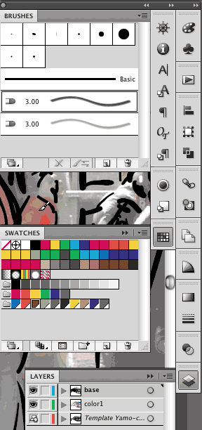
I opened Illustrator and chose File > Place, located the composited photo, enabled Template, and clicked OK. The initial default setting for the template is viewed at 50% opacity, and I kept that as is. Double-clicking Layer 1 in the Layers panel, I renamed the layer “base” and clicked OK.
I had previously created custom Calligraphic brushes that I liked. To load those brushes, I opened one of my completed images (Place des Vosges with Noah) that contained those brushes, selected a bunch of objects in the image (to make sure that I’d grabbed objects made with any of the used brushes), and copied. Closing this file, I pasted the copied portion of the old image, which also pasted into the new file my custom brushes. After I deleted the pasted objects, the new brushes remained in the file and the Brushes panel.
I wanted to use the custom Calligraphic brushes I created for this previous artwork.

On the left, Illustrator’s default Brushes panel. On the right, the Brushes panel after I pasted in objects created with custom brushes. Illustrator automatically added the brushes to the panel.

Setting Paintbrush Tool Options
The settings for the two customized calligraphic brushes that I had already created used “Fixed” for both Angle and Roundness, with each varying 2 points in size in the Pressure parameter. This setting let me control the size of the brush stroke by the amount of pressure I exerted using a Wacom Intuos4 tablet and Art Pen.
I needed to adjust Brush Options to be able to draw with maximum fidelity and reduce the amount that the stroke would smooth out on its own. Double-clicking the Paintbrush tool, I adjusted the tool options so that it had the minimum Tolerances set for Fidelity (.5) and Smoothness (0).
To draw a sequence of adjacent paths, I disabled the Keep Selected option. With this setting off, after drawing each path, it would be deselected. When this is enabled, attempting to draw each subsequent path simply redraws the previous (selected) path).
Finally, to make it fairly simple to redraw paths if needed, I made sure that Edit Selected Paths was enabled. Now I could use the Command/CTRL key to select the path, then draw near the path redraw it and not merely place an additional path.
With Paintbrush Tool Options all ready to go, I clicked OK.
Beginning to Draw
With my Photoshop composite in place as a template on a locked layer below, I zoomed in on the focal point of my artwork and started to draw with the larger of my two calligraphic brushes.
The workspace ready to start drawing.

One of the benefits of drawing like this is that Illustrator’s strokes are objects, so when I realized it would be difficult to write “Salon” legibly and thin enough to fit, I drew it, selected the word, switched to the Selection tool and scaled it horizontally using the Bounding Box (disabling Scale Strokes and Effects in Preferences).
I selected the word “Salon” before I squished it horizontally with the Bounding Box.

The word “Salon” after being squished.

I turned the template on and off as I worked:


Making a Color Group
Drawing into the “base” layer, I continued to move about the artboard (using the Hand tool), and zoom in and out using the scroll wheel on the tablet. When I felt as though the initial sketch was somewhat in place, I created a second layer below the base for the color.
I knew that I wanted to use a limited palette of colors, and that I might make adjustments to the colors as I worked, so I created custom global color swatches in the Swatches panel. Once I had a core set of colors, I selected them (selecting the first new color, then holding Shift and clicking the end color in the Swatches panel) and made them into a color group (clicking the New Color Group button). As I worked, I added new global colors to the group as needed.
I selected some basic custom colors and made them into a color group.

I added a few more colors as I worked.
Using Bristle Brushes
Unlike Calligraphic brushes, Bristle Brushes are almost infinitely variable, even in their default form, so I didn’t need to adjust their settings. As long as you have a Wacom tablet and Art Pen, the Bristle Brush is sensitive not only to pressure and opacity, but also to tilt and rotation. It’s easy to decrease the size of the brush with the [ bracket key, increase it with the ] bracket key, and set the opacity by pressing the numbers 1 through 0.
Each Bristle Brush mark is constructed from multiple strokes that have multiple opacities within. Drawing strokes on top of each other builds the color and opacity.
In Illustrator, the appearance of your next object is determined by whatever object is currently selected (or last selected if you have deselected). Therefore, if I chose a blue large stroke created with the Bristle Brush on the color layer, then the next stroke of the Paintbrush tool would be a large blue stroke on the color layer. If I instead wanted to rework a calligraphic mark, I could select that, and redraw it. And so I continued to work switching between the two layers (base and color), hiding and showing the template layer, locking this layer or that as needed.
Beginning to apply color with the template visible.
The same state as above, but with the template hidden.

Note: If you select a Bristle Brush stroked object to use as your next default, but you want to set the size or opacity for the next stroke, you must first deselect the current object (hold the Command/CTRL key and click on the artboard). Otherwise, you’ll be reducing the opacity and or size of that existing stroke! This isn’t a bug, it’s a feature, and I did end up using it, but I also accidentally started adjusting an existing stroke by accident.
Refining the Image
Once the image was far along enough, I double-clicked the template layer and reduced its opacity to 20%. Most of the time I hid the template entirely. I also resized the artboard manually using the Artboard tool, so that it would crop the image as I wished when printed.
Evolving the image and resizing the artboard to crop the image.

When I thought I might want to remove some calligraphic lines, I decided instead to move them to a new hidden layer so they’d still be accessible if I changed my mind. To move these lines from the base layer, I dragged the color square from the base layer to the hidden lines layer. (Did you know can drag objects to a hidden layer, but not a locked layer?)
In another new layer, I drew graffiti to add to the streetscape. Targeting the layer by clicking the circle, I set the layer to Multiply mode and reduced opacity, and then all the graffiti in this layer inherited this opacity and blending mode. To adjust opacity and blending mode as I worked, I had to again target the layer. Otherwise, Illustrator would add the opacity to the layer settings!
Targeting the layer and setting blending mode and opacity for all the objects to be created in the layer.
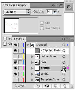
I also made some adjustments to the global colors, including warming up the basic gray I had used liberally throughout. To visually crop the image to the bounds of the artboard (at all times, not just when printed or exported), I created a clipping mask the size of the artboard. To do this, I selected all the layers and chose Collect in New Layer from the Layers panel menu, naming this new master layer “cropped.” Making a rectangle the size of the artboard, I then moved this rectangle loose in the master layer, and as the top object. Clicking on the master layer in the panel, I then clicked the Make/Release Clipping Mask icon.
I finished the illustration by placing a stroke around the image. I Option/Alt-clicked the Clipping Path in the Layers panel to select it, then set the stroke to 2 points.
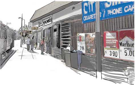
The final illustration. Click on the image to see a larger version.
This article was last modified on January 18, 2023
This article was first published on July 6, 2011
Commenting is easier and faster when you're logged in!

Recommended for you

PhotoSpin Expands Their Lifestyle Collection With New Images By Yuri Arcurs
PhotoSpin, www.photospin.com, a leading royalty free stock subscription company...

How to Straighten Photos Taken at an Angle
It’s hard to photograph many images head-on. For example, if you try to shoot a...

Creating Duotones in Photoshop
Duotones offer designers a great way to add visual interest to photos. Essential...