

Adobe InDesign is rich with features, which is just one of the reasons I and many others love it so much. With the switch to Creative Cloud, pushing out new features has become easier for Adobe, and consequently we are treated to new features much more frequently. Many of those features are—to quote a favorite visionary of our times—insanely great. Others leave us scratching our heads and wondering when the heck we would ever use them. Luckily for us, there is almost always a way to hide, turn off, or otherwise obliterate those annoying “features.” (Scare quotes added to emphasize unabashed bias).
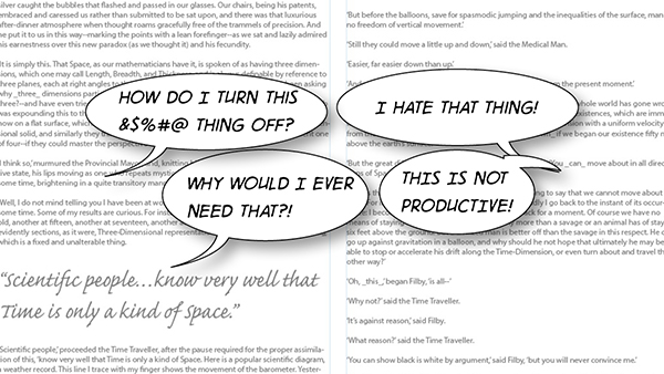
Just because they’re on this list, doesn’t automatically qualify them as annoying in my book. In fact, there is one I actually love to use, but that I know other people despise. Your mileage and frustration with the following features may vary.
Check Out This New Thing!
I get it. New features in InDesign are sometimes cool, but I’m okay simply knowing a feature exists. I don’t need a giant rollover to announce its presence every time I hover dangerously close to a new feature’s button. Yeah, I’m looking right at you, Mr. Publish Online. The one-click-to-publish offering is probably pretty cool and a nice alternative to Adobe DPS or even Fixed Layout ePub. That may be the case, but that button screams, “I’m here!” with its LEARN MORE and TRY NOW buttons. Keep in mind this pop-up is activated when merely hovering over the button, located in the far-right side of the Control panel. Trust me, you can’t miss it.
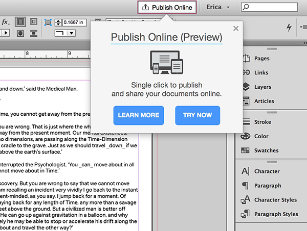
What you can do is turn that sucker off. Again, you might want it there. At the moment, that is the only way to actually send your file to the Publish Online service. If you’d rather hide it for now, go to InDesign > Preferences on the Mac or Edit > Preferences on Windows, and click on the last preference pane “Technology Previews.” Uncheck the box next to Publish Online and it’s gone for good. If you decide to turn it back on to use Publish Online, you’ll have to deal with the pop-up until you publish your first creation. (H/T to Bob Levine for sharing the idea of publishing a blank page to make the pop-up go away right now).
Might I Interest You In…
The newish in-context glyph menu introduced in version 2015.2 gives you easy access to all of the alternates available for a particular character, set of characters, or fractions. Back in the old days, if we wanted to use an alternate glyph—like a swash, oldstyle numeral, or artistic alternate—we had to open the Glyphs panel to find the character we needed. This was the mousing equivalent of trudging uphill, both ways, in the snow. And we liked it! Ahem. Nowadays, you young whippersnappers have the luxury of having a contextual menu appear when you select a character, or word that contains a character, with alternate glyphs available.

When you’re working with text and select a word or character, having a blue highlight line and contextual menu pop up might not be helpful to your particular brand of productivity. If that’s the case, you can turn this new feature off in the Preferences panel, under the Advanced Type pane. At the bottom of the box is an option called Type Contextual Controls that you can toggle on or off. There are two options: “Show for Alternates” and “Show for Fractions,” which lets you pick and choose which you do or don’t want to display.
The first iteration of this feature is decent, but there are some little bugs (features?) that are frustrating. The worst being that if you select an “f” that’s followed by an “i,” you get the option of choosing the proper ligature, but you then have the original “i” to delete. Selecting the “f” and “i” together doesn’t bring up the contextual menu. Hopefully there will be improvements in the near future.
Hot Off the Presses
Brand new to the latest version of InDesign (v. 2015.3) is the Styles Override Highlighter. This little feature finally gives the user easy access to a feature that’s been lurking behind the scenes for a very long time. In fact, developers have made use of it by creating scripts like one of my favorites: the ShowHideLocalFormatting script. What the script—and the new built-in feature—does is visually highlight any local formatting applied on top of styled text. The Styles Override Highlighter calls out (in a not-so-subtle teal) paragraph styling overrides with a vertical bar, while any character overrides are represented by a block of color.
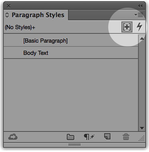
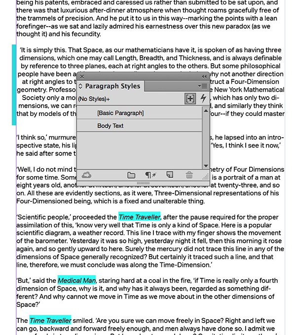
The Styles Override Highlighter is off by default, but to toggle the feature on, click the tiny plus sign in the upper right corner of your Paragraph Styles panel. If you’re not using styles (I’ll pretend not to hear that), then you won’t see any change. And if you’re very good at using styles and have no overrides, you also won’t see any indication of this feature in action. Unlike the now-unnecessary script, you can tell if the highlighting is active as the toggle becomes “pressed in” when active. So far I love this feature, so I’ve set it to be on with no document open, so that every new document I create will be ready to reveal any lurking overrides.
The Grabbing Hands, Grab All They Can…
They say one man’s trash is another man’s treasure. I’ve never been really clear on who “they” are, but “they” were totally right in the case of the Content Grabber. Also known by the mystical-sounding “translucent bagel,” the Content Grabber is the little circle that pops up in the center of an image within a frame in InDesign. It frees you from constantly switching between the Selection and Direct Selection tools. Use the former to select the frame, roll over the image center, when the delicious apparition appears, click and grab it to move the image, all without changing tools. I think of it as the Bagel of Sanity. The Grabber of Freedom. In short (or not) I felt as if I was waiting for the Content Grabber all my life.

Sadly, not everyone in this world shares my views (things will change when I’m Queen of All the Known Universe), and they malign this lovely feature. If you’re one of “those,” which is nothing like being part of “they,” then you can simply turn it off to remain in your unenlightened state. Go up to the View menu, choose Extras, and select Hide Content Grabber. That’s all there is to it…enjoy the Stone Age!
Now It’s Your Turn!
What’s one annoying feature or behavior in InDesign that you would love to nuke from the app? Let me know in the comments. It’s always interesting to hear what people like and don’t like, and to see how differently we all work. And if there’s no native way to turn off a feature, we can all reply with imaginative ways to destroy our most annoying “feature.”
This article was last modified on April 22, 2016
This article was first published on April 22, 2016
Commenting is easier and faster when you're logged in!

Recommended for you

The Art of Making Fine Art Books
The digital revolution may be in full swing, but a visit to any museum store pro...

Secrets of the Esc Key
If you’ll pardon the pun, the Esc key might escape the notice of many Adob...

Using the Content Collector and Content Placer Tools in InDesign
Last time we took a trip to InDesign’s Island of Misfit Tools, we looked a...