Transforming Type
You can make some nifty type effects with InDesign alone, but for unlimited creative freedom, you need the help of the “ultimate plug-in”: Adobe Illustrator.

This article appears in Issue 96 of InDesign Magazine.
Designing with type in InDesign is… well… functional, like a good black suit and sturdy shoes. It does what you need most of the time, and does it very well.
But InDesign’s type features have one exception to this rule… a feature that lets you truly go wild: Create Outlines. This command lets you pair a wild tie and matching socks with that black suit, giving you the power to turn heads by designing outside the (text) box!
Create Outlines is the key to breaking out because it lets you edit the letter shapes just like you’d edit any path. It takes your boring characters and turns them into frames that you can use to create a wide variety of designs—even putting photos into them. But here’s the thing: you can take those paths much further when you pair InDesign with Adobe Illustrator!
Let’s first look at the Create Outlines feature a little bit, and then look at what you can do when you bring Illustrator into the mix.
Creating Type Outlines with InDesign
First, before you convert text to outlines, it’s a good idea to format it how you want it to look after it’s converted to outlines—except for size, which can be easily adjusted afterward. You can make other minimal adjustments, too, but it’s best to get it (more or less) how you want it upfront, by selecting family, weight, kerning, and so on.
Once all of that is set, you can choose Type > Create Outlines… but wait! How you’ve selected the text is important (and choosing the wrong way can cause problems).
If you have a range of text selected with the Type tool when you run this command, you’ll end up with the vectors as a single
inline graphic inside the original text frame. In some situations that’s helpful, but in most cases this is not what you want. So instead, select the text frame with the Selection tool before choosing Type > Create Outlines (Figure 1).

Figure 1: For best results, select the text frame with the Selection tool before creating outlines.
The text frame will disappear, and the type outlines will be a new, independent object in the form of a frame or a compound path (Figure 2).

Figure 2: Type converted to outlines becomes fully editable vector paths.
(A “compound” path is a single object made of separate paths. For example, an “O” or donut shape is a compound path because it is made of two paths: inside and outside. However, the paths inside a compound path don’t have to overlap.)
Technically, if the text frame that you converted had more than one line of text in it, each line becomes a compound path, and then they’re all grouped together. With this new object selected, you can change fill, stroke, and even drop art inside each path by choosing File > Place (Figure 3).

Figure 3: An image placed into type outlines
And just like with any vectors in InDesign, you can edit the type outlines with the Direct Selection tool, Pencil or Pen tool, and Pathfinder panel.
Editing the path outlines like this is perfect for when you want to make small stylistic changes, such as changing the dot of an i from a square to a circle, or jogging the height of a letter so that it fits better in a tight headline.
But what if your design asks that you go out on the town, kick off those sturdy shoes, peel off the black jacket and throw it into the crowd, and paint the night with a bit more flamboyance?
Ah…now we must turn to the InDesign “plug-in” known as Adobe Illustrator. Cue disco ball, loud music, and leisure suit (or whatever you might wear out on the town; I can speak only for myself).
Should you convert text to outlines?
I want to be very clear about something here: When I talk about converting text to outlines, it’s just a little text and only for applying special effects I couldn’t do any other way. I am not talking about converting your whole document to outlines. That’s not a good idea. Steve Werner explains why in this article. If your printer needs you to convert all the text to outlines, use this technique instead.
Warping Type with Illustrator
Some of the tools we’ll play with in Illustrator are Envelope Distort, Graphic Styles, Effects, and the Appearance panel. The details of working with each of these could be an article of its own, so please experiment beyond the basics I cover here.
Before we go into any details, it’s important to understand that all of these tools leave the text totally editable and changeable after saving and closing—that’s why these are called “live objects.” So if you format text with all kinds of effects and later on you have second thoughts (or a client does), you can change any aspect of the design, or go back to the basic text, at any point. That is one reason (of many) that doing cool effects in Illustrator is often better than using some of InDesign’s blunt methods.
Make With Warp
The Make with Warp feature is awesome because it’s not just incredibly useful, it’s also super easy. Using any of Illustrator’s type tools, add some text to your artboard. Format it with the typeface and weight you want to use as your starting point. Then choose Object > Envelope Distort. You can use the keyboard shortcut Command+Shift+Option+W (Mac) or Ctrl+Shift+Alt+W (Windows).
There are three options here for manipulating text. The first is Make With Warp, which is just like using the Warp tool in Photoshop. So why not do this in Photoshop, you ask? Because getting the text from Photoshop to InDesign involves a number of pitfalls, (which could fill yet another article), including the risk of pixelating, unwanted white backgrounds, and more, so for our purposes please trust me that Illustrator is the best choice.
In the Warp Options dialog box, you can create an infinite variety of looks by first choosing a warp Style and direction (Horizontal or Vertical), and then applying different amounts of bend and distortion (Figure 4).

Figure 4: Illustrator’s Warp Options dialog box
With Preview selected in the dialog box, you can see the effect update instantly as you change settings. When you’re satisfied with the look you have, click OK.
If you want to edit the effect, apply a different style or settings via the Control panel (Figure 5).

Figure 5: You can select a different style of warping at any time via the Control panel.
If you need to apply a different stroke or fill, change the font, or edit the text itself, click the Edit Contents button in the Control panel, and then grab the Type tool and make your changes. But be warned, it can be a challenge to select within the text when you’ve applied a lot of warping. This is where something like InDesign’s Story Editor, which shows you your text without any fancy formatting, would be handy to have. Alas, no such feature exists in Illustrator.
If you ever want to remove the effect, simply choose Object > Envelope Distort > Release, and you’ll have your original text back, plus a new object in the shape of the warp, which you can safely delete (Figure 6).

Figure 6: The results of releasing a warp
Make with Mesh
If you want to have more control over your effect than the Warp presets offer, try using a mesh object. With your type selected with the Selection tool, choose Envelope Distort > Make with Mesh, or use the keyboard shortcut Command+Option+M (Mac) or Ctrl+Alt+M (Windows). In the Envelope Mesh dialog box, you can choose how many rows and columns of anchors you want (Figure 7).

Figure 7: The number of rows and columns in a mesh determine the number of anchor points you can manipulate
Getting the hang of this might take a little experimentation. Turn on the Preview checkbox to see what the default settings give you to work with; then, if you think you need more anchors, add more rows and/or columns. When you think you have the right amount, click OK. Now you can create a custom effect by manipulating the anchor points.
Using the Direct Selection tool, click on one or more anchors and move them. I find it’s easiest to just nudge them with the arrow keys instead of trying to drag them. The anchor points also have control handles you can drag to reshape your type. These handles work much like the control handles you’d use in Illustrator (or InDesign) to reshape any vector path, except that there are more of them for each mesh anchor. There is a separate control handle for each mesh line. So anchor points inside the mesh, which are connected to their neighbors by four lines, have four control handles. Anchor points on the border of the mesh have either two or three handles you can manipulate. With all these controls at your fingertips, you really can reshape your type in just about any way you can imagine (Figure 8).

Figure 8: The sky’s the limit when you distort text with a mesh.
Make with Top Object
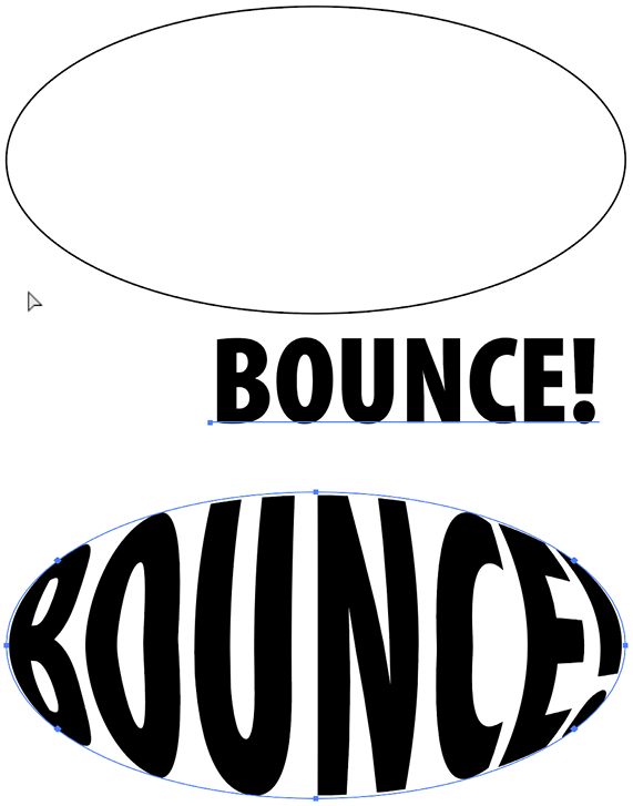
The third option for using Envelope Distort is useful but should be used sparingly… much like the font Giddyup or Cooper Black! It’s the Make with Top Object feature, and to understand how it works, you must first know that items placed on your artboard are “stacked” in the order they were added. So if you draw an oval, then type the word BOUNCE, and then select them both and choose Object > Envelope Distort > Make with Top Object, you’ll get an error message instead of a cool effect, because the text is the top object. To fix this, just select the oval and choose Object > Arrange > Bring to Front to move the shape in front of the text. Now, with both items selected, you can choose the Make with Top Object command, or use the keyboard shortcut Command+Option+C (Mac) or Ctrl+Alt+C (Windows) and your text will warp to fill the shape (Figure 9).

Figure 9: Distorting type to fill an oval shape
Happy 30th Birthday, Illustrator!
 Do you remember 1987? For the first time in almost 400 years, a supernova was visible in the sky. A weird little cartoon called The Simpsons first appeared on television. Starbucks opened its first coffee shops outside Seattle. And Adobe released a computer program for drawing vector graphics, and called it Illustrator. Thirty years and millions upon millions of images later, it’s hard for many artists and designers to imagine a time when Illustrator didn’t exist. If you want a little sampling of Illustrator-related nostalgia, check out the Adobe Creative Cloud blog, and this post at Digital Arts, which includes the promotional videos produced by Adobe (starring John Warnock!) to explain to folks what they could do with this new program. And to see even more Illustrator goodies from that bygone era, check out Raiders of the Lost Art at Mike Rankin’s old publishing tech blog.
The Big Three: Effects, Appearance, Graphic Styles
For seriously fun and crazy type treatments, you need to get comfortable using three powerful Illustrator features that work together: the Effects menu, the Appearance panel, and the Graphic Styles panel. Let’s take a quick peek at each one.
The Effects Menu
Illustrator’s effects enable you to create eye-popping graphics, and give you infinite flexibility to boot. In short, anything you apply to text from Illustrator’s Effects menu remains live and editable. Applied Effects show up in the Appearance panel, along with Fill and Stroke (Figure 10).

Figure 10: Click the FX icon in the Appearance panel to edit effects applied to the selected object.
To edit an effect, simply click on its name in the Appearance panel (more on that panel in a moment). This reopens the effect’s dialog box, where you can tweak the settings or choose a different effect. Whether you want to extrude the text to appear like a 3D object, twist it, bloat it, or give it a jagged edge, the Effects menu is a nonstop funhouse of incredible options for making your text pop.
The Appearance panel
In addition to allowing you to modify or remove effects, the Appearance panel is also where you can go to apply multiple fills and strokes to type or other objects. This is another way of creating truly unique looks that you just can’t make with InDesign alone.
For example, try this: Create some text to look the way you want (font, size, and color can be easily changed later on, so you don’t have to make any permanent decisions here). Select your type with the Selection tool, and use the buttons at the bottom of the panel to add additional fills and strokes on top of the ones you first applied to the text.
Using the Appearance panel with multiple fills and strokes is a lot like working with layers in Photoshop. What’s on top is visible, blocking what’s below. So it’s important you stack the items in the order you want to see them. To see more than one stroke, you’ll have to use strokes of different sizes, or incorporate blend modes to mix the colors of the strokes. Using blend modes also allows you to combine different fill colors, gradients, and even patterns.
Here’s another cool trick you can do with effects and the Appearance panel. Select one of the two fills you created in the Appearance panel list, and then choose Effect > Path > Offset Path. This allows you to resize the fill independently of the object and the rest of its appearance. Turn on the preview, and set a size you like. Positive values make the fill bigger than the object. Negative values shrink the size of the fill. If the fill is covering everything, move it below the other fills and strokes.
If you are playing with script fonts, like in my example, applying a stroke to the letters may cause you to see the outlines of each letter overlapping (Figure 11).

Figure 11: Visible strokes in overlapping script letters
To fix this, drag the stroke item below the fill so the overlapping lines are hidden (Figure 12)

Figure 12: Strokes hidden by moving the fill over them
To add a stroke around the offset fill you just created, add the new stroke, and then copy the Offset Path effect by holding Option/Alt while you drag and drop the FX icon from the fill to the new stroke in the panel (Figure 13).

Figure 13: Stroke added around an offset fill
Graphic styles
For one last exercise, we’re going to take a shortcut in the interest of time. Instead of walking you through each effect and seeing how it affects text, we’ll skip to the Graphic Styles Libraries and play with some presets. Once you’ve applied a few, you can see how the effect was built in the Appearance panel, and tweak the settings to create the look you want.
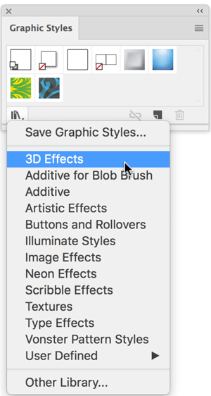
Start by going to the Graphic Styles panel menu and clicking the button to show the Graphic Styles Libraries menu. Choose anything here… no, scratch that… try choosing 3D Effects (Figure 14).

Figure 14: 3D Effects are just one of the choices to explore in the Graphic Styles panel
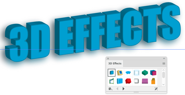
This opens a separate panel where you can just start clicking the thumbnails to see what happens to the text (Figure 15).

Figure 15: You can apply 3D effects with a single click when you use graphic styles.
After you’ve had your fill of 3D, try Scribble Effects or Neon. Fun!
When using graphic styles, take advantage of the fact that your styles can be applied to text throughout the document, including text on multiple artboards. This can be enormously beneficial in some cases. For example, it means you can create headers for various InDesign pages using different Illustrator artboards.
Say you’re doing a catalog and you want each header (with different text) to have the same design, like the one we created earlier using the Appearance panel. You can save that design as a graphic style, apply it to all the headers, one per artboard, and then place those multiple artboards throughout your InDesign document. Then, if you ever need to make a global change, open the Illustrator file, select an instance of the text, and change it using the Appearance panel. Then, holding down the Option/Alt key, drag the thumbnail from the Appearance panel over the thumbnail in the Graphic Styles panel, and all instances of that graphic style will be updated! Save your document; then update the link in InDesign to see the new design reflected document wide. And you thought InDesign’s styles were powerful!
Now that you’ve created some fun text elements in Illustrator, you must also understand the two approaches for getting formatted text out of Illustrator and into InDesign, and why we need each.
Place vs. Paste
There are two ways to get your fancy type from Illustrator into InDesign: File > Place and Copy/Paste. These are not synonymous. They each have distinct behaviors, benefits, disadvantages, and purposes. Do not tread lightly, using use whichever one your fingers find easier to enact. I find it’s best to have a plan before choosing one over the other. Let’s compare.
File > Place
Typically we use the Place command to get Illustrator files into our InDesign layers, creating links to the art files. This traditional workflow has some key advantages over pasting:
The text (and the effect) remains editable in Illustrator.
A single piece of art can be placed into multiple InDesign documents, giving us the power to edit one file and have that change appear everywhere the file was placed.
We can work collaboratively with other designers who might create type designs.
Obviously, with placed files, most of the design of the text needs to be done in Illustrator, as InDesign has little control over the look of placed artwork. So you need to choose the color, font, and any other formatting you want in Illustrator.
One design control you have in InDesign over the placed Illustrator file (other than size, of course) is effects. And in fact, it’s often better to apply things like transparency and drop shadows to the text in InDesign, because you can use an object style to globally apply and edit those effects. Another important control we have in InDesign is that of layer visibility. For example, you may want to show or hide specific layers in a piece of artwork for version control in a multilingual project. When you place an Illustrator file, there are controls in the Import Options dialog box to set the visibility of each layer of a placed file in your layout. Or, after the file is placed, you can alter layer visibility by choosing Object > Object Layer Options.
Copy/Paste
When we copy designed text from Illustrator and then paste it into InDesign, a completely different sort of thing happens. Actually, several things happen. The type is converted to outlines and comes into InDesign as a group of fully editable objects, any “live object” editable attributes are expanded (often resulting in dozens of smaller paths), and gradients and other fills become clipping masks. And since there is no link to any external files, all further edits to the art must take place in InDesign. Does that sound like fun? It’s not. That’s why I say copy and paste may be great for very simple paths, but Place is much better when it comes to doing text effects.
That said, if you do copy and paste the paths, and if you want to do something like put a photo into your newly pasted text treatment, you’ll see that you can fill only one letter at a time. This is because InDesign doesn’t see all the letters as a single object. To unify them, make the text into a compound path. Ungroup all of the letters, select the ones you want to fill with a photo, and then choose Object > Paths > Make Compound Path (or use the keyboard shortcut Command+8 (Mac) or Ctrl+8 (Windows)). Now you can place a photo into your text treatment (Figure 16).

Figure 16: Be sure your outlined type is part of a single compound path before placing an image into it.
Try It On for Effect
There’s nothing wrong with making creative text effects in InDesign. Just like that dependable pair of shoes, a few old standbys like creating outlines, transparency effects, and blending modes can take you pretty far. But when the occasion calls for a little (or a lot) more, don’t hesitate to dress up your type in Illustrator. You can create something that really makes a statement with warping, effects, graphic styles, and the Appearance panel. The creative potential of these tools is matched only by the flexibility and efficiency they offer.
Russell Viers has taught many major publications and designers to work faster and improve quality. He has been actively involved with digital publishing since the early days, having started with CompuGraphic typesetting machines in the early ’80s, and PageMaker 1.0 in 1987. He has also authored several videos from lynda.com, Peachpit Press, and Total Training. Find more at russellviers.com.
Commenting is easier and faster when you're logged in!
Recommended for you

Holiday FX: Do You Want to Build An InDesign Snowman?
Do you want to build a snowman? Come on let’s go and play! I know that thi...

Tip of the Week: 3 Ways to Highlight Text
This InDesign tip on using the Story Editor when designing with text was sent to...

InDesign Magazine Issue 62: A Fresh Start
We’re happy to announce that InDesign Magazine Issue 62 (June, 2014) is now avai...


