
Top 10 Terrible Type Transgressions
To err is human, but to commit these typographic sins is anything but divine.

This article appears in Issue 72 of InDesign Magazine.
To err is human, but to commit these typographic sins is anything but divine. As a long-time Adobe InDesign trainer and print designer I’ve seen more than my share of hideous typesetting. I’ll admit that most of these mistakes I’ve made myself in my early days, but over time and with minimal study, plus a little attention to detail, I’ve learned how to coax elegant results from type. If you learned to type on a typewriter, chances are good you’re one of the worst offenders. But this isn’t your fault. The typewriter, in its day, was an amazing invention that brought typesetting to the average person at a relatively low cost. There was something soothing about the clacky-clack sound of a room of typists pounding on a hefty Olivetti or Underwood. Despite the fact that most people who learned on a typewriter haven’t touched such a machine in ages, old habits die hard. In the list that follows, the first five typographic mistakes tend to be holdovers from the days of the typewriter. The next five errors are often made by those who’ve simply never learned the right way to use a word processor or page layout application like Adobe InDesign. After reading this list of type no-nos, if you’re among the not-guilty, congratulations! Pat yourself on the back (no gloating, please). For those still making some or all of these goofs, take heart. Fixing these problems is easy, as you’ll see. Now that you know.
1. Two Spaces After a Period
Those of you who know me won’t be surprised when I lead off this list decrying the perennial faux pas: using two spaces after a period. Why was the typewriting generation indoctrinated to use two spaces after a period in the first place? Typewriters used mechanical keys
that struck an inked ribbon. All keys were the same width and occupied the same amount of horizontal space. For example, the ‘l’ key was the same width as the ‘w’ key. This property is called monospacing. To help make typing more readable, typists put two spaces at the end of a sentence. When computers came along, type was set using fonts with proportional spacing. Proportional spacing adjusts itself based on the letter. The need for two spaces to differentiate the end of sentences disappeared. This practice of typing two spaces at the end of a sentence remains a hard habit to break. No matter how many times I tell my sister not to put two spaces at the end of a sentence, her fingers resist. Space-space. Oh well.
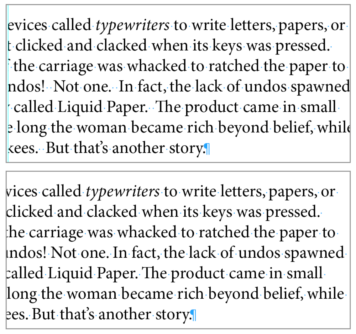
Figure 1: In the top example two spaces are used after each sentence. The bottom example uses only one space.
2. Using Spaces or Tabs to Position Type
Every so often I see beginning students using spaces or tabs to position their type horizontally across a page, as for column headings or centered text. This is a holdover from the days when people designed pages in Microsoft Word. Don’t do it. It’s embarrassing and clunky. InDesign has many better ways to position text. Among them are editable tab stops, left and right margin settings, horizontal alignment, first or last line indents, and Inset Spacing.
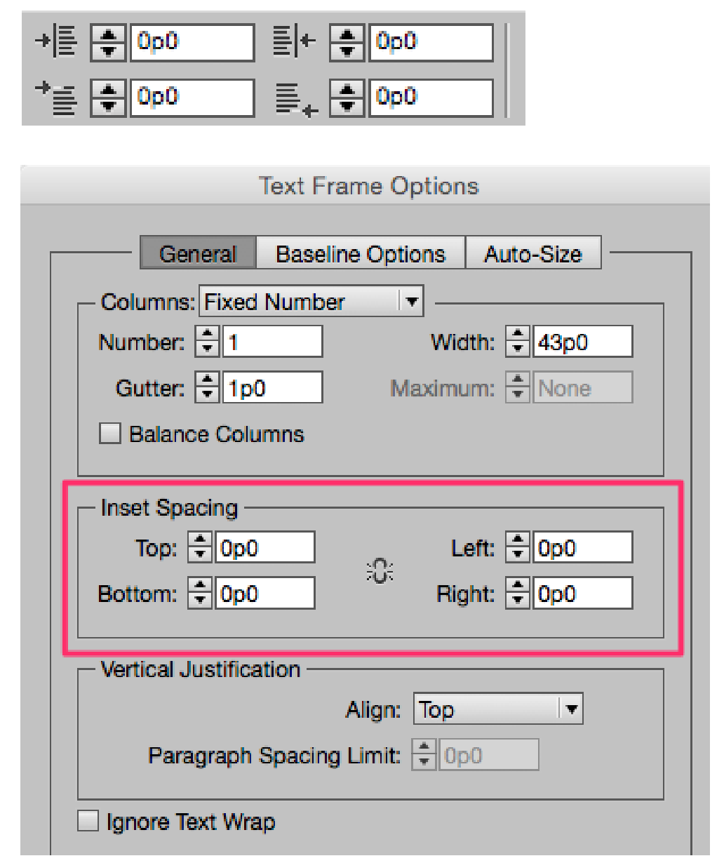
Figure 2: The top image is captured from InDesign’s Control Panel, showing left and right margin settings, and first line left and last line right indents. Employing Inset Spacing (Object > Text Frame Options) is another way to move text horizontally or vertically.
3. Using Tabs Instead of First Line Indent
Another misdemeanor I often come across is using tabs instead of a first line indent. Although tabs will create what looks like an indent, using a first line indent is a better strategy. This is because first line indents are an attribute that can be part of a paragraph style. Once an attribute is part of a paragraph style, all changes are global and easy to apply. This ease of change translates into creative freedom for the designer. Experimenting with different fonts and styles is a snap, which leads to better design. Figure 3 shows how first line indents can be set in a paragraph style. If you use the tabs method (shown in the bottom image), be aware that you must hold the Shift key to separate the First Line Indent marker from the Left Margin marker below.
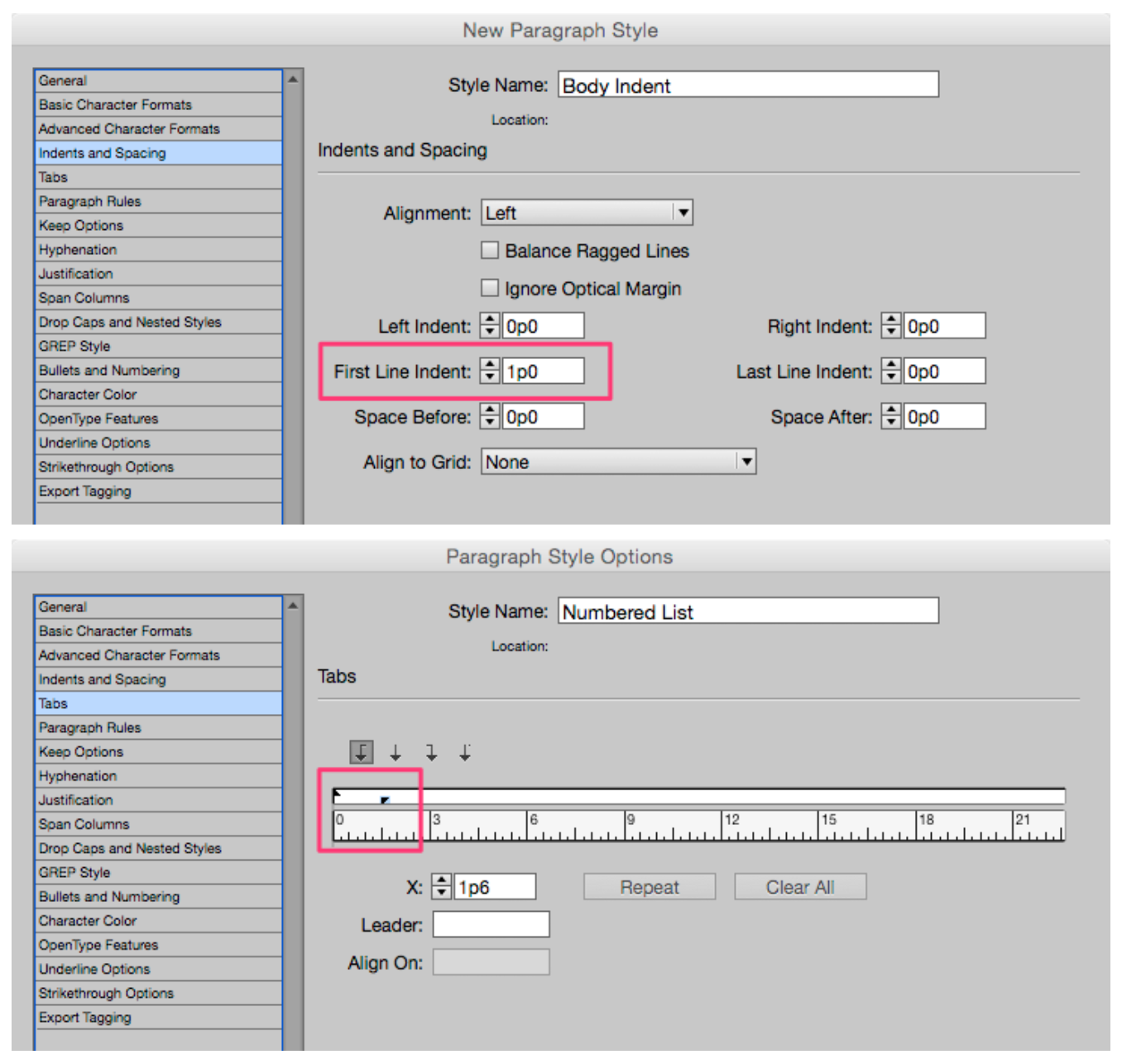
Figure 3: In the top image I’ve added a 1 pica First Line Indent to my Body Indent paragraph style. In the bottom image, the first line indent is achieved by Shift-dragging the upper triangle on the Tabs bar 1 pica.
4. Extra Returns Instead of Space Before or Space After
Let’s get this straight right now. The Return key was not invented to add blank lines to your page. Yes, it does add blank lines on the page when pressed, but this is not what it’s for. Blank lines for space will always be the height of the previous line. If you want more or less space, you’ll have to change the leading value of the blank line or use additional blank lines. Plus, if your text reflows at any time, you may end up with a blank line at the top or bottom of a column, which could be a problem. But the most important reason this is a no-no is because line spacing can easily be made part of a paragraph style, using the Space Before and Space After features (Figure 4). As I said earlier, the use of paragraph styles gives designers artistic freedom. With the click of a button, you can increase or decrease the space before or after a paragraph with precision throughout your entire document.
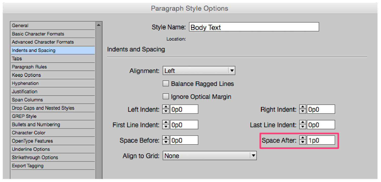
Figure 4: Here I’ve automatically added 1 pica of space after each paragraph to my Body Text paragraph style.
5. All Caps or Underline Instead of Italics or Bold for Emphasis
Another holdover from the typewriter days (when there was no other way to indicate emphasis) is using all caps or underlines instead of bold or italicized type. Today, all caps should be used only for headlines or an occasional subhead. The eye relies on the size difference of upper- and lowercase characters when reading text passages. All caps, except in small doses, forces the reader to do extra work. Even worse is type that uses a script font and all caps (Figure 5a). Underlines fall into a similar category as all caps—a necessary evil when using a typewriter, an unfortunate relic when using a computer. Because of the widespread use of underlining to indicate Internet hyperlinks, many people still use underlines for print documents. A better solution to the emphasis problem in InDesign is a character style that can apply either Bold or Italic. Both are simple to create and even simpler to use. As you can see in Figure 5b, I’ve specified only the italic style to be applied. By leaving blank other attributes such as the Font Family, Size, and Leading, this style can be used with many different fonts.

Figure 5a: If you can read this, congratulations!

Figure 5b: Character styles can be extremely specific or extremely generic. Here, an italic style will be applied to any font that has an italic version. Size, leading, and other attributes will honor the existing font it’s applied to.
6. Fake Small Caps Instead of Real Small Caps
The concept of Small Caps isn’t a holdover from typewriter days, rather it’s a neat convention borrowed from the toolbox of professional typesetting. But you can’t just blithely assume you can use this feature—properly, I mean—without knowing if the font you’re using supports it. In Figure 6a, I’ve set the sentence in Times Roman and clicked the Small Caps icon in InDesign’s Control panel (Figure 6b). Because this particular version of Times Roman has no true small caps glyphs, it’s easy to see the difference in stroke weight between the large caps and the small caps.

Figure 6a: Times Roman lacks true small caps. Note how the weight of the large caps is heavier than the weight of the small caps.
Figure 6b: Clicking this button in the Control panel applies Small Caps to text in InDesign.

Figure 6c: Minion Pro includes true small caps in its character set, which you can see in the Glyphs panel. Note how large caps and small caps have equal weight in the example text.
7. Baseline Shift to Move Type Vertically
Like the telephone lines that seem made for birds to perch on, the baseline is the invisible line that type characters sit on. Those characters that don’t sit on the baseline are located either above (superscript) or below (subscript). Baseline Shift is a type attribute that, like the name says, shifts the baseline of a character either up (positive values) or down (negative values). One easy way to adjust Baseline Shift is by clicking the Baseline Shift control in InDesign’s Control panel (Figure 7a). Baseline Shift is also an attribute that can be automated and built into Paragraph or Character styles.
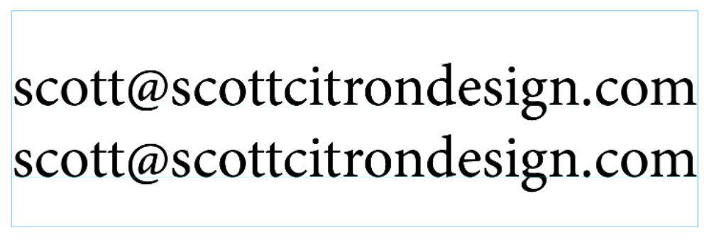
Figure 7a: Top: With the default baseline setting applied, notice how the baseline of the symbol sits above the baseline of the surrounding text. Bottom: With a –.5 pt baseline shift applied, InDesign brings the symbol down slightly, aligning it closer to the baseline of the surrounding text.
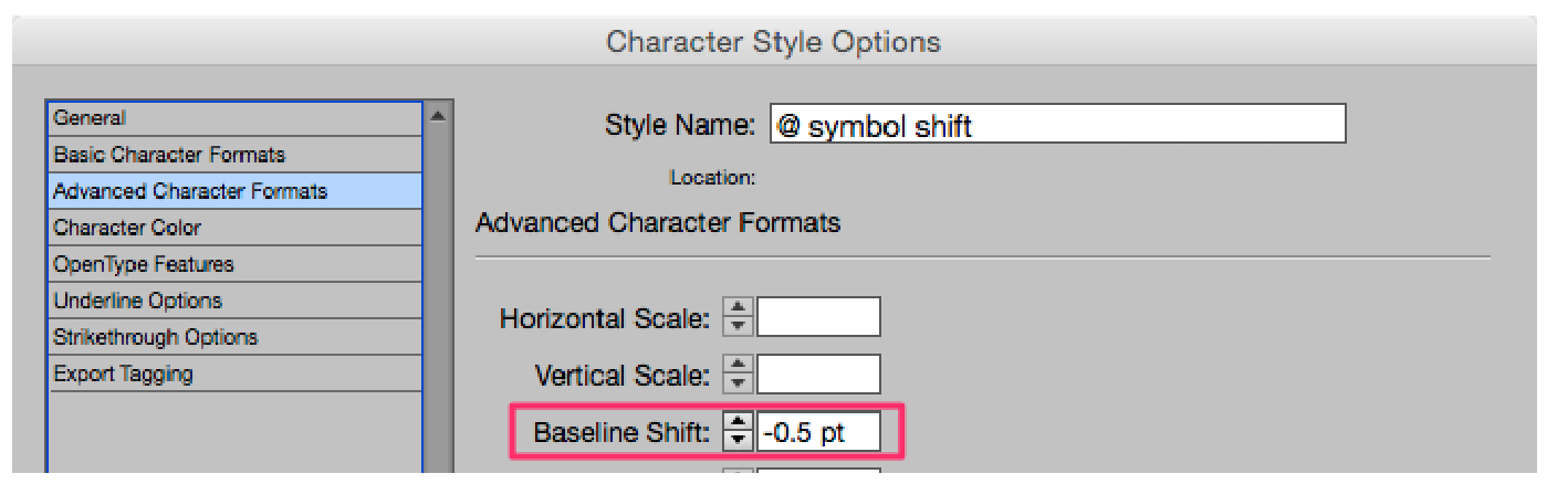
Figure 7b: You can set a baseline shift from the Advanced Character Formats pane of either the Character or Paragraph Styles Options dialog box.
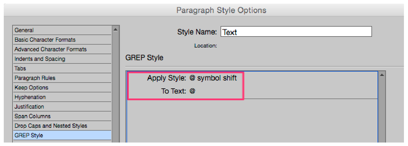
Figure 7c: Automating a baseline shift for the @ symbol is easy via the GREP Style panel in the Paragraph Style Options dialog box, as seen here.
8. Manual Bullets or Numbers Instead of Auto Bullets and Numbers
Recently I was hired to update a large textbook for a major publisher. The book, a step-by-step college manual for Microsoft Office, was filled with numbered and bulleted lists. Often the updates I performed consisted of deleting from or adding to these lists. Normally this would be simple, but in the case of this project, each list was created manually. That means numbered lists started with numbers manually keyed into the text. The same went for bullets. Fortunately, a bullet is a bullet, so adding or subtracting lines wasn’t a big problem. Not so with the numbered lists. Each time a line was adding or deleted I was forced to renumber these lists by hand, a task that’s neither fun nor a good use of one’s time. While I admit that setting up complex multi-level numbered lists is a bit tricky, creating single-level numbered or bulleted lists is not. The first step is to create a new paragraph style. In the Paragraph Style Options dialog box, open the Bullets and Numbering pane (Figure 8a). Set the List Type to either Numbers or Bullets. Note that you can add a character style. Doing so gives you the ability to create a customized bullet or number, rather than accept the default style of your font. You set the position of the bullet or number in the lower section of the dialog box. In this example, I’ve set my numbers to hang. This means that the number will be placed at the left margin. Per the instructions in the Numbering Style area, InDesign will add a period (.) and a tab before my text. Once the text is placed, it will hang flush with the first letter of my text, not with the number.

Figure 8a: Here we see the settings I’ve used to create a simple single-level numbered list.
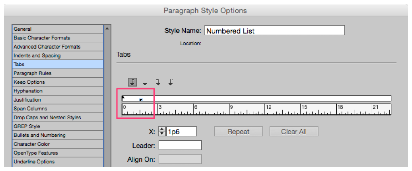
Figure 8b: If you find setting the position of your bullet or number confusing, click on the Tabs pane and do it from there.

Figure 8c: The text “hangs” 1p6 from the left margin.
9. Fake Italics Using Skew
InDesign lets you skew text, but just because it looks “kind of” italic, doesn’t mean you should use it instead of a true italic style! That said… I did have to resort to this trick once in my professional life. Once. Mum’s the word, huh? I was setting the name of a book in a font that had no italic style (according to The Chicago Manual of Style, book titles should always be italicized), and was backed into a nasty corner. The result wasn’t pretty, but my copyeditor approved, so we went with it. The easiest solution to this problem is to avoid fonts that lack an italic style. Unfortunately, this isn’t always possible. Take the font Trajan, for example. Figure 9 shows a book title in Roman and with fake italics using InDesign’s Skew feature. In this example I skewed the text 7 degrees. The results aren’t terrible (unless you’re Carol Twombly, the font’s designer), but I don’t recommend bastardizing fonts by skewing or stretching unless you have no other choice.
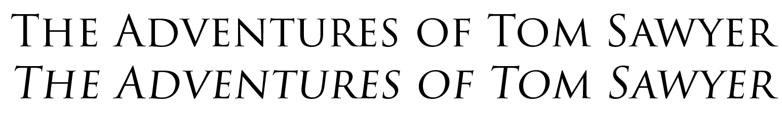
Figure 9: The top example is set using Trajan Regular. The bottom version is the result of selecting the text and applying a 7-degree skew. I suggest avoiding the problem altogether by choosing another typeface.
10. Vertical or Horizontal Stretching of Type
The last no-no in our list—the vertical or horizontal stretching of type—has much in common with #9 (skewing type). Recently I saw an InDesign layout where the designer stretched the headlines 150% horizontally. I don’t really know why anyone would even think to do this, because it looks so bad! The same goes for vertical stretching (or squishing). Take a look at the four examples in Figure 10.

Figure 10: (A) Headline set in Minion Pro Regular with no distortion of either the vertical or horizontal axis. (B) Extended 150% horizontally. (C) Stretched 150% vertically. (D) Squeezed 50% vertically.
In Conclusion
As I said before, old habits die hard. But it’s never too late to change your ways. Each new document or new project is a clean slate where you can commit yourself to doing things the right way. And now that you’ve read this article, you’re already ahead of the game. The next step is to pay attention to how you’re setting type and to be vigilant about ridding yourself of bad habits. If you learned to type on a typewriter, you’re partly forgiven for your transgressions. But now that you know better, it’s time to improve those skills. I’ll be watching!
Commenting is easier and faster when you're logged in!

Recommended for you

callas Software Introduces New Line Up of PDF/A Solutions at AIIM/OnDemand
callas software, developer of powerful and innovative PDF solutions, announces a...
Photoshop for Beginners
Becoming a Photoshop expert is probably on a lot of folks’ bucket lists. W...
Applying Gradients to Multi-Line Text
Did you ever wish you could fill multi-line text with a gradient, so that t...