
Return to page 1 of “Three Ways to Take Your Web Site Mobile.”
Among the recommendations and best practices Mobify suggests are choosing a limited amount of content for the mobile visitor: top stories, search, direction, maps and contact information. The company also suggests short pages because longer pages may not display on older phones with limited memory.
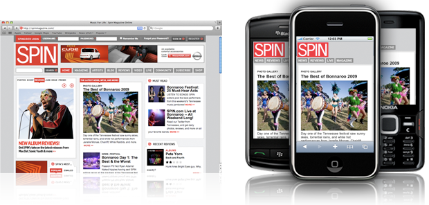
Another edited Mobify example (and the full-site page) from Spin magazine. Click the images for a larger view.

It’s Time
No matter which strategy you choose, the sheer volume of mobile users is now a force to consider and design for. Like nearly every new technology, mobile Web devices have quickened the pace at which people look for, view, and utilize information. Even with a large amount of information to convey, a designer now needs to think in terms of snippets: chunks of quickly digestible content that easily lead to related content.
“Mobile users tend to be less patient and give up pretty quickly if a site is too difficult to navigate,” said Wills. Anticipating and testing your new mobile site from the perspective of someone standing in line at Starbucks may be the most effective design tool you have.
This article was last modified on May 19, 2023
This article was first published on August 3, 2009
Commenting is easier and faster when you're logged in!

Recommended for you

Before&After Design Tip: Use Text to Supplement an Image
Turn a problematic image into a powerful one

Why is my InDesign text highlighted in blue?
This is an increasingly common problem: InDesign users suddenly find that some (...