


Marty Blake
Marty Blake has been working as an illustrator and graphic designer for many years. Her illustration is grounded in collage, and these days, most often executed digitally. Her pictures are composed of scraps from her extensive library of old books, magazines, ephemera, a set of 1939 wallpaper swatch books, and vintage cigar box labels. Her illustration clients include editorial, book jackets, advertising and packaging, while her design clients include arts and educational institutions, restaurants and fine foods. Her projects have consisted of logos, letterheads, brochures, ads, posters and publications, apps, and of course, her own self-promotion. Marty designs from concept through execution, and when needed, also art directs photo shoots and monitors jobs on press.
After teaching adjunct and lecturing for a long time in a number of schools, Marty is currently full-time Assistant Professor and Undergraduate Illustration Program Coordinator at Syracuse University, but still takes on client work. She recently joined the Board of Directors of ICON, the Illustration Conference, as Education Chair.
I have been a fan of Marty’s work for many years. What strikes me the most about her work is not only her wildly creative and very unique solutions, but her skill at combining type with image, as well as type with type. We asked Marty about her work, inspiration, and process. Here is what she had to say:
How did you get started in your style of collage and illustration?
Although I enjoyed drawing, painting, and making things since I was a little girl, a college course in Dada and Surrealism and the discovery of Joseph Cornell and Hannah Hoch’s work had a lasting impact.

A series of posters pretending that the Future of Storytelling Festival had been around for over a century, and these were historic posters from the past. Client: Melcher Media.
You are very brave and skillful in your typography, both combining type with image, as well as mixing typefaces. I have seen you combine over seven in one piece! How did this skill develop?
Thanks! Maybe it arises from a love of vintage typography and circus posters. (Massimo Vignelli would be appalled!)
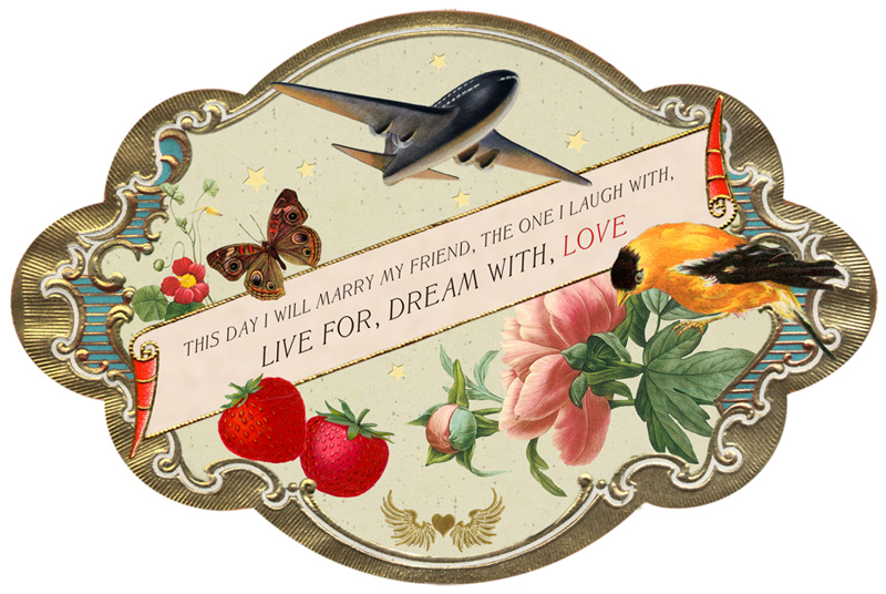


Wedding invitation and all related printed matter. Client: Nancy Radke.
What came first in your studies and bag of tricks: illustration, design, or typography?
Undergraduate I was a printmaker; my work was always figurative, the topics often surreal. I went immediately to grad school to study illustration (I would not recommend this breathless path to others). Somehow unable to successfully transpose my drawing style into illustrations, I began to make collages to cheer myself up. Murray Tinkleman and Wilson McLean encouraged me to respond to assignments with collage and I went on to write a 225-page Master’s thesis on collage illustration. It was a Golden Age, with people like Fred Otnes, Anita Siegel, Carol Wald, and Joan Hall all working in collage. I was able to interview most of them.
I am an accidental designer. I moved to NYC after grad school and, unable to make a living right away by making collages, I worked on the night shift setting headlines for editorial, advertising, and book jackets. I developed an eye and passion for type and began designing projects on the side. I worked as designer for Dance Theater Workshop for a couple of years, cranking out a large volume of work and learning about production.

Three cards from a Dog Tarot deck consisting of a series of 30 cards, boxed with booklet. Client: Potter Styles, div. Clarkson Potter, div. Crown Publishers, div Penguin Random House, NYC. Art director: Danielle Deschenes.
Do you still collect resources for your work, and if so, where? Are they organized in any particular manner?
I have so much ephemera, though I still poke through used book stores and antique shops. I have flat files filled with labeled folders for dozens and dozens of categories and book cases filled to overflowing. I also have digitally archived folders within folders of thousands of scanned images. Frankly, for illustration work I also might work with Getty Pictures, stock agencies, and other resources to find just the right image and to avoid any potential copyright conflicts.
What is your process?
For illustration, I’ll first listen to the art director, then read a manuscript if necessary and do research. I’ll collect far more images than I’ll need and start to throw them together in Photoshop. My sketches often look like finishes. I need a bit more time up front but can usually move swiftly in doing corrections.

Conference graphics for The Future of Storytelling Summit, including tickets, conference book cover and interior page templates, cover of takeaway book, and 90 portraits. Client: Melcher Media, NYC.
What is your favorite piece and why?
I have several favorites, but one standout is the packaging projects for Smog Design in LA. After all, how many clients ask the designer, “Could you please make it weirder?” This was tremendous fun to work on!

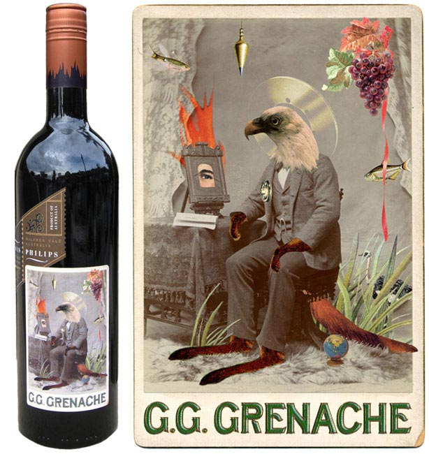
A series of two wine labels: a Reisling and a Grenache. Client: Smog Design, LA for R Wines. Art directors/designers: Jeri Heiden and Glen Nakasako.
Your most challenging?
I was approached by Melcher Media in NYC to do some spot illustrations for an iPad app for Monty Python, The Holy Book of Days, with a release date timed with a rerelease of the movie Monty Python and the Holy Grail. Long story short, when they learned I was also a designer, I ended up illustrating and designing the entire app, with a developer doing all the backend coding. The job entailed everything from 28 ornamental borders to category icons, simple animations, title pages, home pages, etc. I almost always work alone, but for this I had to hire an assistant! One bonus was that I got to incorporate Terry Gilliam artwork and see sheets of his original work. Another bonus was learning that John Cleese and Eric Idle loved it. As a life-long fan of Monty Python, this was quite an honor. 


Design and illustration of iPad app Monty Python and the Holy Book of Days as a companion to the movie Monty Python and the Holy Grail. Client: Melcher Media, NYC.
Do you have any advice for students or aspiring illustrators, especially regarding typography?
Read. Look everywhere at everything. Be aware of trends, then ask yourself “and then what?” Frequently stop looking and start making.

Seasonal self-promotional postcards.
This article was last modified on January 18, 2017
This article was first published on January 18, 2017
Commenting is easier and faster when you're logged in!

Recommended for you

Communication Arts 7th Annual Typography Competition
Communication Arts magazine, a professional journal for those involved in visual...

TypeTalk: Introducing Gill Sans Nova
Gill Sans is distinctive, historic sans serif typeface designed in 1926 by the i...
Hermann Zapf, ITC & Apple: The History of ITC Zapf Chancery & ITC Zapf Dingbats
On June 4th 2015 we lost one of the great ones. I’m speaking of Hermann Zapf, th...