


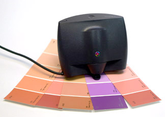
The first color-measurement device I tested was the Colortron. That clever instrument was my trusty companion for several years, as I dragged it around the world, demonstrating it to people who attended my seminars.
What is a Colortron, you ask? The Colortron is a spectrophotometer used to gather color information about a reflective or transmissive subject. It can be used to calibrate a monitor, for instance, or to read color patches for building ColorSync profiles. It can be used for densitometry in the pressroom. A multi-talented device indeed!
But, what defined the Colortron in the first place and continues to define it today is the software that makes it go. The engineers and creative people behind the Colortron really did it right when they developed this part of the package. Called ColorShop, the software includes modules for the Colortron basics: densitometry, color-gathering, and monitor calibration. But it also includes delightful modules for viewing colors, checking color, picking color, and having a great time with color. These capabilities are, in my experience, unmatched in our industry.
The thing is, the Colortron and its cool software have been on the market for years, but it has mostly gone unnoticed. So I guess you could say I’m writing a review five years late.
First, some background: The Colortron was originally developed by Light Source, a company based in Marin County, California. Several years later, Light Source went into a “growth phase,” and as a result of inadequate financing the company ran into difficulty. On the brink of disaster, Light Source and its clever Colortron instrument were rescued by X-Rite, the much larger instrument maker in Grandville, Michigan. X-Rite adopted the Colortron, adding it to its line of color instruments, and X-Rite ultimately improved it with some small but significant technological changes. Today the Colortron IIc is available, and it’s as clever an instrument as ever, even better now that it is more accurate.
And thankfully, its ColorShop software is as good as ever, too.
Harmonic Convergence
The software modules that make ColorShop especially valuable are the Color Harmony tool, the Tweener, the Color Picker, and palette tools. I use these occasionally, and when I do, I fall in love again with the color software I first enjoyed in 1994. Harmony allows you to choose any color and then see that color’s mathematical harmonic — its opposite. Simply stated, this will show you cyan if you choose yellow, magenta if you choose green. But color harmonies of more than two colors are more interesting, and when you select a three-color harmony, ColorShop will divide the color wheel into thirds, displaying a palette of three colors that are mathematically harmonic around the wheel at 120-degree increments.

We are seldom conscious of the harmonic of an individual color, and it’s sometimes surprising to see the colors that pop-up in the Harmony window. Often lovely, sometimes obnoxious, the harmonic colors that are identified by the software are interesting, and often very useful when designing a project. You are free to choose any of the colors picked by Harmony, by dragging them to your master palette for export to Adobe Illustrator, QuarkXPress, and other applications.

Up to six-color harmonies can be built, making the most wonderful combinations of colors you can imagine (and some you never would), and from these harmonies a handsome set of colors can make a design project really stand out from the crowd.
A Whole Lot of Colors
The original Colortron instrument included an internal battery, making it portable (this battery was also the source of some of its chronic problems and was removed from the instrument as a result). When I connected the Colortron to my old PowerBook 170 (with a black-and-white monitor), I was able to use the Colortron as a color-gathering instrument in the field. I once read the colors of all the BMW automobiles at a car dealership. Dogged by a salesperson who was asking me what it would take to “put me into one of these fine automobiles,” I walked around the lot, carefully measuring colors with the Colortron and my PowerBook.
It didn’t read metallic colors at all well, but it did a fine job with the other colors of the cars in the lot, and the palette of colors was used to build a demonstration of color control for the ad agency handling BMW’s account. I later learned that car manufacturers have a more sophisticated instrument for measuring paint colors including metallics. Called a goniospectrophotometer, it has a diffuse light source and several sensors to allow highly reflective colors to be measured with accuracy.
Compare and Contrast
Another of ColorShop’s best tools is the Compare tool, which lets you compare any two colors — from Pantone libraries, measured sources, measured or imported colors. The Compare window shows the two colors adjacent to one another, and shows a mathematical value — called Delta E — for the difference between the two. A Delta-E unit is defined as the smallest amount of change necessary to be perceived by a standard observer. The two colors are presented on a palette of neutral gray, which can be lightened or darkened to suit your tastes. I find it one of the more amazing things about color that you can change the perceived difference between two colors quite radically simply by changing the background color that surrounds them.
ColorSync profiles can also be applied to color palettes in ColorShop, allowing you to build palettes of colors that are within the gamut of colors printable by a specific press/paper/ink combination. This is particularly useful when trying to reduce one of the Pantone libraries to in-gamut colors for a commercial press. Though this fact is not well known, less than half of the Pantone solids are within the gamut of CMYK-process color inks. It is wise, therefore, to build palettes of colors that can actually be printed. This allows for the leveling of customer expectation and printing reality.
To help you consider how your color palette will look under different lighting conditions, ColorShop has a Lighting tool that will demonstrate, to the degree that a computer monitor can, the effect of various lighting conditions on the color of your choice. I find it fascinating to compare these effects, observing metamerism, about which I’ve already written.
Color Me Sold
All in all, ColorShop is a delightful piece of software, and one that offers considerable benefits to creative professionals. You can buy ColorShop bundled with the Colortron IIc or X-Rite’s Digital Swatchbook instrument for about $1,000. Each instrument is sold in computer catalogs, and each is available for both Macintosh and Windows computers. For a free preview, you can even download a demo version of the software from the X-Rite site.
One last benefit, and this one might be the best of them all: When you purchase a Colortron, you get a well-written manual that explains all the software components along with the companion instrument. Chapter 4 of that manual, entitled “The Primer,” is a college education in color in only 71 pages. Written by Fred Bunting, X-Rite’s instructional guru, this primer is simply the best piece of technical writing I have ever encountered. It’s clear, concise, and not too lofty for the average person. Fred’s writing technique is extraordinary, and the illustrations are clear and understandable. I take this primer out from time to time and reread it, just to remind myself about the basics of color.
So, if you’re getting started in color management, or if you’re a creative professional attempting to get better control over your color selection and application, consider the X-Rite ColorShop software, with its accompanying manual. And get the Colortron instrument as part of the package!
This article was last modified on December 13, 2022
This article was first published on July 31, 2000
Commenting is easier and faster when you're logged in!

Recommended for you

Five Ways to Box a Paragraph in InDesign
This article was originally published in InDesign Magazine #66 (October 2014). S...

CreativePro Video: Fix Distorted Perspective in Lightroom
In this week’s CreativePro video, Nigel French shows a quick way to adjust issue...
InStep: Preflight to the Rescue!
InDesign's real-time error checking reduces headaches when designing screen and...