
The FX Files
An investigation of the 9 kinds of graphic effects you can apply to objects in your InDesign layouts

This article appears in Issue 141 of InDesign Magazine.
InDesign offers a wide variety of transparency effects— from shadows and glows to bevels and feathers—that can add vitality to both text and images. You can tweak and mix and match effects to achieve an almost unlimited number of looks. Even better, because all of InDesign’s transparency effects are live, you can make modifications to change the strength or character of an effect (or remove it altogether) at any time.
In this article, we’ll look at each of InDesign’s nine transparency effects in turn, and see some examples of what you can do with them.
Applying Effects
First, let’s take a look at the basic process for applying effects. After you select an object in your layout, you can apply effects to the entire object, to just the fill or stroke, or to the content of the frame (text or graphic). Note that you can’t apply effects to a selected range of text—only to all the text in a selected frame. Once you have your target object selected, then use one of the following ways to apply the effect:
Choose Object > Effects, and then the specific effect you want. Choose the level (Object, Fill, Stroke, etc. in the dialog box).
Use the Control panel button, and then choose your desired level and effect (Figure 1).

Figure 1. The Control panel’s FX button gives you quick access to InDesign’s transparency effects.
Open the Effects panel (Window > Effects), then double-click on the level where you want to apply the effect to open the Effects dialog box.
Okay, now that you know how to find them, let’s take a look at the nine basic effects.
Drop Shadow
Cutout or silhouetted images can greatly enliven InDesign layouts. But when you place cutout objects on a plain background, they can look too flat (Figure 2). A shadow can help to make them stand out from the page.

Figure 2. A silhouetted image can look very flat on its own.
The Drop Shadow effect gives you the ability to lift the object off the page, making it appear much more three-?dimensional. As humans, we’re used to seeing light coming from above rather than below, so you should usually specify the Angle setting so that the shadow appears below the object, like the light is shining from overhead. InDesign’s default drop shadows are much too big and dark—around 40% Opacity with a small Distance value works well for most purposes (Figure 3). It’s also helpful to add 3 or 4% noise to make drop shadows look slightly more natural.
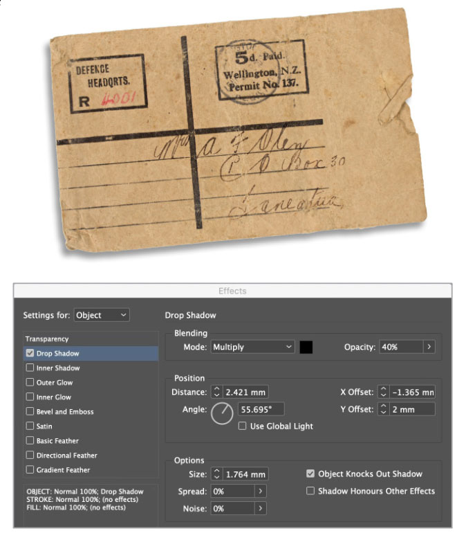
Figure 3. Just a simple drop shadow can add a lot of visual interest to placed images.
Consider using the Drop Shadow effect whenever you have text over images in your layouts. Text placed over an image will always look best when the text is white—even on a light background. You might think that black text would work better on a light image, but it tends to look muddy; and colored text often looks amateurish. When you place text on a light background or a bright image, however, it can be hard to read. A simple solution is to add a drop shadow to the text, which will lift it off the image and make it stand out—and it’s a far more subtle solution than adding a stroke to the text. Use a small X and Y offset, and don’t make the shadow too large (Figure 4).

Figure 4. Even a small drop shadow enhances the readability of text placed over an image.
Shadow Shortcut
You can assign keyboard shortcuts to any effect that you use on a regular basis, but the Drop Shadow command actually has a built-in shortcut: Command+Option+M (macOS) or Ctrl+Alt+M (Windows). This shortcut applies a drop shadow to any selected object and opens the Effects dialog box where you can make modifications. Option- or Alt-clicking the Drop Shadow button in the Control panel accomplishes the same thing.
Inner Shadow
The most frequently used form of an inner shadow is to make text appear to be cut out from the paper on which it’s printed. It’s a simple but surprisingly effective technique, and it works best with strong, thick text (Figure 5). A font with fiddly serifs will never catch the shadow properly. As with a drop shadow, it’s best to set the lighting direction to the top, so the light appears to be coming from above. This technique works for graphics as well, as long as they’re composed of simple flat colors.

Figure 5. A simple inner shadow can make the fill of text appear to be beneath the level of the surrounding content.
You can also use the Inner Shadow effect to add the appearance of warmth to the edges of text. For Figure 6, I added a red inner shadow to the yellow text. I set the Distance to zero this time, to produce an even shadow all the way around the text.

Figure 6. Inner shadows don’t have to be black. Experiment with different colors to add visual interest to text.
Outer Glow
Outer Glow almost always works best on a black background. Here, it’s used to give science-fiction lettering the sort of treatment you’d be likely to see on a film poster (Figure 7).

Figure 7. The Outer Glow effect and a black background make a great combination.
The effect is even stronger when you set the text to the same color as the background. Now, the text disappears, with just the glow giving it a ghostly presence (Figure 8).

Figure 8. Making the text the same color as the background gives an outer glow even more impact.
With this technique, you can strengthen the glow without enlarging its fuzziness by increasing the Spread value. The higher the Spread value, the stronger the glow (Figure 9).
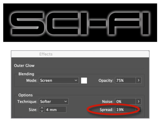
Figure 9. Increase the Spread value to increase the intensity of the intensity of the glow.
InDesign doesn’t allow you to set the opacity of the text separately from its glow, so if you want to make the text disappear while seeing just the glow you’ll need to employ some blending mode trickery. First, set the fill of the text to Registration. (Yes, I know you’ve probably heard that you should never use Registration for anything other than actual registration marks, but this is a special case.) Registration is by definition the darkest possible color you can put in an InDesign layout, so you can make that color disappear no matter what it’s on top of by applying the Screen blending mode to it (Figure 10). A white glow won’t be affected by the Screen blending mode. Other colors can produce interesting effects as well.

Figure 10. The Screen blending mode makes a dark fill color like Registration disappear while leaving the white glow untouched.
Inner Glow
Inner Glow is effectively identical to Outer Shadow, with the mode set to Screen rather than Multiply. Used straight out of the box, it adds a soft, fuzzy edge inside text or graphics (Figure 11).
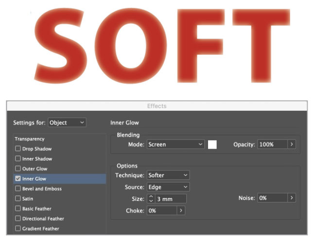
Figure 11. A basic Inner Glow effect
If you increase the Choke amount, the edges of the text eventually disappear entirely. This is particularly so if the Opacity is set to 100%, and the color to the background color of the page (Figure 12).
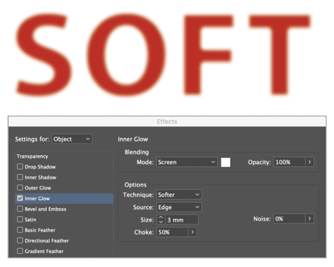
Figure 12. Increasing the Choke amount can make the edges of the object disappear, for a softening and blurring effect.
Changing the Source setting from Edge to Center will move the glow to the inside of the lettering. This can give it a rounded, almost three-dimensional quality (Figure 13).
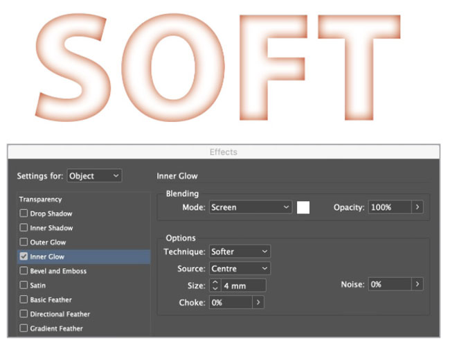
Figure 13. Plump up your text with an Inner Glow effect applied to the center.
Bevel and Emboss
The Bevel and Emboss effects have more variants than the other effects, thanks to their Technique settings. At the basic level, with Technique set to Smooth, they lend a three-?dimensional quality to text and graphics (Figure 14).

Figure 14. A basic Inner Bevel effect
If you change Technique to Chisel Hard, you get a more sculptural result: The text will appear as if cast in metal (Figure 15).
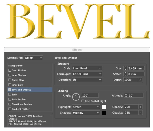
Figure 15. Chisel Hard creates very sharp bevels with crisp highlights and shadows.
Here’s a way of making the fill of the text disappear, with just the bevel and emboss showing. Make a new color swatch that’s 50% each of cyan, magenta, yellow and black, and make the text that color. Then, in the Transparency section of the Effects panel, change the blending mode to Hard Light (Figure 16).

Figure 16. Settings for making the fill disappear while keeping shadows and highlights visible
This makes the text disappear, as 50% gray is invisible in Hard Light mode. When you now apply your Bevel and Emboss settings, they’ll stand out against the background (Figure 17).

Figure 17. A very convincing chiseled effect, courtesy of Bevel and Emboss and the Hard Light blending mode
Changing Technique back to Smooth produces a more subtle engraved effect. Set Direction to Down, and the text will look carved into the stone (Figure 18).
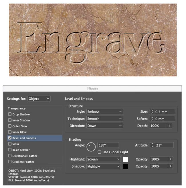
Figure 18. Using the Smooth technique can yield a more subtle, carved look.
Satin
The Satin effect places two inner shadows on top of the text—the inverse of the text—to give it a shiny appearance. On its own, the Satin effect produces a vaguely glossy appearance, looking—as the name implies—like the text has a satin surface. However, Satin is best used in conjunction with Bevel and Emboss, to make the text look more metallic (Figure 19). Satin works least well in large simple shapes, like rectangles or ovals.
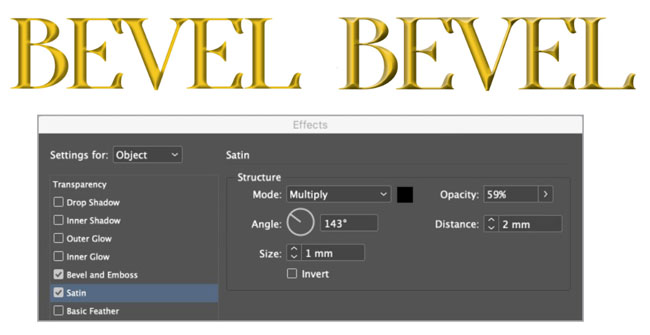
Figure 19. A basic Satin effect (left) and Satin combined with Bevel and Emboss (right)
Basic Feather
Basic Feather softens the edges of text, graphics, or images. This can produce a ghostly effect, similar to Inner Glow. But unlike Inner Glow, the Basic Feather effect will be transparent when placed over an image or a colored background. Here it is using the default Corners setting of Diffused, which produces the softest effect (Figure 20).
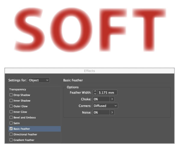
Figure 20. Basic Feather with default settings
Changing Corners to Rounded produces an interesting softening effect—but it also creates striations at the edges, almost as if the text were made of inflated rubber (Figure 21).
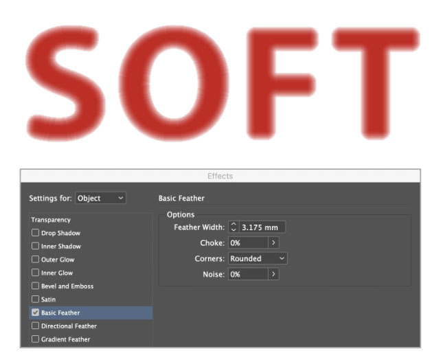
Figure 21. With a change to its Corners setting, Basic Feather can also round the edges of text and other shapes.
Increasing the effect’s Noise setting dissolves the edges for a special effect that could be useful for a dramatic headline (Figure 22).

Figure 22. Basic Feather with a high Noise setting
You can also apply Basic Feather to images. For Figure 23, I used it to blend the sky off into the page to lend a vignette effect to the image.
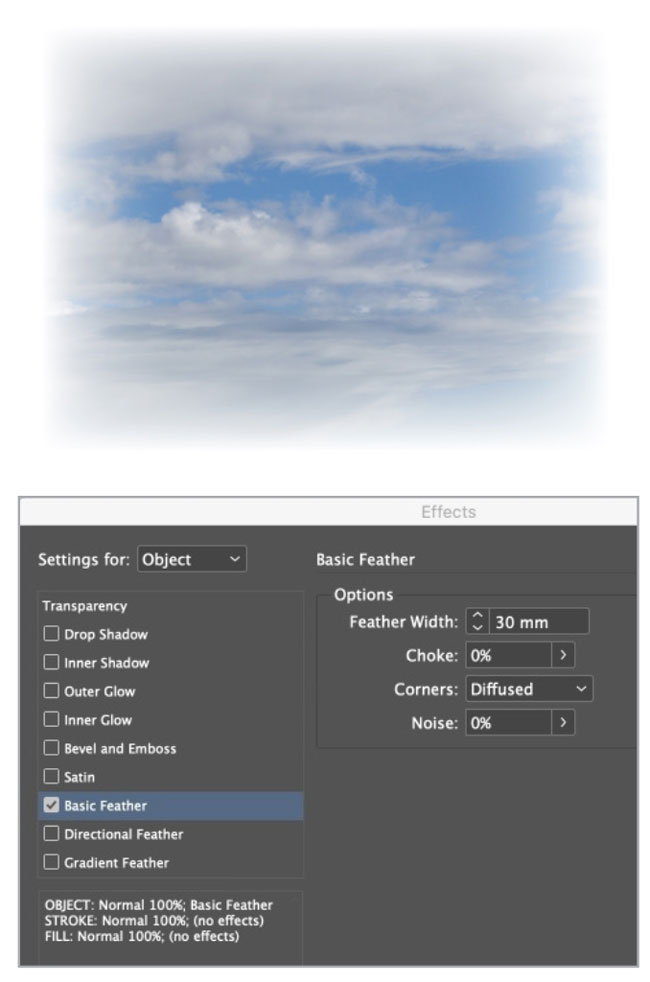
Figure 23. Use Basic Feather to fade images into the surrounding layout.
Gradient Feather
Gradient Feather smoothly fades an image to which it’s applied and is a good way of producing reflections. You can set the angle of the gradient, and optionally choose a Radial rather than a Linear gradient for effects such as sunbursts.
Figure 24 shows a silver tureen that I duplicated and flipped vertically. But note how the background of the flipped version covers up the feet of the original.

Figure 24. The first step in creating a reflection is to flip a copy of the object.
You can easily remedy this by changing the Basic Blending Mode setting to Multiply, so that all the white in the duplicated version disappears (Figure 25).

Figure 25. Use the Multiply blending mode to fix any problems created by white backgrounds.
When you apply the Gradient Feather effect with Angle set to 90 degrees, the reflection will smoothly fade away. Lower the opacity of the left point so the reflection begins at, say, 60%. If you click in the middle of the gradient and drag the mid point to the left, you can make it fade away more rapidly (Figure 26).

Figure 26. By adjusting the gradient stops, you can fade out the flipped copy and make a convincing reflection.
Note that this technique works well only when the object has been photographed square on to the camera. If it’s at an angle, then the reflection will look unconvincing.
Directional Feather
Directional Feather works very much like Gradient Feather, except that it can only be applied to the four rectilinear edges of an image—top, left, bottom, and right—although you can change the angle of all four together to create diagonal feathers. In Figure 27, the sky in the image isn’t tall enough to reach the top, so a blue panel has been added behind it on which to place the text.

Figure 27. Without Directional Feather applied, the blue background behind the text doesn’t mesh with the adjacent photo.
Adding a Directional Feather to the top of the image fades it away smoothly, blending it into the blue background. The effect is to extend the sky seamlessly (Figure 28).

Figure 28. Directional Feather blends the solid blue fill and the photo seamlessly.
Unlike Gradient Feather, you can apply Directional Feather to more than one edge—and you can apply it by different amounts to each edge. In Figure 29, I applied it to both the top and left side of the image, so that it fades into the blue background of the page.
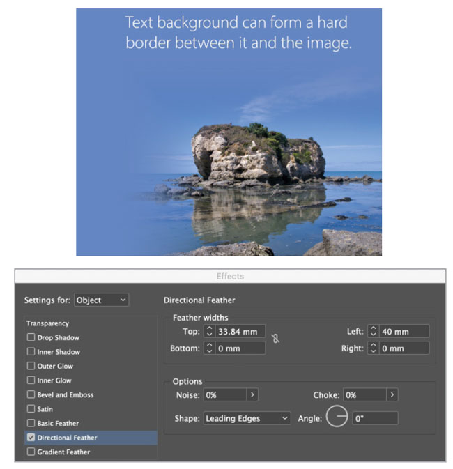
Figure 29. Directional Feather applied to the top and left of the placed photo
There are three Shape options for Directional Feather. In Figure 30, I set Shape to First Edge Only to feather just the leftmost extents of the arm and leg.

Figure 30. Directional Feature set to First Edge Only
When you set Shape to Leading Edges (Figure 31), the effect feathers each of the leftmost edges of the figure. Note how the left armpit is left alone: that’s because the arm to the left of it catches the feather first.

Figure 31. Directional Feature set to Leading Edges
When set to All Edges, the Shape setting extends the feathering to the right arm and leg as well (Figure 32). I think you’ll agree that it’s a pretty odd-looking result, so it’s rare you’d want to use it.

Figure 32. Directional Feature set to All Edges
Extra-terrific-al Effects
InDesign’s transparency effects can solve a number of design problems and spare you countless trips back and forth between InDesign and Photoshop. My best advice is to experiment freely, combine different effects and blending modes, and see what you can conjure up. Just remember that a little FX can go a long way, so always err on the side of subtlety. Used judiciously, transparency effects take a humdrum layout to something out of this world.
More FX Fun at CreativePro
Here are 10 nifty tutorials on InDesign Graphic Effects.
Commenting is easier and faster when you're logged in!

Recommended for you

InDesign Magazine Issue 92: InDesign in the Middle East
We’re happy to announce that InDesign Magazine Issue 92 (December, 2016) is now...

The Type Project Book Excerpt: City Poster
See how to embrace your influences and borrow from them to make something totall...

Understanding InDesign’s Text Frame Options
From columns and spacing to baselines and grids, learn how to take full control...