

Type crimes don’t only exist in print. You’ll find them on the web and other digital media as well. Any public media that contains type should be adhering to professional standards of good typography. Unfortunately, this is not always the case, particularly on the web. In fact, type crimes are a lot more prevalent on the web, and in any scenario where an experienced graphic designer is not part of the process when posting text. Let’s take a look at five things you should make every attempt to avoid.
Double word spaces
Double spaces between sentences are a well-known type crime in print, but they also appear on the web. The reason for this is many people who write copy, whether they be professional writers, bloggers, business owners and such, are not knowledgeable of proper typesetting practices, as opposed to just ‘typing’. Without a proofreader knowledgeable in typographic practices, major errors such as this go unnoticed and frequently go from the writer to web master to upload, with no one in-between.
Any copy intended for publishing should be proofread for this common and extremely unprofessional type crime. If there is no one in-the-know looking over the copy, as is frequently the case for personal blogs and other WordPress sites, it needs to be checked for this error. The easiest way is to search for two word spaces and replace with one. Then check the copy over carefully to make sure that something else wasn’t deleted by this action that needs to be there. (Read more about double word spaces here.)

Two word spaces between sentences make for visual interruptions that disturb the overall ‘color’ of the type, and also reduce readability.
Hyphens and dashes
Hyphens and dashes appear with great regularity in all kinds of text. The problem arises when hyphens (or more commonly, two hyphens) are used instead of dashes, a substitution that is considered a major type crime.
Before typing or applying the proper punctuation, one must understand the difference between hyphens and dashes (which can be explained in detail in this article). Once text is properly punctuated, the next task is to understand how to apply this “smart” punctuation to the web and other digital media. Hyphens are not an issue, but on the web, dashes must frequently be coded in order to appear correctly. This is not as complicated as it seems: it frequently just requires a search and replace, inserting the proper code, which can easily be found on the web. If there is a web programmer or web master, this should be pointed out to them and they will do it. But if not, anyone in the process can do this, including the designer, writer, or even you if it is for your own blog. Codes for specific punctuation can easily be found on the web.
It should be noted that some content management systems (CMS), including WordPress, might render the dashes properly if they are in the actual copy. But this automatic insertion needs to be investigated on a case-by-case basis in order to have them appear correctly. In addition, keep in mind that some email marketing services do not support this “smart” punctuation – even if coded in – so note this accordingly.

These three punctuation marks vary primarily by width.

Never use two hyphens in place of a dash, a practice from the days of typewriters when dashes weren’t available on the keyboard (top). When using any dash on the web, it is best to add a space before and after to allow for more line break options (bottom two). If you don’t, it can result in overly deep rags (second from top).
Quotation marks and primes
In professional typesetting, quotation marks and primes – which are commonly referred to as inch and foot marks – are entirely different glyphs. But unfortunately, most copywriters, business owners, and others are not aware of this. Once again, if one doesn’t’ “type” them in correctly and there is no one to do a typographic proofreading of the copy in order to call out these marks, they frequently appear incorrectly on the web and other digital media, such as movie titles, motion graphics, and the like.
True quotation marks are design sensitive, that is, are different for the open, left designs and the right, closed ones. On the other hand, primes, which are frequently referred to as typewriter quotes, are straight or sometimes slightly angled marks, both of which are not design sensitive. (Read more on these glyphs here.) The problem arises in digital media because even if the quotes appear correctly in the submitted or uploaded text, they will not necessarily appear that way in digital copy. Unless you are using WordPress or a CMS that is set to automatically convert these for you, they will need to be coded into the copy before inserted and upload it into the appropriate medium. I have done this numerous times, and considerate it the responsibility of the person uploading the text. It’s really not that difficult, usually requiring a “search and replace” with the proper code.
As mentioned earlier, problems can arise with certain CMSs as well as email marketing systems which might or might not allow for smart quotes or other specific smart punctuation, even if you code them. Therefore, be aware of the capabilities of the medium you are uploading to, and deliver or upload the copy accordingly.
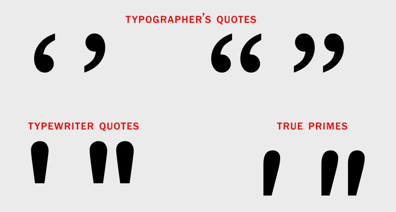
The differences between smart, typographer’s quotes, and both typewriter quotes and true primes – both used for measurements – can be seen above.

The top example shows the incorrect use of dumb, typewriter quotes, as well as smart, typographer’s quotes. The two examples below it are considered correct.
Hard line breaks and inter-line hyphenation
There currently is no automatic hyphenation on the web. In addition, one cannot manually control rags and line endings, as type size and style can look different for everyone, depending on platform, device, resolution, as well as the readers’ personal settings. This is important to know because some people who are not aware of this try to correct what they see on their screen with hard line breaks and manual hyphenations. This should be avoided at all costs because it usually results in very deep rags as well as interline hyphenations for some viewers, both results of which are extremely unattractive and unprofessional to boot.
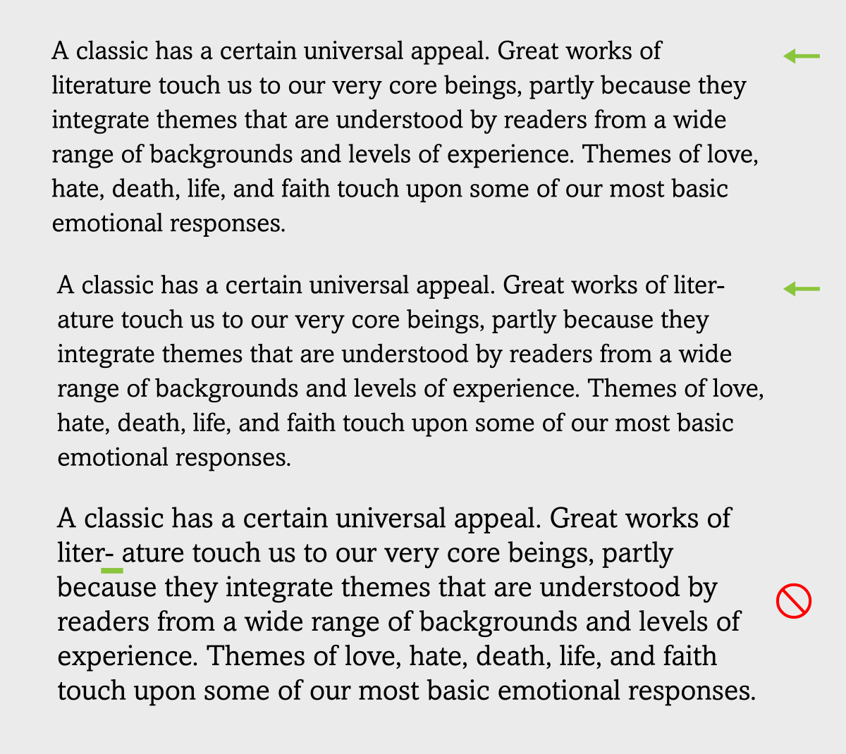
When a deep rag appears on your screen when inserting text, do not try to fix it with a manual hyphen (upper two), or it will most likely appear mid-line for some viewers (lower).
Poor Justification
Many people find justified text attractive, and/or desirable when used for a specific layout or design. But the problem on the web as well as some other digital media is that you cannot control the line endings, and therefore have no idea how the justified text will look for each viewer. If the column width is too narrow and the words are too long, justification can frequently result in text with very large or very tight word or letter spaces, all of which are extremely unattractive, and can render the text much less readable.
My advice in general for the web as well as for other digital media that cannot be specifically controlled is to avoid justification entirely and go with flush left or other non-justified settings. This will ensure your text is easy to read for all readers on any device, with appropriate word and letter spacing. (Read more about this topic here.)
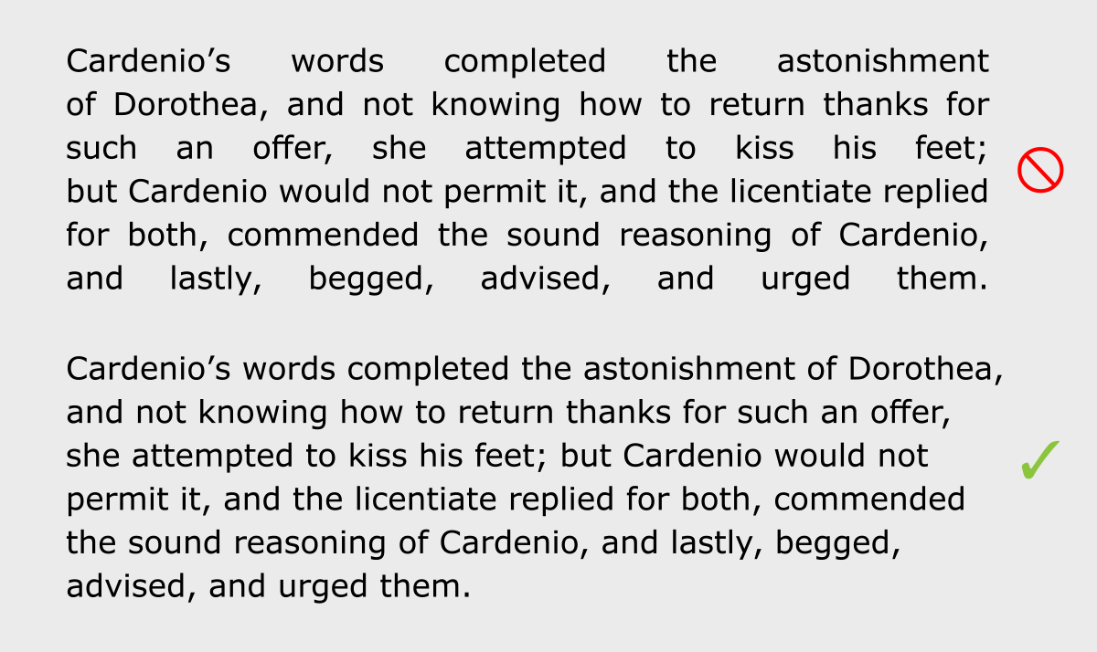
Poor justification (upper) can lead to very open spaces, which are a typographic eyesore and reduce readability. Flush left text (lower) allows for a more natural look, which is also easier to read.
This article was last modified on January 27, 2023
This article was first published on July 19, 2017
Commenting is easier and faster when you're logged in!

Recommended for you
TypeTalk: (Re)Introducing Tobias Frere-Jones and his latest typeface, Mallory
He’s back! Two years after launching his new foundry Frere-Jones Type, Tobias Fr...

A Garden of Delightful Type
Here at CreativePro, we’ve seen a lot of type. Digital type, printed type, wood...

Before&After: Logo Makeover
To create a new logo for a high-end custom-framing business, we turn abstract at...