TypeTalk: Justification on the Web

TypeTalk is a regular blog on typography. Post your questions and comments by clicking on the Comments icon above.
Q. Any tips for setting good-looking justified type on the Web?
A. The phrase “good-looking justified type” is often a contradiction of terms on the Web because we have much less control over how type looks online compared to print.
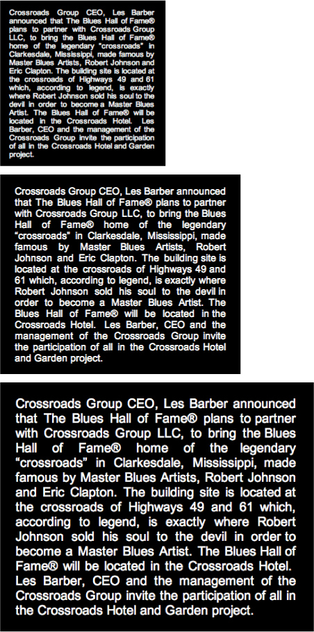
In print, you not only determine the size and style of your type, but you can control line breaks and hyphenation settings. In standard HTML text on the Web, line breaks may be affected by each individual viewer’s operating system, browser settings, and even monitor. Another contributing factor is that current browsers don’t support hyphenation. Because of this, line breaks and the resulting column rag and alignment are at best unpredictable.
Figure 1. The real-life example of justified text on the left has unsightly holes that reduce readability. On the right is what it would like if it were not justified—a big improvement!

Figure 2. This is an actual example of how a justified block of text on the Web behaves when the Zoom feature is used to enlarge or reduce it. As you can see, the line breaks vary in each example, but all show the rivers and holes that are a common outcome of justifying text when you have no control over the line breaks.

Figure 3. Uneven and unattractive justified text with lots of visual holes and rivers (left example) can be greatly improved by setting it flush left/rag right (right example).

That’s why I don’t recommend justifying type on the Web. In a similar vein, don’t make manual line breaks or word breaks to adjust a rag, or some viewers will wind up with very short lines.
Love type? Want to know more? Ilene Strizver conducts her acclaimed Gourmet Typography workshops internationally. For more information on attending one or bringing it to your company, organization, or school, go to her site, call The Type Studio at 203-227-5929, or email Ilene at in**@***********io.com. Sign up for her e-newsletter at www.thetypestudio.com.
This article was last modified on May 15, 2023
This article was first published on May 12, 2011
Commenting is easier and faster when you're logged in!
Recommended for you

TypeTalk: The Five Best (and most underused) Features of OpenType Fonts
OpenType fonts have been the font format of choice for the last decade or so, si...

New Handwriting Font Release
Press Release Monotype Imaging Holdings Inc. (Nasdaq: TYPE), a leading global pr...
The Ins and Outs of Tracking
The term ‘tracking’ is relatively new, being a product of the digital age, and r...


