

Roberto de Vicq
Roberto de Vicq is an award-winning designer who is known for his stylish, sophisticated use of typography. It is not an overstatement to say his work is always exquisite and appropriate, sometimes in surprising, unexpected ways. His work, which includes that for restaurants, publications, logos, as well as hand lettering, is always a visual surprise. That is because his design studio, Devicq Design, specializes in solving design problems with strategy, elegance and wit, with the focus on the type.
Roberto de Vicq de Cumptich was born in Rio de Janeiro, Brazil, and moved to New York to pursue his MFA at Pratt Institute. He began working for Condé Nast Magazines, after which he became Art Director for Random House and later, Creative Director for HarperCollins. In 2016 he moved his studio to San Francisco, where he develops an array of projects from books, magazines, and typeface design, to publications, restaurant design, branding, and web site creation.
This stellar designer has received awards from the AIGA, Art Directors Club, Communication Arts, Eye, Graphis, How, Print, Type Directors Club, and Literary Market Place. He frequently speaks to groups such as the Society of Newspaper Designers; the Association of American Publishers; University of College Designers Association; TypeCon; Type Directors Club; Art Directors Club, and the Publishing courses at Stanford University, Columbia University, and New York University.
In 1999, de Vicq wrote Bembo’s Zoo for his daughter, which went on to become a finalist for the prestigious Newberry Award. In 2007 he also wrote Men of Letters and People of Substance, which was selected as one of the AIGA’s 50 Best Books of 2008. de Vicq says, “A writer searches for words to express and convey meaning; for us (designers), the shape of those words defines the conversation”.
Rather than interview this wildly talented designer at length, we will let his work speaks for itself – along with his own explanations and comments.
Roberto de Vicq de Cumptich
Tell the Wolves I’m Home
The whimsical silhouettes and typography on these paperback and hard cover versions create a sense of a fairy tale of intertwining lives in this moving story of love, grief, and renewal. Client: Random House, Winner of Type Directors Club award
The Incomplete History of Secret Organizations
This comprehensive and lavish book created in tandem with the Netflix television series A Series of Unfortunate Events makes exquisite use of type, lettering and image. We kept the steampunk sensibility consistent with the art direction and high quality production of the series. In addition to very elaborate and colorful typography, we found, created and incorporated much of the Victorian engravings. Client: Melcher Media/ Hachette
Snow White
This book displays a new treatment of The Brothers Grimm Snow White fairy tale with wild illustrations by Camille Rose Gracia, and a revival black letter type treatment. Client: Harper Design


Pelikan
After the success of Snow White, we were commissioned to design Charles Perrault’s Cinderella, once again featuring the talented Camille Rose Garcia. At that time, he was developing a typeface based on the 1923’s Pelikan fountain pen logo while attending the Type@Copper program. What attracted me particularly was the unusual lower case ‘a’ that folds into itself like a marshmallow. Pelikan is a display typeface with hint of blackletter, swash caps, and heavy calligraphic influence, so I combined the two assignments and amazingly enough the typography mirrors the illustrator’s style (especially the hair styles!).” Client: Harper Design![]()
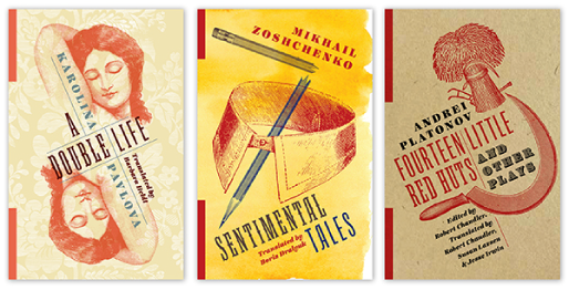
Russian Library
Columbia University Press publishes English translations of Russian literature, concentrating on works previously unavailable in English and also new translations. The Russian Library was written in disparate forms, times and moods, so the brand had to be wide enough to encompass all these differences, and yet have a specific Slavic look. The cover design treatment borrows from a constructivist aesthetic framework and typefaces reminiscent of old playbills to create mini posters conveying the narrative of each book. Client: Columbia University Press. Art Director: Julia Kushnirsky

Osteria
Osteria is a big, comprehensive collection of basic recipes from local restaurants all over Italy. ‘Osteria’ are almost always family owned, and the menus tend to be short, with emphasis on regional specialties of pasta, grilled meat or fish, often served at shared tables. These simple establishments tend to be inexpensive, so we designed the book with a plain kraft paper jacket, and hand drawn type and ornaments. Client: Rizzoli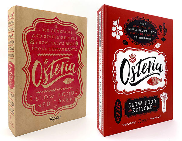

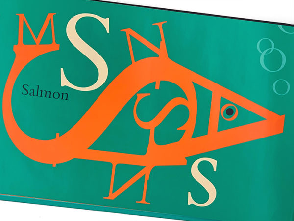
Grato
Grato is an Italian family restaurant in West Palm Beach, Florida, created by Chef Clay Conley. It also means gratitude in Italian. For Chef Conley, appreciation for Italian food is proportional to the quality and freshness of its ingredients. Based on this idea of using a fresh produce to tell the story of character and tradition, we conflated two sunny locations, Florida and Italy, with citrus fruit, to represent both narratives. The logo, in a triangle shape, is a reference to early 20th century travel stamps from idyllic destinations. (Postcard and mural shown above.) Client: Clay Conley, Winner of Type Directors Club award
Ligature Poster
This poster was intended to promote Adobe InDesign software, and the glyphs palette feature. The marketing tag line was ‘design passion’. We designed a poster using the names of famous women characters in literature, each containing a ligature (a special glyph that replaces and connects two or more letters). The idea was that a ligature is a kiss between two letters, and should be utilized whenever a typeface offers it. Before InDesign was available, you had to memorize the key combination for each ligature, but InDesign‘s glyph panel makes it simple to find, if the specific typeface has it. Client: Adobe Systems
Map of the Starrs
Map of the Starrs is a little pamphlet showcasing Starr restaurants in the area around Philadelphia. The pamphlet was included in Christmas baskets, along with samples of each restaurant’s specialty and delivered to concierges of the best-known hotels in the area. Client: Starr Restaurants, Creative Director: Randi Sirkin, Winner of Type Directors Club award

Type Over Time
Both the Type Over Time logo and postcard were designed to promote a conference on the intersection of type and culture, organized by the Type Directors Club. On the lapel pin is the TDC logo that is given to every member when they join the organization. Client: Type Directors Club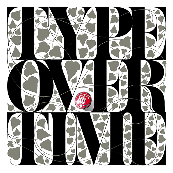
Bembo’s Zoo
Almost 20 years ago, I designed Bembo’s Zoo, an alphabet book for my daughter Viva. It was illustrated with a menagerie, using only the letters of the animal’s name using the classic typeface Bembo. The initial letter for each animal’s name is the same both in English and Portuguese, so I could teach my daughter both languages.

Men of Letters
Men of Letters is a book of portraits of famous writers using again only the letters of the writer’s name, rendered in a typeface that relates to the writer’s time period or his or her sensibility. For example, for Truman Capote (on the left, with James Joyce to its right), I used Modern, since it was the typeface used on the original jacket for In Cold Blood. Client: David Godine Winner: Communication Arts, AIGA 50 best books, Type Directors Club award
This article was last modified on June 29, 2021
This article was first published on March 11, 2019
Commenting is easier and faster when you're logged in!

Recommended for you

FontoberFest: Free Serif Fonts
Each Friday this month, we’ll feature a new set of free fonts for your use, abus...

Stately, the map-making font
My country ’tis a font, Sweet land of ligatures, of thee I sing No, I haven...
Breaking The Rules of Typography
By purposefully and intelligently breaking the rules of good typography, you can...