

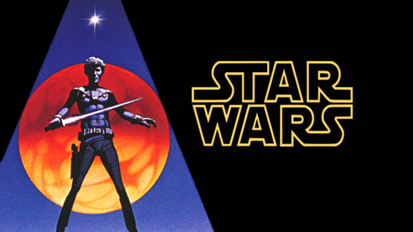
A long time ago, in a galaxy far far away…a logo was born. Well, it wasn’t just born, it evolved through many versions at the hands of several designers, changing fonts, colors, and kerning until it became one of the most iconic logos of all time. I am of course talking about the Star Wars logo.

Nearly everyone is familiar with the big blocky letters and the long ligatures of the Star Wars logo. But not many folks know that it’s a hand-drawn work based on Helvetica Black, a font that was chosen because George Lucas wanted a “fascist” look and the designer thought there was nothing more fascist than Helvetica!
And few folks realize that the logo started out looking quite different, with a modified version of Futura Display.

You can read about these and many other fascinating tidbits in the evolution of of the Star Wars logo in an amazingly thorough and well-illustrated blog post at Tenth Letter of the Alphabet.
May the Fonts Be With You
Originally published May 31, 2013
This article was last modified on April 27, 2021
This article was first published on December 21, 2015
Commenting is easier and faster when you're logged in!

Recommended for you

How to Automate Addresses with Data Merge in InDesign
See how to add addresses to any number of envelopes quickly and easily.

Hunting the Elusive Plus Symbol (Local Formatting)
Chad wrote us about an InCopy problem that's not limited to InCopy; I've been as...

QuarkXPress 6 Tips: Working with Layers
This story is taken from “The QuarkXPress 6 Bible.” To buy this book...