
I Felt That
Telephones are a good example of built-in feedback. The distinct tones provided when different buttons are pressed are a cue to their identity, and the dial tone offers reassurance that this thing is actually on. A highly usable Web site includes many forms of interactive feedback with the user in mind. A click or down state assigned to buttons allows visitors to know that the button has indeed been clicked.
Button rollover states provide additional feedback and can pull double-duty to further inform the user of where the button will take them. Once a navigational button is clicked, it’s a good idea to have that button change to an off state that appears inactive or grayed-out. This serves many functions: It gives feedback to the user, letting them know that they clicked that particular button and are now in the selected area. And with a quick scan, they can see where they are in relation to the rest of the site, provided the rest of the navigation makes this obvious. If you are making a navigation system using hyperlinks (such as the types mentioned below), it’s good practice to remove the underline or gray-out the link they are presently on.
 The navigation provides no feedback that I’m actually in the Resources section of this site, though the Resources headline makes the location fairly obvious.

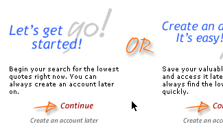
This site includes excellent navigation feedback. Glancing at the navigation, I see I’m in Products & Services.
You Are Here
Smart fire escape plans, mall directories, and well-conceived subway maps share one thing in common: a “You Are Here” mark. This helps you to quickly orient yourself in relation to your immediate surroundings, and gives you perspective on what’s possible from your current setting. Although browsing an unfamiliar Web site is rarely a life-or-death situation, a “You Are Here” mechanism can really boost a site’s navigation. I separate these methods into two types of applications: a “Browsing Aide” and a “Process Aide.”
The Process Aide significantly assists in filling out a multi-field online application or a consumer checkout process. I usually refer to this as “landmarking.” Amazon.com‘s current checkout process is a prime example of landmarking. It explains not only where you are, but what you’ve done and how much is left to do before you’re finished. I believe it is important to show a user how many steps are required, especially if you’re asking them to fill out several pages of information. This system is typically represented as some sort of graphic timeline or roadmap. The added ability to click on previous steps could be included, in case the user wishes to back up and change options or information.

Amazon.com’s checkout process is helped along by this “landmarking” graphic that indicates where you are in the scheme of things.
The Browsing Aide offers to the user the path to the page they arrived on with easy access to go back to any point along the path. This navigational aid is often referred to as “breadcrumbing” or “traceable paths.” Although there are different ways to employ this type of mechanism, the most common one is to have a simple horizontal path line that resembles a file directory path using basic titles of visited pages.
Something like this: “Home > About Us > Investor Relations” is an example of a Browsing Aide. Past pages become clickable, while the currently browsed page has no link and should appear in its selected state. And if a user jumps into a specific page in the site, a traceable path should show as if they arrived there by clicking on the appropriate links.

MySimon.com makes good uses of “breadcrumbing.” Check out the highly-clickable Track Search button as well.
A Balanced Approach
Providing users the controls they’re accustomed to and including additional navigational aides whenever possible should keep your sites from falling prey to poor usability. Granted, talk of usability brings out strong opinions in many who design for the Web. Some people contend that being immediately usable and aethetically pleasing are mutually exclusive, that one design simply can’t achieve both. To my way of thinking, great Web design is born when you succeed in the delicate task of balancing the two. It helps simply to use common sense and to keep the uninitiated user in mind.
This article was last modified on January 8, 2023
This article was first published on August 6, 2001
Commenting is easier and faster when you're logged in!

Recommended for you

How to Solve Typographic Widows and Orphans
Discussions of typographic widows and orphans normally start with an argument ab...

InDesign Template: Flexible Presentation
This template is based on the feature article on presentations by Mark Heaps in ...

Why Don’t Arrow Keys Work Next to Blank Fields?
Why are the text formatting fields sometimes blank and don't allow you to use th...