

The United States Postal Service’s financial woes are well-documented and its relevancy often questioned. To turn that negative image around, the USPS turned to New York’s GrandArmy creative agency for help in modernizing their image. The agency worked to bring packaging, signage, and the USPS retail store experience up-to-date.
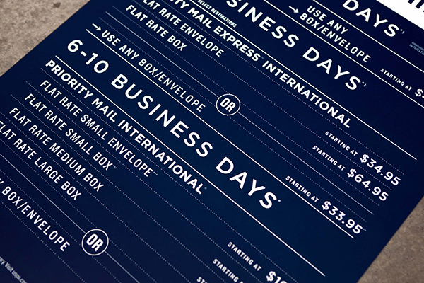
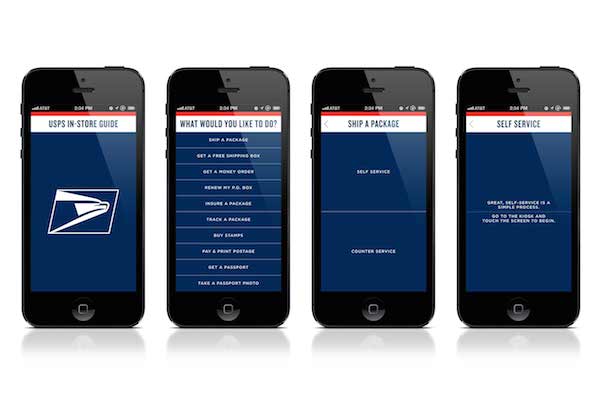
GrandArmy created a unified look to the in-store experience—from way-finding to kiosks to product and service signage. The combination of the Gothic and Knockout typefaces with the patriotic red, white, and blue color scheme creates a cohesive and sophisticated look. Borders of blue or red are used to distinguish between the different levels of mail services offered.

Shipping package design—which went through a rebrand just last year—has been further de-cluttered and takes clear advantage of all the whitespace a large packing box has to offer. The USPS mobile app underwent a similar face-lift, further unifying the look of the shopping experience, whether online or in person.
It remains to be seen if this visual overhaul will help keep this venerable institution relevant and modern. If snow, rain, and the gloom of night can’t “stay these couriers from the swift completion of their appointed rounds,” let’s hope the insatiable need for faster communication won’t either.

This article was last modified on January 28, 2021
This article was first published on August 20, 2014
Commenting is easier and faster when you're logged in!

Recommended for you
CreativePro Video: Text Distortion in Illustrator
In this week’s CreativePro video, Von Glitschka shows off his technique for gett...

Automatically Add Space Around Em Dashes and En Dashes
Learn how to use a GREP style in InDesign to automatically add space around em d...
callas pdfToolbox 4 Now Available
callas software, leading supplier of PDF technologies for print production and d...