
Still Life with Gelatin

Jason Horowitz is a freelance commercial photographer specializing in stock, still life and conceptual illustration. Initially specializing in black-and-white scenes of people, Horowitz has recently turned to color still life, in which the accumulation of everyday objects results in a rather surrealistic tableau. His images are available through Stone.
Horowitz earned a Bachelor of Arts/Photography at George Washington University in Washington, D.C. before receiving a Master of Fine Arts/Photography from Virginia Commonwealth University in Richmond, Virginia in 1988. He has taught photography at several colleges throughout the greater Washington, D.C area, including Georgetown University. His work has been on display in numerous galleries throughout the last two decades. Horowitz’s latest photos are currently being shown at the All Media Juried Show at the Arlington Arts Center in Arlington, Virginia (January 2000 to February 2000), where he won a third prize award. Creativepro.com caught up with Horowitz to discuss his unique, and sometimes unsettling, approach to photographing everyday life.
creativepro.com: How long have you been a professional photographer?
Jason Horowitz: On and off for about 20 years.
creativepro.com: How did you get started?
JH: I had originally gone to school to study literature, and I edited newspapers and magazines. One summer home from school I decided to take a photography class so that I could take pictures if I went to do an interview or if I was writing an article. As soon as I picked up a camera I knew I was home. I was much happier and much better at doing that than I was at writing. So from that moment on I took pictures.
creativepro.com: And stopped writing?
JH: I sort of moved away from writing as a career. I dropped out of school and took some photo classes and just took pictures for a while. And when I went back to school I went back for Fine Art instead of for Literature.
creativepro.com: You’re evidently happy with that choice.
JH: Oh, yeah. Very happy. I think I’m one of those people who lucked into what they should be doing. I think that some people wrestle around with it and never find the thing they were meant to do. And I feel like I have, so I think that’s a very lucky circumstance. For me making pictures is what’s important. Sometimes I do it in a graphics program-I do a lot more digitally now than I used to-I’ve made sculptures…I discovered that it’s making something visual that’s really at the core of everything I’m best at doing.
creativepro.com: A few of your images at Stone are noted as “digital enhancements”; does this mean that you haven’t digitally retouched any of the others?
JH: Yes. All the pictures of the stuff floating around are straight photographs, although I have done some digital enhancements for Stone and actually now my artwork is starting to move into what may turn out to be an all-digital phase.
creativepro.com: So are you using digital cameras?
JH: Well, I haven’t started moving into digital cameras yet. I have a Sony Mavica that I’ve used for fun, but I think my son likes it more than I do. I have a 7-year-old and when I would give him my point-and-shoot with film in it, every ten minutes he would say, “Dad, I’m out of film!” Because the Mavica uses floppy disks he can take hundreds of pictures without it costing anything. He took to it right away.
creativepro.com: As a traditional photographer what role do you see digital imagery playing in your future work?
JH: As time goes by I would like to be more and more digital.
creativepro.com: Is it the technology’s limitations that are holding you back now?
JH: I think it’s a combination of technology and cost. I shoot a lot of my artwork in medium format and I don’t feel there’s a camera-that I can afford as a an artist rather than a commercial photographer-that can do what my Hasselblads can do yet. The ones that can are around $25,000 to $30,000 and they’re scanning backs, so they’re very limited. I light with strobe and I’m very reluctant to reorganize the entire way I do things in order to work with a scanning back. I’d like to see it get to the point where you could make about a 50-70MB file with strobe so that I would be able to duplicate my work with film and my medium-format camera.

creativepro.com: There seem to be two distinct styles among the work you have online, the black-and-white “people in motion” and the rather unique “gelatin” series. What periods of your career do each of these represent?
JH: The black-and-whites were done about 10 years ago. I finished most of those about 92-93. I started the color pieces about 94 or 95. The photographs of the food are my current work.
creativepro.com: Let’s talk about the TV dinners in gelatin. Some reviewers have found them dramatically profound: is that your intention or are you just being playful?

JH: I think it’s a little bit of both. Things that are profound you get to by being playful. I think that artwork that sets out with the intention of being profound or having something really big to say often ends up being really kind of pompous and forced. I find that my most interesting ideas and the things that really get to where I want to go actually start out by my just playing around with stuff.
creativepro.com: What reaction do you hope to evoke with the food in gelatin?
JH: I think I’m interested in evoking a tension between attraction and repulsion. I want them to be big colorful photographs-like commercial photographs-like something with the color and depth and surface that you find in a really slick commercial photograph. It makes them really beautiful, but once you get into the subject they’re a little more disturbing.
creativepro.com: I have to admit, the TV dinners in gelatin made me think of that plastic vomit from the joke shop. Certainly that kind of reaction hasn’t escaped you!
JH: Some people really think they’re hilarious and others think they’re really gross. An interesting thing happened to me recently when I showed them in Germany. The reaction of the Germans was very, very different than anything I had really experienced before. They were more interested in talking the politics of food with me. A lot of people were coming up to me and saying things like. “Oh, I agree with you so much. American popular food is terrible. The American imperialism-the McDonald’s on every corner-it’s all terrible.” I think that’s kind of a subtext of the work, but in some way that really set them off.
creativepro.com: What’s your inspiration for this kind of work?
JH: I had been interested in the idea of doing some still-life work. I’d been playing around with stuff in the studio and I’d been very dissatisfied with just putting some stuff on a set and photographing it. For years before that everything I did was street photography. It had an artistic bent but it was based on a documentary style. And when I first started working in the studio it felt really weird to me to just set things up and shoot-it felt alien. I got to thinking about doing some abstract photographs. The actual idea came when I had the flu in 1994 and my wife made me Jello with stuff floating in it-red Jello with pineapple in it. I had a really high fever and I went down to get something from the refrigerator. When I picked up the Jello I could see through it to the light in the refrigerator. And at that moment-partly because of the fever maybe-it looked really beautiful to me!
creativepro.com: So it was born of a fever then?
JH: Yeah, it was a moment of inspiration!
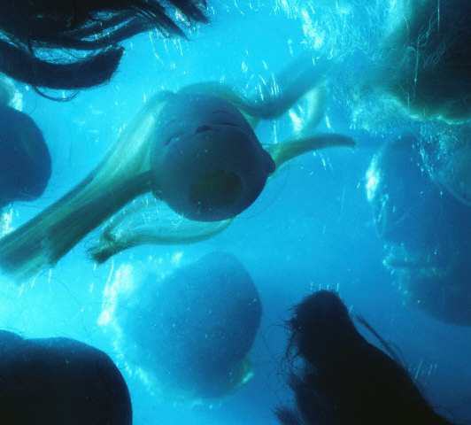
creativepro.com: In addition to food you’ve also used dolls and light bulbs, which are more common metaphors; but do the chicken and pot roast have a metaphorical value?
JH: A little bit. It gets back to the idea of food itself. I think of it more as the overall content than the specific food that’s important. There’s something really “Fantastic Voyage” about it. Some people see them as sort of “space” photographs, a macrocosm, while others see them as a microcosm, as if you’re seeing it through a microscope. One of the things I tried to achieve with the work is that each one has its own internal space and internal logic. The space in the photograph is a different space than we’re in. I have three or four fish tanks and I’ve always been fascinated by underwater stuff and scientific photographs, things caught in amber and that sort of thing.

creativepro.com: Do you want to talk about the technical aspects of this technique or is that a trade secret?
JH: It’s not really a trade secret. But even though on the one hand it’s interesting in an anecdotal way, it’s not really germane to the work. Basically, I suspend the objects in Knox gelatin in a small fish tank and then let the gelatin set. Then the next day I photograph it in the studio and I treat it as I would any other still-life subject.
creativepro.com: So do you actually place things specifically or do you let them fall randomly?
JH: I let them fall randomly, then I move them around a little bit. No matter how much I arrange them, I’ve learned, when I look through the camera the next day I make different images than I thought I would when I set the thing up. So I’ve learned not to fuss around with them too much when I make them. There are a lot of happy accidents that happen and I really like that serendipity. When I see the results through the camera it satisfies my other urge to take documentary pictures, in a strange way, because I spend a lot of time exploring the subject and just responding to what I see. I like to explore the tension between photographic detail and the abstract qualities of the work. I’m really interested in the relationship between photography and other art media.
creativepro.com: Many photographers are marrying their desire for photography and abstract art by using digital enhancement, but you’ve chosen to do it all photographically.
JH: I think that straight photographs allow for a cleaner examination of that relationship than manipulation will let you do. It’s become relatively important to me that they are straight photographs. I think that’s become an important part of the work that wasn’t there when I started. You know, people have asked me, “Why don’t you just model 3D spaces and create fantasy worlds?” I think 3D models fall short of the intense realism and feeling of real space that my current work has. And I think they would be much more boring to make and to look at. They wouldn’t have the spontaneity and humor that these have. I’d have to sit and labor over every texture and every detail. The reason my work looks spontaneous is because I respond spontaneously to the subject.
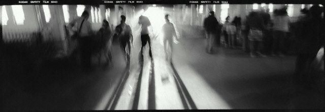
creativepro.com: Let’s move on to the black-and-white images, obviously a stark contrast to the work you’re doing now. You went from no color to the vibrant colors that define your work today. What were you trying to say with the black-and- white imagery?
JH: I think of the black and whites as sort of an evolution. There are some that are very realistic, like the ones done at the beach. And then there are some that are more jittery that are done in nightclubs and aquariums and dark kinds of spaces. I did the beach shots first and then I did the darker ones. I see my work-it’s a perfect metaphor when you get to the food at the end of the line-as a journey from outer to inner. I also think a lot of the mood and feeling of the earlier work is impressionistic and the later, darker spaces is more expressionistic.
creativepro.com: Why are all of your subjects are faceless?
JH: I think it’s sort of universality through anonymity. It could be anyone-they’re archetypal people in archetypal relationships. You know, they’re not specific people.
creativepro.com: The elongated format suggests to me the view through a mail slot, as though you’re spying on everyday life. Is this your intention?
JH: A little bit of that and I also wanted to present an image that you have to scan across. The original prints are 20 by 60 in size. They almost develop a narrative content: there’s something going on here, and then there’s something going on in the middle, and then something going on at the end. There’s a little bit of an element of time. But definitely that feeling of looking in from outside is something that I’ve always been interested in.
creativepro.com: Are your subjects aware that they’re being photographed or these completely candid?
JH: Candid, for the most part. There may have been one or two who knew, but these were mostly candid shots of people I didn’t know.
creativepro.com: Do you still do this kind of work or is that now just a historical phase of your career?
JH: I haven’t been doing any street photography since I’ve started the color, so I guess it’s kind of historical. But lately I’ve been eyeing the camera I used for those and thinking I might actually shoot some color with it. So I think the ideas are still floating around, but they’ve been on the shelf while I’ve been in the studio.
creativepro.com: Do you find it hard to pursue dramatically different styles simultaneously?
JH: I think so. I think the fact that I never have is evidence that I would find it hard. When I’m working I get so immersed in one way of thinking and seeing.
creativepro.com: You’ve gone from B&W stills of people in motion to colorful and exotic still life in gelatin: what do you think might be the next phase of your career?
JH: Well I’ve applied for two grants to start the next phase. I think I’m going to digitize some of the spaces I’ve worked with-it might be some of the same subject matter to start with. I’m starting to play with the idea of animating them. That’s totally the wrong word-I’ve been interested recently in adding the element of time to the color spaces. I have ideas for clockwork “animations” where things move really, really slowly. Objects might sort of pulsate, move around a little bit, maybe vibrate. I think of colors very subtly modulating, like an incredibly slow lava light, in a way. Maybe more the way a minute hand on a clock moves, rather than a second hand, so you almost couldn’t see them move. I can envision them on the Internet, but the way I really see them is in a darkened space on glowing flat panel displays. But I don’t feel like I’m done shooting food yet, so that’ll also be going on for a while longer.

creativepro.com: What other projects are you involved in besides what we see online?
JH: Well, the other stuff I’m involved with is trying to earn a living. I think of myself primarily as a fine artist. Obviously I work for Stone and I also do some assignment work. I’ve occasionally used some of the techniques I use for art for creating work for clients. For instance, the image on the Stone Web site of little TVs floating in gelatin was done for a local television station for the cover of their brochure. Over the years I’ve done a weird assortment of stuff. I started way back as an architectural photographer. But primarily now I define myself as an artist and hopefully more and more I’ll earn my living that way.
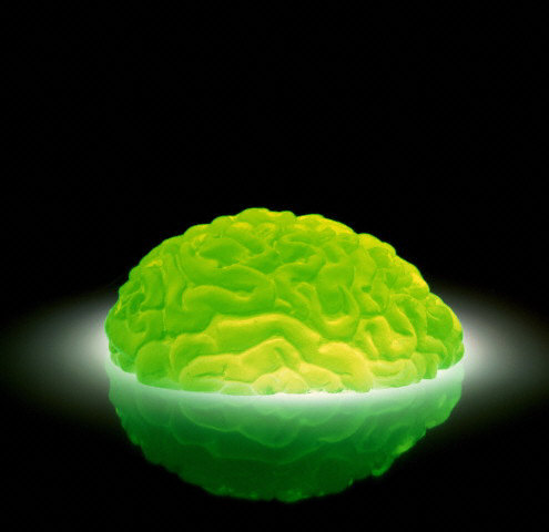
Images referenced in this story area available from Stone: EB5918-001 (soldiers); EB5922-012 (red light bulbs); EB8948-003 (green brain); EC2828-001 (green light bulb); EC4656-001 (black and white); EC4710-001 (chicken and fries); EC4711-001 (doll heads); EC4542-001 (tvs); and EC4655-001 (bw people).
Jason Horowitz can be reached at Mirror Ball Studio (https://www.mirrorballstudio.com), 703.243.5335 (voice), 703.243.5888 (fax), or ja***@**************io.com. His fine art dealer, Jayne H. Baum, can be reached at Jayne Baum Contemporary Photography and Fine Art, 26 Grove Street, New York, NY 10014, 212.255.9286 (voice), 212.229.8998 (fax), or JH********@*ol.com.
This article was last modified on January 2, 2023
This article was first published on February 18, 2000
Commenting is easier and faster when you're logged in!

Recommended for you

CreativePro Tip of the Week: Creating Dotted Lines in Photoshop
This CreativePro Tip of the Week on creating dotted lines in Photoshop was sent...
Creating an Out of Bounds Effect in Photoshop
Images where animals or people bust out of their background are very popular, an...

How to Make a Manga Character in Photoshop
The recent film Alita: Battle Angel stars Rosa Salazar as a cyborg, a human brai...