
Stacking Effects in Illustrator
Learn how ignoring a warning can give you the power to create unique effects in Illustrator artwork


This article appears in Issue 34 of CreativePro Magazine.
In many cases, Illustrator’s crazy alerts can be clicked away unread—ignored forever or accepted as a learning inspiration. We’re going to do the latter.
So, you’re an InDesign user. You are working on your design and happily applying effect after effect from the program’s menus. Then Illustrator interrupts you with the dialog box you see in Figure 1… and you’re out of the flow. Well, thank you very much, Illustrator.
First of all: What is an instance of an effect? That sounds pretty technical!

Figure 1. This alert from Illustrator pops up when you make a selection from the Effects menu that you have already applied.
This alert warns you that you have already applied that effect at least once and is saying to you: “Are you sure you want to apply this effect a second time instead of editing the one you already have?” Tip: You can edit an effect by clicking it in the Appearance panel.
For some effects it makes some sense to click Cancel to abort what you are doing. For instance, it would probably not make a lot of sense to reapply a 3D effect. Rendering might take a while and might even crash Illustrator.
On the other hand, applying other effects more than once can give you clean results and beautiful, efficient workflows that replace tedious processes of building uneditable artwork by duplicating a lot of paths or applying destructive operations.
Let’s look at some examples.
Making a Grid (Multiple Transform Effects)
Let’s start with something simple. This is a true classic. Illustrator doesn’t have functionality for printing a small design (e.g., a business card or a sticker) multiple times on a single page, so you must manually copy the design in your document.
Making actual copies has two disadvantages: First, you’ll need to make any late edits separately to all the copies of the design, and secondly, should you need to set up your document for another card or sticker, then you will need to go through this routine again.
It’s better to use two instances of the Transform effect. The first will create a row of objects. The second will create copies of that row to make a grid.
Group (Object > Group) the elements that form your design.
Choose Effect > Distort & Transform > Transform. Create a row by specifying a number of Copies. Then set a Horizontal distance up to 100 px/1.3889 in. with the Move slider. If you want a higher value, you can enter it in the field, or just press the Up Arrow key (Figure 2).

Figure 2. Create a row of your image by generating virtual copies.
Apply another Transform effect. You’ll see the alert. Click Apply New Effect. This time, use the Move slider to set the Vertical distance and specify 0 for the Horizontal value (Figure 3).
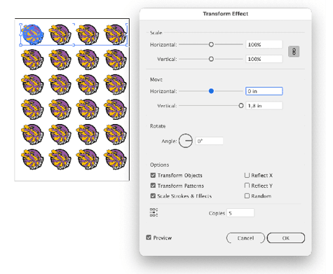
Figure 3. Make a grid by moving the rows from step 2 while making five copies.
Tip: The two effects can also be applied in reverse order: first vertical (to create a column), then horizontal.
To edit the design, you can enter Isolation mode by double-clicking the original grouped vectors. To edit the grid spacing, open the respective Transform effect by clicking it in the Appearance panel (Figure 4).
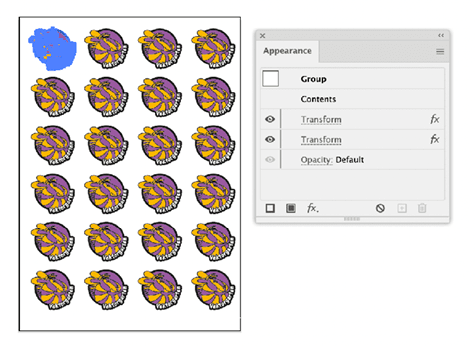
Figure 4. The Appearance panel lists the two transform effects that have been applied to the group. You can edit the transform to nondestructively adjust the position of the copies of the artwork in your document.
Rotating in a Blend with Multiple Transform Effects
Let’s look at another example, this time with multiple transform effects in place. In this case you will need to apply a larger value than the effect allows. You’ll also use blends for lettering and graphic visual effects.
Create an object or a group of objects, perhaps with gradients applied (Figure 5). Then duplicate that object or group and draw a freeform line. It can be any shape as long as it’s one open path.
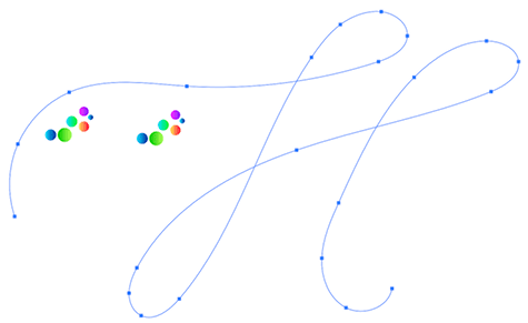
Figure 5. The base objects: two groups and an open, unfilled, and unstroked path
Assign a fill and stroke of None to that path, and then select both the objects or groups and that line. Press Command+Option+B/Ctrl+Alt+B to create a blend.
Double-click the Blend tool in the Tools panel to open the Blend Options dialog box. For Spacing, select Specified Steps and set a high number so you will see one visible and unbroken line (Figure 6).
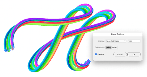
Figure 6. Enter the number of specified steps in the Blend Options dialog box.
Now comes the fun. Open the Layers panel, and then go into the Blend layer. Target one of the two objects inside by clicking the target symbol (the circle), as in Figure 7.
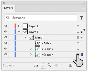
Figure 7. Target a layer in the Layers panel to apply appearances to an element.
Choose Effect > Distort & Transform > Transform to apply the Transform effect. Enter 360° for the rotation (Figure 8).
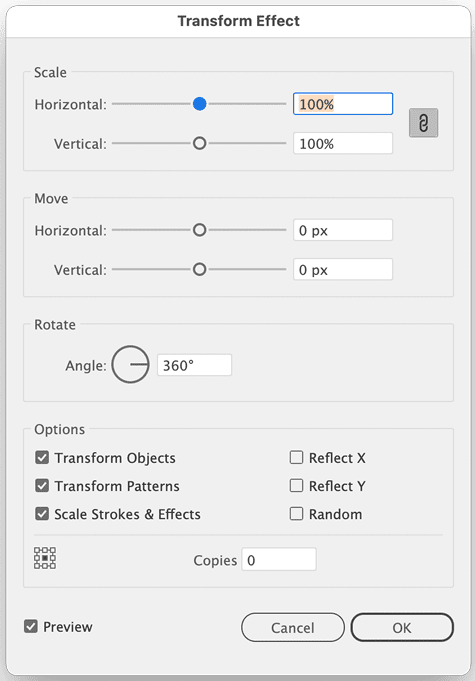
Figure 8. This Transform effect applies only rotations. When effects are used in a blend, then Illustrator blends the effects settings.
Duplicate the effect in the Appearance panel by dragging it onto the Duplicate Selected Item button as needed (Figure 9).
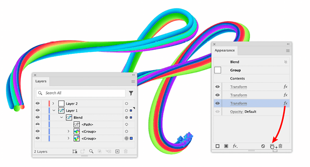
Figure 9. Duplicating an effect. It’s important to keep just that one group targeted.
So far, I have come across only one situation in which rotating an object more than 360° would be useful: in animation, where that kind of rotation makes a lot more sense. (If you have come across other situations where this might come in handy, I am curious to know.)
When using blends this way—as a live object—it is easy to forget that Illustrator will, in fact, create as many objects as if you duplicated the original group of vectors. You will not see them in your work file, but they will be in the PDF or in any other vector file format you save your work in. So this method will likely only be suitable when your final output will get simplified to a raster-based file. (We will touch this subject again.)
Generating Sparkles with Multiple Roughen Effects
When you need to create precise sparkles and place them with precision, then effects are not for you. But if you need to generate a couple dozen sparkling things repeatedly, then effects come in handy. You can create sparkles from dotted strokes: First, you turn the dots into circles, and then you make them into stars.
To create a sparkler, start with a circle and apply a fat stroke to it. To make that stroke a dotted line, turn on Dashed Line in the Stroke panel, set Dash to 0, and make Gap a much higher value than the stroke width. Turn on Round Caps (Figure 10). You could also apply a gradient and the blend mode Hard Light to it and apply a second stroke with slightly different settings.

Figure 10. Settings for one of the dotted strokes in the Stroke panel
In the Appearance panel, click the Path entry at the top and choose Effect > Distort & Transform > Roughen. The Roughen effect now makes the initial path very uneven, so that your dots no longer form a circle (Figure 11).
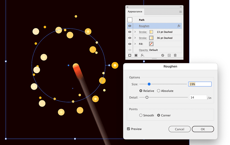
Figure 11. Scatter the dots by applying Roughen. Make sure that the Roughen effect is not inside a stroke, but on top of the two strokes in the Appearance panel.
Now that the dots are scattered around the place, you need to outline the strokes: Choose Effect > Path > Outline Stroke. The Outline stroke effect doesn’t cause any visible change (Figure 12). Here, you are able to use it as an effect to trick Illustrator into treating the dots like they were outlined. And if you like, you can still change the stroke width. Note: It’s important that the effect is below the two strokes in the Appearance panel.
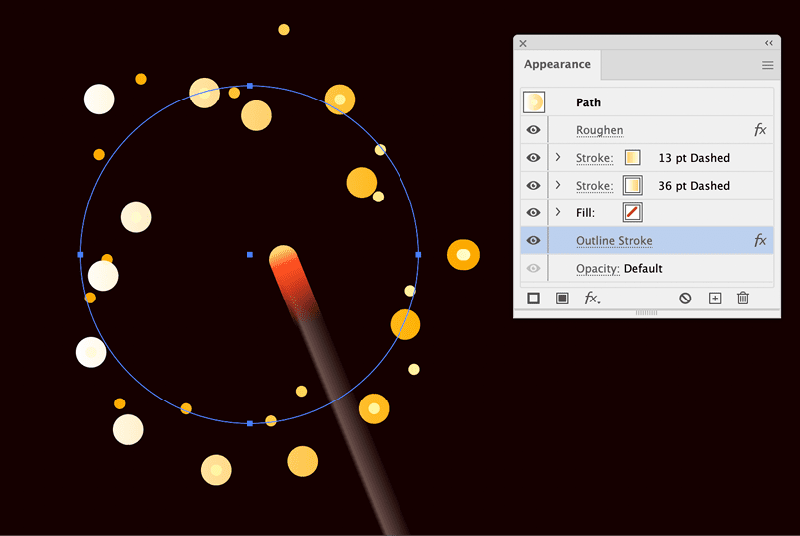
Figure 12. The Outline Stroke effect doesn’t cause any visible change, but it enables you to apply another effect.
Now it’s time to roughen the circles again: Choose Effect > Distort & Transform > Roughen. This will generate the alert. Click Apply New Effect. In the Roughen dialog box, click OK. Illustrator will put the effect in the wrong place, so drag it below the Outline Stroke effect. Open the options again, and use the Size and Detail settings to get the sparkle look you want (Figure 13).
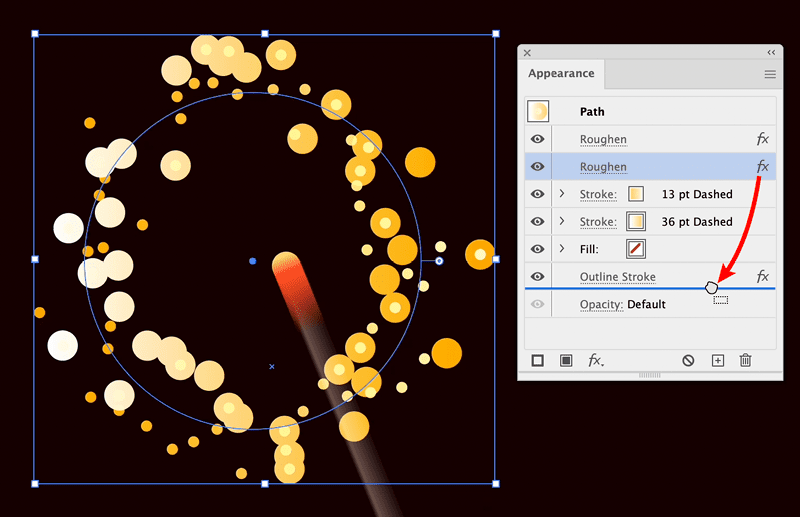
Figure 13. Moving the effect in the Appearance panel
The nice thing is that all of this is live. You can edit all the aspects of the sparkles: their size, their number, their distribution on the artboard as well as the size of their ridges by clicking on the respective effects in the Appearance panel (Figure 14).
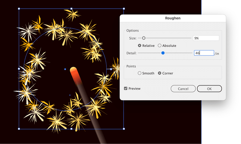
Figure 14. Setting up the sparkles. At this point, if you decide you need more sparkles, you can edit either the dashed stroke settings or the first Roughen effect.
Creating a Block Shadow with Multiple Transform Effects
There are several methods for creating block shadows in Illustrator. The ones most prominently shared in tutorials or as YouTube Shorts advise using either blends with hundreds of tiny steps or making hundreds of copies with the Transform effect (Figure 15). That method will work only if you do not need to export or save a vector file.
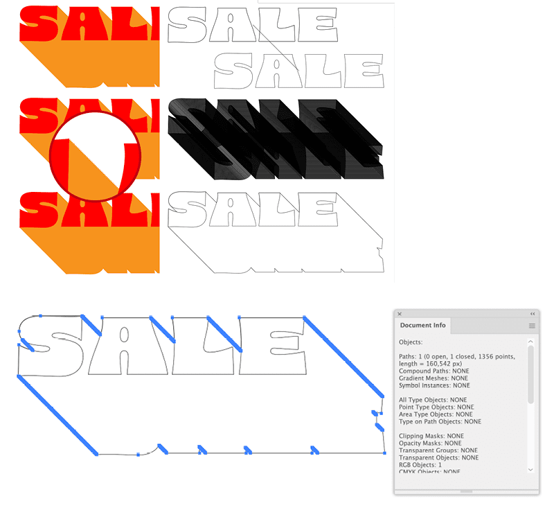
Figure 15. Block shadows generated with a blend look clean until you expand and unite them and then count the anchor points.
Much lesser known is a clean alternative way that uses a Classic 3D effect combined with several transform effects.
The process starts with choosing Effect > 3D & Materials > 3D (Classic) > Extrude & bevel (Classic). In the resulting dialog box, select the Position preset Isometric Top.
The Y axis rotation is not precise, though. Change it to 35.264° (Figure 16). (You’ll set the length of the extrusion later.)

Figure 16. Adjust the Y axis rotation for more precision.
The result is not the typical block shadow, because there is an isometric distortion applied to it. To get rid of that, use a Transform effect: Choose Effect > Distort & Transform > Transform, and set Horizontal Scale to 100% (turn off the Proportional option by clicking the chain icon), Vertical Scale to 173.4%, and Rotate Angle to 45° (Figure 17). Illustrator automatically applies the effect after the 3D effect in the Appearance panel.

Figure 17. Transforming the 3D object into place
After applying the Transform effect, you might want to edit the length of the block shadow. To do so, open the 3D effect and change the Extrude Depth setting.
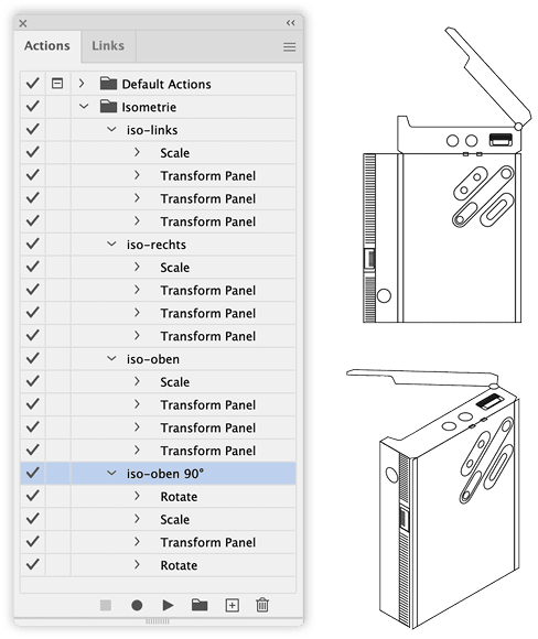
Figure 18. Turning flat drawings into isometric view by using actions
Now we have the typical block shadow direction, but only one Transform effect. The additional ones come into play when you want to have the shadow go a particular direction. To apply the Transform effects, open the Appearance panel, apply the Transform effect without changing anything in it, and click OK.
Move the Transform effect to the top (above the 3D effect), then open it again and enter a rotation that puts the shadow where you need it. Apply another Transform effect with the same value, but negative (Figure 19). That effect needs to be at the bottom (below the Transform effect that you used to undo the isometric distortion).
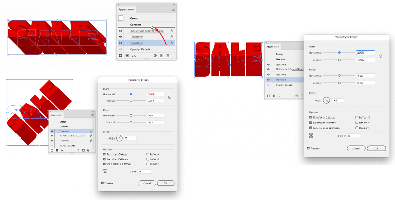
Figure 19. Rotate the object before the 3D effect gets applied, and then undo that rotation after the isometric un-transform.
To get a file that you can output on a printer or plotter, this construction needs to be expanded. Before doing that, open the 3D effect once again and set the Surface to No Shading. Choose Object > Expand Appearance, and then use the Shape Builder tool to unite the shapes and colorize them (Figure 20).

Figure 20. With the setting No Shading the object looks completely flat, but it contains all the paths necessary for coloring.
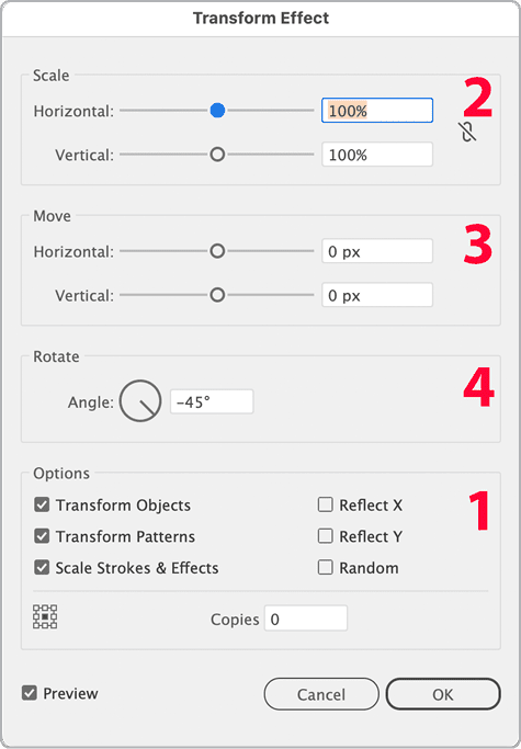
Figure 21. When it comes to the order of applying transformations, things couldn’t get more obscure.
Creating a Cut Contour with Multiple Pathfinder and Offset Path Effects
Cut contours or just underlying areas can also be created nondestructively. You first need to create an additional shape that has the same shape of the design, closes existing gaps, and then gets extended to the outside. The usual way to do this is to use Pathfinder functions. Although some users already consider Pathfinder buttons somewhat obscure, wait until you see Pathfinder effects. In this example you will get a lot of “another instance” alerts.
Like with the sticker sheet, you first need to group the elements of your design. If you used strokes in the design, then apply Effect > Path > Outline Stroke just to the affected strokes (Figure 22).
Figure 22. This effect tricks Illustrator into treating strokes as outlined.
Open the Appearance panel, and apply a new stroke to the group using the Add New Stroke button in the bottom left of the panel (Figure 23). Note: All the effects that you apply now need to be applied to just that stroke.
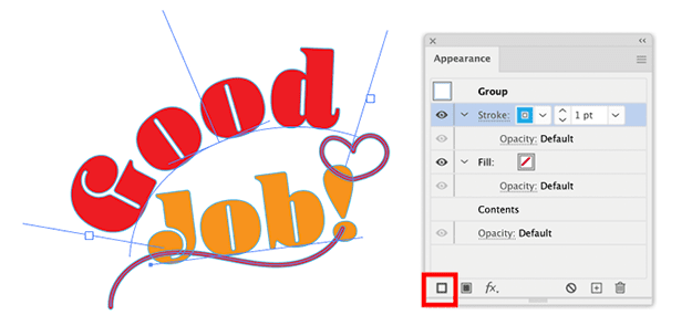
Figure 23. Apply a stroke to the group.
Choose Effect > Path > Offset Path. The amount needs to be large enough to create an area encompassing all the holes you want to close (Figure 24).
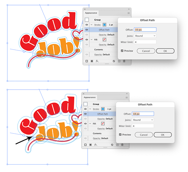
Figure 24. You need to set up a larger offset when you want to close more gaps. Don’t worry about that big hole on the inside. The Pathfinder effects will take care of that.
Choose Effect > Pathfinder > Add. Depending on the nature of your artwork there might still be holes (Figure 25).

Figure 25. Pathfinder Add unites all the overlapping shapes.
Apply Effect > Pathfinder > Divide. This leaves neighboring shapes alone, but it adds virtual shapes where formerly there were holes. Make sure to turn off the Divide And Outline Will Remove Unpainted Artwork option (Figure 26).

Figure 26. Be sure to turn off Divide and Outline Will Remove Unpainted Artwork.
Afterwards, unite all that by again choosing Effect > Pathfinder > Add. This gets rid of the big hole on the inside (Figure 27).
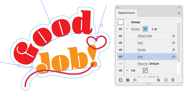
Figure 27. The third Pathfinder effect closes all the holes.
If necessary, reduce the offset by using another Offset Path effect (Figure 28).
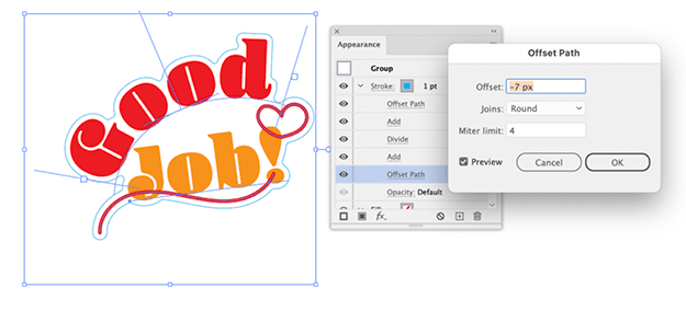
Figure 28. As the last step, reduce the offset to what you actually wanted. Using Round Joins will give you better results when plotting the artwork.
You can still move around elements in the design, and the cut contour will adapt. Note: Before you send this to the plotter, you need to expand the appearance.
xxxxxxxxxxxxxxxxxxSIDEBAR5
Extreme Effects
I hope the examples in this article inspire you to take advantage of the ability to apply multiple effects to objects. You might be amazed at what you discover you can create, such as an entire train engine from a single vector point (Figure 29). You can see the process in this YouTube video.
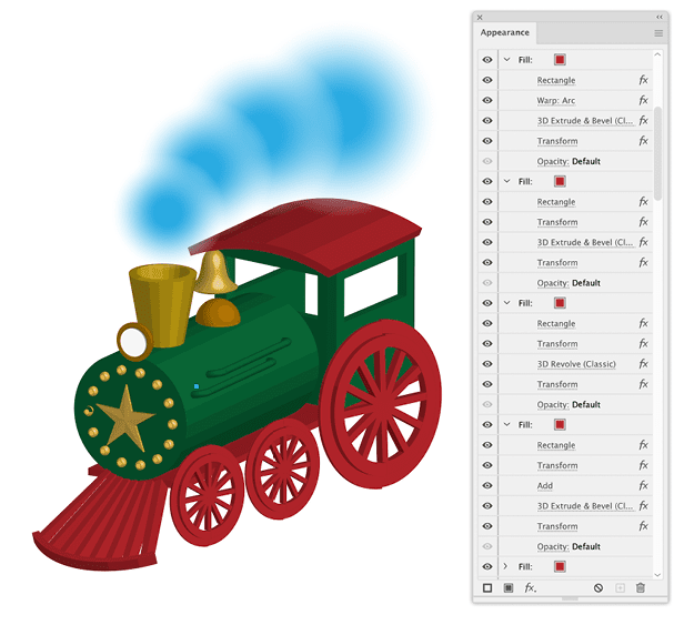
Figure 29. One anchor point with several fills and strokes that have 30 3D (Classic) effects applied. You can watch the process in a video.
Commenting is easier and faster when you're logged in!

Recommended for you

InDesign 102
David Blatner is your guide for what to to tackle after you’ve mastered the basi...

How to Make a Glow Effect in Illustrator
Learn how to make Illustrator artwork pop with the Inner Glow and Outer Glow eff...

Making Illustrative Effects in Photoshop
Combine illustration and photography to create an intriguing image. Drawing skil...