
Designing with Gradients
Techniques for enhancing your page designs with attractive color blends.

This article appears in Issue 145 of InDesign Magazine.
The human eye likes variations in color—to see one rich color smoothly transition into another. It reminds us of the evening sky, the ocean, or the way firelight dances across a wall. It’s easy enough to create this effect in almost any design program. But to get a truly sophisticated gradient, you’ll want a powerful tool with plenty of options. For many years, designers preferred creating gradients in Adobe Illustrator or Adobe Photoshop, but these days, gracefully blending colors has never been easier in InDesign. No need to jump from one program to another when you can do it all in one place, right?
Some Gradient Basics
The basics of creating a gradient in InDesign are very similar to other programs, and you’re probably familiar with them enough to generate a simple gradient without much work. But let’s quickly review some of these fundamentals before jumping off into some more advanced behaviors.
Using the Gradient Swatch tool
To start, you’ll need a document and a shape to work with. How about a big circle? We can make a pool ball, which is a nice beginner project. With the Gradient Swatch tool (G), just click inside the circle—voilà! A gradient from black to white appears.
Click and drag across the object to change the direction, angle, and the end points of that gradient (Figure 1). When you drag across the object, take care to note your starting and stopping place; the start of your line will be the white point of this gradient, and the end position will be the black point. If your gradient doesn’t look right, all you have to do is drag across the shape another time to recreate it. (Note: Make sure you’re using the Gradient Swatch tool and not the Gradient Feather tool! We’ll get into that later.)
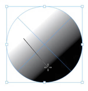
Figure 1. You can change the angle of a linear gradient by dragging with the Gradient Swatch tool.
Simulating a sphere
Now let’s make it interesting: Let’s make a pool ball gradient that really pops. Here’s a quick overview of the steps: We’ll start with a circle, apply a gradient, then edit that gradient (you can edit using the Gradient panel, or you can add the gradient to your Swatches panel and edit there). Lastly, we’ll add an Inner Shadow effect for some uncanny realism.
The first step is to double-click the Gradient Swatch tool or choose Window > Color > Gradient to open the Gradient panel, where you get more options (Figure 2).
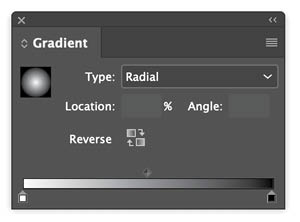
Figure 2. The Gradient panel lets you numerically change the angle of the gradient. You also can swap the two colors and alternate between radial and linear gradients. The two draggable endpoints are called stops. You can grab a stop and drag it around, changing that color’s start position, and add a new stop by clicking just beneath the gradient line. If you want to remove a stop, you can delete it by dragging it off the panel; it disappears like a bad memory.
Give your circle a radial gradient (Figure 3). It’ll start looking like a pool ball soon enough—but to really make this gradient look slick, we need more options. You can access them from the Swatches panel.
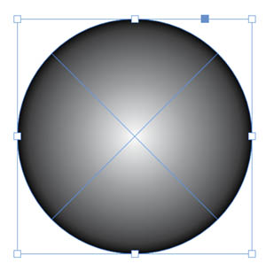
Figure 3. Circle filled with a radial gradient
In the Swatches panel menu, choose New Gradient Swatch . Tip: You can also create a new gradient swatch very quickly by right-clicking the thumbnail in the Gradient panel and choosing Add to Swatches (Figure 4).

Figure 4. Right-clicking the thumbnail is a convenient way to create a new gradient swatch.
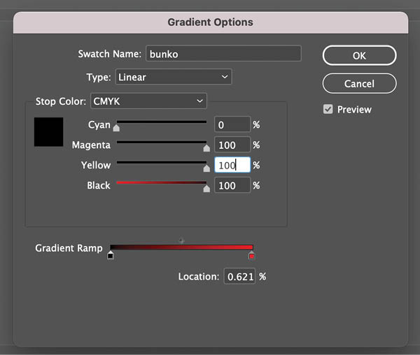
Each stop on the gradient ramp has its own color controls, which are very useful. For the example, I left the white stop as is, but changed the color of the black stop to a bright red. (It defaults to CMYK, but I prefer the RGB color gamut, so I changed the color mode as well.) Next, I added a third stop with a deeper shade of dark red (Figure 5).

Figure 5. Add color stops to make more interesting gradients.
Then returning to the layout, I dragged with the Gradient tool across the ball. I did it a few times, trying to get the right, pseudo-3D effect (Figure 6). I got close to the effect I wanted, but it still looked a bit too artificial. I know it’s going to have that “uncanny valley” look, but too fake is not right. So I used my trick to add a little “extra” to this type of object: a transparency effect.
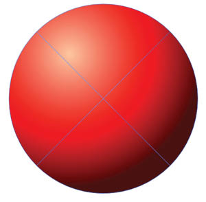
Figure 6. A radial gradient can create a 3D effect with highlights and shadows.
Try this: Choose Object > Effects > Inner Shadow. You might play with the options here, so that the distance is set to 0, the size is increased quite a bit (to soften the edges), and the opacity is turned down to 30%. You might (or at least, I might) also edit the color of the shadow, changing it to a deep, dark red, rather than plain black, with 3 to 4% noise. This gives our pool ball just a little extra dark around the edges—a second gradient overtop of the first, for extra depth, so that it will really look at home in an early Pixar movie (Figure 7).
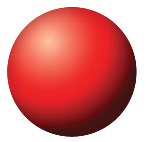

Figure 7. An Inner Shadow effect adds an extra bit of realism to the ball.
To round out the exercise, duplicate your gradient swatch, rename it, and change the color values from reds to blue or green, and then try applying that to a copy of your pool ball. Do this by simply selecting the ball and then choosing the new gradient. It should apply the new gradient in the exact same location as the old one, giving you a new object with same artificial light source. This little exercise gives you a taste of how easy this tool can be.
The Dope on Default Gradients
When you first open the Gradient panel, it displays the default white-to-black linear gradient. But as soon as you tinker with that in the panel by changing any of the settings, the result is treated as the new default gradient and will be applied to any selected object if you press the . (period) shortcut key. This can be handy, but what if you want to start again with that basic white-to-black gradient? Unfortunately, there’s no shortcut to bring it back. You have to either recreate it from scratch or copy and paste an object from another InDesign document with the original default gradient applied to its stroke or fill.
A Common Mistake: Grayish Gradients
One common problem with gradients occurs when you try to blend a color into black. If the black is not a rich black, with enough of the other color in it, you can get a dull, muddy effect that also doesn’t appear smooth—not at all what you want!
In this example, the red is blending into a CMYK black that has no other inks in it. If you’re designing for print the solution is simple: Select the black stop, and edit the color to include the additional inks. In this case, I added a significant amount of yellow and magenta to the black. This way, the red transitions cleanly and smoothly into black, without that muddy gray interfering.
If you’re creating for screens, the solution is even easier: Just make sure both of your colors are RGB, rather than CMYK. Voilà! Instant rich black.
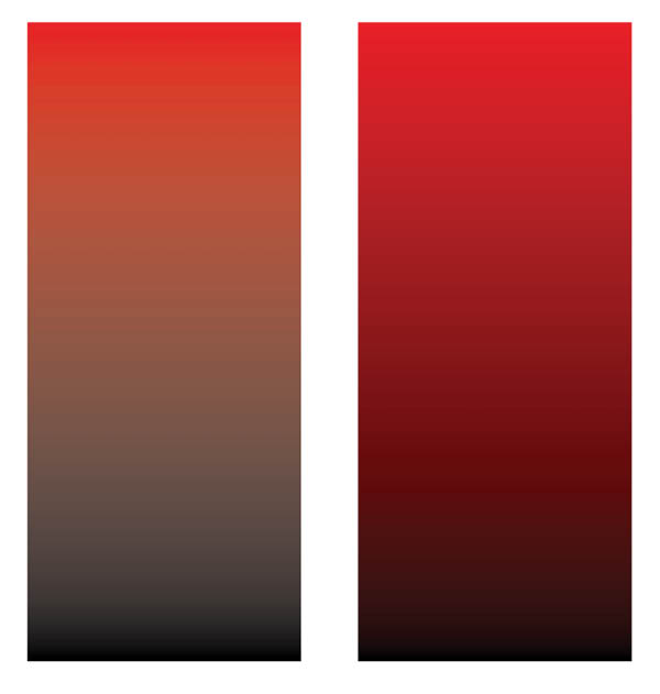
When blending one color into another, it’s important that they have some colors in common. Blending a CMYK black that’s not a rich black into a color will make a sickly gradient.
Simulating a Gradient Mesh
Adobe Illustrator has advanced gradient capabilities that are tough to match. They include the ability to blend multiple color stops on any shape via the Gradient Mesh tool. So, for example, you could have a rectangle in which each corner has a different color, with each color blending into the others with smooth gradients. While InDesign is limited to creating simple linear and radial blends, Illustrator can create blends that stretch out in any direction. However, there is a fairly easy workaround to simulate mesh gradients in InDesign, which also illustrates some advanced concepts.
Try this: On a new page, add a rectangle that fills the entire page. Add a gradient fill, and using the steps above, save and edit that gradient in the Swatches panel. You can use whatever colors you like but consider this idea: deep plum (R105 G30 B85) to orange (R255 G120 B45). It’s just a great gradient, everyone uses it, and it never gets old.
Duplicate that gradient, rename it, and edit the colors into an entirely different but equally beautiful gradient. I went for green-gold (175R 240G 75B) into turquoise (R60 G175 B145). The trick here, as all color nerds know, is to have a little color theory under your belt; see “Picking Great Gradient Colors.”
Picking Great Gradient Colors
The secret to a really nice gradient is to ensure that both of the colors you are blending together share a dominant value. My plum-orange gradient works because both values have a lot of red or magenta in them, which really makes the transitions smoother. If you try to blend, say, a red to a green, you’ll soon find your transitions getting a little muddy, because the two colors share so little. Green-gold and turquoise share yellow, and that’ll work nicely as well. 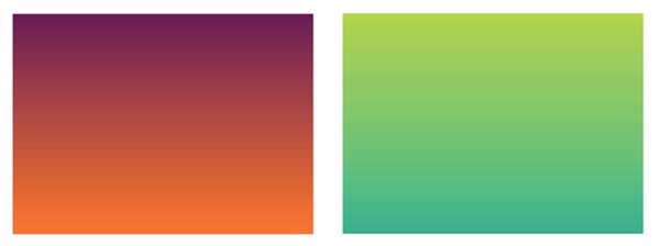
I’ve chosen these color combinations because they are a little unexpected. Many beginners find it’s easiest to blend a gold into an orange or a deep purple into a bright blue. Those are all analogous colors: two colors that are adjacent to one another on the color wheel. They’ll be pretty, but to my way of thinking, maybe a bit too predictable. In any case, if your gradients are looking sickly, it will never hurt to consult some good color theory! Check out Lauren Krause’s article on picking colors in Issue #34.
To apply the first gradient, drag with the Gradient tool from the top of your frame to the bottom. Copy the frame and paste it in place (Command+Shift+Option+V/Ctrl+Shift+Alt+V). Then, apply the second gradient as the fill in the top rectangle so you have two frames filled with different gradients, one atop the other. Now comes the fun part: Remember the Gradient Feather tool? The one I told you that you weren’t ready for? You are ready now.
Select the top rectangle on your page, and then drag horizontally across it with the Gradient Feather tool. It should add a feathered mask to your shape, making it fade from opaque to transparent to reveal the other gradient underneath (Figure 8).
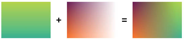
Figure 8. This effect involves two gradients, one atop another, on different layers. By also adding a Feather Gradient to the top object, you can achieve the look of a gradient mesh, which is otherwise impossible to create in InDesign.
If your first attempt creates a gradient that is either too abrupt or too wide, or the wrong angle, you can try again by simply dragging a second time across the image. Voilà! A complex gradient that any Adobe Illustrator user would be proud of.
Note: Feather gradients, because they use transparency, are represented in the Gradient Feather options in the Effects dialog box (double-click the tool to pull that up) as monochromatic—either black or white or gray. This is because gradient is really representing transparency; a pixel is either opaque (black), transparent (white), or some value in between (gray). But the most important thing to consider in the options for this tool is the mid-point. You may not want a gradient that blends in a smooth fashion from opaque to transparent; you might want the fade out to begin only on the edges. To achieve that, you could add a new stop about three-quarters of the way on your feather gradient, and make sure that this new stop is actually 100% black. The feather will appear now only on the outer quarter of the shape (Figure 9).
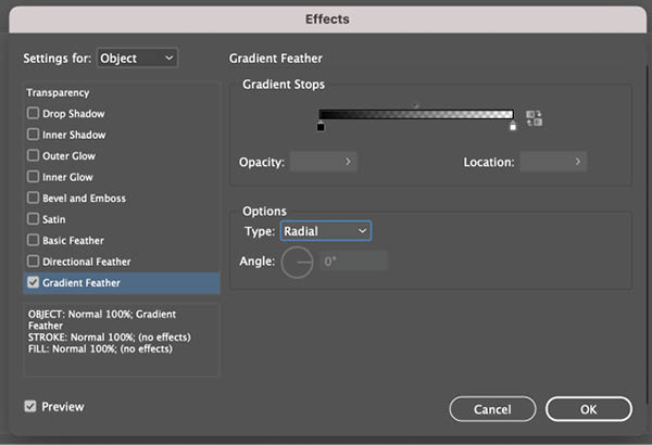
Figure 9. Feather gradients are truly powerful tools. They are represented in the Gradient Feather panel by a monochromatic gradient: Black represents opacity, while white becomes a transparency grid. It’s not unlike a simple type of layer mask you might make in Photoshop.
Of course, you’ll want to fiddle with these until your eyes have their own gradient, that fades from red to white. This way you’ll know you’re a true expert .
Applying Gradients to Photographs
One effect I always find interesting is blending photographs with gradients. I have a photo in my library of the Russian futurist poet, Vladimir Mayakovsky, who was renowned not only for his literary works, but also for his very stern face. I’m going to add this photo to the gradient and try combining it in various ways. Generally speaking, black-and-white photos work best for this, but color photos could work in some cases.
I drew a new rectangle frame on a new layer, made sure that it was the top layer, and placed the photo. You know what’s coming next: blending modes! I like to try them all, because you never know what weird combination will work. I settled on Hard Light, which as you can see in Figure 10, really combines the gradient and the photo in a nice way, don’t you think?
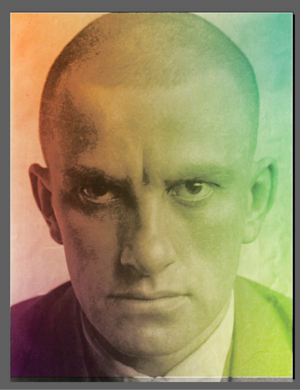
Figure 10. You can add a photo over top of the earlier gradient combo you made, and then try a few blending modes.
I’m happy now, but I can’t stop. I really enjoyed messing around with the Gradient Feather tool, and I think I’ll try that again. This time, I double-click the tool to access the Gradient Feather options, where I change the gradient type to Radial, instead of Linear. Clicking in the middle of Mayakovsky’s face, I drag to the edge, and now he appears to be emerging from the color field (Figure 11). I can’t help but wonder what this futurist would think if he saw his photo being used in such a futuristic manner.
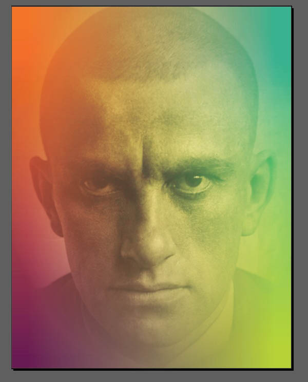
Figure 11. Adding a radial Gradient Feather effect creates some interesting interaction between the blended colors and the detail of the photo.
I like this effect, but now it seems the photo is not popping enough. I have a trick for this. I change the blending mode once again, this time to Overlay. The Overlay effect is nice, but not intense enough, so I duplicate the layer once, and then duplicate it again (Figure 12). This is one of my favorite hacks in Adobe programs: You can intensify blending modes by duplicating a layer, getting results that are otherwise difficult to achieve. I hope one day they will allow us to adjust the intensity on these blending modes, so that I can avoid creating a bunch of duplicate objects, but for now this is an effective workaround.
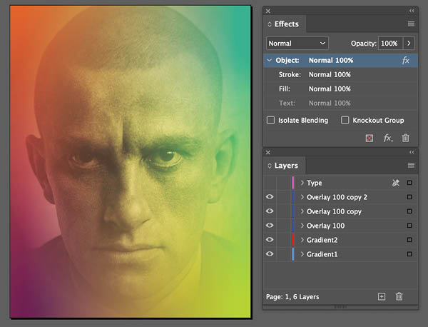
Figure 12. Stacking duplicate layers with the same blending mode applied to them is an easy way to intensify an effect.
Mixing Gradients with Type
The photo of Mayakovsky is looking good, but let’s say my art director insists that this image needs some type. It seems to me that poetry should be set in a dignified typeface, like Adobe Caslon. I set the type as large as possible, running directly over the image.
I mentioned earlier that Adobe Illustrator has some strong gradient capabilities. But can you add a gradient to type easily with that program? Nope! Illustrator will assume that what you want to do is apply a separate gradient to each letter, which is strange, because that will almost always look terrible. But in InDesign, you can easily apply a gradient across any range of text: a full page, a paragraph, or just a word. It’s as easy as selecting the type and applying a gradient swatch. You can apply the gradient evenly across anything from a single letter to the entire text frame to make the type look the way you want. I spiffed it up even further with the use of a blending mode for the type; I chose Color Dodge for a nice effect (Figure 13).


Figure 13. I added type over the top of the image, then used a blending mode to allow the gradient to interact with the type in an interesting way.
Multi-Stop Gradients
As I mentioned earlier, the default behavior for a gradient is for it to have two values, represented by two color stops on the Gradient panel. Many people assume that’s all there is to a gradient. How wrong they are! The design dictum that “less is more” is true—until it isn’t. Those of us who survived the 1980s know that sometimes “more is more.” Let’s explore what you can achieve by adding additional stops to a gradient.
First, I decided to add some nice colors in my Swatches panel that are a little outside the normal rainbow. To do this, I opened the Adobe Color Themes panel (Window > Color > Adobe Color Themes), clicked on the Explore tab, and scrolled down until I found a theme that seemed interesting (Figure 14). It has the rather uninspired name of color theme41084medium-retina, but happily its creator was better at choosing interesting colors than naming them. (For a full rundown on how to use the Adobe Color Themes panel, check out Steve Werner’s article in Issue #106.)

Figure 14. For a quick way to access colors that will work nicely together, try the Adobe Color Themes panel.
By clicking colors in that theme, I added them to my Swatches panel. From there, I drew a shape, applied an ordinary black-and-white linear gradient to it, and then edited that gradient to include a color stop for each color from my theme.
There are few ways to add color stops to a gradient. One is to open the Gradient panel, place it alongside your Swatches panel, and simply drag color swatches onto the gradient ramp. Each time you do that, you add a new color stop (Figure 15). Alternatively, if you drag a swatch directly over a color stop, you can replace the original color for a new one. Tip: Another cool way to apply a swatch to a color stop is to select the stop, then hold the Alt/Option key, and click a color in the Swatches panel.
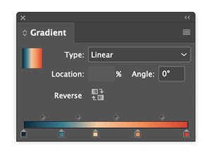

Figure 15. There’s no reason a gradient should be limited to only two stops. Simply clicking the line representing the gradient adds a stop, and you can apply a color to it. Even easier, you can drag colors out of your Color Swatches directly onto the gradient, and then move the stops around to get the effect that you want.
Dragging the stops to the right or left on your Gradient panel will adjust the transitions. You can get some nice subtle effects this way. I find it interesting to drag two stops so close together that they almost create a hard edge in the middle of the gradient (Figure 16). (Be careful where you click: It’s easy to accidentally add a stop, and in that case you’ll probably want to delete that stop by just dragging it off the panel.) And then it’s interesting to try switching from a linear gradient to a radial gradient.
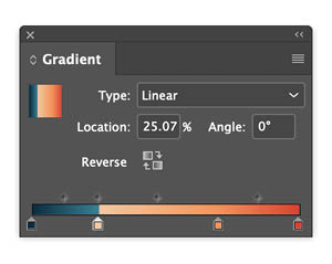
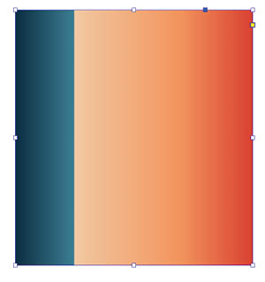

Figure 16. Why does every transition need to be perfectly smooth? You can get really neat gradient effects by dragging two stops so that they are right next to one another, while allowing other stops plenty of breathing room. Looks great in both linear and radial formats.
You can keep adding more and more stops to your gradient until you’re satisfied. (Figure 17).
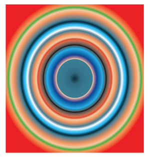
Figure 17. Is there a limit to the number of stops? The only thing stopping you from finding out is your own good taste.
Gradients on the Go
Did you know that Adobe Capture allows you to create color themes and gradients from images on your mobile device? Check out Theresa Jackson’s article on Adobe mobile apps in Issue #143 for details.
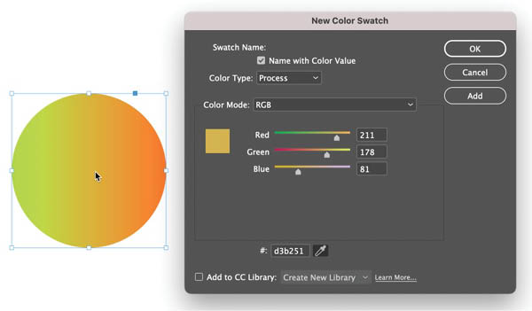
Sampling Colors from Gradients
Want to make a solid color swatch from one of the intermediate tones in a gradient? Don’t reach for the Eyedropper tool. It will sample the entire gradient when you click. Instead, go to the Swatches panel menu and choose New Color Swatch. Then click and drag from the eyedropper button in the dialog box. This way, you can sample the RGB values of any color on your screen.
Creating Gradients with Effects
Why limit ourselves to gradients created with the Gradient Swatch tool? There’s also the amazing Effects panel, which you can use to create soft color transitions in the form of shadows and glows, giving you gradients that can appear in any shape you want. (We looked at this briefly, with our pool ball, earlier, but let’s dig a bit deeper.)
To begin, I’ve got a rectangular background, to which I applied a lovely pale orange. I then cut and pasted an interesting vector shape I created in Illustrator, and I applied this same orange to my vector shape, causing it to disappear when placed over top of the background (Figure 18).
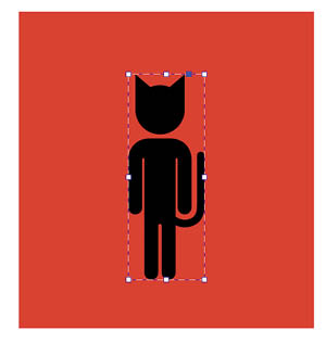

Figure 18. Now you see the cat, now you don’t.
Now, I’ll open the Effects panel (Window > Effects). For some reason, InDesign stores all the blending modes here, which to my way of thinking ought to be in a panel called “Transparency,” but no matter. What we are interested in are real effects: Click that tiny FX icon at the bottom of the panel to reveal a whole host of options.
Previously, in the pool ball example I chose Inner Shadow, but for this, I want Outer Glow. Choosing this option pulls up the Effects window, where I will make some changes. The default color for a glow effect is white, but I will change that to one of the pale golds I have among my color swatches. I also will bump the size of that glow way up to 5p0, keeping the technique on Softer, which really does make my orange shape begin to glow against the orange background (Figure 19). Make sure that the blending mode is set to Screen, which will give the best glow effect.

Figure 19. Does a Glow or Shadow effect count as a gradient? Most definitely. I pasted a vector shape over top of a rectangle of the same color, and then added an Outer Glow effect from the Effects panel to make the shape visible. Duplicating the layer created a little extra intensity to the effect.
Subtlety Is Key
When a gradient is done well, it should add a subtle pop to your layout, bringing a suggestion of depth that isn’t present with flat color. But remember: With great power comes great responsibility! Gradients can be done poorly, they can be distracting or overwhelming, and if you don’t blend the right colors, you can really muddy up a page. The key here is to know at least a little color theory, and how to use the tools, but also—perhaps most crucially—to know when to stop. Does your layout look like someone went crazy with an airbrush, spraying soft tones across everything in sight? The discerning eye knows when enough is enough.
Commenting is easier and faster when you're logged in!

Recommended for you

InDesign Magazine Issue 138: Scripts From the Crypts
We’re happy to announce that InDesign Magazine Issue #138 (October 2020) is now...
Designing with Rules, Borders, and Shading
Creative ways to highlight text content in InDesign

InDesigner: San Francisco Bay Brand
How consistent design and efficient processes make for a successful product pack...