
The Legal Ramifications
According to a trademark attorney I spoke to, trademark law provides “very few clear answers” when it comes to conflict. The main concept at work in trademark law is likelihood of confusion. Two companies using the same trademark may not be in conflict when there’s little chance consumers would be confused. If there is possible market confusion, two companies may be in conflict when their trademarks are merely similar, not identical.
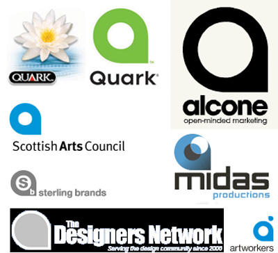
In the case of Quark vs. Scottish Arts Council, it’s unlikely anyone would confuse the two organizations or the services and products they represent. Any change on Quark’s part will likely be motivated by goodwill, not the law.
In very high-profile cases, with brands like Apple or Nike, there is another concept at work, that of dilution. If a trademark is so famous that it is primarily associated with one company, that company can make a case that any use of its trademark will dilute the investment they’ve made in establishing that mark. Neither Quark nor the Scottish Arts Council have that sort of profile, so they would have to prove direct market confusion.
The Bigger Mistake Quark Made
You may not believe that the similarity between Quark’s new logo and the Scottish Arts Council was unintentional. I do, but to me that’s not the real point of this situation. I don’t understand why Quark didn’t take several design steps that should be basic when creating a brand identity that’s not only unique, but less likely to encounter conflict.
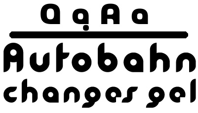
Top, the upper and lowercase Q and A from the typeface PopGod by Rian Hughes. Bottom, a sample of the font Girl by Dirk Uhlenbrock.
One danger of using a stylized letter as your primary logo is that the generic nature of a letter in the alphabet makes it tricky to protect legally. There are millions of businesses entitled to use the letter Q for a logo. I don’t know what Quark paid for its new logo, but for under $50 they could have purchased either of the two commercial typefaces above. London type and graphic designer Rian Hughes dreamed up the typeface PopGod in 2002; it was released in 2003. Rian told me, “I guess there are some simple geometric design solutions that will be repeatedly arrived at completely independently of each other — I’m surprised that it doesn’t happen more often.”
Or take the font Girl by Dirk Uhlenbrock. According to the type house Fountain, Uhlenbrock first conceived this design in 1998 after studying Bauhaus typography. It was released in 2003. I’ll bet you can find the same geometric shape in an old Dover clip-art book, or from the SoloType collection of vintage fonts.
According to Jeff Fisher of Logomotives (and the author of The Savvy Designer’s Guide to Success), the Quark incident challenges designers to do better.
“It’s a call for creative professionals to push themselves harder in their creative efforts,” says Fisher. “While I have hundreds of design books on my shelves, I seldom flip through the volumes for inspiration. My best ideas come from my first impressions based on the initial input from a client.
“Once concepts are fine-tuned, it’s time to do your homework and determine if the design is unique enough to present to clients. You search by whatever means available: self research, a trademark attorney, an image search firm, or even relying on the eyes of designers on forums.”
According to Fisher, David E. Carter’s 1999 book Bullet-Proof Logos: Creating great designs which avoid legal problems is a valuable resource. “Carter says three types of logos can help designers avoid infringement issues:
“One, name in type: A simple type treatment of a business name can often set it apart from other firms in a graphically pleasing manner. Two, name in modified type: The unique modification of a typeface, in representing a company name, can present a logo that can’t be easily duplicated. And three, name in type with a secondary device. I use this technique a lot in creating logos that incorporate a unique art element as a letterform, or a specific design element within a type treatment, which then limits the possibility of the design being ‘borrowed.’ Many identities that face infringement issues are those with a simple graphic symbol, often a geometric shape, slapped up next to a simple type treatment of the name.”
I got some of the same advice from attorney J. Scott Culpepper, a partner specializing in trademark and patent law with the firm Thomas, Kayden, Horstemeyer and Risley in Atlanta. His three top tips for avoiding trademark problems:
- Spend the money for the most thorough search possible.
- Use stylized design, but be sure to incorporate the full name of the company or product, even if they’re tied together only by a unique border, color, or other graphic element.
- When possible, the name itself should be unrelated to the goods or services involved. (So “Big Dog Plumbing” is better than “The Plumbing Professionals.”)
The Public Relations Issue
Quark’s real trouble with its new logo is not a legal one. It’s a public relations snafu that must be handled appropriately. Quark should voluntarily change the mark and cite respect for the creativity of other organizations as the reason. (Quark says it has variations on the logo; perhaps one of those differs enough to pour oil on troubled waters.) If the company has already printed a lot of material with the controversial logo, the monetary cost of a change will be high. But what is the cost of the design community’s ire?
That’s not to say that we in the design community don’t have our own fall-out to deal with. We’ve set ourselves up for harsh criticism when things like this happen. I thought winemakers were the kings of pretentious superlatives to describe the uniqueness of their products. But check out these passages from the Quark press release about the new logo:
“The green just came into being. I was looking for something that would take Quark in a completely new direction — a color that was friendly and inviting, but would also really help Quark stand apart. We wanted to help Quark break out of the visual ‘sea of sameness’ that lumps together so many corporate software companies,” said Chris Wood, creative director at SicolaMartin and designer of the new Quark logo. “It really was an evolution. The more I played with the green, the more it came to represent so many things that Quark has gone through: rejuvenation, growth, and rebirth. It just seemed to make sense.”
Does one mark really say all those things?
I’m reminded of a 1960s cartoon from the old Look Magazine. In several frames, a woman describes the color she would like the painter to use for her living room. “I want to bring out the soothing warmth of these drapes,” she says in one frame, as the painter patiently stands in silence. (I’m paraphrasing a bit.) In the next frame, she says, “I also want to bring out the bold vibrancy and stimulation contained in this painting.” And then in the following frame, “It’s important that the room make a statement of sophistication, humor, and good taste.”
The painter returns to his truck where a helper is cleaning brushes. “Gonna paint it green,” he says.
Sometimes green is just green, and the letter Q is just the letter Q. There’s nothing wrong with Quark’s goal of using design as a way to symbolize new direction and commitment. But to read too much into it sets up everyone for disappointment. In this case, the effort not only fell short of the goal, but also backfired in a way that gave Quark antagonists something new to gripe about. And God knows the company doesn’t need that right now.
Read more by Gene Gable.
This article was last modified on May 19, 2023
This article was first published on September 21, 2005
Commenting is easier and faster when you're logged in!

Recommended for you

Photoshop Power Shortcuts on Adobe TV
After the conclusion of the Adobe MAX conference in May, I posted a news item ab...

Lightroom CC for Designers
If you’re a designer, you’d be forgiven if you responded to Adobe’s announcement...

Turn Your Mobile Phone into a Microscope With the Micro Phone Lens
Got a smartphone or tablet? Like macro photography? Then you might want to check...