
Seeing the Benefits of Accessible Color
Accessible color choices can help your work reach more people—and make you a better designer.

This article appears in Issue 149 of InDesign Magazine.
Most graphic designers—if they’re even thinking about accessibility—assume that it doesn’t apply to their work or that it only has to with blindness, wheelchairs, or older people. But, accessibility is actually much more than that. Your color choices play a part in whether or not your design work will connect with or alienate an audience. There are also many benefits for you as a designer when you make accessible color choices.
Who Accessible Color Choices Serve
Accessible color choices are one of the foundations of accessible design, and they benefit several different audiences.
People with visual disabilities
The most obvious audience that accessible design serves is composed of people with a visual disability. This is an enormous group of 2.2 people billion worldwide—over one-quarter of the world population.
One type of visual disability is low vision, which could mean someone can’t see things in their center of vision or peripherally. They might have trouble seeing in low light or have blurry or hazy vision. Low vision stems from many causes, including macular degeneration, cataracts, diabetic retinopathy, glaucoma, and the most common malady: just getting older! The lens inside the eye starts to harden in most people after age 40, making it more difficult to see in a variety of conditions (presbyopia).
Another type of visual disability is color blindness. One in 12 males and 1 in 200 females have some form of color blindness. Color blindness can be hereditary, the result of a brain injury, or from another cause. Red-green is the most common type of color blindness, and there are variations within this group, including conditions known as protanopia, protanomaly, deuteranopia, and deuteranomaly. To people with these conditions, green may look more red, red may look more green and less bright, or red and green may be indistinguishable from each other (Figure 1).

Figure 1. Christmas decorations as someone without color blindness would see them versus how someone with a form of red-green color blindness might see them
Blue-yellow is a less common form of color blindness. It is also known as tritanopia. Someone with this condition may find it hard or impossible to tell the difference between blue and green, yellow and red, yellow and pink, or purple and red (Figure 2).
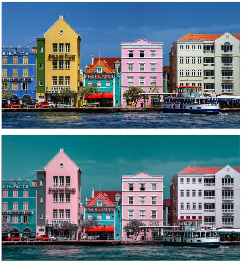
Figure 2. The top photo shows how someone without color blindness would see these buildings, and the bottom one shows how someone with a type of blue-yellow color blindness might see them.
Notice how the blue building looks more green, the green building looks more gray, and the yellow building looks pink. Imagine asking for directions and being told to look for the yellow building.
Complete color blindness is another type of color blindness, although it’s rare. People with complete color blindness see shades of gray only (Figure 3).

Figure 3. A bouquet of tulips as someone without color blindness would see it and how someone with complete color blindness would see it
People with cognitive, learning, and neurological disabilities
People with a cognitive, learning, or neurological disability also benefit from accessible color choices. Some of these conditions include:
- Autism
- Down syndrome
- Multiple sclerosis (MS)
- Traumatic brain injury (TBI)
- Attention-deficit hyperactivity disorder (ADHD)
- Dyslexia
- Seizure disorder (epilepsy)
For example, someone who’s suffered a traumatic brain injury may have trouble with certain hues of red. Someone with a cognitive or learning disability may experience increased or decreased comprehension depending on the colors used.
People with a perceptual processing disorder
Individuals with a perceptual process disorder such as Irlen syndrome also benefit from accessible color choices. In this case, the disorder doesn’t stem from a visual issue with the eyes. Rather, the issue is that the brain can’t process the visual information coming from the eyes. People with Irlen syndrome may perceive stark black text on a white background to be wavy, blurry, moving, or even tilted at an angle, for example.
All sighted users
Another audience—and this one may surprise you—is all sighted users with or without a disability. But it’s true. All sighted users with or without a disability benefit from accessible color choices. They won’t notice that text uses an accessible color combination, but they will be able to more easily read and comprehend the content.
For example, I often see instances where a designer placed white text on a yellow or light turquoise background, or gray text on a maroon background. I don’t have a visual disability, but I have trouble reading text like that!
Contrast Guidelines
While choosing colors is important, it’s even more important to ensure a good contrast among the colors you choose. To understand your design options when it comes to color and contrast, you need to refer to the Web Content Accessibility Guidelines (WCAG) that pertain to color and contrast. The WCAG includes three levels of conformance—A, AA, and AAA—ranging from minimum to strict. AA is the most common one and the one you usually need to meet for a legal requirement. Level AA includes level A and AA requirements. Key guidelines you should be aware of include the following.
WCAG 1.4.1 Use of Color
One important guideline is WCAG 1.4.1 Use of Color (Level A), which says not to use color as the only visual means to:
- Convey information
- Indicate an action
- Prompt a response
- Distinguish a visual element
This applies to many common design elements including text, data graphics, hyperlinks, buttons, and form fields. To understand the importance of this guideline, consider line graphs, where the lines may be styled with different colors and may overlap one another. Someone who cannot tell the difference between the colors might find it difficult or impossible to grasp the information being conveyed.
WCAG 1.4.3 Contrast Minimum
You can’t rely on only color for the situations I mentioned, but you can use contrast. WCAG 1.4.3 Contrast (Minimum) (Level AA) says that text and images of text must meet a minimum contrast ratio with their backgrounds.
Contrast ratios are expressions of the relative luminance of lighter versus darker colors. The maximum ratio is 21:1 for pure black on pure white. At the other extreme, a 1:1 ratio means the colors have no contrast at all. I’ll share some resources for determining contrast ratios later in this article.
In the WCAG, contrast ratios vary with the size of type. “Normal-size” text needs to be at a ratio of 4.5:1. But large text needs to meet only a 3:1 ratio. Text that is at least 14 pt (18.66 px) and bold or at least 18 pt (24 px) of any weight qualifies as large.
WCAG 1.4.6 Contrast (Enhanced)
WCAG 1.4.6 Contrast (Enhanced) applies if you need to adhere to Level AAA—the strictest level of conformance—which is rare. In that case, normal text would need to meet at least a 7:1 ratio, and large text would need to be at least 4.5:1.
WCAG 1.4.11 Non-text Contrast
WCAG 1.4.11 Non-text Contrast (Level AA) applies to graphical objects and user interface components. You must have at least a 3:1 contrast ratio against adjacent colors for these elements. Examples include:
- Lines in a line graph
- Pieces of a pie chart
- Hyperlinks
- Buttons and other form elements
No contrast requirements
There are no contrast requirements for the following:
- Logos
- Decorative elements
- Inactive user interface components, such as a disabled button that doesn’t become active until required form fields are filled out
- Text that happens to be part of an image that isn’t being used to convey information (Figure 4)
- Heat maps
- Screenshots

Figure 4. In this example, unless you are trying to use the photo of the street sign in place of the words South Second Avenue, the text in the photo would not have a contrast requirement.
Proofing for Color Blindness
Both Photoshop and Illustrator can display documents as people with color blindness would see them via the Proof Colors commands in the View menu. Sadly, InDesign does not. But there is a workaround: Export a PDF, and open it in Illustrator. Then choose View > Proof Setup > Color blindness – Protanopia type or Deuteranopia type. You can also compare the color-blind version and the original by choosing Window > New Window and then Window > Arrange > Tile.
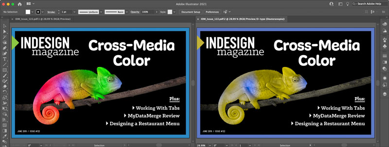
Note that to get the most accurate color-blind proof colors your documents need to be in RGB mode.
Checking Contrast
Now that you’re aware of the guidelines, you need to know how to check the contrast of your color combinations. There are a few ways of doing this using third-party tools, and Adobe also recently added their own version of a contrast checker to the Adobe Color website.
WebAIM Contrast Checker
WebAIM (Accessibility in Mind) has been offering accessibility solutions for more than 20 years, including a contrast checker tool at their website, webAIM.org. To use it, start by getting the hexadecimal value of a color in InDesign: Right-click a color swatch in the Swatches panel and choose Swatch Options from the context menu. If the swatch is in CMYK mode, temporarily switch it to RGB, where you’ll see the hex code at the bottom (Figure 5).
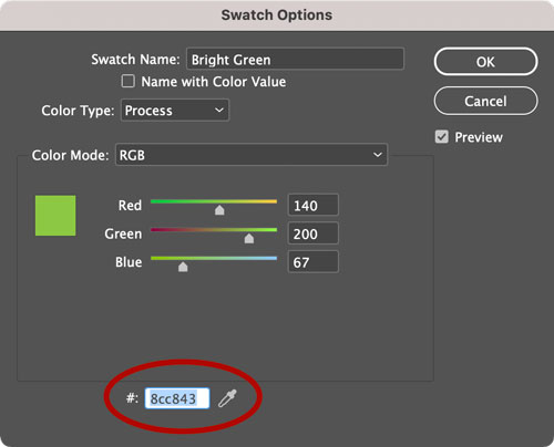
Figure 5. Color swatches in RGB and HSB mode display their equivalent hexidecimal values in the Swatch Options dialog box.
Copy this value and paste it into the WebAIM Contrast Checker along with the hex code of the background color (Figure 6). The checker will give you the contrast ratio and let you know if it passes or fails for normal or large text or a graphic object or user interface component at AA and AAA levels of conformance.
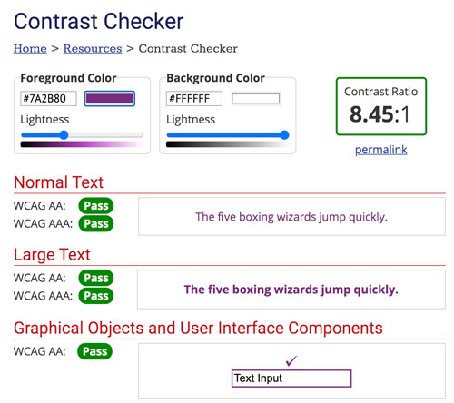
Figure 6. WebAIM’s Contrast Checker
Adobe Color
Adobe added a similar color contrast analyzer to the Adobe Color website. You can enter hex values or upload an image and sample colors from it to see if they meet the WCAG AA and AAA standards. Sliders underneath the input boxes allow you to adjust the colors until you achieve the desired ratio. Alternatively, you can quickly apply suggested color combinations or enter a desired ratio and have the tool adjust the colors to meet that standard (Figure 7). You can then save the color combination in a Creative Cloud Library where it will be labeled with the WCAG standard it meets.
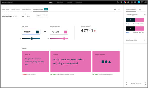
Figure 7. The new Contrast Checker tools at the Adobe Color website
TGPi’s Colour Contrast Analyser
If you’d prefer a tool that lets you quickly sample colors from anywhere on your screen, check out TPGi’s Colour Contrast Analyser. After launching it
(and if necessary, giving it permission to record the screen if you’re using macOS), select the Eyedropper icon and hover over the foreground color you wish to sample. Then do the same for the background color (Figure 8).
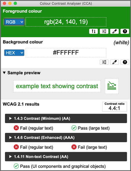
Figure 8. TGPi’s Colour Contrast Analyser tool
Sampling is particularly useful when you need to check or get the value for a tint of a color or where text appears over a gradation or photo with various tones. However, you should be aware that sampling colors is not as precise as using hexadecimal values. There may be a slight difference in color. In some cases, that difference is enough to affect whether a color combination passes or fails.
How You Benefit from Accessible Color Choices
There is much more to know about accessibility, but addressing color and contrast greatly benefits you in the following ways:
- Your work gets better results, because it will be read and understood by a larger audience.
- You gain a competitive edge over other designers because most designers ignore accessibility.
- You can earn more for this specialized skill.
- You save face and you save your place of work or your clients time and money, because someone won’t need to redo your design work to make it accessible.
Commenting is easier and faster when you're logged in!

Recommended for you

UK British Council promotes Rights Grabbing Competition
Pro-Imaging is an international organisation representing professional photograp...

InDesign Basics: Working With Layers
InDesign Basics is a series of articles for new InDesign users, highlightin...

InDesign CS4 Users Can Now Manage Preferences Easily
Preferences can be shared and multiple preference files stored on one machine wi...