
My favorite period for interior design is surely the 1950s, or at least what I imagine that era to be. I’m always on the prowl for authentic material from that time showing the styles and colors of the day, unfiltered by a modern lens.
I was delighted to come across an envelope full of paint brochures recently, clearly squirreled away by someone who had used them to choose colors or get ideas at the time of publication, which was between 1955 and 1956. In addition to color chip samples, these brochures show plenty of tips for painting and examples of “modern” design practices, from color schemes to painting special effects. Click on any image for a larger version.


Of all the DIY home projects I think painting is my favorite—it’s relatively easy and the results can be dramatic. It’s fun to pick out colors, imagine what a room will look like, and there’s even a kind of Zen thing that happens during the actual application of the paint.


Things weren’t all that different in the mid-Fifites when it came to painting, though the paint was likely to be oil-based and more toxic than today. Colors were a little less subtle and there were not nearly as many choices. People expressed themselves with color even more aggressively than they do today.


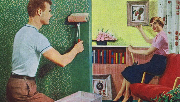
The main point of these brochures from Sherwin Williams and Sears is that painting is easy. So easy even a woman or a child can do it.


In my experience, a good paint job is not necessarily that easy—I have a lot of admiration for professionals. But it is something most of us will tackle at one time or another.


My favorite part of these brochures are the examples of what Sherwin Williams called “applikay.” These roll-on patterns of contrasting paint were very popular in the Fifties and I’m surprised you don’t see more similar effects today. They look hard to apply to me—one wrong turn and you’re really in trouble.


And of course I’m a sucker for classic Fifties color schemes, which seem pretty unnatural by modern standards. But I’d take any number of these rooms today. In my house growing up, everything was painted a shade of beige, or what is now called Navajo white.


I’ve often wondered if the popular paint colors of the Fifties and into the Sixties were a result of manufacturing limitations or truly due to public demand. It’s hard to know which comes first sometimes. Did people really want pink and green kitchens or did they follow the examples in brochures like these, feeling they must be right?


And have we learned more about colors and how they work together, or have tastes simply changed over time? People have been painting their walls for centuries so surely there must have been periods of much more subdued shades and colors. Yet it seems that at least since Victorian times, bright and bold color schemes have been the norm.


What color toilet does Gene prefer? Go to page 2 to find out.
This article was last modified on May 15, 2023
This article was first published on February 25, 2011
Commenting is easier and faster when you're logged in!

Recommended for you

Creating Colored QR Codes During a Data Merge
How to use transparency effects to make QR codes with any color, including gradi...

Adjusting Image Width in HTML
Creating a good HTML email is hard — and even harder when you want it to be resp...

Scanning Around With Gene: Seventies Era Type and Typesetting
My favorite type era is definitely the Seventies, which I’ve written about befor...