
Return to page 1.
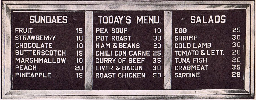
In 1949 you could get pot roast, French-fried potatoes, lima beans, apple pie, and coffee for 35 cents. And that same year a chocolate sundae would cost you 10 cents.


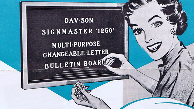
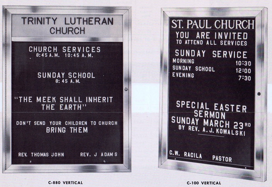
There was something very democratic about changeable-letter signs. All the items were of equal weight, so to speak, at least when it came to font choice. Yes, you could make things different sizes, but many establishments clearly only bought one or two sizes.

I suppose things were a little boring back then and maybe all the bold and in-your-face graphics we have today are somehow better. But I’m not so sure. (If you like this style of font, you can find many historical sign and stencil-font reproductions from type designer Jeff Levine at MyFonts.com)


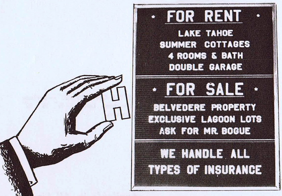
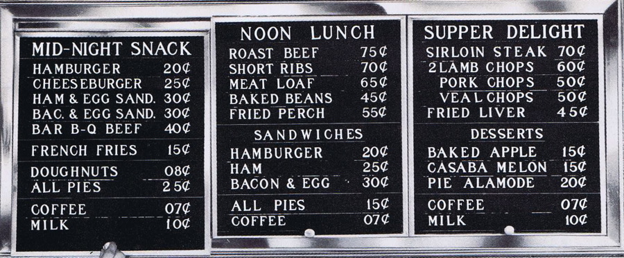
You could tell a lot about an establishment by the quality of its changeable-letter sign and the obvious care or disregard that went into laying it out. Could a dry cleaner with sloppy signage really do a good job cleaning your clothes? And could anyone who mixed fonts or sizes in the same word possibly provide decent service? These are from 1957 and 1950.


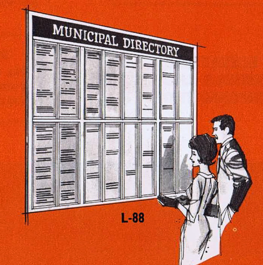
Of course, you were limited back them by the availability of letters. You’d see a fair amount of abbreviations, either to save on characters or time. Nowadays you can have all the letters you want, and what sort of challenge does that provide? From 1961.

Pedro’s Mexican Market didn’t have much of a sign, but I remember it being neat and all the items lined up nicely. No wonder the corn tortillas smelled and tasted so great.
Follow Gene on Twitter: https://twitter.com/SAWG
This article was last modified on March 8, 2021
This article was first published on September 10, 2010
Commenting is easier and faster when you're logged in!

Recommended for you
Finesse Your Type with Three Great InDesign Scripts
Dan Rodney describes himself as a designer, instructor, web developer, and all-a...

Paragraph Indents: Old Standby or Old Hat?
Indenting the first line of a paragraph is one of the most basic typographic con...

TypeTalk: The Creative World of Gail Anderson
Anderson's bold and innovative type work has graced the covers of book covers, B...