
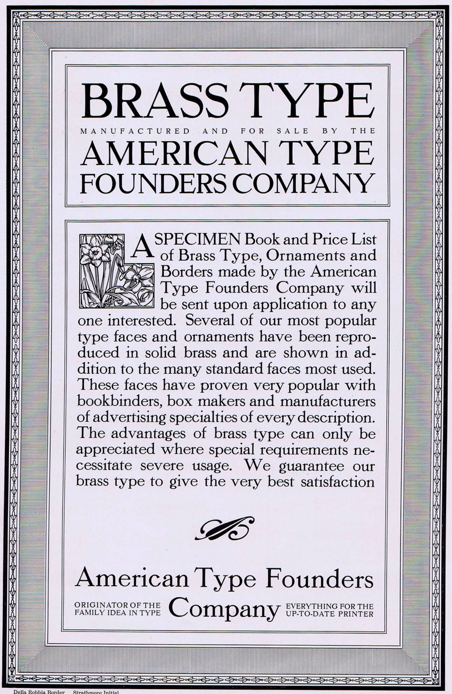
A very generous and thoughtful reader, Linda Anderson, was kind enough to send me something I’ve coveted for many years: a 1912 catalog from American Type Founders, then headquartered in Jersey City, New Jersey.
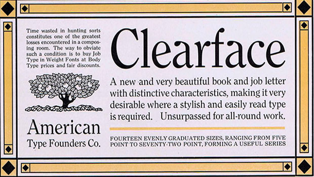
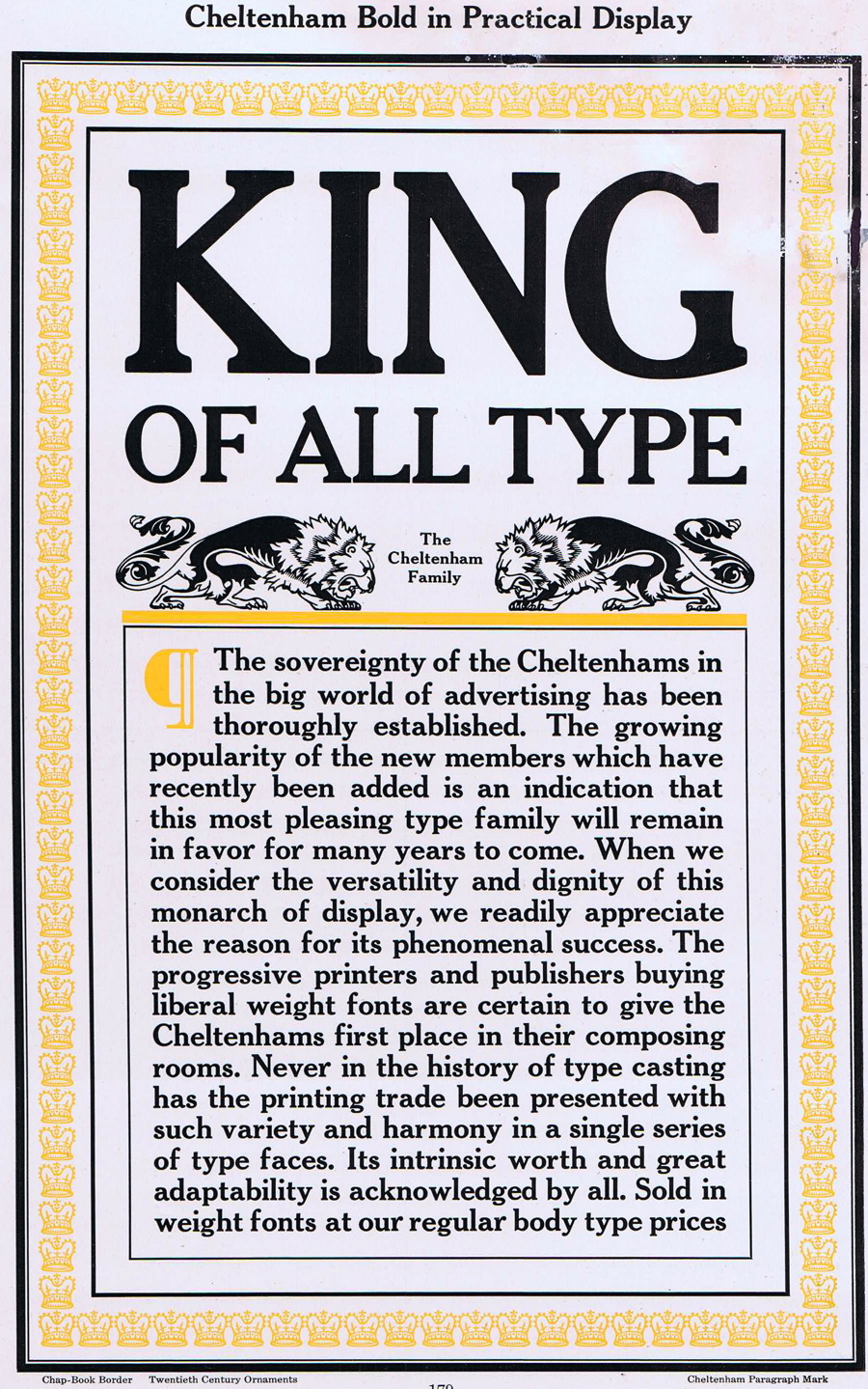
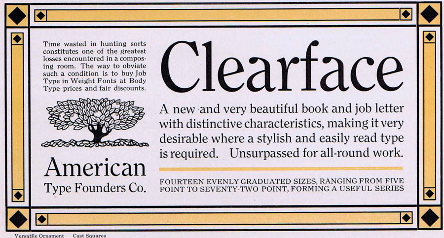
This isn’t a small, run-of-the-mill catalog it’s a massive 1,300-page specimen of the finest turn-of-the-previous-century hand composition, and it weighs in at more than 12 pounds. I could fill a year’s worth of columns just from this one source, but today I’ll look just at sample advertising that was designed to show off various type styles. Even so, I’ve had to break up this article into three pages, or loading all the samples would slow down your Web browser! Click on any image for a larger version.
American Type Founders (ATF) was created in 1892 by the merger of 23 different type foundries, which represented about 85% of all type manufactured in the United States at the time. By 1912 when this catalog was produced, ATF had 21 offices around the country and was the preeminent supplier of popular type styles to America’s printers and newspapers.
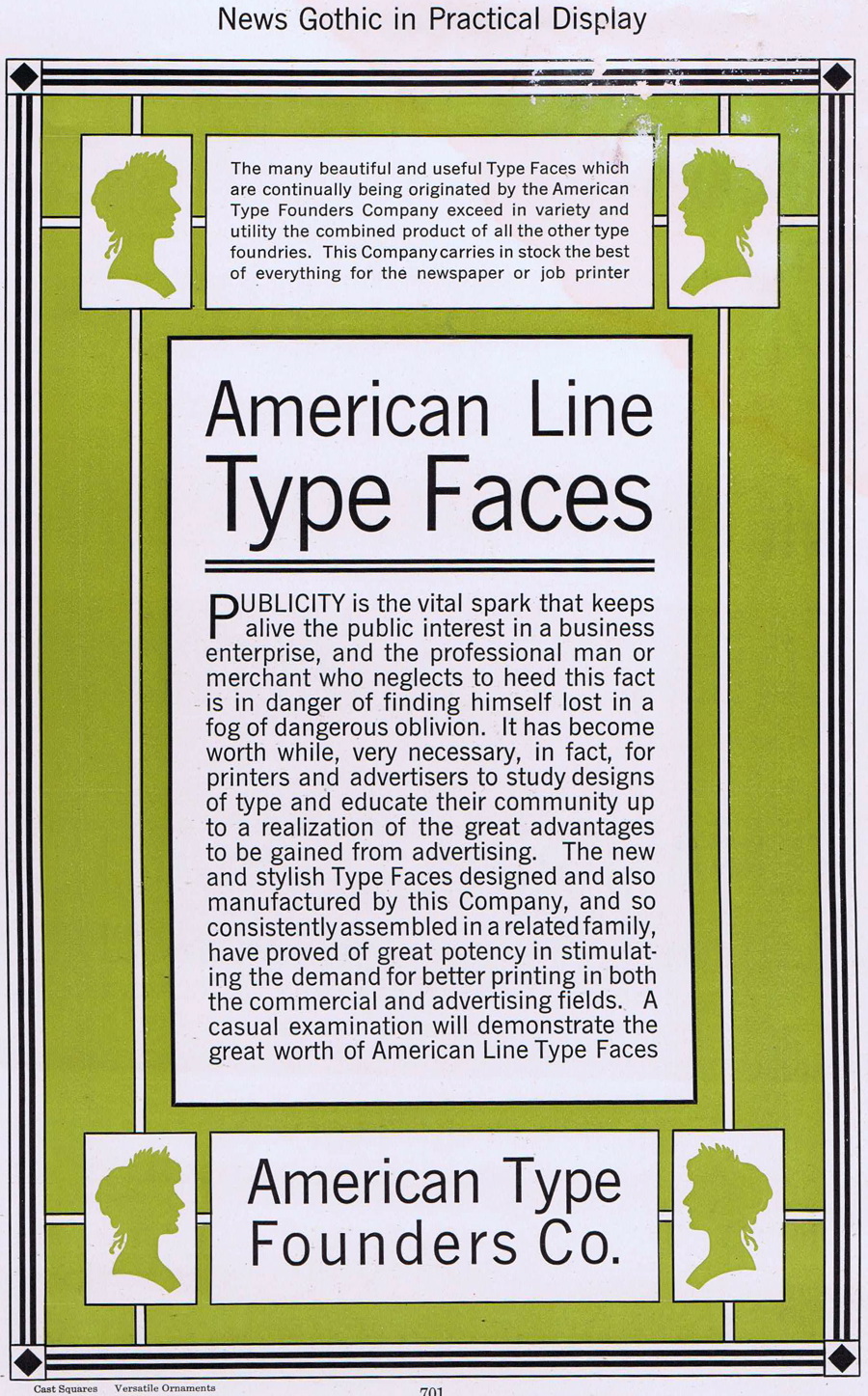


Both the 1912 and 1923 editions of the ATF catalog are prized as masterpieces of letterpress printing. In addition to hundreds of sample ads such as those shown here, the catalog has line and paragraph specimens of the many ATF type designs, which included the standards Century, Franklin Gothic, Bodoni, Caslon, and many others.


Considering that the entire catalog was likely set by hand, one letter at a time (all the way down to 4 point!), it is a monumental effort that must have required many men working thousands of hours. Much of the type in these ads is justified, which required careful planning and the use of small metal spacing material to even the lines.


One ATF story has Frederic Goudy selling his first type design to the company for $10 (which was double the $5 he asked for). ATF’s chief type designer was the prolific Morris Fuller Benton, who worked at the foundry from 1900 to 1937 and is responsible for many of the standard type designs still in use today. He designed more than 200 styles for ATF, including Hobo, Bank Gothic, Broadway, Franklin Gothic, and News Gothic.

Go to pages 2 and 3 for many more examples.
This article was last modified on March 8, 2021
This article was first published on July 16, 2010
Commenting is easier and faster when you're logged in!

Recommended for you
Create Easy 3D Text Effects with Retrolift Photoshop Actions
I know that “flat design” is enjoying its 15 minutes of fame right now, but some...

Learning Typography with Typekit Practice
The way that I feel about fonts and typography can be summed up by a quote from...
Super Fonts Assemble!
If you love going to the movies like I do, the ramp-up to the summer season is a...