
Berthold Wolpe (1905-1989) was a giant among type and book designers. By all reports he was a charming and convivial man without an ego that matched his high standing among peers. A major revival of his typefaces from Monotype will hopefully also revive the knowledge of his work, and lead to new uses of these classic faces updated for modern times and expanded character sets. Many have been unavailable for years, or only in limited forms.

This video produced by Monotype, introduces the Wolpe Collection.
The Wolpe Collection from Monotype on Vimeo.
Berthold Wolpe Bio
Wolpe started out studying as a metalsmith, which shows in the aspects of engraving that he brought into contemporary type design. He then trained in the legendary Offenbach workshop of Rudolf Koch (designer of Kabel and Neuland), where he learned the physical and design fundamentals. The workshop was collaborative, and he ultimately produced work side by side with Koch, including a collection of drawn alphabets in The Little ABC Book.
Wolpe was forced out of a teaching position after Hitler assumed power in 1933, as his parents were Jewish, and he left Germany for England in 1935 at the invitation of Stanley Morrison of Monotype. There, he designed faces for Monotype, produced a typeface and designed covers for Fanfare Press, and then embarked on a 25-year career at the publisher Faber and Faber (1941 to 1975), where he designed over 1,500 book covers. In later years, he added weights and reworked some of his earlier typefaces, but largely illustrated and lettered by hand, rather than pioneering more type. He continued to design, lecture, and draw—and apparently collect pens and a bit of everything else—until his passing at 84.
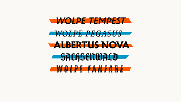
Monotype has revived five of Wolpe’s great faces, conceived of and produced in under a decade from the early 1930s to early 1940s: Albertus, Fanfare, Pegasus, Sachsenwald, and Tempest. Each of them has distinctly different utility, although all but Pegasus work best at display and even monumental sizes. Albertus and Sachsenwald can be used at larger text sizes, while Pegasus is a book face. They each come with interesting histories and some have long-running uses in signage and media, which I’ll describe in the next section.
All five families can be used as part of the Monotype Library Subscription ($14.99/month or $119.98/year), which includes print usage and as Web fonts at up to 250,000 page views per month with that basic price. They can also be purchased by weight or family for desktop use at these prices:
- Albertus Nova: $99 (five weights) or $19.80 each
- Wolpe Fanfare: $99 (six weights, including inline) or $16.50 each
- Wolpe Pegasus: $79 (four styles and weights) or $19.75 each
- Sachsenwald: $49 for both weights or $24.50 each
- Wolpe Tempest: $79 (three weights) or $26.33 each
Returned to life
Type designer Toshi Omagari, at Monotype since finishing graduate school in 2012, discovered Albertus in the company’s archives when he was looking for candidates for revival. He then came across another face, and then another, then another—all by Wolpe. Omagari went back to Wolpe’s drawings, transcripts of talks, and adaptations to various Monotype and other typecasting systems to find the heart of the typefaces. Designed for hot-metal output and relief letterpress printing, the faces needed interpretation for digital production and modern offset, as well as an expansion of glyphs and repair of details lost or distorted in previous electronic renditions with many characters.
Omagari is loyal to Wolpe’s original work. In his research, he says he found that Wolpe’s designs were sometimes interpreted less than perfectly after they left his pen, often to accommodate typecasting machines. In others, Wolpe tried varying approaches for a letter and settled on one, but left traces of others. At The Type Archive, a remarkable institution that possesses nearly the entire history of UK type dating back to the 1600s, including Wolpe’s papers, Omagari was able to look through pencil drawings for Albertus. He found, for instance, that Wolpe drew and erased several notions for the distinctive lower case “g” in Albertus; that “g” wound up appearing in different forms as well, depending on the hot-metal casting equipment it was interpreted for.
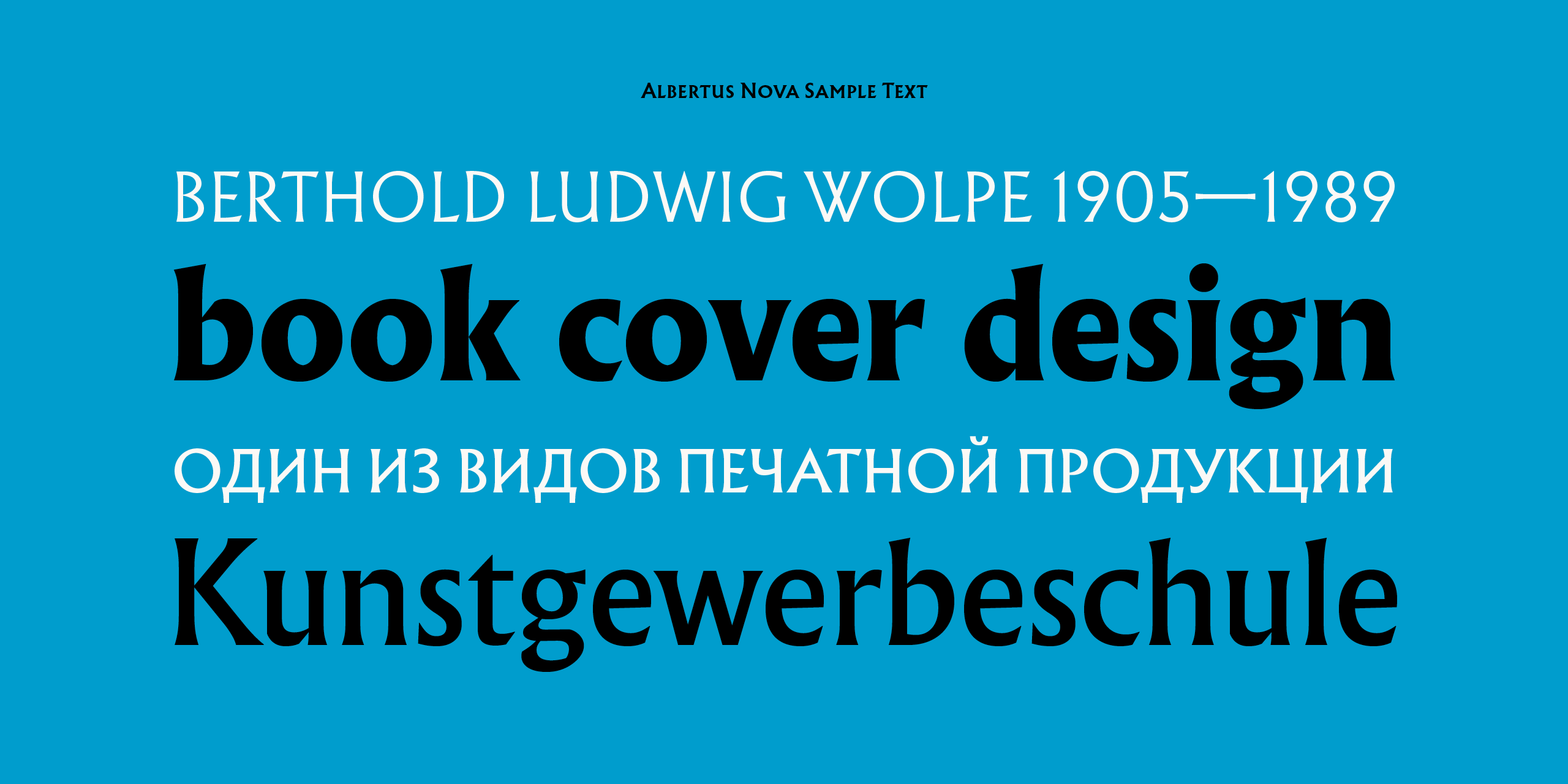
With OpenType, Omagari was able in many cases to make a choice for the main, default alphabet, but then embed alternate Wolpe renditions or new variations as alternatives. He created additional weights for several of the typefaces, and added Greek and Cyrillic to Albertus, Fanfare, and Tempest. He says that Albertus’s existing digital version—this new one is labeled Albertus Nova to avoid confusion—was in use by videogame companies. “Not a lot, but I was surprised by the number,” he says. The Greek and Cyrillic are partly to help complete localization across larger swaths of Europe, beyond the full extension of Latin glyphs.
It’s probably more accurate to call this revival a collaboration, even at the distance of about 80 years since Wolpe’s earliest designs, and 40 years from some of his late extensions and adaptations. Omagari approached the task with clear reverence, but also created cohesive extended sets that work better with current technology than previous subsets of some of these faces.
There are a lot of fun alternatives, and one of the best is almost an Easter egg—a drawing by Omagari of Wolpe in the style of Charles Mozley, an illustrator who drew pictures of Wolpe for a small tribute volume published in 1960, Wolperiana. This drawing appears in each font as the final glyph in order. Omagari’s drawing fooled Toby Wolpe, one of Berthold’s children, who thought it Mozley’s. Toby Wolpe has nice things to say about the project in a video released with the announcement (above).
In working through his research and designs, Omagari says he found that many of Wolpe’s designs thrive on differences. For instance, he says he was unable to copy and paste any details in Pegasus. “All the different shapes of ‘h’ compared to other letters—nothing matches.” He finds this an antidote to modern design tendencies. “This reminds me how unnecessarily precise and consistent we have become,” he says. “History has taught us really good lessons—like consistency is overrated.”
Monotype didn’t disclose the expense of creating these revivals, but the scope is enormous: 20 weights and styles across five distinct faces, with a massive amount of research and the creation or re-interpretation of many fonts. The company commissioned a large variety of ancillary design work to show off the face at launch. It also helped sponsor a free Wolpe exhibit at the Type Archive, the first time it’s ever been open to the public, through December 4, 2017.
The only one of Wolpe’s great faces that remains missing is Hyperion, a lilting italic face created for the Bauer foundry, and which was released in 1931. It can be found in a few books from the metal type era, and would be a great addition if the current rightsholder would be inspired by Monotype’s efforts.
Wolpe’s Fonts and Their Uses
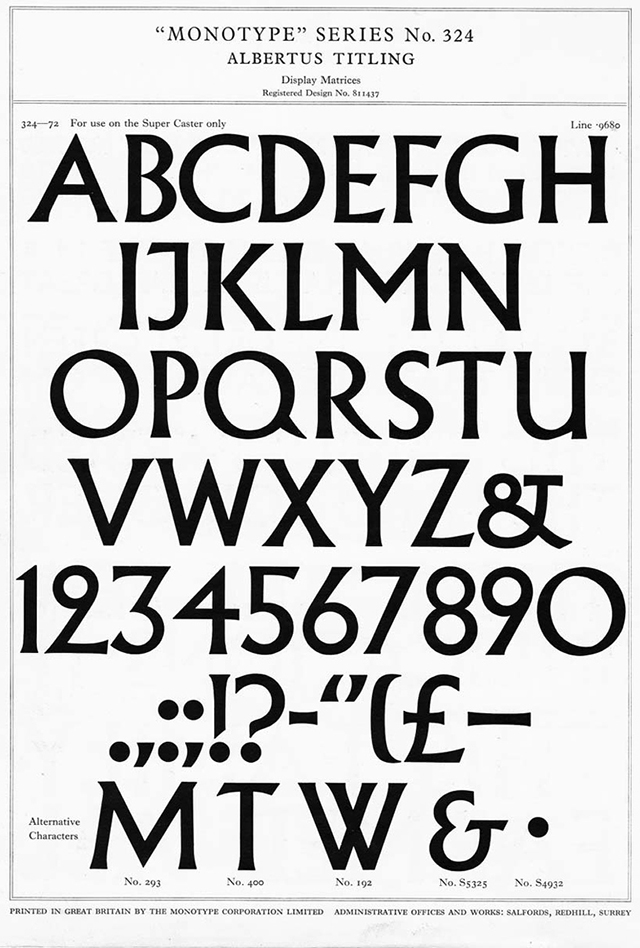
Albertus came first, originally issued in 1935 as Albertus Titling with a limited character set designed with no descenders. Rather than pure serif or semi-serif, Albertus flares slightly at its terminals. It’s derived from metal engravings Wolpe showed Monotype’s Stanley Morrison on a trip to England in 1932.
Wolpe later expanded Albertus to a full upper and lowercase with quirky elements that make it readily identifiable. The square shape of the lowercase “a” is unique, so far as I know. And while the letters work harmoniously together, they have a remarkable amount of individuality. Wolpe and others’ additions of light and bold were less successful; the italic isn’t part of this revival and is best ignored.
Albertus has been used widely since its introduction, despite at times having limited availability. It’s the typeface of the City of London (the historic core and business district of London), the ubiquitous face in 1960s The Prisoner TV series, and appears in much of the titling and ancillary material in the Lord of the Rings movies. For fans of The Prisoner, Omagari included the modified lowercase “e” in both lowercase and capital forms that the TV series created.
The digitized form of Albertus available for decades wasn’t the best translation of Wolpe’s design from metal, and has some extremely poorly rendered characters, like the lowercase “g”. Omagari notes that Albertus Light is particularly weak, although he points out that it’s a translation of a version redrawn by Wolpe in his last years. Looking side by side at Albertus and Albertus Nova is no fun: the revival is not only more true to specimen sheets I’ve seen in person and online, but it’s simply better drawn.
The Albertus available for many years at left in Light (top) and Regular; Albertus Nova Light (top) and Regular at right. Look at that g!
Albertus Nova Light arguably sits closer to the regular weight as reproduced in specimen sheets than the light that was created later by Monotype. This makes sense, with the adjustment between letterpress-era printing and current techniques. I find the thin weight a little too spindly compared to all the other weights, and the black has to stifle some of Albertus’s distinctive features.
You can use Albertus in a broad variety of ways. The stronger weights work beautifully either as titling or mixed case for headlines, book covers, and broad design elements, like in logotypes. The first thing I did with Albertus Nova was redesign the cover of a book I was in the process of updating: it’s bright and sharp, and works well at full size and in tiny thumbnails.
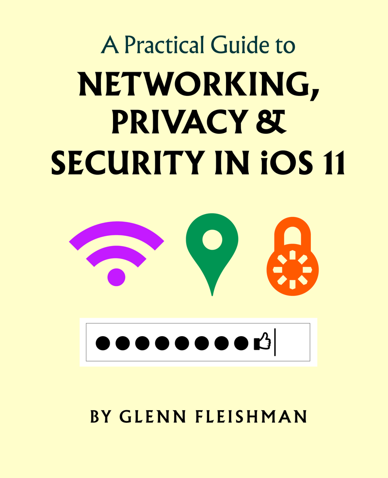
I created a new design for a book I was revising using Albertus Nova. It reads well and strongly at every size.
Albertus can be used as a text weight, but typically at 14 and above. The quirks of the lowercase case in particular can make it hard to follow for long passages. The new light weight seems to work better at very small sizes, however, than the original regular.
It’s worth exploring the alternate characters in depth, too, as Omagari has pulled in elements from Albertus Titling, such as a “2” with a closed loop that doesn’t work in general usage, but which has its place in some designs. A nifty alternate cap “A” has a crossbar on top and a divot in its internal crossbar. There’s a full set of small caps, never found in earlier versions, and numbers for fractions, too.
I joked once that half the books in an average bookstore would have covers that feature type designed by Koch or Wolpe. To test my theory, I went to the Amazon retail bookstore in Seattle and looked at several hundred covers, a task made easier as the store shelves nearly all books face out. Remarkably, I found only a single cover that used Albertus—and unfortunately relied on the italic.
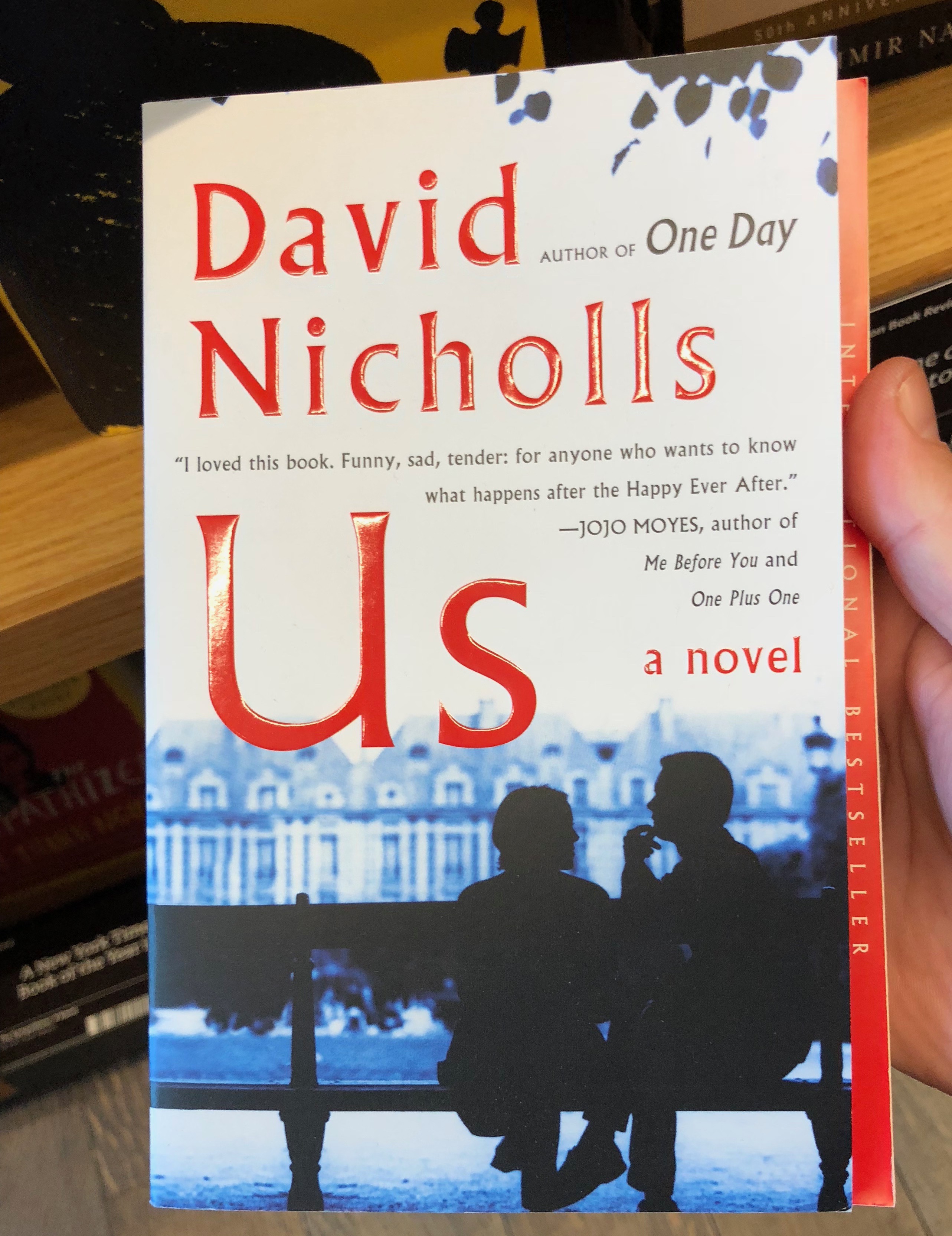
David Nicholls’s Us is the only book I found at the Amazon retail bookstore using a Wolpe or Koch face.
Fanfare was created for Fanfare Press, and Wolpe used it both there and later at Faber and Faber. Despite its age, it feels quite modern, craning forward without being an italic. It’s a titling face that comes with small caps for lowercase. Fanfare has the sense of handlettering without the preciousness of a face that tries to imitate it. It offers a feeling of variation that makes the letters dance but not swim in front of your eyes. The face wasn’t digitized previously by Monotype, so it hasn’t been overused.
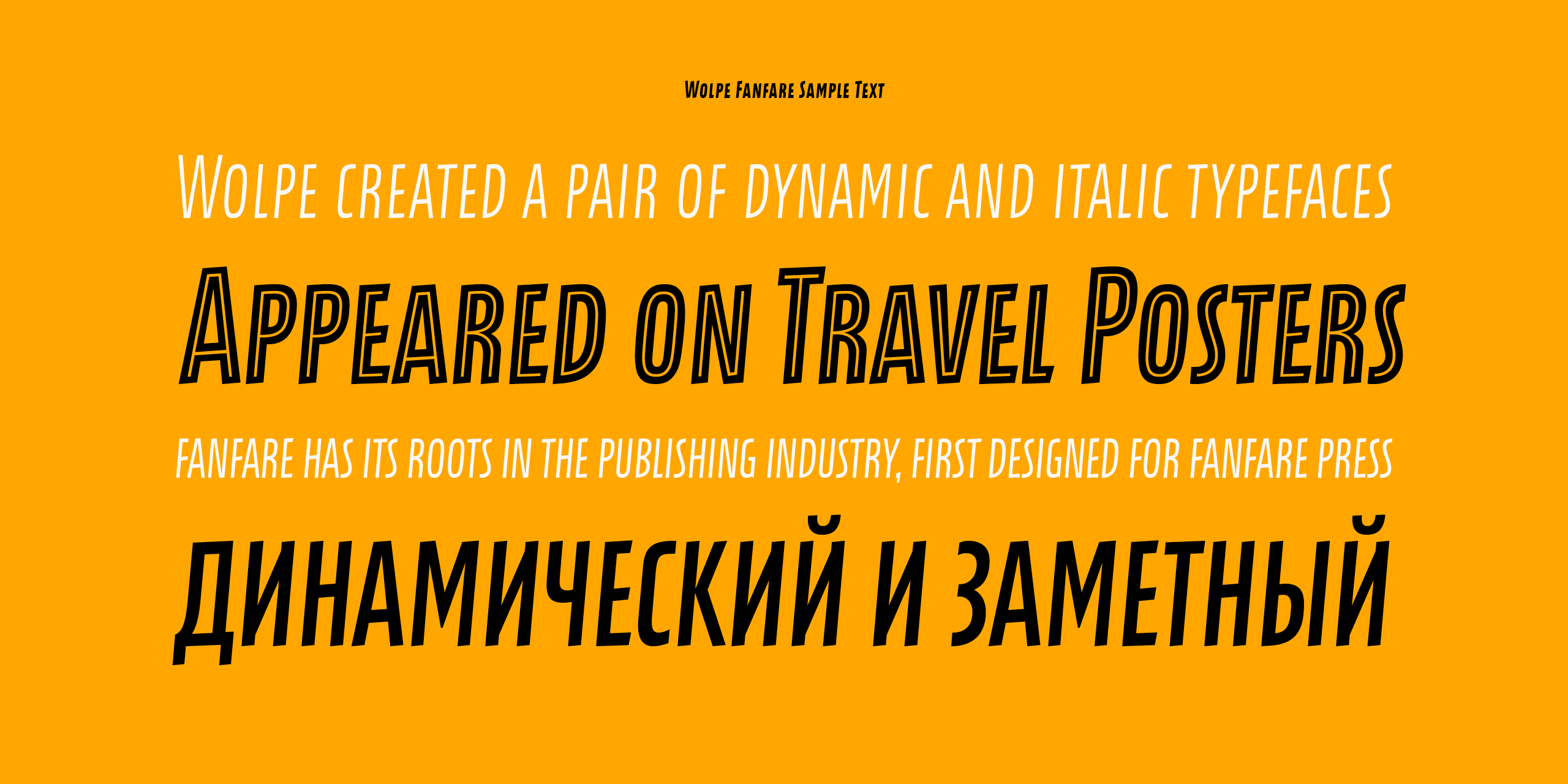
Monotype pairs the five weights of Fanfare with Fanfare Inline, which allows an overlay onto the solid versions for knocking out white or for chromatic uses.
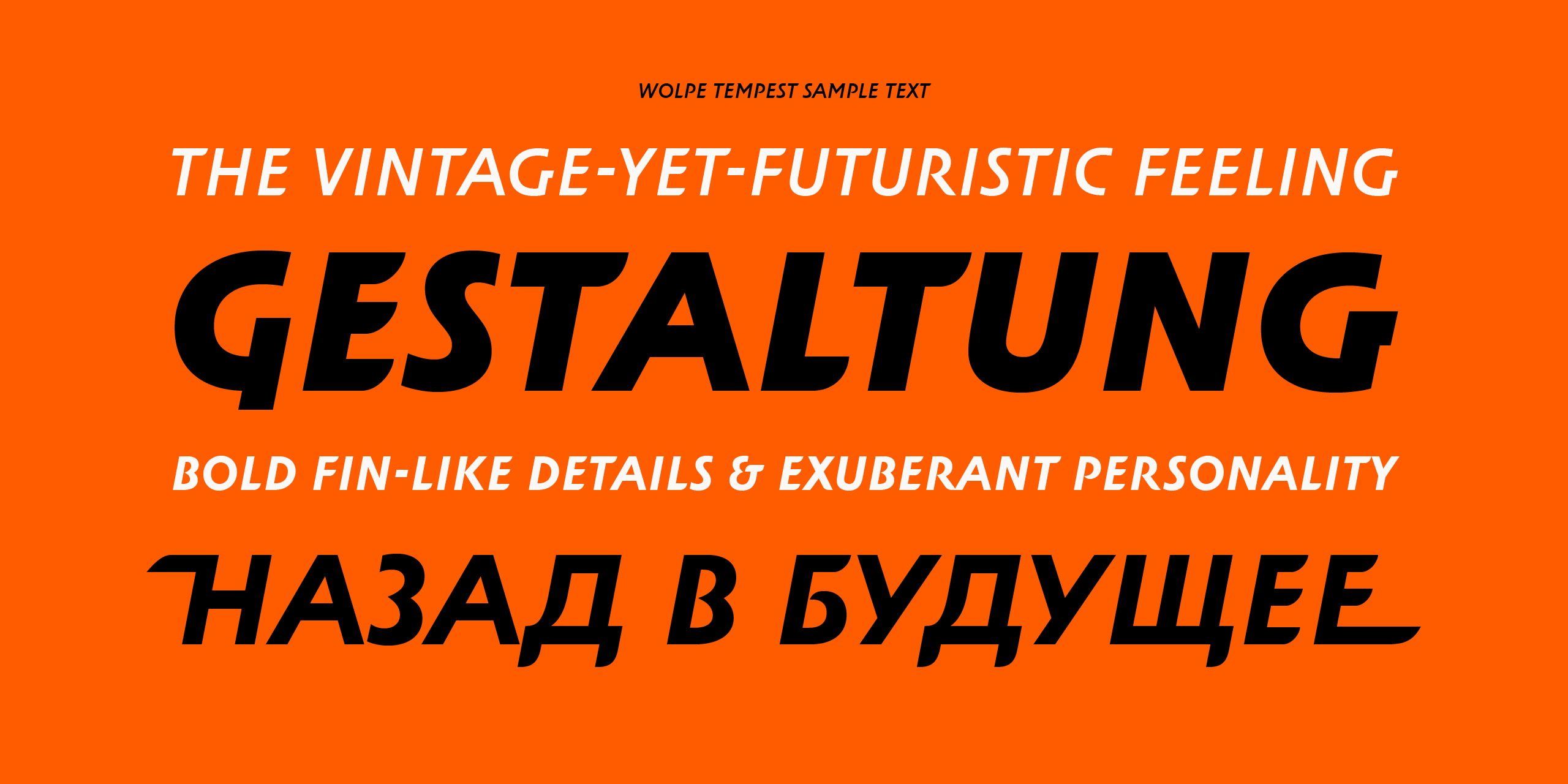
Tempest is also a titling face and lacks small caps. Like Fanfare, it feels futuristic, but the slant has an even greater sense of motion: Tempest seems like it was designed for airline posters, as the letters seems to almost have wings. A number of alternates include extended flat swashes that can create a more drawn or illustrative effect for books, posters, and billboards.
Pegasus sets well at the book weights for which it was designed. Wolpe intended it to complement Albertus, though it’s a kissing cousin rather than a family member. As with Albertus, Wolpe made a host of decisions that made the face stand out, while still being usable and readable. It never found broad use, and didn’t move from metal to the phototypesetting era.
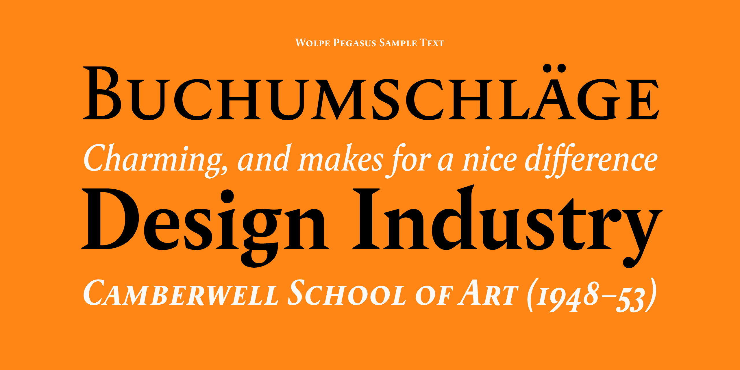
However, legendary type designer Matthew Carter worked with Wolpe on creating a filmset version that was used seemingly only for Berthold Wolpe: A Retrospective Survey, a celebration of Wolpe’s 75th birthday in 1980 with an exhibition at the Victoria and Albert Museum in London. Carter also advised Omagari on this revival, which is the first time Pegasus will be widely available in several decades and in something close to its original design intent. (If you are or want to become a Wolpe fan, I recommend the reissued 2005 edition, which is very affordable.)
Omagari says that Wolpe insisted type designers needed to draw letters at close to their actual size before making the large drawings used for reduction for matrix cutting, and he found Wolpe’s Pegasus pencil work at 14 points. He notes that Pegasus suffered from being cut much thinner than its appearance in print for ink spread, but that with modern output and printing, he was able to push the face closer to its original intent.
Finally, Sachsenwald is a bit of an odd one out, though I’m glad for its return. Gutenberg’s early work imitated manuscript scribes’ black letter (or Gothic) styles. This lettering approach broadly co-existed fonts in a Latin or Roman upright hand and humanist italics for nearly two centuries before it tapered out across Europe. But its use persisted in a variant called Fraktur in Germany. (Omagari says that the first design for Albertus lowercase was an actual blackletter.)
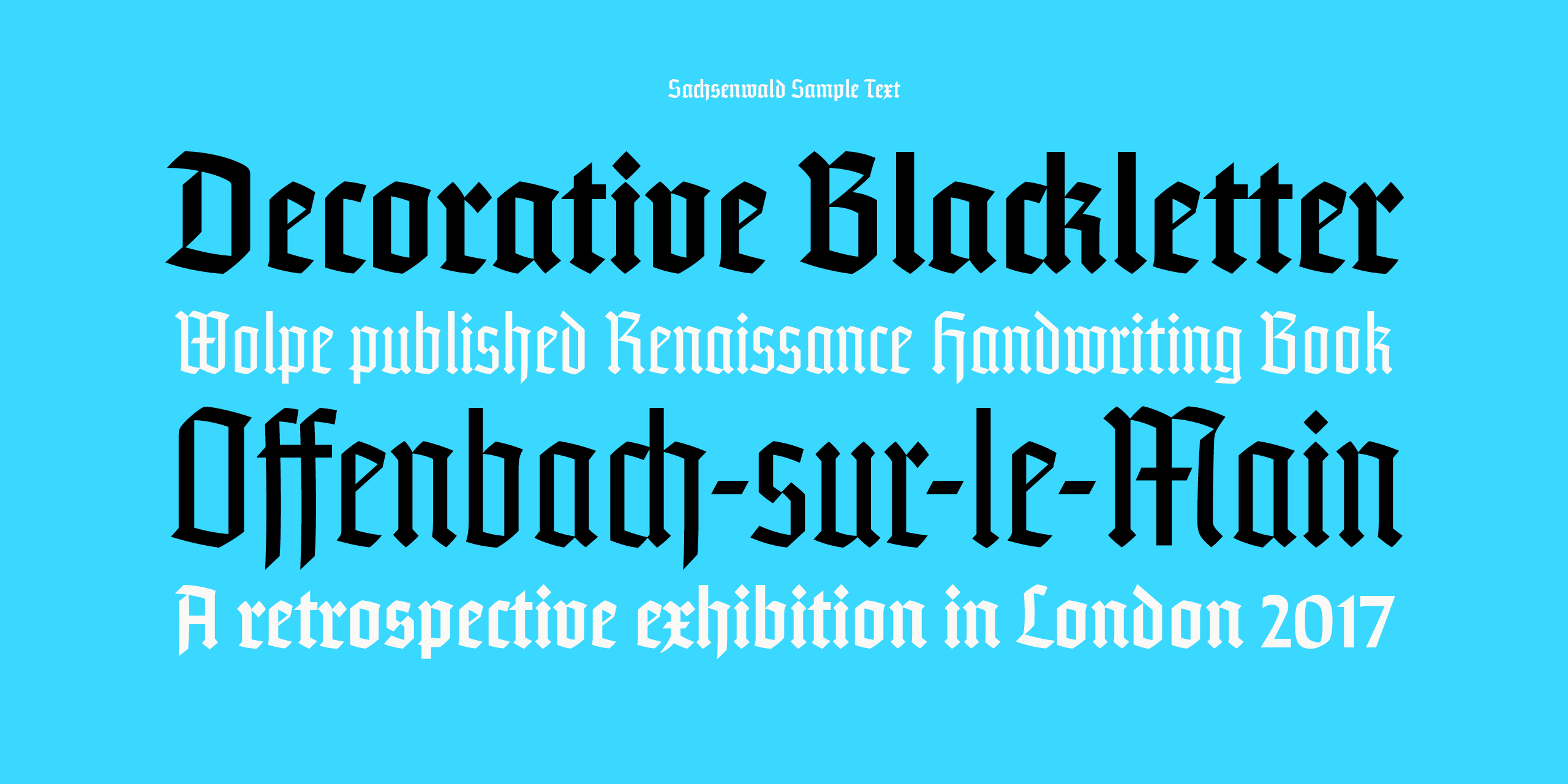
Wolpe originally began the design of Sachsenwald for a German publisher under the name Bismarck Schrift, and it fit somewhere between what we think of as an English Gothic style and Fraktur. The name may owe itself to a comment by Otto von Bismarck, a towering figure in German history, who returned books given to him that weren’t in Fraktur with the message, “I don’t read German books in Latin letters!”
However, even some Germans found Fraktur difficult to read fluently—the lowercase letters are heavy and difficult to discern among the strokes. The “k” is particularly rough. Sachsenwald has some aspects of Fraktur, but not that. (A 1937 issue of the magazine Production Manager noted of Fraktur that its “letters are distinguished one from the other by almost invisible lines. Indeed it is contended by some that a large part of the difficulty of learning the German language comes from the illegibility of the type.”)
The face was commissioned by a German publisher, and the complications of war and Wolpe’s displacement to England led that firm to abandon it. “A German publisher commissioning a British company to make a blackletter typeface” was problematic, Omagari says. However, Monotype encouraged Wolpe to take it up in England, and it was released as Sachsenwald.
The Nazi Party effectively kiboshed the acceptability of blackletter as a style, because of its early embrace of Fraktur. That led to shunning Gothic as a style, even though the Nazis reversed their opinion in January 1941, swearing it off as Jewish-influenced—possibly because Hitler intensely disliked Fraktur. However, it continued to be used in varying ways through the war.
Only two sets of matrices, the molds from which Monotype machines cast letters in hot metal, were ever sold. One set remarkably became available for casting a few years ago at the Bixler Press and Letterfoundry in New York. Tom Rickner, director of Monotype Studio, pointed me to an edition of Rubaiyat of Omar Khayyam, illustrated by Arthur Szyk and published in 1940 with tipped-in color plates by Fanfare Press, and I purchased an affordable clean copy. This title uses Albertus for capital letters and Sachsenwald for lowercase. It’s beautiful and a little strange, and one of the few historic uses.
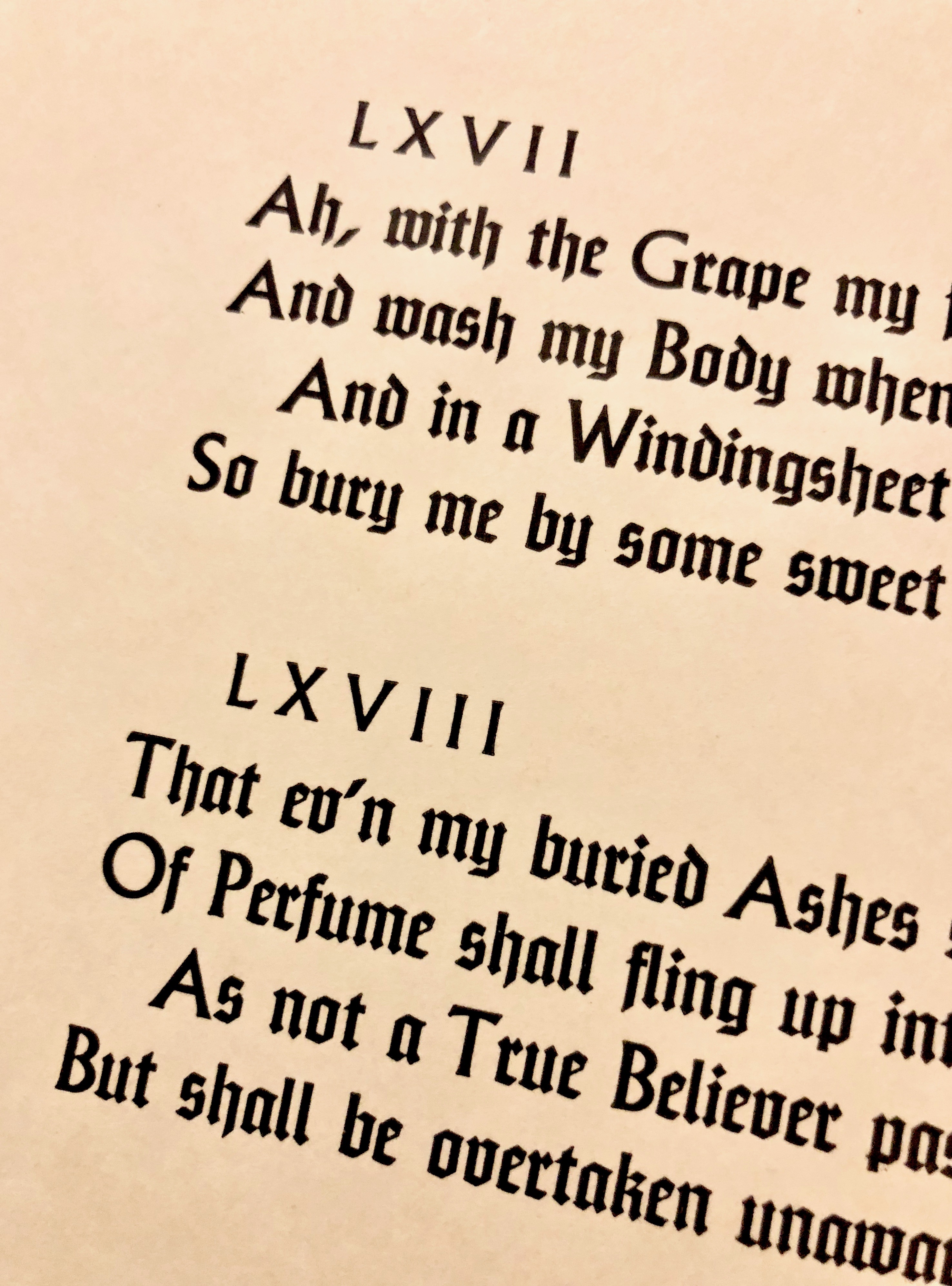
From a page of the 1940 Rubaiyat of Omar Khayyam with Albertus capitals and Sachsenwald lowercase
Sachsenwald will likely grace the covers of European history books, but its legibility and heaviness (in both weights) makes it an excellent choice for decoration. It might also find its way into official documents as a more modern feeling Gothic, despite its age.
I know that face…
I’m absurdly familiar with the until-now huge absence of Wolpe faces and the issues with the previous digital version of Albertus. In 1990, when I was an undergraduate graphic design student at Yale, my senior project was creating a digital rendition of Albertus at the urging of Roland Hoover and Greer Allen, the then-current and previous university printers. (The position was first filled by Carl Purington Rollins, a well-regarded designer and bookbinder who held it for decades, and who was close friends with type designer Bruce Rogers.)
Wolpe, who had died the year before, was a friend of Greer’s. Roland was a committed letterpress printer with his own well-outfitted shop (to my knowledge, he’s still printing at nearly 100), and who relied on Albertus and other faces in metal. I named my version Furioso, a tribute to Hoover—the name comes from Orlando Furioso, or Roland the Berserker, a little inside joke. I worked from type specimen pages and other materials in the school’s Art of the Book collection.
I put Furioso out into the world, as type designs aren’t copyrighted, and I was hoping more people would be exposed to Albertus—and I assumed Monotype would eventually create a version. It did, but like many, I felt it lacked a full attention to detail, especially around the tapering serifs. Over the next 30 years, I’ve seen Albertus many times in the wild, often on book covers and signage: sometimes it’s Furioso and sometimes it’s Albertus.
It’s a true delight to me to see Albertus reissued in a version that’s suited to modern design and reproduction needs with a full attention to its original intent, and expanded to make it more generally useful as well. That and the other expertly revived Wolpe work should make old faces new friends to many designers.
This article was last modified on November 6, 2017
This article was first published on November 6, 2017
Commenting is easier and faster when you're logged in!

Recommended for you

The Digital Art Studio: Patching Text without the Fonts
How do you fix a typo when you don’t have the correct font? After my beloved stu...
20 Desert Island Typefaces
If you could use only twenty typefaces for the rest of your life, which ones wou...

Shag, A Retro Font Family with Roots
The Shag family of fonts is a fun, nostalgic collection inspired by the work of...