

Pros: 64-bit support, fun-to-use pattern feature, significantly better performance with certain files, gradients on stroke, and better results with image tracing.
Cons: Updated user interface uses more space, making for limited real estate on lower resolution displays. Image tracing still relies on confusing settings.
Score: 99 out of 100
It’s hard to believe that 25 years ago, Adobe Illustrator came on the scene, playing a significant part in redefining the design and publishing industry. Today, Illustrator continues to be an integral part of a designer’s modern toolkit. In previous versions though, Illustrator’s underlying technology wasn’t nearly as modern, and those who rely heavily on this powerhouse vector application are familiar with trying performance and untimely crashes. With a new 64-bit architecture in version CS6, the promise of a faster and more stable version of Illustrator has summoned the interest of many. Does it live up to the hype? Let’s take a closer look.
First impressions
If you purchase Illustrator CS6 either as a part of one of Adobe’s Creative Suite packages or as a standalone application, you’ll be taken through the usual installation process. I decided to upgrade my Adobe applications via an Adobe Creative Cloud membership, so the installation process of Illustrator CS6 was virtually transparent. A single click on the install button in the Adobe Application Manager and Adobe Illustrator CS6 was being installed in the background (the application is downloaded from the Internet and then installed on your computer). A few minutes later, I was able to launch the new version of Illustrator on my desktop.
When you launch Illustrator CS6, you’re greeted with the new “dark user interface.” While it has a modern feel to it, you’re free to adjust the brightness of the interface to your liking, via a setting in Preferences. I find that when I’m working in darker environments, the dark UI blends into my environment letting me focus on my artwork. In brighter environments (like well-lit studios), using a brighter setting will probably feel more comfortable.
IMAGE 1. Illustrator CS6 features the “dark” user interface, similar to what’s in Photoshop CS6, After Effects, and Premiere Pro. Click the image for a larger version.
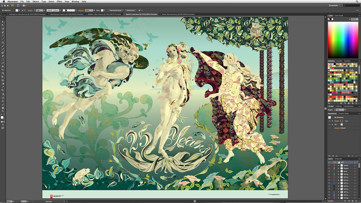
Illustrator CS6 has more than just a fresh coat of paint. Due to the 64-bit work that was done in Illustrator (more on that in a moment), Adobe had to move to a completely new user interface infrastructure, meaning that every single panel and dialog box had to be rewritten. In the process, Adobe made some improvements, such as an easier-to-navigate Preferences dialog box, a more consistent Control panel, a redesigned Color panel featuring a larger color ramp and a hexadecimal field for working with web colors, and more. While these design changes are welcome, the new user interface elements (check boxes, buttons, etc.) are a few pixels larger than in previous version, resulting in a user interface that takes up more screen real estate. Those working on lower resolution monitors may feel the crunch.
The new user interface infrastructure also supports more functionality. So you can now double-click on and edit text directly in any panel, allowing you to name things like brushes or swatches with ease. The same applies for layers, so you’re running out of excuses to name the layers in your documents. And if you select a text object on the artboard and then highlight the Font field in the Control or Character panel, you can simply tap the up and down arrow keys to cycle through your fonts while watching the text update—great for choosing that perfect typeface for the logo you’re working on.
IMAGE 2. Double-clicking on text inside of panels — such as the name of a Layer — lets you edit in context.

Perhaps more noticeable than the user interface itself, Illustrator CS6 just seems… snappy. The application responds and performs like a well-oiled machine—likely a result of all the code that was rewritten in order to make Illustrator a 64-bit application.
64-bit
Illustrator CS6 is a 64-bit application, which ultimately means that it has the ability to access and use as much RAM as you can throw at it. That’s good news for anyone who has faced those “not enough memory to complete operation” or “PDF is having difficulties” errors that have plagued Illustrator in the past. 64-bit doesn’t mean Illustrator is faster (although we’ll talk more about that shortly), but ultimately, the result is a far more stable application. If you want more information on exactly what a 64-bit version of Illustrator means for you, I wrote up some detailed information here.
Gaussian Blur
If you thought getting into an argument about how to pronounce GIF was fun, wait until you’ve observed a passionate discussion about the proper pronunciation of Gaussian Blur. It’s why my friends often refer to it simply as G-blur. Call it what you may, the Gaussian Blur effect is all-new in Illustrator CS6.
It’s used often enough, especially by those who like to create “shading layers” by applying Gaussian Blur effects to objects with different blend modes and opacity levels. The Gaussian Blur dialog box has also been updated to include a Preview option so that you can experiment with different values without having to reapply the effect ad nauseum.
A brand new Gaussian Blur effect in Illustrator offers a tremendous performance boost overall — because the effect is used within other effects. Drop Shadow, Outer Glow, and Inner Glow all use the Gaussian Blur effect to process their soft appearances. So documents that use any of these effects will see huge improvements in speed.
For example, I opened a rather complex document that used a lot of objects with various Gaussian Blurs to simulate shading. I then converted all of the Gaussian Blur effects to the new Gaussian Blur effect in CS6. Then, I compared the performance of the same file in Illustrator CS5 and Illustrator CS6. After selecting all the artwork, I scaled the artwork up in size 500% and measured the results: 21 seconds in Illustrator CS5, compared to 7 seconds in CS6. That’s a significant difference, especially if you can imagine doing that several times a day, day after day.
Patterns
Creating seamless pattern tiles in Illustrator can be fun—as fun as using the Pen tool that is. I think at some point, anyone who has spent some amount of time using Illustrator has tried to create seamless pattern fills. But the process was plagued with two main issues. First, you had no easy way to preview how your pattern tile was going to repeat—forcing you to constantly define, apply, edit, and then reapply constantly until you got it right. Secondly, the process of editing a pattern was anything but intuitive. Even if you were able to finally create your pattern, you certainly lost your creative drive to then iterate on your pattern, experimenting and ultimately improving upon it.
In stark contrast, creating seamless patterns with Illustrator CS6 is fun and easy. I found myself spending time not only creating new seamless patterns, but even taking the time to experiment with different repeating options and creative variations.
IMAGE 3. When in Pattern Definition Mode, you can adjust your artwork and various settings in the Pattern Options panel to experiment with, and perfect your seamless pattern. In this example, the artwork in the center is the original art that I created, and the dimmed copies around it are automatically generated by Illustrator to help visualize how the pattern will repeat. Click the image for a larger version.

Simply select artwork and choose Object > Pattern > Make to enter the new Pattern Definition Mode. Patterns that you create are automatically added to the Swatches panel. The best part of all? To edit an existing pattern, simply double-click the pattern swatch in the Swatches panel.
Gradient on Stroke
Every release of Illustrator has a “finally” feature. You know what I’m talking about—a feature that makes you exclaim “finally!” when you hear about it. Gradients, added back in version 5 (that’s 5, not CS5), have always been available only as a fill attribute. Designers have long expressed their desire to apply gradients as a stroke attribute as well. Over the years, gradients have seen numerous improvements, including Gradient Mesh and the ability to specify Opacity values for gradient color stops.
In Illustrator CS6, you can now apply a gradient (linear or radial) as a stroke attribute. Admittedly, at first blush, the feature seems pretty simple. Once you assign a gradient to a stroke, you can use settings in the Gradient panel to specify whether the gradient is applied within the stroke, along the stroke, or across the stroke. Then it occurs to you that in CS5, Adobe added variable widths to strokes, and your mind starts to wonder… variable widths, the appearance panel’s ability to add multiple strokes to a single object, transparency stops in gradients… oh MY —the things you can do with gradients on a stroke! Perhaps the coolest things I’ve noticed is that if you apply a gradient to a stroke and you then expand the appearance of that stroke, Illustrator generates a gradient mesh object.
Image Trace…. Third time’s a charm?
Creating vector artwork is a tedious and time-consuming task. Which is why since the advent of computer graphics, man has been on a quest for a one-click solution to convert pixel-based artwork into ready-to-use vector artwork. In the beginning, there was Adobe Streamline — a separate utility that generated artwork with so many anchor points that it was often faster to use the Pen tool to draw the art from scratch than to try manually cleaning it up (I actually credit Streamline as being the reason for why I became adept at using the Pen tool).
In Illustrator CS2, Adobe tossed Streamline to the wayside and wrote an entire new tracing engine, dubbed Live Trace. While Live Trace offered some interesting capabilities, it still was far from perfect, and getting usable results was hit or miss. Attempting to tweak the results of a Live Trace by adjusting its cryptic settings more often than not was an exercise in frustration. Image tracing is always a highly requested feature, and the fact that requests were still coming in even with Live Trace out there was indication that something else had to be done.
So for Illustrator CS6, Adobe’s engineers revisited image tracing, tossing Live Trace aside (that feature has been removed from Illustrator). Starting all over again, they developed a new feature called Image Trace, with a goal to deliver better tracing results and an improved user interface. Were they successful? Let’s take a closer look.
There’s no question that with the new underlying architecture and the new tracing algorithms, Image Trace is both faster in raw tracing time and produces better results than the older Live Trace feature.
I used three different images, simulating three different workflows, to compare the new Image Trace in CS6 with the older Live Trace feature in CS5. Let’s take a look at my findings:
IMAGE 4: The most simple of tests, I took a Photoshop image (center) that would simulate perhaps scanning and tracing a logo, using just black and white.
Using the Default preset in CS5, I got 4 paths, and 122 anchors (left). Using the Default preset in CS6, I got 4 paths, and 184 anchors (right). Click the image for a larger version.

IMAGE 5: Here I used a photo (center) to generate a stylized illustration. Using the Color 16 preset in CS5, I got 1,702 paths, 15,906 anchors, and it took 4 seconds to complete the trace (left). Using the 16 Colors preset in Illustrator CS6, I got 958 paths, 12,155 anchors, and it took 21 seconds to complete the trace (right). I was surprised to see how much longer Illustrator CS6 needed to complete the trace, although it did result in much fewer paths and anchor points. Click the image for a larger version.

IMAGE 6: Here I traced an image (center) with the hopes of achieving a photorealistic result. Using the Photo High Fidelity preset in CS5, I got 4,704 paths, 31,838 anchors, and it took 4 seconds to complete the trace (left). Using the High Fidelity Photo setting in CS6, I got 3,281 paths, 26,139 anchors, and it took 8 seconds to complete the trace (right). Click the image for a larger version.
Whereas the Live Trace feature settings in CS5 were located in a modal dialog box, the Image Trace settings are now found in a convenient panel, making it possible to easily make changes to your trace as you work. The panel can be docked and collapsed to an icon, just like others in the user interface.
There are some really nice amenities in this new panel, like a button that you can click and hold to see the original source image. When you release it, the trace result returns. This makes it really easy to compare the original pixel version to the traced vector version.
You can now also choose to trace your artwork using a method where paths slightly overlap each other — similar to how trapping works. This results in smooth transitions of color between traced objects, and no white gaps that may appear due to antialiasing. It’s also especially helpful when you need to make small tweaks to the artwork after expanding.
And yet despite all these gains, the panel is filled with many settings that are difficult to use or understand.
For example, there are six presets across the top of the panel that are depicted as buttons. Yet directly beneath these six icons is a popup menu that contains additional presets. The presets represented by the icons aren’t present in the popup menu, which seems inconsistent (unless the User Experience designers at Adobe think that making me figure out what six different icons represent is “simpler” than listing an easy-to-understand name in a popup menu). You’d think they’d have learned from the Pathfinder panel where most people just click on each button and press undo until they see the result they are looking for. Photoshop’s Adjustment panel suffers from the same iconic issues. Adobe’s user interface designers must be paid by the icon.
Not to keep harping on the User Experience team at Adobe (ok, I guess I am) — but they seem to think that if a feature has too many settings, they can make it “easier to use” by simply hiding half the settings in an “Advanced” tab. In my humble opinion, there’s nothing “Advanced” about getting the perfect tracing result. Unless of course Adobe means “Advanced” refers to the level of intelligence you need to have in order to understand the settings, in which case, they are dead on. The controls for specifying the number of paths or corners used in the trace are measured in percentages, making it nearly impossible to control precisely.
IMAGE 7. A comparison of the old Live Trace feature (left), the “simplified” version of the new Image Trace panel in CS6 (center), and the expanded version of the same panel with the Advanced features visible (right). Click the image for a larger version.

Ultimately from an ease-of-use perspective, the new Image Trace is just as bewildering to use than the old Live Trace was. In a vector application where precision is expected, the experience of tracing artwork is more like trying to predict the weather. At the same time, the results speak for themselves—tracing is faster and offers better results.
Pantone Libraries
Illustrator CS6 features a new collection of Pantone libraries, what Pantone refers to as their Plus collection (visit www.pantone.com for more information). The CS6 versions of Photoshop and InDesign also contain these updated libraries. It’s important to realize that Pantone changed some of the CMYK and RGB color definitions, so you may want to take a closer look at the colors that you use often.
Adobe also changed the default setting for how spot colors are displayed in Illustrator — they now use their LAB color definitions instead of their CMYK definitions, resulting in spot colors that appear more accurately on screen and in proofs. However, if you’re in the habit of specifying Pantone colors that will ultimately be converted to process colors for printing (CMYK), you’ll want to make sure that you choose colors from the Pantone+ CMYK libraries, and not the Pantone+ Solid libraries. Only use Solid if you will indeed be printing those colors as spot colors.
The verdict
Adobe had an opportunity to “reimagine” the user interface in Illustrator. Don’t get me wrong — its better than what we’ve had until now for sure — but it would have been really nice to see more done in consolidating and simplifying the user interface, making Illustrator more approachable. Crash-protection a la Adobe InDesign would also be nice, but maybe the new underlying architecture makes it possible for Adobe to accomplish that in the future. On that note, it’s impressive that Adobe spent the majority of resources on rebuilding the application instead of cramming in a laundry list of features that only some users would need. Illustrator CS6 answers what all users have always been asking for — a modernization and reliability.
Everything considered, the question you need to ask isn’t whether you should upgrade to Illustrator CS6 (you should), but rather, how you should upgrade to this newest version. You can either get Illustrator as a standalone license, as a part of any Adobe Creative Suite license, or with a membership to Adobe’s latest offering, Creative Cloud (how you use Illustrator in your day-to-day work will help determine which path to choose, but an in-depth analysis of each of these options is beyond the scope of this review). If you’re surprised by the 99 out of 100 score I gave in this review, try using Illustrator CS6 WITHOUT using any of the “new” features. The under-the-hood stuff is worth the price of admission alone.
This article was last modified on January 18, 2023
This article was first published on June 11, 2012
Commenting is easier and faster when you're logged in!

Recommended for you

Photoshop Pie Crust Effects
You may not be a whiz in the kitchen, but all you need is an understanding of Ph...

How to Prepare Raster Images for Use with Illustrator Brushes
In the process of testing Illustrator features released last June in the Creativ...

Photoshop Power Shortcuts on Adobe TV
After the conclusion of the Adobe MAX conference in May, I posted a news item ab...