Regarding Transparency
The essential guide to getting the best results with blending, opacity, and effects in InDesign

This article appears in Issue 141 of InDesign Magazine.
Transparency in Adobe Illustrator, InDesign, and Acrobat is defined as anything that isn’t fully opaque—so it includes objects with a partial opacity, translucent feathered edges on images placed in InDesign or Illustrator, blending modes other than Normal, as well as drop shadows and other effects. It’s incredibly easy to create transparency effects in InDesign, but that wasn’t always the case. And even though it’s easy, it doesn’t mean it’s a no-brainer. In fact, transparency effects can end up being a terrible headache if you don’t know what you’re doing. Fortunately, I’m going to set you up with everything you need to know to use transparency in InDesign.
Transparency—The Early Years
Sometimes understanding a little history can help explain why things work the way they do.
As with so many landmark events, I remember exactly where I was when I first saw InDesign 2.0. I was already besotted with the program, so I was thrilled to attend a private Adobe session at MacWorld San Francisco. I was excited by the introduction of tables, and thought the Paragraph Composer was a lovely addition. But then the presenter pulled the big ace out of his sleeve: He showed a native Photoshop image of a Volkswagen Beetle with a translucent window being placed in an InDesign layout. You could see the underlying page content showing through the window, and the audience gasped in admiration. As a longtime cynical prepress wonk, I grumbled, “too bad that will never RIP1!”
1 RIP: Raster Image Processor. The software + hardware combination that converts your lovely page layout information to a language that a printing device understands. Also used as a verb. And sometimes profanity.
It turned out that I was right… and wrong.
Early difficulties
First, a little history for context: The dawn of desktop publishing was born of the alignment of early Macintosh computers, Aldus PageMaker, the Apple LaserWriter, and Adobe’s PostScript imaging language. PostScript allowed the computer to communicate with the LaserWriter, and artists could now set their own type, create vector content, design entire pages, and submit finished artwork directly to a print service provider. Yes, it was Ancient Times. But at the time, it was cutting edge compared to setting copy with Letraset rub-off lettering and pasting hand-drawn artwork to pieces of white drawing board. I’m surprised we survived. (Yeah, this is the “you-kids-don’t-know-how-good-you-have-it-we-had-to-paste-up-barefoot-in-the-snow” speech.)
While PostScript was the magical translator that worked in hundreds of commonly used devices, such as desktop printers and film imagesetters, it didn’t understand transparency at all. To PostScript, everything was opaque; objects always covered up and hid objects below them.
To support transparency at the turn of the millennium, Adobe had to adopt a new PDF-based imaging model in Illustrator and InDesign. Geeky but interesting note: Illustrator 9 had transparency a few weeks before it manifested in InDesign 2.0, and that opened a huge can of worms in both applications. Designers quickly became enamored of translucency, blending modes, and drop shadows, and suddenly every job had see-through text, soft-edged native Photoshop images, and tons of drop shadows.
However, while these effects were attractive on designers’ monitors, they were initially a nightmare for print service providers, whose imaging devices all spoke only PostScript; they didn’t know how to process all this newfangled stuff. As you can imagine, this created a hostile standoff between printers and designers. However, printers soon discovered that changing a few settings in their RIPs or updating RIP software usually enabled them to successfully image this fancy new kind of content. The panic subsided, there was happiness in all the land, and drop shadows everywhere—until digital printing came on the scene.
Digital printing issues
The RIPs for digital printing devices seem to do an odd job (no, not the Bond villain) of interpreting transparent content. Some desktop PostScript printers also behave this way; my old Xerox ColorQube 8580 is a good test bed for this phenomenon. In the example in Figure 1, digital output results in what we laughingly named the Yucky Discolored Box (YDB) on
InDesignSecrets.com. Funny name aside, it’s no laughing matter when it’s your print job.

Figure 1. The drop shadow behind the moth, created in InDesign, is falling on a spot color, PANTONE 874 (gold). Processed through a conventional RIP (left), it renders correctly. But the RIP for a digital press or desktop laser printer (right) treats the area as an image, and color manages it differently from the vector content of the underlying spot color frame.
Where is that box coming from? Figure 2, gives you an idea; the area of the moth image that overlaps the gold rectangle is actually sort of a “sandwich” created in the print stream to make it digestible by PostScript devices. Although this arrangement is a perfectly fine way of rendering the content, some RIPs insist on treating the content as if it’s made up of two different kinds of material. While this example involves a spot color background, the same YDB Syndrome can also manifest in process color content.
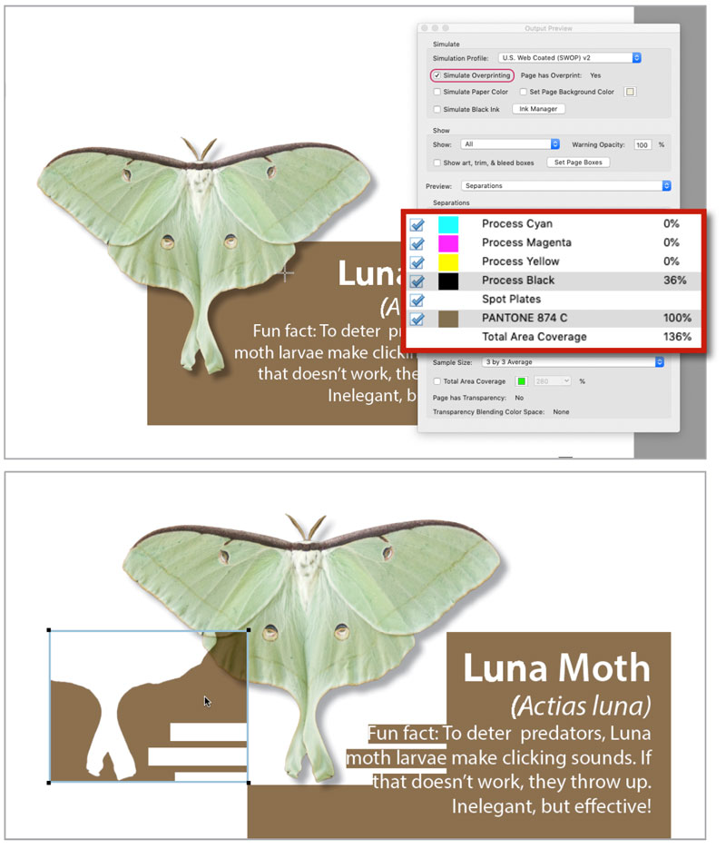
Figure 2. I exported this PDF with the PDF/X-1a setting, which flattens transparency for older devices. The cursor sampling the shadow + gold area shows a value of 36% black, 100% PANTONE 874 gold (top), which is what you’d expect. But the deconstructed file reveals a weird sandwich, with a separate spot gold shape overprinting the shadow (bottom). Strange, but it’s what older devices understand.
The underlying cause of Yucky Discolored Box Syndrome is that some RIPs color manage raster and vector art differently, and they see the transparent area (the shadow in the moth file) as an image, needing to be treated differently from the adjacent vector content (the gold rectangle). The print service provider may be able to control this with color management settings in the RIP.
The fix for YDB varies according to device, but the first thing to try for home proofing on a laser printer is to turn on the Simulate Overprint option in the Output area of the Print dialog box. Note that this will convert any spot to process in the print stream. But of course most digital presses and printers don’t have dedicated “real” spot colors, so it’s likely that your spot content was going to get converted anyway.
Note: If you’re exporting to PDF, in order to invoke the Simulate Overprint option, you have to set the Acrobat compatibility to 4.0. (More about Acrobat compatibility later.)
Misleading Displays in InDesign and Illustrator
You would think that your design software would not mislead you as you design. I have bad news: If you use blending modes with spot colors, both InDesign and Illustrator lie to you.
In Figure 3, an Illustrator file with art using three spot colors looks just fine on the monitor in the default normal view (left). But that’s a lie—turning on View > Overprint Preview tells the true tale (right). The printed piece would not look at all as the designer envisioned, leading to heartache at the proofing stage or (even worse) at the press check. Why is this? I’m guessing it’s done in the interest of performance, because Overprint Preview takes a bit more processing power to render.

Figure 3. Be wary of using some blending modes with spot colors in Illustrator. Here, I used the Hue blending mode on three spot-color leaves. In Normal display (left), the overlapping areas look nifty. But Overprint Preview (right) tells the truth; this is how it would print, because the spots can’t intermix this way.
Now, how could you achieve the desired look with spot colors? Sometimes it’s not hard; if you’re using the Multiply blend mode, use plain old Overprint instead. Select the objects, and in the Attributes panel turn on Overprint Fill. Your normal view will be closer to realistic (Figure 4), without having to use Overprint Preview, and the job will print sort of as you expected.

Figure 4. Using the Overprint Attribute in Illustrator rather than Multiply blend mode allows the Normal view to be a little better (left). However, turning on Overprint Preview tells the full story (right).
For more exotic blend modes, such as Exclusion or Difference, there is no easy answer if you insist on using spot colors; you just can’t get there from here. Beyond being subject to misleading appearances when viewed in Normal mode (Figure 5), these blending modes result in CMYK content—and that’s not viable on a job that’s supposed to print solely in spot colors.
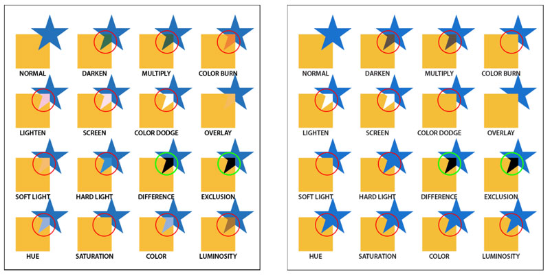
Figure 5. Spot color objects in Illustrator blending modes as they appear in Normal view (left). You’ll notice some differences when the objects are viewed with Overprint Preview on (right). Also, the areas indicated in green circles will not be spot at all; they’ll be rendered in CMYK. This is not what you want on a spot color job.
How about InDesign? Well, it’s a lying dog, too. Unless you activate Overprint Preview, InDesign misrepresents blending modes, whether they are being used in native InDesign objects or imported artwork (Figure 6).
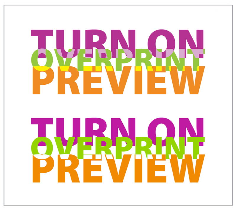
Figure 6. InDesign’s normal display will lie to you, too. All three lines of text use spot colors. The word overprint uses the Luminosity blending mode, while preview uses the Lighten blending mode. In Normal display (top), the designer might like the effect. But turn on Overprint Preview (bottom), and you see how it will actually print. Oops!
Differences in Imaging Models Between Adobe Applications
You would think that Photoshop, Illustrator, and InDesign, all being Adobe products and part of the same Creative Cloud, would think the same way. In many ways they do—but not when it comes to transparency blending modes. Spoiler alert: Illustrator, InDesign, and Acrobat treat blending modes the same, but Photoshop plays the game a bit differently. You’ll most often encounter the shortfall when you’re dealing with drop shadows.
Within Photoshop, shadows set to Multiply interact correctly with underlying content, darkening it realistically. But once you save your Photoshop document, Multiply blend (and other blend modes) that appear on top of a transparent background won’t be honored by InDesign or Illustrator. Illustrator, however, plays nice—its blending mode attributes are understood by InDesign. In Figure 7, you can see how the Illustrator shadow and InDesign’s own shadow multiply correctly with the underlying color in an InDesign layout. But the Photoshop shadow is opaque in InDesign, and knocks out what’s underneath; its blending mode attribute is ignored and treated as if it were set to Normal mode. Note: These are CMYK images, with a 40% black shadow. If you create an RGB shadow or four-color shadow, the faded shadow effect won’t be as obvious. But for print, it’s best to make shadows K only to prevent any color shift on press.

Figure 7. Left: Placed Illustrator file. Shadow created in Illustrator and set to Multiply. Center: Placed Photoshop image. Shadow created in Photoshop and set to Multiply. Right: Placed Photoshop image. Shadow created in InDesign and set to Multiply.
There are two ways to combat this issue. If the object just needs a drop shadow (i.e., concentric to the object’s edge), don’t create it in Photoshop; just place the image in InDesign and create the shadow with InDesign’s effects.
But if you need a realistic cast shadow (or some other transparency effect that requires a blend mode against a transparent background), you’ll have to do a little extra work. Fortunately, InDesign has the chops to accomplish this. Here’s how to make a Shadow Sandwich in InDesign (it looks complex, but it isn’t):
In Photoshop, put the cast shadow on a separate layer. Unless you’re going to composite the image with another image, don’t bother to set the shadow layer to Multiply (Figure 8). Tip: Name your layers sensibly so they’ll be easy to recognize when you get to InDesign.

Figure 8. This is a cast shadow (as opposed to a concentric drop shadow). In this layered Photoshop image, the lenses and shadow layers are set to Multiply, which would allow the sunglasses to fall realistically on underlying content in Photoshop. But you’ll need some help from Object Layer Options to accomplish the correct result in InDesign.
Place the file in InDesign, and scale and position it. At first, the image will have an opaque white background, but don’t panic.
Copy the frame to the Clipboard.
Select the remaining frame, and go to Object > Object Layer Options. Turn off the layers that will be opaque; in the sunglasses image in the illustration, that will be the layer named “frames.”
In the Effects panel, set the frame’s blending mode to Multiply. Deselect the frame.
Bring back the copied frame by choosing Edit > Paste in Place.
Again, invoke Object Layer Options. This time, turn off the layers that needed to multiply. In the Sunglasses image, that would be the “lenses” and “shadow” layers. Leave this pasted frame’s blending mode to the default, Normal.
Group the two frames of the Shadow Sandwich together in case you need to move or scale the conglomeration. For the final result, see Figure 9.

Figure 9. Building the Shadow Sandwich. Initially the image background is opaque (left), but don’t freak out. Copy the frame to the Clipboard. Using Object Layer Options, just turn on the layers that multiply (center); use Effects to set the frame to Multiply. Use Paste in Place to bring back the copied frame, and turn off all the layers that needed to multiply, leaving the opaque frame parts (right). Pretty cool, huh?
The result—a group with two versions of the same image file—replicates the appearance in Photoshop, but allows the bottom layer to have a different transparency blend mode.
The problem of Simulate Overprint
I need to talk about a feature in InDesign called Simulate Overprint, which shows up in several places, including the Print and Export PDF dialog boxes. It sounds a lot like Overprint Preview, and so you might think it means “make my output more accurate.” Ironically, in some cases that’s true, but you generally want to avoid it. In Figure 10, you see how the InDesign document looks in Normal view (yeah, I know it’s ugly; I’m not a designer—I’m a mechanic). Notice how differently it appears in Overprint Preview. You already know this, but I’m laying the groundwork for examples of the appearance in exported PDFs and Publish Online projects. Bear with me.

Figure 10. Normal view InDesign (left) versus Overprint Preview (right). The flower looks similar in both views, but the leaves are radically different.
If you export a PDF that’s compatible with Acrobat 4 (which means your transparency effects will be flattened; more on that in a minute), you have the option to invoke the Simulate Overprint feature. You would think that this would ensure that your fancy transparent content would render as it appears in Overprint Preview in InDesign. However, as you can see in Figure 11, when viewed in Acrobat, a PDF created with Simulate Overprint looks a bit different from InDesign’s Overprint view. And worse, it has also converted all spot color content to CMYK process colors. That can be a big problem.

Figure 11. PDF created with Simulate Overprint, viewed in Acrobat. Note that the Simulate Overprint option converts spots to process.
Taking it Online
Going beyond print or PDF, what happens to your fun blending modes if you export to Adobe’s Publish Online or fixed layout EPUB? These are based on HTML rather than PDF or PostScript, so colors are going to interact differently. As you can see in Figure 12, there are some changes between the final result and InDesign’s Overprint Preview display, but it still looks pretty cool. At least when you export to Publish Online, you can immediately view the finished product and know what your audience will see, rather than finding out at the proofing—or worse, printing—stage.

Figure 12. Exported and viewed in Publish Online
Many of the previous examples show you the misleading results of using blending modes with spot color content—in all cases, the output is not what you are led to believe by viewing your work in Normal view mode. What can you do? You have two options: Either accept the disappointing, realistic verdict of Overprint Preview, or you can—gasp—convert all your spots to process. Then, your Normal view tells the truth, as does Overprint Preview. You’ll have to sacrifice the vibrance of some spot colors, such as fluorescent colors or bright oranges and greens. But you’ll know what you’re getting. It’s a hard bargain, I know.
What Is Flattening?
You may have heard the terms flattened transparency and live transparency. What do these terms mean?
In the beginning of this article, I mentioned that PostScript devices don’t understand transparency. Consequently, to prepare fancy-schmancy transparent content for those devices, we have to render that content into a flattened form that PostScript devices understand. Essentially, flattening is the process of dividing artwork into vector and raster regions which, when combined, replicate the look of the fancy transparent effects by stitching together a bunch of opaque pieces in a sort of quilt. The flattening happens only in the outgoing print stream, or during the PDF creation process; your original art in InDesign or Illustrator is not affected.
The opposite of flattening is called live transparency. In this workflow, your content is processed in its native form by modern devices, without the need for creating opaque representations.
To flatten—or not
If you choose File > Print and send to your desktop laser printer, flattening will occur, period—well, assuming it’s a PostScript printer. That’s because you’re generating an outgoing PostScript stream, and PostScript doesn’t speak transparency. If you’re really old school (by which I mean primitive), generating PostScript and then using Acrobat Distiller to create a PDF, you’re also flattening everything, for the same reason. (I know people used to perform this method to create a somewhat smaller PDF, but we’re no longer using dial-up modems and floppy disks, so please tell me nobody does this any more, okay?)
However, if you’re exporting a PDF to send to a print service provider, you can choose whether or not to flatten, based on the printer’s specifications (assuming your printer is enlightened enough to provide specs). As print workflows have become more enlightened, flattening as part of PDF export is not required as frequently as it once was.
If your printer doesn’t give you specs for PDFs, here’s what you need to know about whether flattening will occur: If you choose Acrobat 5.0 or later compatibility in the export dialog, no flattening occurs. If, however, you choose Acrobat 4.0 compatibility, flattening does occur. The short story is that Acrobat 5.0 and later support the newer imaging model and live transparency. Acrobat 4.0 thinks in PostScript, and doesn’t understand transparency, so the fancy content must be pre-digested via flattening.
These days, virtually every modern high-end imaging device uses a RIP that understands native PDF files, bypassing the need to convert to PostScript. So unless you’re sending to some printer who’s still living in the Dark Ages and running some obsolete, coal-powered RIP, you should be safe sending PDFs created with the PDF/X-4: 2008 setting (File > Adobe PDF Presets > PDF/X-4: 2008). This is in keeping with Acrobat 7 compatibility, keeps transparency unflattened, and maintains the color model of all content (RGB content, grayscale, spot and CMYK remain unchanged). Any setting that generates a PDF compatible with Acrobat 5.0 or newer will avoid flattening.
If you are dealing with a printer who still lives in a cave and hand-cranks his press, you’ll have to go lowest common denominator, and use the PDF/X-1a setting. This is compatible with old-?fashioned Acrobat 4.0, flattens transparency, and converts all RGB content to CMYK based on the conversion space you designate in the PDF export dialog. Spot color and grayscale content are not changed.
Transparency Flattener recipes
Unfortunately, there are still times you’ll need to adhere to a PDF spec that sticks to Acrobat 4.0 compatibility—for example, some companies still want PDF/X-1a for advertising submissions. In this case, you should understand the options that govern how the flattening process treats text and vector elements that interact with transparent objects.
You can choose from three flattener presets: Low, Medium, and High. To create a custom setting, choose Edit > Transparency Flattener Presets, and click Edit (Figure 13). My suggestion? Just use the High Resolution setting and forget the others. The Low and Medium options create low-resolution images that just aren’t suitable for printing.

Figure 13. Creating a Transparency Flattener preset
Flattener Preview
One of the big questions when flattening a document is “what is going to be affected?” Fortunately, Adobe has an answer: Choose Window > Output > Flattener Preview to experiment with settings, so you can anticipate how your output will be handled.
In the Flattener Preview panel (Figure 14) you will find these options:
Rasterized Complex Regions: Highlights rasterized areas, based on the Rasters/Vectors slider. To minimize stitching artifacts, choose Clip Complex Regions.
Transparent Objects: As the name implies, this highlights every object that has transparency (including images with alpha channels), areas using blending modes, and artwork with opacity masks (Illustrator).
All Affected Objects: Highlights all objects that are involved in transparency, including objects that are overlapped by transparency. This tells you what the flattening process will affect—strokes or patterns may be expanded, parts may be rasterized, etc.
Affected Linked EPS Files: (Illustrator only) Highlights all linked EPS files that are affected by transparency.
Affected Graphics: (InDesign only) Highlights all placed content involving transparency effects.
Expanded Patterns: (Illustrator and Acrobat) Highlights all patterns that will be expanded during flattening.
Outlined Strokes: Highlights all strokes involving transparency that may be automatically outlined, or outlined if Convert All Strokes To Outlines is selected in the Flattening settings.
Outlined Text: (Illustrator and InDesign) Highlights all text that will be outlined (either automatically or because Convert All Text To Outlines is selected). Note: Flattener Preview doesn’t show the thickening of strokes and text; you’ll only see that in final output or when previewing in Acrobat with Smooth Line Art turned off. This is because “hinting,” which enables smooth display and printing of text, is lost when text is outlined. In sans serif fonts, lowercase Ls and uppercase Is (that’s i) will appear thicker than they should be.
Raster-Fill Text And Strokes: (InDesign only) Highlights text and strokes that will have raster fills after flattening.
All Rasterized Regions: (Illustrator and InDesign) Highlights objects and overlaps that will be rasterized. The overlapping areas of two transparent gradients are always rasterized. This also shows images involved in transparency, as well as effects such as drop shadows and feathered edges.

Figure 14. In the Flattener Preview panel, choose which areas you’d like to highlight, based on the Flattener preset you’ve selected.
Figure 15, shows what you’ll see if you choose the Medium Resolution flattener setting and ask the Flattener Preview to highlight Raster Fill Text And Strokes. You’ll see that a bunch of text is being affected; on older RIPs, this can sometimes cause text to become slightly bolder. The only good solution in that case is to put the text frame on a layer higher than the image (so it’s no longer affected by the transparency). Fortunately, you generally don’t have to worry about that if you’re sending a PDF with live transparency to a printer (such as PDF/X-4).
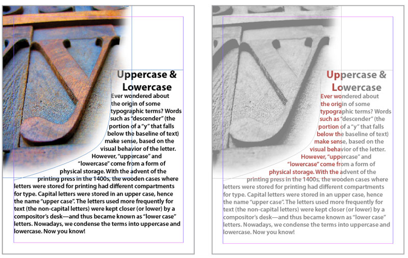
Figure 15. The feathered edge of the wooden type image overlaps a portion of the text. In the Transparency Flattener Preview panel, you can preview the result if the outgoing PDF invokes flattening using the Medium Resolution setting: Some of the text will become raster content with a vector edge (sort of like a vector layer mask in Photoshop).
In Acrobat, it can be interesting to dissect a flattened file. Open the Print Production toolset, select an element, then right-click and choose an option. In Figure 16, you can see that I selected a clump of text that fell under the soft edge of the wooden type image. I right-clicked and chose Delete Clip, which deleted the text outline (which had been functioning as a clipping path), leaving only the disembodied image patch.

Figure 16. It looks like text, but it’s really a clipping path shaped like text, masking a little patch of image. Genius.
Argh! White Lines in my PDF!
Have you ever seen thin white lines criss-crossing your PDF? It can be alarming. You’ll see these when you’ve exported to a PDF with Acrobat 4.0 compatibility (and thus flattened any transparency). Relax—they’re not really there, I swear. Find comfort in Figure 17. Good news: The white lines are imaginary.

Figure 17. Top: Oh, no! Deadly white lines! Bottom: Turn off Smooth Line Art in Acrobat Preferences to fix the illusion.
The imaginary white lines are just the boundaries between areas created during flattening; there really is no gap between the areas. But Acrobat presumes to soften the edges of those areas by anti-aliasing them, leading to the illusion of a gap. In Acrobat preferences, under Page Display you can turn off Smooth Line Art, and the anti-aliasing is disabled. However, a side effect of this change is to make your vector art look crunchy. Guess what—that’s imaginary, too.
So you have to decide which imaginary display artifact annoys you the most: imaginary white lines, or imaginary vector crunchiness. Just know that whatever you decide, these are just display artifacts: They don’t print. Good luck convincing your panicked client of this, though. In the interest of client sanity, create a PDF that’s compatible with Acrobat 5.0 or later to send to your client and they won’t see these artifacts. Then, if your print service provider requires an Acrobat 4.0-compatible PDF, generate a PDF just for their use. Your client will be none the wiser.
Conclusion
This seems like a complex patchwork of content (and it is), but it’s what makes sense to a device that speaks only PostScript. However, many newer workflows use a more modern approach, using RIPs that can easily handle native, unflattened transparency to digest content, such as Adobe’s PDF Print Engine.
A final thought: Don’t be afraid to use transparency—just be aware of the discrepancies between Normal views and Overprint views and always check before finalizing your design. Double-check in Acrobat to be sure. And communicate with your print service provider as you begin to create complex jobs chock full of transparency; they can guide you to the best way to prepare your job. Transparency effects are fun, as long as you know what you’re doing and can be assured to get the result you want!
Commenting is easier and faster when you're logged in!
Recommended for you

Easy SOQ Compliance
Learn the process for crafting winning proposals that conform to strict requirem...

InDesign Magazine Issue 74: Flipbooks
We’re happy to announce that InDesign Magazine Issue 74 (June, 2015) is now avai...
Designing with Gradients
Techniques for enhancing your page designs with attractive color blends.


