QuarkXPress How-To: Transform Text into Art

Previously, many of us have shied away from trying to be crafty with text in QuarkXPress, but maybe it’s time to break out of that mindset. With QuarkXPress’ improved ability to export PDFs, we now have more leeway to experiment with text, and those previous prepress issues that fonts used to cause are slowly becoming a thing of the past. Believe it or not, you can create some really nice text effects right in QuarkXPress, as shown in Figure 1.
 Figure 1: Creating a marriage of text and QuarkXPress-drawn items can produce pleasing results.
A Real Eye-Opener
In this article, we’ll show you how to create several text effects using various techniques. In doing so, you’ll discover the power of several QuarkXPress functions, many of which you’ve probably only used on objects. With each technique, you’ll begin to see how versatile text is and how you can use it to graphically enhance the pages of your documents.
Making Waves
To create the wavy text shown in Figure 1, we started by running text along a custom path. The technique is simple. First, select the Bézier Text-Path tool and draw a wavy line. Click and drag the tool to create smooth points. Then select the Content tool and type your text. Format the text and apply the Superscript type style to raise the text up and off the path. Lastly, format the path with Line attributes.
Manipulating Dingbats
To create the circle of stars shown in Figure 1, we flowed a dingbat character around a circle. To do the same, select the Oval Text Box tool and, while holding down the [shift] key, draw a circle. Next, choose Item > Shape and select the last item on the pop-up menu to convert the shape to a Bézier line. Now select the Content tool and then a symbol font, such as Zapf Dingbats. Lastly, choose a specific dingbat character and type it repeatedly until the circumference of the circle is filled. You may need to adjust the character’s text attributes to fill the space evenly.
Tip: To help pick a dingbat character, use the Key Caps utility under the Apple menu or Character Map in StartProgramsAccessoriesSystem Tools in Windows.
We created the fireworks in Figure 1 using a combination of the previous two techniques. We drew a spiral path with the Freehand Text-Path tool, typed a star-shaped dingbat character along the path, and then applied color.
Tip: Another trick is to use dingbat characters as clip art. Simply highlight a dingbat font character you’ve typed on the page and choose the Text To Box command to convert it to a path. Then fill the shape with color, place an outline around the graphic, whatever you prefer. Finally, resize the shape the same way you do other resolution-independent objects.
A Moment of Reflection
Not every day is a holiday, but every day is a good day for spicing up your layouts with another text effect! To create the effect shown in Figure 2, begin by typing a word in a text box and formatting it. Make sure to change the item’s runaround to None. Next, select the word with the Item tool and use the Step And Repeat command to create a copy of the word directly over the original. Now choose Item > Modify, select the Flip Vertical check box on the Text tab in the Modify dialog box, and then click OK. Use the arrow keys to nudge the text copy up or down, so it sits just below the original.
Highlight the text copy with the Content tool, hold down the [option] key ([Alt] key in Windows) and choose Style > Text To Box to convert the text copy to letterforms. Select the letterforms with the Item tool and apply a 90-degree linear blend, making the first color fade into the background.
Lastly, with the converted text still selected, choose Item > Modify, click on the Box tab, and enter 15 in the Skew text box. Then click OK. If necessary, realign the converted text so it sits directly below the original text.
 Figure 2: An interesting text effect is a reflection on you.
Tip: Want to have even more fun with your text? Twister XT from Jintek is a free, that’s right, free XTension for the Mac that lets you distort text and create various effects even wilder than what we did in this article. You can download Twister XT from Jintek.
Picture This
To create the text effect shown in Figure 3, we had to convert the text into a picture box. It’s best to stick with a nice fat sans serif typeface when filling text with a picture to really showcase the imagery.
To create a similar effect, first typeset some text. Next, hold down the [option] key ([Alt] key in Windows) and choose Style > Text To Box. Now, select the converted text with the Item tool and choose File > Get Picture. Select an image to drop into your letterforms and then click Open. Lastly, choose Style > Fit Picture To Box (Proportionately) or press [command][option][shift]F ([Ctrl][Alt][Shift]F in Windows).
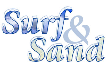 Figure 3: Fill your converted text with something other than solid color.
Frame It
Once converted to paths, you can frame your text, as shown in Figure 4. For example, once you’ve converted some text to paths using the Text To Box command, select it with the Item tool, and choose Item > Frame to open the Frame tab of the Modify dialog box. Select the width, style and color of your frame and click OK. If you like, also apply a background color.
 Figure 4: It helps if you can think outside the box, or should we say text box?
Know No Boundaries
Most people think a font’s usefulness begins and ends with formatting text. As a designer, you know fonts are much more than that — not only do they dictate the way a page layout looks and prints, they also can be used as art, as we’ve shown you in this article. Use your fonts wisely but don’t be afraid to use them for more than just formatting text.
This article was last modified on December 11, 2025
This article was first published on September 13, 2002
Commenting is easier and faster when you're logged in!
Recommended for you

Linotype Launches a New Typeface System with Gothic Appeal
Linotype introduces a new type system with a familiar feel and diverse possibili...

Tip of the Week: Adding Alt Text to Images With Object Styles
This InDesign tip on adding alt text to images with object styles was sent to Ti...

Scanning Around With Gene: The Pioneering Look Magazine
Even if you didn’t read Life magazine when it was in print, you’ve p...


