If your email is not recognized and you believe it should be, please contact us.
Members Only
Previewing Separations and Flattening
Claudia McCue shows how to use the Separations Preview and Transparency Flattener Preview in InDesign to find potential printing problems long before your job goes to press.
is_members_only_template: false is_members_only: true downloadable_content: access_level: no membership
This article appears in
Issue 67 of InDesign Magazine.
Fellow printing aficionados, it’s time to show a little love to a couple of unsung heroes in InDesign—the Separations Preview panel and the Flattener Preview panel. They may not look fascinating, but think of them as detectives that can help you find problems, long before your job goes to press.
About Color Separations
In printing, the term color separation refers to the process of separating a color image into the four process printing colors—cyan, magenta, yellow, and black, corresponding to the inks to be used on press. In the Olden Days, skilled camera specialists accomplished this with an arcane combination of colored filters and complex exposures. Now, we usually rely on Photoshop to perform this magic (Figure 1).
Figure 1: The four process printing inks—cyan, magenta, yellow, and black—combine to create a full color image when the job is printed.
Separations Preview Panel
You’re just designing pages in InDesign, not running a printing press—what do you care about color separations? Isn’t that the printer’s problem? Well, yes, color separation issues can be a problem for the printer—and that can translate to missed deadlines or extra costs for you. The Separations Preview panel can be a powerful forensic tool, helping you find such problems before they become quite expensive to resolve. Choose Window > Output > Separations Preview to display the panel, and then choose Separations from the panel’s View menu (Figure 2). When you activate Separations Preview, InDesign turns on High Quality Display and Overprint Preview, so you’ll notice that graphics are sharper and color rendering is better. (Odd tidbit: when Overprint Preview is active, frame edges disappear, but guides remain visible. No, I don’t know why.)
wp-image-109956″ src=”https://creativepro.com/wp-content/uploads/2018/08/psffig2.jpg” alt=”” width=”250″ height=”283″ /> Figure 2: The Separations Preview panel comes to life only when you choose Separations from the View menu.
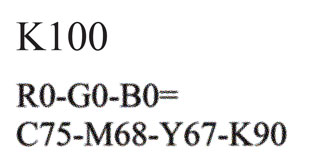
Once the Separations Preview panel is active, use it to find common problems in your layout. For example, imported content from Microsoft Word or Excel may come in as R0-G0-B0 rather than K100. When the job is output, that text will print in something like C75-M68-Y67-K90 (depending on the color settings you’re using). Even though modern computer-controlled presses are capable of very tight register, such text will not be as crisp as solid black-only text, just because of the halftone screening (Figure 3).
Figure 3: Text in just black ink (K100) has nice clean edges. RGB text looks black on screen, but will print in four colors. And because none of the inks is 100% solid, all will be rendered in halftone dots, adding to the ragged look.
Here’s an easy way to find out if you have RGB text: In the Separations Preview panel, just turn off the visibility of the black plate—any text still visible is made of more than just 100% black (Figure 4). Locate the spurious entry (if there is one) in the Swatches panel, delete it, and replace with good old-fashioned Black. Unfortunately, you won’t always find a swatch representing the RGB text, because it isn’t perceived as a spot color; you may just have to use the Separations Preview panel to reveal the text, and then select and fix it manually. Tedious, yes. But it’s worth the effort to prevent press problems.
Figure 4: Turning off the Black plate should make all the black text disappear. Text that’s still visible is RGB text, and will print in four colors. This is not good.
If you’re trying to determine the whereabouts of an unwanted spot colors, the Separations Preview panel is a great way to locate and display where those colors are used (Figure 5). Just deselect all but the mystery colors so you can find and fix the incorrect objects or text.
Figure 5: Although the blue text looks the same, some of it uses the wrong spot color, PANTONE 646. Separations Preview makes it easy to find the renegades.
Maximum ink limit (total ink coverage)
But wait—as the late-night commercials say—there’s more! There’s a limit to how much ink you can pile up in one spot, depending on the press and paper stock being used. Total ink coverage (TIC) is the sum of the percentages of all inks being overprinted in an area. For example, in the shadow area of an image, the values might be C73-M85-Y83-K68, which is a total of 309% ink. Typical ink limits are:
Sheetfed press, coated stock: TIC 320–340%
Sheetfed press, uncoated stock: TIC 240–260%
Heat-set web press, coated stock: TIC 300–320%
Cold-set web press, uncoated stock (e.g., newsprint): TIC 220–240%
Exceeding the recommended amount of total ink causes poor ink adherence and delayed drying, as well as ink soaking through to the other side of the paper. Choose Ink Limit from the View menu in the Separations Preview panel, and either choose from the options in the percentage pull-down menu, or manually enter a value. Areas exceeding the chosen ink limit are then highlighted in red on the page (Figure 6). Tiny, isolated pockets exceeding the limit are probably fine, but large areas highlighted in red are a warning that your job will be problematic to print.
Figure 6: This publication will be printed on uncoated stock on a sheetfed press, but the red highlight shows that large areas of this image exceed the recommended 260% ink limit. The Separations Preview panel reports that the total ink at the cursor position is 284%, far beyond the ideal limit.
InDesign’s misleading display
Blending modes such as Multiply and Color Burn are a fun way to start with a simple design and produce a more interesting appearance. However, if you’re using blending modes with spot color content, you’ll be disturbed to discover that how InDesign normally displays these effects are not necessarily how the effects will appear in print. The good news is, this is one more problem the Separations Preview panel can reveal. For example, in Figure 7, the initial view of the blending mode effect would lead you to think that the area where the teal text overlaps the Jeep picture will print in a contrasting green color. When Separations Preview is activated, Overprint Preview is automatically turned on, and the overlapping area disappears, leaving little white sprinkles—not at all what you’d expect.
Figure 7: The PANTONE 326 text is using the Color Dodge blending mode, which looks spiffy in normal view (left). But turn on Overprint Preview (right), and you see how this effect will really print. Aren’t you glad you checked before sending it to press?
Of course, you can activate Overprint Preview (View > Overprint Preview) independently from Separations Preview, but Separations Preview can show you something that Overprint Preview can’t. If you’re creating a piece that’s going to print solely in spot colors, you need to know how the job will print—and if any of your effects will generate unwanted process colors (Figure 8). Just turn off the spot color plates in the Separations Preview panel; anything that remains will print in CMYK. There’s just no end to the deceit, is there?
Figure 8: Use the Separations Preview panel to get a more realistic rendering of blending modes, and to reveal which areas will print as process (indicated in red).
Other Separations Preview panel options
The Separations Preview panel can do more than just allow you to view individual inks or preview transparency blending modes. The panel menu offers three options for changing how inks are represented, and how they print.
Ink Manager: Need to change a spot color to process? Need to glom two spot plates together? Ink Manager is your friend. Show Single Plates in Black: Fairly self-explanatory, the default option lets you view individual inks as grayscale images rather than in the ink color. If you’d like to see them in a more festive rendition, deselect this option to display each ink in its own printing color (Figure 9).
Figure 9: To view individual plates in their printing ink colors, deselect “Show Single Plates in Black.”
Desaturate Black: An odd option that makes all instances of black anemic. I get it—it’s nice to have a way to visually distinguish between just 100% of black offset printing ink and a rich black (a combination of solid black and other colors). But this is not the best way to do it (Figure 10).
Figure 10: The Desaturate Black option in the Separations Preview panel has good intentions, but poor implementation. Process black ink is a bit weak, but it’s not this weak.
For a more realistic rendering of black and rich black on screen, go to InDesign preferences, select Appearance of Black, and choose Display All Blacks Accurately (Figure 11). When you output to a desktop printer, blacks will render as a rich black (to avoid looking like gray ink). But simple black content will output to PDF as it should.
Figure 11: Set the onscreen rendering of black ink to “Display All Blacks Accurately” to more easily differentiate between K100 and rich black content.
Flattener Preview Panel
Flattening is the process of converting live transparency (such as drop shadows or feathered edges) to opaque objects that can be digested by older workflows. Because live transparency was a new concept way back in 2002, printers freaked out and hid under their light tables (or in the darkroom). Within a couple of years, many imaging workflows were actually capable of digesting such new-fangled content, but InDesign nevertheless provided a way to express transparent content in a way that ensured that even ancient coal-powered devices could correctly image jobs containing transparency.
Fast-forward to present day: Unless you’re submitting your job to a very primitive printing company (or one whose representative says “we’ve always done it this way”), you’ll find that transparency really isn’t problematic any more. Even so, the flattening process has become more sophisticated, with less tendency to rasterize text and vector content than in the early days. Almost all current workflows correctly process live transparency, allowing you to submit your InDesign or unflattened PDF/X-4 files without drama. However, you’ll still receive requests to submit flattened PDFs such as PDF/X-1a, so it’s still good to know what occurs during flattening. Using the Flattener Preview panel (Window > Output > Flattener Preview) is a convenient way to explore the process. The panel serves two purposes: it allows you to invoke a flattener preset (or build your own), and provides a preview of the results of the chosen flattener setting. Creating a Transparency Flattener preset
To create a new flattener preset, choose Transparency Flattener Presets from the Flattener Preview panel menu. Then, choose one of the existing presets (they can’t be edited), and click New to create a new preset and get an idea of the options:
Raster/Vector balance: The degree of vector information to be preserved. The lower the setting, the more vector objects will be rasterized.
Line Art And Text Resolution: The resolution used in the event that any text or line art must be rasterized.
Gradient And Mesh Resolution: The resolution used for shadows, feathers, and other pixel-based effects.
Convert All Text To Outlines: As you might expect, this converts text to outlines. As a result, text hinting is lost, and type will look rough in Acrobat (if “Smooth Line Art” is off in Display preferences), or on low-resolution desktop printers; however, type is fine on high-resolution devices.
Convert All Strokes To Outlines: Replaces all strokes with filled shapes, to avoid discrepancies between unflattened strokes and filled shapes.
Clip Complex Regions: Uses object paths to determine boundaries between vector and rasterized artwork to avoid awkward “stitching” artifacts. This option can result in very complex files for output.
Previewing Flattener results
To preview which areas will be affected when a particular flattening preset is used, from the Highlight menu in the Flattener Preview panel, choose the option for what you’d like to highlight, including aspects such as rasterized complex regions, transparent objects, outlined strokes and text, and raster-fill text and strokes. Frankly, some of these options are redundant and exhibit a bit of overkill; for example, highlighting “Transparent Objects” shows you what you probably already know—you have some drop shadows and some objects with reduced opacity settings (Figure 12).
Figure 12: Highlighting transparent objects will reveal effects such as drop shadows, use of blending modes, and elements with less than 100% opacity. Keep in mind that this doesn’t mean that content will cause printing problems.
Perhaps the most useful indicator is the Raster-fill Text and Strokes option (Figure 13), which shows which text is interacting with a transparency effect and may be converted to outlines during flattening. While the notion of converting some of your text to outlines may make you cringe, InDesign does this in an elegant way.
Figure 13: Because of transparent interactions, the text highlighted in red will be converted to outlines and filled with pixels. It’s not as scary as it sounds.
During the flattening process, InDesign performs a complex operation on text that is interacting with effects such as shadows. InDesign’s clever solution to flattening involves cutting up images into little pieces, burning in shadows and other effects, and then creating outlines of the text and using those outlines as clipping masks for image content. It keeps the original text as an underlay to retain searchability (Figure 14).
Figure 14: Here’s an x-ray view of InDesign’s handling of a drop shadow interacting with text. Let’s hear it for the InDesign engineers!
Your chosen flattening settings are invoked when you export to a PDF with Acrobat 4.0 compatibility (or if you print a document). If you create a PDF that’s compatible with Acrobat 5.0 or later (such as PDF/X-4), transparency remains live and unflattened.
Forward With Forensics
Now that you’ve seen some of the hidden wonders of the Separations Preview panel and its friend the Flattener Preview panel, perhaps they don’t look so dull. The next time you’re preparing a job for print, remember their capabilities—they just might save your budget (and your deadline).
We’re happy to announce that InDesign Magazine Issue #123 (July 2019) is no...
×By signing in, you agree to our Terms of Use and acknowledge our Privacy Notice.
Manage your privacy
This site uses cookies, but not the kind you eat. We use cookies to remember log in details, provide secure log in, improve site functionality, and deliver personalized content. By continuing to browse the site, you accept cookies.
Functional
Always active
The technical storage or access is strictly necessary for the legitimate purpose of enabling the use of a specific service explicitly requested by the subscriber or user, or for the sole purpose of carrying out the transmission of a communication over an electronic communications network.
Preferences
The technical storage or access is necessary for the legitimate purpose of storing preferences that are not requested by the subscriber or user.
Statistics
The technical storage or access that is used exclusively for statistical purposes.The technical storage or access that is used exclusively for anonymous statistical purposes. Without a subpoena, voluntary compliance on the part of your Internet Service Provider, or additional records from a third party, information stored or retrieved for this purpose alone cannot usually be used to identify you.
Marketing
The technical storage or access is required to create user profiles to send advertising, or to track the user on a website or across several websites for similar marketing purposes.
We use technologies like cookies to store and/or access device information. We do this to improve browsing experience and to show (non-) personalized ads. Consenting to these technologies will allow us to process data such as browsing behavior or unique IDs on this site. Not consenting or withdrawing consent, may adversely affect certain features and functions.
Functional
Always active
The technical storage or access is strictly necessary for the legitimate purpose of enabling the use of a specific service explicitly requested by the subscriber or user, or for the sole purpose of carrying out the transmission of a communication over an electronic communications network.
Preferences
The technical storage or access is necessary for the legitimate purpose of storing preferences that are not requested by the subscriber or user.
Statistics
The technical storage or access that is used exclusively for statistical purposes.The technical storage or access that is used exclusively for anonymous statistical purposes. Without a subpoena, voluntary compliance on the part of your Internet Service Provider, or additional records from a third party, information stored or retrieved for this purpose alone cannot usually be used to identify you.
Marketing
The technical storage or access is required to create user profiles to send advertising, or to track the user on a website or across several websites for similar marketing purposes.