

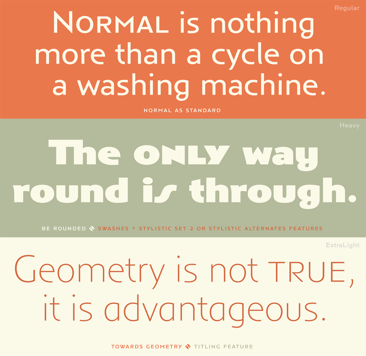
Anisette, designed by Jean François Porchez of Typofonderie in France, is not a brand new typeface, but one that recently caught my attention from a “snail” mailing, and totally wowed me. Anisette is a geometric sans influenced by the 30s and the Art Deco movement and is available in nine upright weights – from thin to black. The original Anisette was designed in 1996 but was updated to an OpenType Pro font in 2014, allowing for the addition of many more glyphs. The striking feature of this design is that it contains three sets of caps: wide, narrow, and small caps, all designed to be used together or by themselves. The wide caps are in the cap positions, while the narrow ones are located in place of the lowercase. The small caps are top aligned and are accessed as you would any small caps depending on which software you are using.

Original Anisette specimen, 1995.

Another Anisette specimen, 1999.
Anisette Petite is the “younger sister” to the original Anisette, and features an intermediate width set of caps, as well as a lowercase. It was originally designed in 2001 and updated to an OpenType Pro font in 2013. The weights of the Petite family match those of the original Anisette, and are intended to provide more diverse options for typesetting with this stylish family. The lowercase contains quirks in the design of the r, l, and the particular g, all of which contribute to giving this typeface design its unique look.
History and usage of Anisette
Although Anisette was inspired by the work of Cassandre and the Art Deco period, it is not a strict revival. It is a new design based on several historical references in which all caps were the style of the day, along with double-width capitals. The three styles of caps in addition to the broad variety of weights allow for the creation of playful interactions that can be appropriate for display settings such as headlines, posters, menus, editorial and book titles, as well as logos and other branding work.

La Plage de Monte Carlo travel poster, 1920s, using mixed-width caps

(left) City of New York Municipal Airports poster, 1937, and (right) Steamship brochure and deck plan, for the S.S. Ile de France, 1934, both showing mixed width caps. The image on the right also uses middle- and top-aligned small caps.
The latest OpenType Pro version of Anisette contains many additional decorative characters such as ligatures, Art Deco and other kinds of alternates, as well as contextual forms and border ornaments. A simple setting can be typeset in many diverse ways. The designer explains, “With Anisette, typography becomes a game, and any setting can be as ?amboyant as if it has been specially hand-drawn.” 


When Jean François Porchez decided to create a lowercase (which later became Anisette Petite), the story became more complicated. His stylistic references couldn’t be restricted anymore to the French Art Deco period, but were broadened to include the hand-painted shop signs found in France throughout the twentieth century. The outcome is a range of slightly strange shapes without strictly following the geometrical, mechanical, and historical principles of other typefaces available from foundries at that time. Anisette Petite is a mixture of inconsistent but charming shapes. The OpenType versions allowed the addition of variations and nuances, such as swash characters and titling alternates that broaden the appeal, flexibility, and customization of this design. Graphic blocks and dingbats have also been added to allow for the creation of patterns and borders. 


While Anisette was designed primarily for display settings, Anisette Petite broadens that usage to include text as well. The complementarity between the two typefaces allow for an almost endless array of variations and is well worth consideration for any project calling for a stylish, playful design reminiscent of the Art Deco era.

Anisette in use: Plaisir des Lys wine label, Gianfranco Pontillo Design
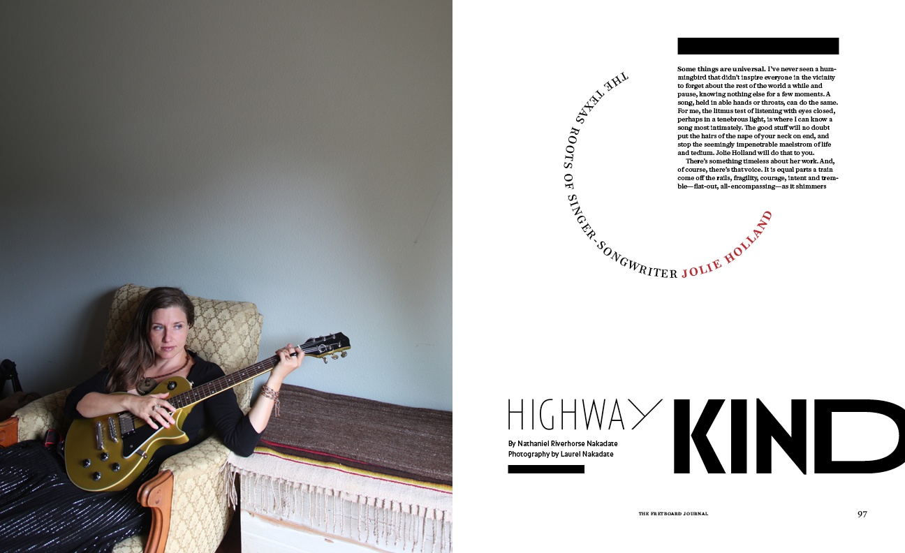
The Fretboard Journal, André Mora
This article was last modified on January 16, 2023
This article was first published on April 26, 2017
Commenting is easier and faster when you're logged in!

Recommended for you

TypeTalk: The Typographic Expressions of Stefan Sagmeister
Stefan Sagmeister is an award-winning designer known for his bold, innovative wo...

Chalk One Up for Inspiration
Reading about the anonymous students—calling themselves Dangerdust—at Columbus C...

Bergsland Typography Releases New Font Families
The Amitale (pronounced Ah-mi-tah’-lay) families are made up of eight new text f...