


Josh “Shag” Agle
The Shag family of fonts is a fun, nostalgic collection inspired by the work of LA-based illustrator Josh Agle, better known as “Shag” (a contraction of the last two letters of his first name and the first two letters of his last). Although originally released in 2003, these designs just recently came across my desktop, catching my eye big-time based on their funky, retro creativity, as well as their “illustrative” roots.
Josh Agle creates slick, narrative kitsch paintings that recall early 1960s advertising illustration, Bossa Nova album art, and Disney animation. Rife with businessmen in skinny suits and women in skin-tight cat costumes drinking martinis, Shag’s paintings depict an ominous world of stylized, witty urbanites. Agle is a world-renowned artist whose depictions of the “Swinger’s Life” have graced the walls of galleries on four continents and are the favorites of celebrities and connoisseurs alike.


Twilight Zone illustration ™ & © CBS.ARR
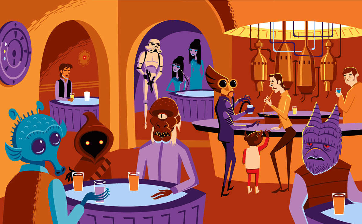
Star Wars illustration ©Disney/Lucasfilm


House Industries paired up with Josh Agle to create the Shag Font Collection. The three type fonts – Shag Lounge, Mystery, and Exotica – have been carefully engineered by House Industries’ type designers to include numerous alternate characters, ligatures, and swashes. Also included are Shagbats, a collection of over 24 dingbat illustrations drawn by Shag exclusively for House Industries.
Tal Leming, one of a team of designers who worked on these fonts, says, “When I was working at House Industries, we decided that we should develop a font kit inspired by the work of Josh ‘Shag’ Agle. Josh hadn’t done much lettering work so we asked him to send us samples of lettering that he liked. Many of the things he sent featured whimsical, hand-cut lettering from the 1960s. We were really into this as well, so that formed the starting point for Shag Lounge. The typeface evolved into an amalgamation of a neo-grotesque style sans serif and hand-cut lettering.”
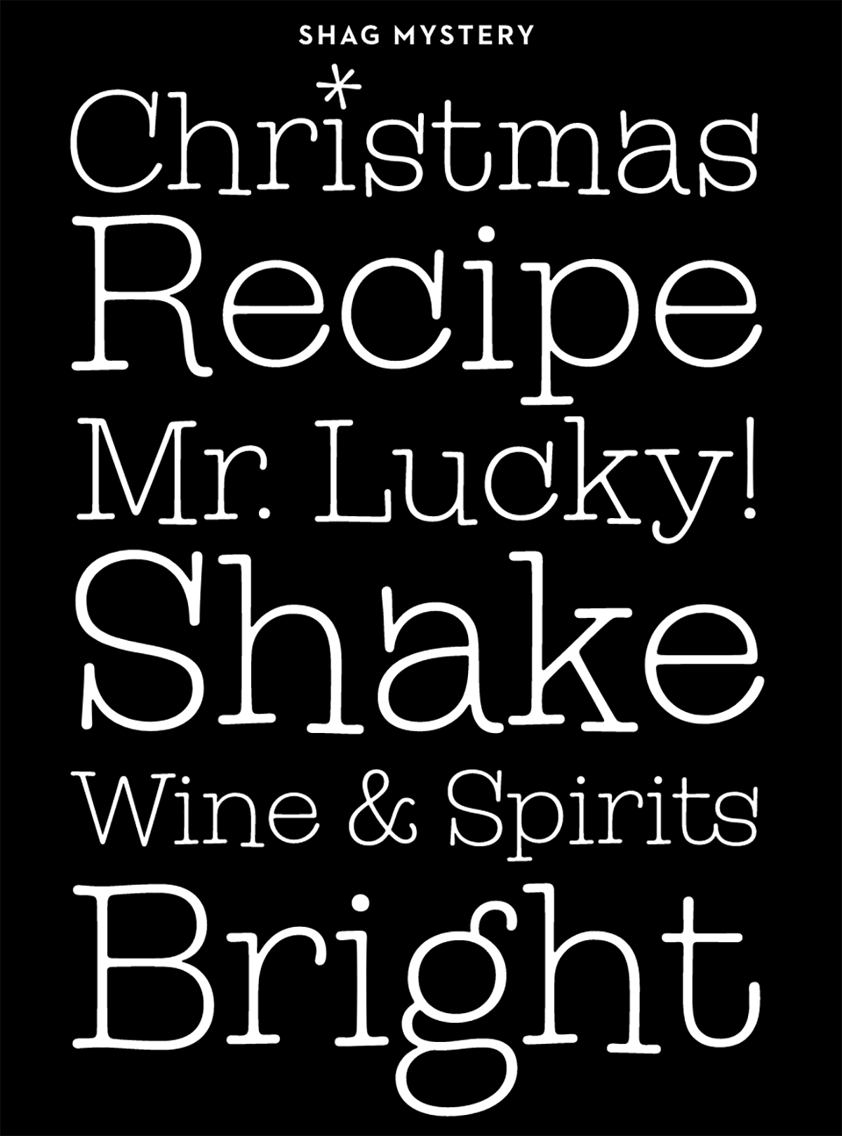
Shag Mystery is a typewriter-ish design with wide serifs and lots of jumpy, vertical movement, while Shag Exotica is a thick, condensed design with triangular, glyphic serifs. All three include an array of alternate characters that provide many opportunities to customize a headline, title, logo, or any setting calling for more individuality.
Users of OpenType-savvy applications will have the added luxury of automatic swash character substitution. While swashes can spice up the beginning and end of words, sentences and headlines, mixing in some of these alternate characters can create some very unique word cocktails.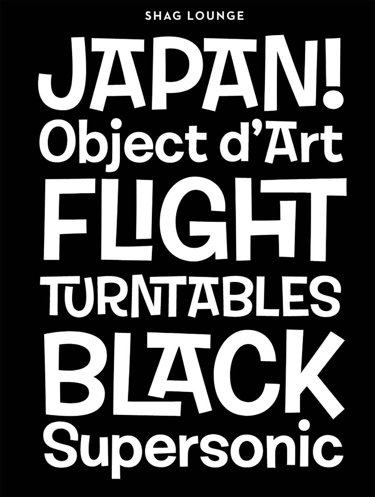


The type inspiration House Industries drew from Shag was based more on the general mood of his work rather than direct lettering reference. They say, “Shag’s depictions of the swinger’s life and other eclectic elements in his illustrations plowed a road swath through several genres, leaving the final designs subject to our own interpretation. We used the opportunity to pull together some designs we have been working on for several years but could never find the right vehicle to sell them. Josh and Andy Cruz, a member of the design team, also compared notes on some of their favorite display type from the ’60s. The challenge was to find three fonts that worked well together, yet different enough to convince our customers to purchase the entire collection.”
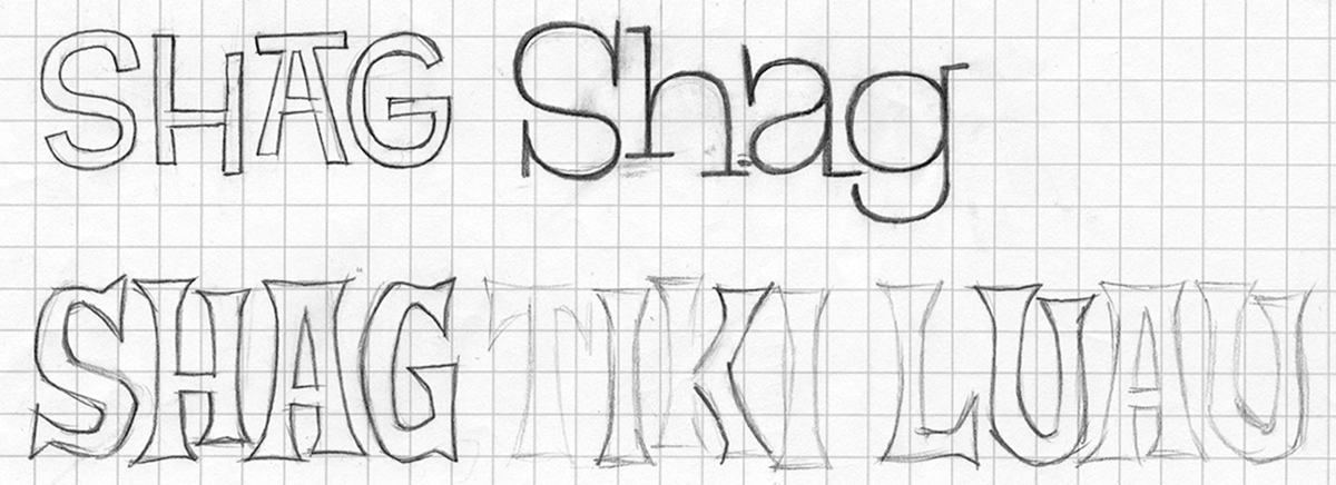
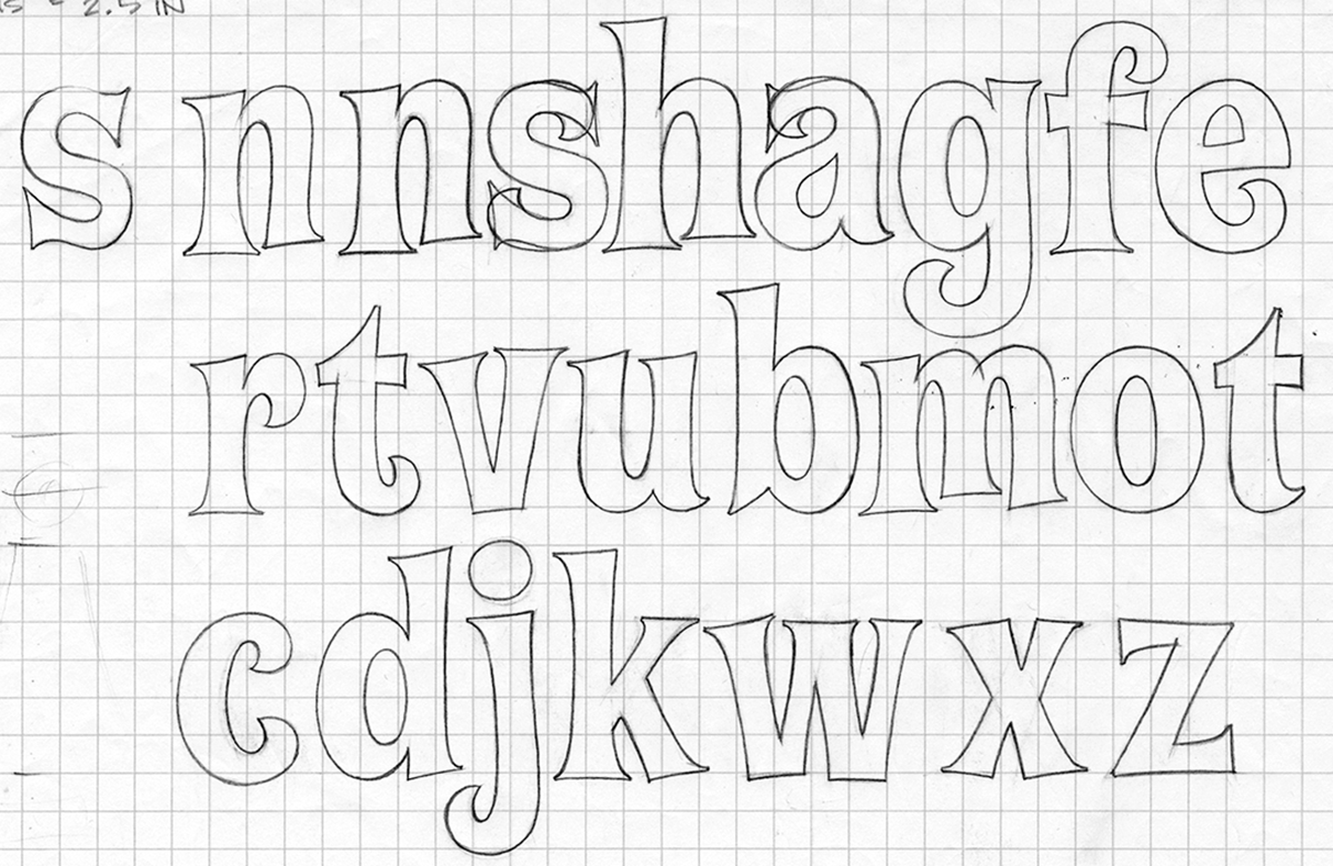
Hand-drawn sketches for Shag

If the fonts in this collection lived in a Shag painting, one might find them sipping hipster cocktails and engaging in discussions with shapely women. However, their versatility allows them to break out of this imaginary world and spice up any design party. With an extensive array of ligatures, swash capitals and alternates, the Shag collection provides endless possibilities for logos, headlines and word marks. Combining Shagbats with these fonts will make your work even more lively!
This article was last modified on March 21, 2018
This article was first published on March 21, 2018
Commenting is easier and faster when you're logged in!

Recommended for you

Avoid These 6 Common Type Mistakes
Learn to avoid these six mistakes and you can take your typography skills from O...

TypeTalk: Distorting Type
TypeTalk is a regular blog on typography. Post your questions and comments by cl...

10 Typefaces from the '80s
Typefaces go in and out of style, and except for a handful of perennial favorite...