


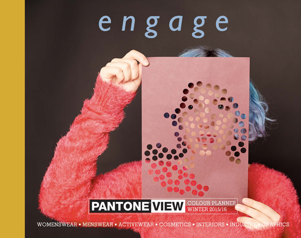
Press Release
CARLSTADT, N.J., Feb. 18, 2014 – Pantone LLC, an X-Rite company and the global authority on color and provider of professional color standards for the design industries, today introduced Engage, the Autumn/Winter 2015/2016 edition of PANTONE® VIEW Colour Planner. Looking at color as a total language, this multi-platform forecast offers seasonal inspiration, key color direction and suggested color harmonies for women’s and men’s fashion, active wear, cosmetics and lifestyle, as well as industrial and graphic design.
With global fashion trends becoming less constrained by rigid color rules and our feelings about the future more optimistic, consumers are delighting in color expression and continuing to seek out color year round. This transitional approach toward color shows the growing acceptance of color throughout the year.
Color statements in the PANTONE VIEW Colour Planner are confident, with classic and familiar tones combining with some less traditional tones for some unusual yet commercial palettes that allow business to playfully engage with color without the financial risk.
“In the past, as temperatures drop, consumers have typically retreated into darker shades of blacks and navies, but in our globally connected world, this is no longer the case,” said Laurie Pressman, vice president of the Pantone Color Institute. “Today as we begin to feel more confident about our economic future and can see what our friends are wearing around the globe, consumers and businesses alike are yearning to engage in a dialogue with color not only during the warmer spring and summer time period but also during the misty and colder autumn and winter season.
PANTONE VIEW Colour Planner Fall/Winter 2015/2016 contains the following eight palettes:
Impression
Impression is a story about subtle, atmospheric color. A sophisticated range of misted and understated shades give an impression, a feeling of color.
Intermingle
Speaking to quiet modesty, Intermingle is comprised of rich caramel beiges that decline to greige and tannic browns. A wonderful array of nature’s hues colors in Intermingle are simplified through dimming, reducing their volume.
Curiosity
Displaying a modern energy, Curiosity highlights a contemporary collection of colors, that jump about and move up and down the scale – dark, bright, loud or soft.
Empathy
Colors in Empathy are warm, optimistic, peaceful and harmonious, but at the same time, pushing the boundaries of new ideas and combinations.
Connect
Connect joins bright splashes of painterly hues – unsophisticated and literal – together in bold graphic and color-block stories. The message is instant, basic and fun.
Physical
Physical is an independent story that breaks out easily into sensual, warm sensations or cools easily to an elegant neutral pace. Green dominates this story and is partnered with a crescendo of warm contrasts spotlighting on strong saffron yellow and turmeric gold.
Iconic
Iconic colors are rooted in history – strong, rich and should be used boldly. Dark shades and eye-catching highlights alternate to create statements.
Subliminal
The understated dark complexity of Subliminal talks in a quiet murmur, putting goose bumps on your skin and instantly changing your mood.
Engage begins with wispy, softer colors, gradually building to more intense shades and finishing with strong bursts of color:
- Neutrals have evolved into more ethereal shades. Similar to last season, they remain tinted with camel and ochre tones, but for autumn and winter, many hues have become washed out with a colder light.
- Pastels continue to shed their sugary image and take on a technical look
- Blacks become colored and imbued with reds and blues so that they can be teamed with stronger and brighter versions of those same colors to produce harmonic combinations.
- Reds retain their depth, richness, and warmth, affecting many of the brown and orange shades and are reminiscent of ceremonial reds.
- As we become less concerned with playing it safe, blues begin to move into the background, playing a supporting role in the palettes. They can be seen tinting blacks and greens and are also present in purples, transforming a sometimes tricky color into something more workable.
- Many of the season’s purples and violets are suffused with blue tones – allowing for more commercial use in both men’s and women’s fashion, however red infused purples will continue to grow and here too have taken on a much more commercial application.
- Yellows become more winterized, darker and more ochre led.
- Greens, occupying the celadon area of the color spectrum, develop a cloudy appearance that links them to the darker blues
- Browns still possess a crafted outlook, but are juxtaposed with bright, often synthetic or clashing hues, which lift and transform these traditional looking colors into something more modern.
Published bi-annually, 18 to 24 months in advance of the season, the PANTONE VIEW Colour Planner is based on the PANTONE FASHION + HOME Color System, the most widely used and recognized color language standard in the world. The book is produced by a team of leading visionaries from all over the world with expertise in different disciplines, providing comprehensive color-direction across multiple design areas.
Within each of the season’s directional color palettes, a general introduction outlines the colors included and the philosophy behind them. In addition, a specific breakdown of each palette highlights harmonies, suggested color combinations and suitable patterns, fabrics and products according to end use. For added convenience and usability, at the end of each palette section, a printed version of each PANTONE FASHION + HOME Color is featured in perforated swatch form and 1” x 4” detachable cotton strips. The PANTONE VIEW Colour Planner Fall/Winter 2015/2016 also comes with a DVD containing static images of photos used to illustrate the seasonal themes a movie version that has music to set the unique mood of each individual palette, a printed color card where the forecasted colors are arranged by color family and a poster-sized overview of the season.
Pricing and Availability
The PANTONE VIEW Colour Planner Fall/Winter 2015/2016 is available immediately for $750 from Pantone at www.pantone.com or from PANTONE distributors nationwide. Visit www.pantone.com or call (888) PANTONE for a list of distributors. PANTONE VIEW Colour Planner is published bi-annually by Metropolitan Publishing BV.
About Pantone and the Pantone Color Institute
Pantone LLC, a wholly owned subsidiary of X-Rite, Incorporated, is the global color authority and provider of professional color standards for the design industries. Pantone products have encouraged colorful exploration and express
ions of creativity from inspiration to implementation for more than 50 years. Through the Pantone Color Institute, Pantone continues to chart future color direction and study how color influences human thought processes, emotions and physical reactions. Pantone furthers its commitment to providing professionals with a greater understanding of color and to help them utilize color more effectively. Always a source for color inspiration, Pantone also offers designer-inspired products and services for consumers. More information is available at www.pantone.com. For the latest news, trends, information and conversations, connect with Pantone on Facebook,Twitter, Pinterest, Instagram and the Pantone Blog.
About X-Rite
X-Rite, Incorporated, is the global leader in color science and technology. The company, which now includes color industry leader Pantone, develops, manufactures, markets and supports innovative color solutions through measurement systems, software, color standards and services. X-Rite’s expertise in inspiring, selecting, measuring, formulating, communicating and matching color helps users get color right the first time and every time, which translates to better quality and reduced costs. X-Rite serves a range of industries, including printing, packaging, photography, graphic design, video, automotive, paints, plastics, textiles, dental and medical. For further information, please visitwww.xrite.com.
This article was last modified on January 18, 2023
This article was first published on February 24, 2014
Commenting is easier and faster when you're logged in!

Recommended for you

Introverts and The Art of Self Promotion
Many creative professionals tend to be introverted. Often they feel this is hold...

Thou Shall Not Use Comic Sans
Excerpted from Thou Shall Not Use Comic Sans: 365 Graphic Design Sins and Virtue...

Rebranding CreativePro
Take a look behind the scenes as we build a new look to better reflect who we ar...