I’ll take “Stuff You Can’t Make Up” for a thousand, please, Alex. How about smoothies based, not on combinations of ingredients, but on Pantone colors they resemble. First it was beer with Pantone labels, then food paired with matching Pantone colors. I guess this is what happens when your color sample books look good enough to eat. Or is that just me?

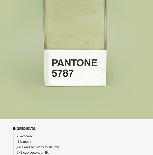
Anyway, back to those smoothies. The collection at the aptly-named pantonesmoothies.com not only shows tasty concoctions that match up with PMS colors, but also includes actual recipes. For instance, Pantone 610 contains avocado, mango, and cucumber. Pantone 644 includes a lot of blueberries while espresso and cocoa powder comes out around Pantone 4665. I’m thinking my (in)famous sweet potato, carrot, and banana smoothies would fall somewhere about Pantone 021.
This article was last modified on December 1, 2015
This article was first published on December 1, 2015
Commenting is easier and faster when you're logged in!

Recommended for you

UK British Council promotes Rights Grabbing Competition
Pro-Imaging is an international organisation representing professional photograp...

Scanning Around with Gene: On the Colorful Road Again
In part one of this two-part look at Arizona Highways magazine, I poked fun at t...