


This week, Britain is celebrating Queen Elizabeth II’s 60 years on the throne with a four day Diamond Jubilee of concerts, horse races, parties, and other suitably regal festivities. The London branch of the Leo Burnett advertising agency has marked the occasion by producing an extremely limited edition Pantone color guide to 60 of Her Majesty’s “fashion-forward colour statements.”
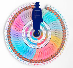
Each card in the set comes compete with Pantone reference number, plus information on where and when the Queen wore that color er, colour.
Here are a few examples, noted by Leatrice Eiseman, executive director of the Pantone Colour Institute.
PANTONE 13-0755 Primrose Yellow “The Queen’s royal wedding outfit from 2011 was Primrose Yellow. Yellow is a colour that speaks to the future with hope and optimism. William’s wedding was a time of national celebration and this choice of yellow complements the joyous mood of the occasion. It’s a colour that is high visibility (befitting a queen), while still not detracting from the bride.”
PANTONE 13-4411 Crystal Blue “Blue is a colour staple in the Queen’s wardrobe, it’s a colour that communicates constancy and it is also symbolic of her devotion to the British people. Blues traditionally have calming properties and she is often seen wearing them during difficult times. Blue is also seen as de-stressing so it’s no surprise she was sporting a serene blue to a Royal Garden Party in 2010.
PANTONE 16-2124 Pink Carnation “Queen Elizabeth wore lighter tones of pink more frequently when she was younger, adding softness to her role as Queen and make her seem less austere, for example the PANTONE 16-2124 Pink Carnation she wore to the Chelsea Garden Party in 1967. In recent years however, she has been seen in trendier bright pinks, defying her age and communicating that she is a monarch modern in thought and spirit.”
PANTONE 13-5414 Ice Green “During the Queen’s landmark state visit to Ireland, the first since the country gained independence in the 1920s, she was seen in a cool shade of green. Her colour choice echoed the sentiment of her visit as green is widely seen to symbolise new beginnings, fresh thoughts and rejuvenation.”
Smashing, no? Unfortunately, you might have a better chance of having tea and crumpets with Her Majesty than acquiring one of her Pantone guides, since only 60 were produced, and they’re not for sale. Oh well, maybe someone somewhere is creating a Pantone color guide to Lady Gaga.
This article was last modified on January 6, 2023
This article was first published on June 3, 2012
Commenting is easier and faster when you're logged in!

Recommended for you
Scanning Around With Gene: Clicking at the Green Duck
Of all the companies that have produced metal buttons and other novelty devices,...

The Art of Business: Do Unto Others
You’re creating a brochure or Web site, and you want to include material o...

How to Create Better Block Shadows in Illustrator
Learn a better way to create the most efficient long block shadows in Illustrato...