


Do That Again
One advantage of the gray eyedropper in addition to being very quick is that it adjusts the color without affecting tone: That’s why it added green, which is a not particularly intuitive move when you’re adjusting the curves manually.
Using the gray eyedropper definitely helped the image a lot, but it’s still not as good as it could be. If we look at the pixel values in the snow, we find they contain quite a bit less red than blue or green: We have a cyan cast. You may be tempted to adjust the curve created by the eyedropper to fix this. My advice is to use a second set of curve adjustments: If you’re using Adjustment Layers on an 8-bit-per-channel file, you don’t need to worry about successive rounds of curves degrading the image, and if you’re working on a high-bit file, you have more than enough data to withstand two rounds of curves. It’s simply a lot easier to fix the problem using a new curve than it is to tweak the old one.
Figure 5 shows a curve that removes the cyan cast, along with the resulting image. Note that I put anchor points at the mid-tone and three-quarter tone to prevent the curve from affecting anything other than the highlights and quarter-tones, where the cast is prevalent. Some areas of the snow are still slightly cyan, but they look natural.
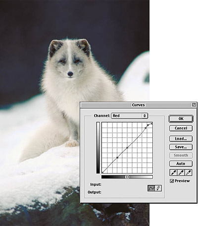
Figure 5: Another curves adjustment removes the cyan cast from the snow.
Rough Around the Edges
There’s one remaining problem: The high-contrast edge of the snow bank has a nasty greenish-cyan cast that extends to the fringes of the critter’s fur. This just isn’t fixable with a global curve: If we create a curve that neutralizes the color fringe, we’ll distort the colors elsewhere in the image. I need to make a selective correction. Here’s one way to effect such correction.
First, I make a Color Range selection of the color fringe, by choosing Color Range from the Select menu, shift-clicking pixels in the color fringe, and adjusting the Color Range Fuzziness setting to get the selection I need.
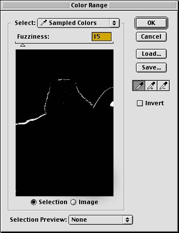
Figure 6: Making a Color Range selection lets us target the undesired green fringe.
With this selection active, I make a Hue/Saturation Adjustment Layer by clicking the Adjustment Layer icon in the Layers palette then choosing Hue/Saturation from the popup menu. Whenever you create an Adjustment Layer while a selection is active, the Adjustment Layer automatically uses that selection as a Layer mask. I desaturate the selection by 100 percent — completely, in other words — by dragging the Master Saturation slider all the way to the left.
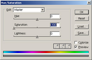
Figure 7: Using a Hue/Saturation Adjustment Layer, we desaturate the undesired fringe.
This helps a bit, as shown in Figure 8, but it’s still far from perfect: The Color Range selection didn’t include enough of the color fringe.
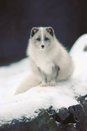
Figure 8: The image after applying the Hue/Saturation Adjustment Layer through a layer mask.
To make the final fix, I need to edit the layer mask. When I target the Hue/Saturation Adjustment Layer by clicking on its tile in the Layers palette, the Layer Mask appears as a channel in the channels palette. I target the Layer Mask channel by clicking its tile in the Channels palette, but keep it invisible by clicking off the eyeball icon in the Channels palette, so that I can see the effect of the edit on the image.
First, I run the Gaussian Blur filter on the Layer Mask to soften the edges of the selection and provide some feathering. The goal is to produce a range of grays along the edges in the mask, instead of a sudden transition from black to white, masked to revealed. Once we have a range of gray levels, we can edit the mask to control the color fringe. On a low-resolution image, a single-pixel blur is enough. On a high-resolution image I’d use a larger radius setting as the edges that we’re trying to affect contain more pixels than in a low-resolution image. If we want the mask to have gray values all across the edge of a high-resolution image, we need a higher radius Gaussian Blur.
The blur doesn’t make much visible difference. The real magic is in the next step. I use Levels to change the contrast of the Layer mask, driving enough pixels to white to wipe out the objectionable color fringe. (A Layer Mask is simply an 8-bit channel. Black pixels in the Layer Mask protect the underlying pixels from the edit, white pixels apply the edit fully, and gray pixels apply the edit partially, with the strength depending on the shade of gray.) As I drag the white input slider to the left, more and more of the layer mask pixels are forced to white, allowing the desaturation to affect the underlying pixels. Tweaking Levels to force all the pixels to either black or white — a radical move that would destroy most images — has exactly the desired effect on the layer mask as shown in Figure 9.
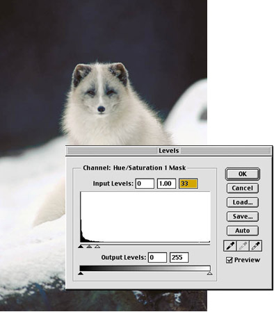
Figure 9: Using Levels, we alter the contrast of the Layer Mask to strengthen the desaturation of the fringe area.
But what if you’re working on a high-bit file? Neither Color Range nor Adjustment Layers are available in high-bit mode. There’s an easy but not-obvious workaround. First, duplicate the image and downsample the duplicate to 8 bits per channel. Then, make the Color Range selection, add the Hue/Saturation layer, and tweak the layer mask as described above until you’ve arrived at the desired result.
Then go back to the high-bit image, and choose Load Selection from the Select menu. You’ll find that you can load the layer mask from the duplicate’s Hue/Saturation layer as a selection. Do so, and apply the same Hue/Saturation adjustment as you did in the downsampled duplicate to the high-bit file. With this technique, you’ll find that it’s quite easy to make selective local edits on high-bit files, even although the tools for doing so appear to be unavailable.
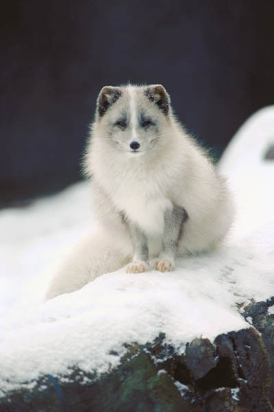
Figure 10: The finished image.
Note that we made two different kinds of corrections for neutrals in this image. The first two rounds of Curves adjustments corrected all the colors in the image, pulling them into the correct balance. The last tweak to remove the color fringe didn’t affect the other colors in the image, it simply made the image look right. In the majority of cases you can probably get by with only the first type, and it’s by far the quickest way to achieve correct color balance. But when we see something in an image that our minds tell us should be neutral (like the edge of a snow bank) as colored, it makes the image look wrong, and we have to fix that too. Always make the global corrections first, and follow with the selective ones as necessary.
This article was last modified on January 3, 2023
This article was first published on June 6, 2001
Commenting is easier and faster when you're logged in!

Recommended for you

How to Create a Neon Glow Effect in Illustrator
Learn how to create a neon glow effect in Illustrator and save it as a graphic s...

Inside the Publishing Revolution: How the LaserWriter and Photoshop Changed the World
Excerpted from “Inside the Publishing Revolution: The Adobe Story” (...

Working with Presets
How to speed up your workflow and reduce errors by having InDesign take care of...