

The 81-year-old paper company Mohawk unveiled a new logo that it says will let it “thrive in today’s digital world.”
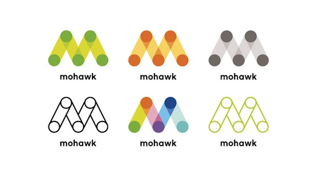
Pentagram partner Michael Bierut, who designed the logo, described it: “The logo is a monogram for the name Mohawk. It’s based on the letter M, but it’s also constructed to evoke the papermaking process and the printing process, both of which involve paper going around cylinders.” he said.
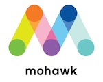
The default mark contains the hues of the color wheel, but it can also be changed for different uses. — for example, the mark on the new MohawkConnects website is yellow and green.

The logo also carries the theme of “connecting the dots”: connecting customer and products, as well its print products and new digital initiatives. To that end, as well. Under Consideration has a thoughtful analysis of the logo.

To celebrate its reinvention, Mohawk is hosting a contest, the winner of which will have business cards printed by /a>Moo.com. The contest is being held in conjunction with HOW magazine. You can read more about the contest here.
Better hurry, though. The deadline is this Friday, April 20.
This article was last modified on July 11, 2023
This article was first published on April 16, 2012
Commenting is easier and faster when you're logged in!

Recommended for you

Grace Under Fire: Tips for Responding to Negative Feedback via Social Media
If you were anywhere near the Internet last week, chances are good that you read...

Scanning Around With Gene: Small. Noisy. Underpowered. Beloved.
In recent advertising, Volkswagen has brought back a vintage Beetle to serve as...

Thou Shall Not Use Comic Sans
Excerpted from Thou Shall Not Use Comic Sans: 365 Graphic Design Sins and Virtue...