

Press release
FontShop doesn’t just carry fonts from the big guys; it’s also your source for the best of independent foundries. Each of these outfits are run by a small group of talented craftsmen and women who are creating original, useful typefaces under their own banner.
Premiéra
Premiéra is a typeface specifically designed to work in small sizes. A large x-height and short ascenders and descenders make it ideal for books and newspapers. Through an exhaustive process of testing readability on test prints, the face developed straight lines and sharp forms. These features not only work to make the type clear, but also give Premiéra a strong personality whether you read it in text or headlines.
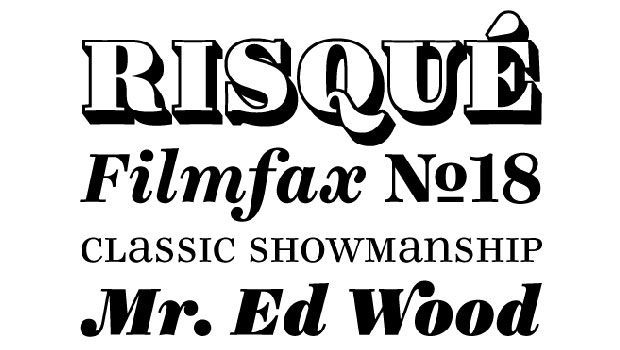
Ingeborg
The Modern typeface classification is usually associated with Didones and display faces that often have too much contrast for text use. The Ingeborg family was designed with the intent of producing a Modern face that was readable at any size. Its roots might well be historic, but its approach is very contemporary. The three text weights (Regular, Bold, and Heavy) are functional and discreet while the Display weights (Fat and Block) catch the reader’s eye with a dynamic form and a whole lot of ink on the paper. The family includes a boatload of extras like unicase alternates, swash caps, and a lined fill.
This article was last modified on January 18, 2023
This article was first published on November 4, 2009
Commenting is easier and faster when you're logged in!

Recommended for you

The Call of the Wide
I’m in one of my bossy moods today, so this column is about what not to do when...
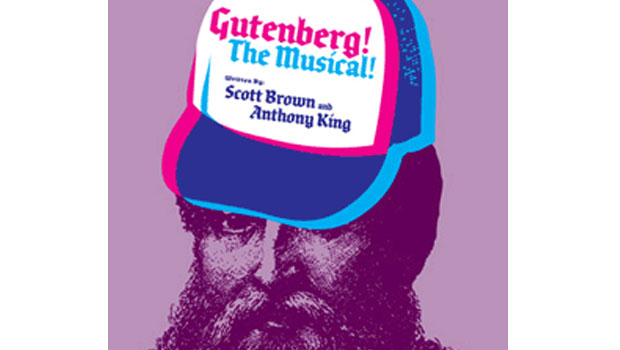
Gutenberg The Musical?
If you’re as out of touch with the off-Broadway scene as I am, you too will be s...

The Joy of Ornaments
Typographic ornaments used to be a design staple back in the days of metal type,...