

I’m pretty bad with esoteric color names. What the heck does ochre look like, anyway? I’m guessing most of you reading this are more well-versed in color than I, but, personally, most days I wouldn’t know the difference between a chartreuse and a puce. Strangely, I do happen to remember the day in pre-school where we learned primary colors (maybe because I was so insistent the teacher explain to me what “primary” meant before the lesson could continue). After that initial lesson in color it’s all a blur.


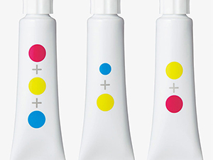
Luckily, schoolchildren of the future might get a helping hand from designers Yusuke Imai and Ayami Moteki. Their “nameless colors” concept—which was recently an entrant in the 2015 Kokuyo Design Awards—teaches how colors work together before giving them a name. Using just the primary colors of cyan, magenta, and yellow, paint tube labels use visual equations to depict how the color in the tube was created. Need a nice orange? Look for the label with equal portions magenta and yellow. The nice part is, instead of remembering that red and yellow make orange, seeing the paint in the tube with one magenta and one yellow dot, the student will know that orange is the color inside. Or conversely, when they see the two equal dots of red and yellow and they squeeze out orange paint, the connection will be made. And all of that done without words, letting the colors speak for themselves.
Now, how many magenta dots to make chartreuse?
This article was last modified on October 8, 2015
This article was first published on October 8, 2015
Commenting is easier and faster when you're logged in!

Recommended for you
Before&After: Create a Series of Cards
These small, tent-style cards needed to be different but look like a series and...
Playing with Color
No matter where we are on our design path, there is always more to learn about o...

Grouping Color Swatches
Want to make groups of colors? Well, you can't, sorry. But you can fake it with...