
Monospaced Fonts
What’s old is new. Mono is back! And not just for screenplays, state documents, and source code.

This article appears in Issue 79 of InDesign Magazine.
Back in the ’80s when desktop publishing put proportionally-spaced type in the hands of the masses, it must have seemed like monospaced fonts were destined for the trash can of design history. Why would you use typefaces that make it look like your publishing technology was from the Stone Age, when you could use “real” fonts and look as professional as a giant publishing house?
To make matters worse, perhaps the best-known monospaced font, Courier, acquired the stigma of being the stand-in used when the real fonts went missing or didn’t get downloaded to the RIP. Presumably it was chosen for this inglorious role because it looked so wrong that you’d realize immediately there was a problem.
But recent years have seen an upswing in the fortunes of monospaced fonts. Monos are cool again, and rather than looking dated, they can look fresh and exciting—even when used for body text. But let’s start out with a look at their history.
Monospaced typefaces owe their existence to typewriters. Typewriter carriages needed to move the same distance forward with each character typed, so each character had to take up the same amount of space on the line. From typewriters, monos branched out to early-generation computer terminals, where characters were made from pixels in boxes that were all the same size, and from there to computer programming. Pick up any programming textbook, and the source code will be monospaced. And in fact InDesign Magazine continues the tradition each month, by formatting code in the GREP of the Month with Monaco. In a monospaced font, each character is distinct, minimizing the ambiguity between characters. In code, where a single typo can be devastating, this is an essential quality.
There is a subcategory of monospaced typefaces designed
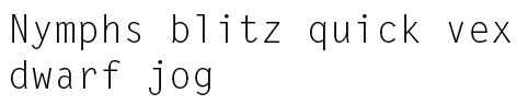
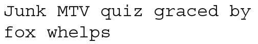
specifically for coding. Examples include Inconsolata, Anonymous Pro, and Source Code, where the letters are distilled to their simplest form, with slab serifs added to the tops of i, j, and l to make these letters wider and appear less spaced. The figures are often smaller than the cap height to distinguish 0 from O and 1 from l. The punctuation marks are bigger than those of proportional-spaced font, as are characters like the greater- and less-than signs (Figure 1).

Figure 1: Source Code, designed by Paul D. Hunt as a companion to Source Sans.
These same qualities make monospaced fonts the best choice for optical character recognition. OCR-A and OCR-B are designed specifically for this purpose.
Code and OCR notwithstanding, the strongest associations most people have with monospaced fonts is typewriters. Think monospaced and you probably can’t help thinking of typewriters. And even if you’ve never used a typewriter, you’ve seen the movies. All those scenes of writers possessed by great ideas, fueled by coffee and cigarettes, tap, tap, tapping away at the keys through the night while the rest of the world sleeps. Anyone who’s ever dreamed of being a writer has, in a moment of romantic indulgence, imagined such a scene (Figure 2).

Figure 2: Love Letter Typewriter, popular during the ’90s grunge period, lends a certain gravitas to the text.
It’s because of this association that—alongside their day job as code fonts—monos are often found impersonating typewriters. They’re used to evoke a personal, handmade feel, and to effect the sense that the designer’s only means of communication is a typewriter, preferably a broken one. We know that no one uses typewriters anymore and yet we have an emotional connection with them. We see them and we hear them. Unlike proportional-spaced fonts, which are gracefully silent, typewriter fonts have their own sound—the rhythmic clatter of the keys, the slamming of the carriage return. If the letters are a little out of whack, with wandering baselines, and struck-out text, they can create a tight, edgy feel. Visions of Jack Nicholson in The Shining come to mind (Figure 3).

Figure 3: The typewriter featured in Stanley Kubrick’s adaptation of Stephen King’s The Shining.
The “undesigned” look of monospaced typefaces makes them the go-to choice for conveying a message so important it doesn’t need the trappings of design (Figure 4).

Figure 4: Record cover by Hipgnosis for XTC’s Go 2 (1978).
Monospace Medley
Here are eight popular monospaced fonts to consider for your next project:
Source Code Pro

Designed by Paul D. Hunt as a companion to Source Sans specifically for coding, Source Code Pro supports a wide range of languages.
Letter Gothic
The default font for InDesign’s Story Editor, Letter Gothic was created between 1956 and 1962 by Roger Roberson for IBM and was meant to be used in Selectric typewriters. A proportional version, New Letter Gothic, was designed by Gayaneh Bagdasaryan for ParaType in 1999.
Anonymous Pro

Designed by Mark Simonson in 2009 and available on Typekit, Anonymous Pro is intended for coding.
Telegrama Raw

Designed by Yamaoka Yasuhiro in 1992, Telegrama Raw evokes the look of low resolution computer monitors.
OCR-A

Created in 1966, OCR-A was one of the first optical character recognition typefaces, and quickly found widespread use on credit cards and bank checks.
Ubuntu Mono
Designed by Dalton Maag for the Debian-based Linux operating system of the same name, Ubuntu Mono is named after the Southern African philosophy of ubuntu—“human-ness” or the belief in a universal bond of sharing.
TheSansMono
Designed by Lucas de Groot as an easy-to-read face for computer code, and available in eight different weights and three different widths, it has been used for years as the go-to monospace font by many writers, including Olav Martin Kvern and David Blatner in their book Real World InDesign.
Courier
Designed by Howard “Bud” Kettler in 1955, Courier was later redrawn by Adrian Frutiger for the IBM Selectric Composer series of electric typewriters. Until January 2004, Monotype’s version, Courier New, was the U.S. State Department’s standard typeface. It was replaced with 14-point Times New Roman.
Or perhaps a project so shoestring that “real” fonts are not in the budget. Of course, we see through such artifice, but it doesn’t matter. Belief is suspended, and even though we know the anti-design look has been carefully crafted by the designer (probably too young to have ever used a typewriter), we’re happy to imagine that a beaten-up typewriter, worn-out ribbon, and five minutes were the only resources available. As a conduit of pure creativity, this person was obviously too busy with important ideas to worry about the design. On a subconscious level we buy the message: this is the raw stuff. It’s about the content: these are the facts, take them or leave them. There are no stealth messages concealed in a Trojan Horse of fancy serifs, louche ligatures, or coquettish cursives (Figure 5).

Figure 5: Without adornment, monospaced fonts don’t have easily recognizable characters in the same way serifs (classic, authoritative) or sans serifs (cool, modern) have. This hard-to-pin-down character gives them an enigmatic quality—a perfect choice for cult “post rock” ensembles, like Godspeed You! Black Emperor.
No wonder, then, that the default font for InDesign’s Story Editor is Letter Gothic.
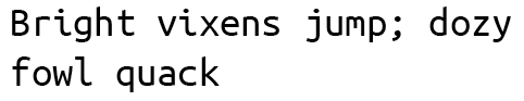
On a purely practical level, in certain situations monospaced typefaces have advantages. If you’re making a grid or aligning type vertically, monospaced fonts let you line up the characters (Figure 6).

Figure 6: Monospaced fonts line up vertically, creating a tidy look.
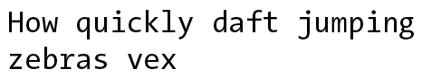
For the same reason, monospaced fonts are a good choice for tabular information. In fact, the default figure style for most proportional typefaces is lining numbers, which are monospaced (Figure 7).

Figure 7: Lining numbers (monospaced) are often the default for OpenType fonts that offer a choice of numbering styles.
This is why if these numbers are used in running text, there often appears to be too much space around the 1.
So what about kerning and monospaced fonts? A good font may have thousands of kerning pairs; a free font may not have any—in which case optical is your best option. However, because a kerned monospaced font is an oxymoron, there are no metrics values in monospaced fonts. But if you choose InDesign’s alternative kerning method—Optical—then the program disregards the metrics values and adjusts the space between the glyphs based on the glyph shapes. There’s no right or wrong answer: choose the kerning method that looks the best—which in large part depends on the quantity and quality of the metrics values. If you choose Optical kerning with monospaced fonts, you are essentially making the monospaced font proportionally spaced. This might be useful if you like all aspects of the font except its monospaced-ness, but not a good idea if you chose the font for that very quality (Figure 8).

Figure 8: Applying Optical kerning to monospaced fonts disrupts their vertical rhythm.
Try it yourself: Set the same paragraph in a monospaced font with Metrics (i.e., zero) kerning and with Optical kerning. The paragraph with Optical kerning now has proportional spacing—you can insert your cursor between each letter pair to see how much kerning has been added—and the vertical rhythm derived from each character having the same width is disrupted.
Similarly, features like justified alignment and Optical Margin Alignment are contradictory to the ethos of monospaced type.
Graphic designers being a contrary lot, it’s not surprising that the wheel has come full circle with monospaced fonts. Designers are discovering that what is old can be made new again. Monospaced fonts, rather than looking dated, can look novel and energetic (Figures 9–13).

Figure 9: Designed for the USA Bureau of Standards in 1966 by Adrian Frutiger, OCR-A is intended for optical character recognition. It was used by banks, credit card companies, and similar businesses, but has recently been “rediscovered” for advertising and techno events. German graphic designer Alexander Branczyk used OCR-A for German trend magazine FrontPage.

Figure 10: Poster set in Decima Mono, designed by Yotam Hadar for the Art of Public Health, a collaborative project between the Yale School of Public Health and the Yale School of Art.


Figure 11: The website for Atelier Boiron Architectes uses monospaced type to create a sparse, crisp feel.
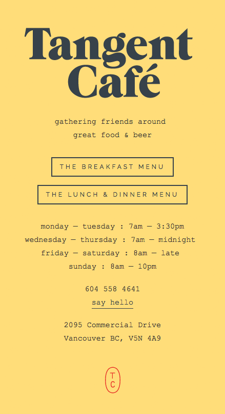
Figure 12: Menu for the Tangent Café, Vancouver, BC.

Figure 13: Empire: The Unintended Consequences of Dutch Colonialism by Eline Jongsma & Kel O’Neill shows that monospace can function effectively as body text.
If a design style or tool falls out of fashion, you can bet that somewhere a graphic designer is strategizing how they can rehabilitate it and incorporate it into their work. After all, anything that hasn’t been seen for a while has the potential to look daring and new.
Commenting is easier and faster when you're logged in!

Recommended for you
Hermann Zapf, ITC & Apple: The History of ITC Zapf Chancery & ITC Zapf Dingbats
On June 4th 2015 we lost one of the great ones. I’m speaking of Hermann Zapf, th...

Times Roman vs. Times New Roman
Times Roman and Times New Roman are very similar, but not quite identical fonts.

InDesign Magazine Issue 95: Footnotes
We’re happy to announce that InDesign Magazine Issue 95 (March, 2017) is now ava...