


I was watching Justin Seeley’s recent video about making long shadows in Illustrator and I thought, “jeez, why would anyone use Illustrator?!” No, I’m just kidding! I love Illustrator. But I did think, “hey, let’s do it in InDesign!”
Here’s how you can make long shadows in InDesign:
Here’s what we’re starting with… just text in a text frame:

Now clone that text frame (I usually just choose Edit > Copy, and then Edit > Paste in Place) and convert that duplicate to outlines by choosing Type > Create Outlines.
While the frame is still selected, choose Edit > Step and Repeat and make the offsets really tiny, and make a whole bunch of them:

The offsets you should use depend on where you’re sending the file. If it’s just for onscreen use, you can probably use 1 point offsets. That’s what I did for the word “Long Shadow” at the top of the page. But for print, you probably need to go smaller so that you don’t see jaggy edges. I’m using a fifth of a point, which is pretty tiny. Make sure the Preview checkbox is turned on, so you can see the result, and adjust the Count field until it looks right.
After you click OK, the duplicate objects will all be selected, and while they are still selected, choose Object > Pathfinder > Add (or click the Add button in the Pathfinder panel). Now go get a cup of coffee, because the more duplicates you made, the longer it will take to add them together:

(See the spinning beach ball? On the Mac, that means it’s taking a long time. For this example, with one letter, it took about 45 seconds of waiting on my laptop.)
InDesign “merges” all those outlined objects together into a single frame. Now, you can color it or change its opacity or blending mode or whatever you want to do. Here, I’ve applied a color swatch that is slightly darker than the background. Then I clicked through the object (Command- or Ctrl+click to select through one object to the next object beneath), selected the original text frame, and chose Object > Arrange > Bring to Front:

(Okay, to be completely accurate, this technique leaves one additional frame that you should probably delete: the original outlined frame that was step-and-repeated. That is, after you did the step and repeat, the original object was still sitting there. You can delete it now.)
If you just need a shadow, then you’re done. But in this case, I don’t want that shadow sticking out the side of the green box, so I’m going to select the shadow-object, choose Edit > Cut, then select the background frame, and choose Edit > Paste Into. That “clips” or “crops” the shadow, like this:

Because the actual “shadow” object was made by adding a bunch of frames together, its edge is kind of complicated. Here you can see it when I zoom in to the upper-right corner of the “S” and select the frame with the Direct Selection tool:

There are ways to simplify the line, but I probably wouldn’t bother, as this generally prints fine.
Obviously, the longer the shadow, the closer together the duplicates, the longer it will take. I love being able to create these kinds of effects in InDesign, because I have tons of control and I end up with native InDesign objects to work with.
Update: I realize I need to go back and add something to this post… I want to be clear that I’m not saying people should do these kinds of effects in InDesign, just that you can. After reading this, some folks told me they would much rather do this in Illustrator because the final shape is too complex for InDesign. That is crazy. However, there is one good reason why I would use Illustrator to make long shadows instead of InDesign: The purist part of me hates all those points along the diagonals.
So I prefer making these kinds of effects using Illustrator, not using the technique that Justin showed, but rather using the 3D Extrude and Bevel filter. Here I’ve selected a text frame (in Illustrator) with the letter “S” in it and opened the filter:
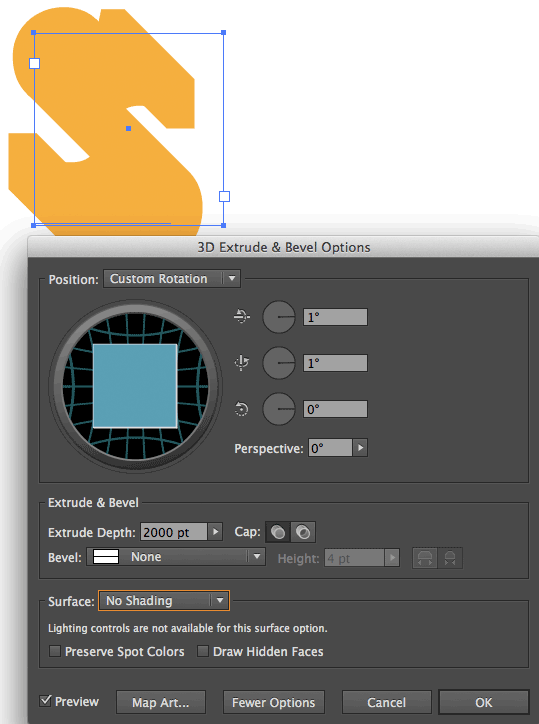
Note that I’ve rotated the shape only one degree, because I don’t want to twist the “straight on” look of the type. Then I make a huge Depth, and set the Surface to No Shading (which provides a totally flat look). Now I can click OK and either convert the effect into paths in Illustrator (Edit > Expand Appearance) or just copy and paste the frame into InDesign, which expands the appearance for me:
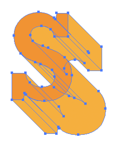
In the image above, I’ve selected the path on the top and changed its color to a slightly darker orange. But you can see immediately that the diagonals are all pure and simple and easy to manipulate — much easier and cleaner than having a thousand little tiny stair steps.
That said, I still stand by my original method: It works and it’s often easier and even more convenient than doing it in another program.
This article was last modified on December 30, 2021
This article was first published on May 17, 2014
Commenting is easier and faster when you're logged in!

Recommended for you


Holiday FX: Do You Want to Build An InDesign Snowman?
Do you want to build a snowman? Come on let’s go and play! I know that thi...

The Apple Watch Effect
Unless you were trapped under a rock (or a pile of Android tablets) recently, yo...