Making Letters Intertwine
PMF wrote: Can you make letters interlock in InDesign? That is, have part of a letter cross over another letter but have another part stay behind the letter so that...

Editor’s Note: For an updated intertwine technique, see this post.
PMF wrote:
Can you make letters interlock in in design? That is, have part of a letter cross over another letter but have another part stay behind the letter so that it links rather than just goes on front or behind. I know you can do it in Photoshop, but is there a way to do it in InDesign?
I learned something new and interesting about InDesign while researching your question! I’ll get to that in just a moment First, the one thing that is for sure is: You can do this, but you have to convert the text to outlines.
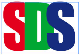
Here’s the original three letters in a text frame:

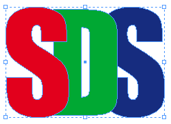
Now here’s what you get when you convert them to outlines:

I was shocked when I saw that. Shocked! Why? It’s just letters converted to outlines, right? Yes, but normally when you convert a whole text frame to outlines (or select some text and convert it), the result is a compound path which is often a hassle to work with, especially when you’re trying to move one letter around at a time. But the image above isn’t a compound path; it’s a group of compound paths. This is far easier to manage because each letter can act on its own.
Why did I get a group of objects? Because each letter is a different color! That’s the new thing I learned: If you change the character colors, InDesign can’t turn them into a compound path, so you get a group of path. Okay, so maybe that’s not earth-shattering, but it was fun for an InDesign geek like me.
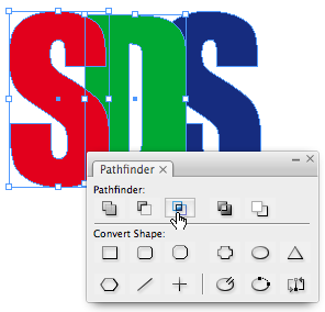
Anyway, once you have those separate character shapes, you can ungroup them and tweak them. In this case, I chose two of the letters, duplicated them in place (there’s lots of ways to do this) and used the Intersection feature in the Pathfinder panel on the cloned objects.

The result is a compound object made up of the two areas in which these two letters overlap. (The upper-right side of the S and the lower-right side of the S.) I chose Object > Paths > Release Compound Path, so I could manipulate them separately. I deleted the little object on the top and colored the lower object green (the color of the D). The result is that the D appears to be intertwined with the S.
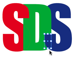
Now I repeated this with the D and the final, blue S. Here’s the result with a little piece of the intersection selected (after filling it with blue).

The only problem is that the pathfinder operation isn’t perfect. There are sometimes tiny areas that don’t match perfectly. For example, here’s where the red S and the green D connect (at 4000%):

In order to deal with this, I selected the intersection object (which is filled with green here) and gave it a tiny stroke (like .2 pt) of green.

Especially after this is printed and trapped, it’s very unlikely you’d ever notice any red showing through. (But it is worth proofing carefully, just in case.)
That said, InDesign actually has one other hidden pathfinder feature, which does the same thing, but even better than the Pathfinder panel: Transparency Flattening. Here’s how you can get the same effect in Illustrator (from InDesign text):
- Copy the text frame to a new document and convert it to paths.
- Change the transparency of the paths so that you can see through each letter to the letter below it.
- Export this page as EPS (or Acrobat 4 PDF), so it gets flattened.
- Open the file in Illustrator. You’ll see all the paths in perfect alignment with each other.
- Copy the paths back to InDesign and ungroup them.
- You’ll notice that you now have lots of extra color swatches and the wrong swatches are assigned to each segment of the text. Select each path within the text and assign the correct color again until you get the effect you’re looking for.
It takes a little time to achieve this special effect, but it goes faster than you might expect.
This article was last modified on December 30, 2022
This article was first published on December 20, 2007
Commenting is easier and faster when you're logged in!
Recommended for you

Making a Text Highlighter
Roger wrote: In MS Word, you can make text look as if it?s been highlighted with...

The Grabber Hand Key
John wrote: I use a mighty mouse for zipping up and around a page, but I miss gr...

Breaking Very Long Lines with No Hyphens
When a reader asked how to break text without hyphens, we were stumped... until...


