


Excerpted from Professional Design Techniques with Adobe Creative Suite 3 (Adobe Press).
A good newsletter is a valuable means of communicating with customers, colleagues, and clients. Portable, cheap, and unbreakable, the newsletter holds its own even in the Internet age.
In this excerpt, you’ll learn how to develop the all-important front page, including a newsletter’s nameplate (sometimes mistakenly called a masthead). And the tips on working with graphics will prove that even the least expensive images can look good when you know the inside tricks.
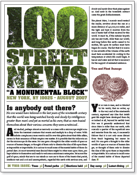
This newsletter’s front page commands attention.
This excerpt is in two parts:
Part 1: Newsletter Development
Part 2: Working with Graphics
To read each part as PDF file in your Web browser, click the links above. You can also download the PDF to your machine for later viewing.
To open the PDF, you’ll need Adobe Acrobat or Adobe Reader. Download the free Adobe Reader here.
To learn how to configure your browser for viewing PDF files, see the Adobe Reader tech support page.
Excerpted from Professional Design Techniques with Adobe Creative Suite 3 by Scott Citron. Copyright © 2008. Used with permission of Pearson Education, Inc. and Adobe Press.
This article was last modified on January 8, 2023
This article was first published on February 8, 2008
Commenting is easier and faster when you're logged in!

Recommended for you

Hanging Punctuation with Optical Margin Alignment in InDesign
One simple trick to improve the look of justified type.

Enfocus Unites Printers, Publishers and Designers with Educational On-site Seminar Series
Enfocus Software, the world leader in PDF workflow tools, has launched in conjun...

CreativePro Ask the Expert Video: Lisa Carney
In this week’s CreativePro video, David Blatner chats with Lisa Carney about her...