

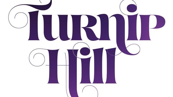
How many fonts do you have on your computer? Don’t bother looking, we both already know the answer: a lot. Some of those fonts are built for setting large amounts of text for people to read. Others are built for setting small amounts of type for people to see—type that is combined with color, images, sizing and spacing to get attention and convey a specific message. Otherwise known as display type. Whether you’re making a book cover, flyer, poster, ad, or packaging, you need to know how to wield display type effectively to create high-quality designs.
In his new Lynda.com course Learning to Set Display Type, John McWade shows you all the ins and outs of working with display type, how to understand the voices your fonts speak with, how to choose the right fonts and use them effectively, as well as how to avoid common pitfalls. This course is absolutely packed with valuable info—if you have just 42 minutes and 13 seconds, you can watch the whole thing and learn to take advantage of your fonts like never before.
Here’s the course description:
Whether you’re browsing the web, picking up groceries at the supermarket, or driving past colorful billboards on the freeway, typography jumps out as a distinctive part of the landscape. Type is a universal design tool—freely available, endlessly versatile, incredibly expressive, and fun to work with. Knowing how to harness its power is essential to effective design. In this course, learn how to do just that.
Join John McWade as he explains how to design in a variety of styles and voices using display type, which is type that’s set at headline size and above. He discusses type families that include strikingly expressive characters, shows how to combine typefaces, shares how to avoid common design flaws, and takes you through working with type in photos. This art form is applicable to print advertising, brochures, magazines, posters, fliers, slide decks, and much more.
- Topics include:
- What is display type?
- Form vs. function
- Setting display type
- Combining typefaces
- Tightening or loosening a setting
- Using display type with images
- Avoiding common mistakes
- Typographic voice
In the free video below, John delves into the topic of form vs. function, showing examples of effective display type and the various messages they convey. Check it out!
Form vs. function
For Lynda.com members, if you are currently signed in to your account, you can also check out these videos from the series.
Not a Lynda.com member?
Get 10 days of free unlimited access to Lynda.com.
Tighten up
Combine typefaces
Common mistakes
This article was last modified on July 25, 2019
This article was first published on May 5, 2017
Commenting is easier and faster when you're logged in!

Recommended for you

Breaking Underlines for Descenders
If you’ve ever tried to design type with underlines, you may have run into...

CreativePro Week Conference Speaker Spotlight: Keith Gilbert, the Typeface Geek
Welcome to our Speaker Spotlight series, designed to highlight some of our Creat...
Art and Design Inspired by Mexico
Happy Mexican Independence Day!! What’s that I hear you saying? “It...