Logos Are Type Too
Logos consisting mainly of letters may not always read like text, but that doesn’t mean that their designers can stomp willy-nilly on the rules of good typography. In other words, a logo is more than just a graphic entity, and how it looks depends in large part on how well its characters are placed.
I got to thinking about this after reading of a new European directive that requires herbal medicines to be tested for purity and efficacy in return for the right to bear the “seal of approval” shown on Figure 1. Even a quick glance at that logo set the alarm bells ringing.

These three letters as set form a very uncomfortable ménage à trois. The H and R are on the most intimate terms, but the T is only in fingertip contact. There’s no need for this, as there’s plenty of room to use more natural spacing. Figure 2 shows the “before” and my edited “after.”

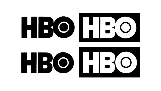
I don’t mind second-guessing the European Union in such cases, as these are the people who mandated the use in package labeling of two of the more unattractive glyphs I know of: those for the liter and “approximately” (or “estimated,” for imprecise content quantities), as shown in Figure 3.
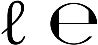
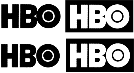
Quirky spacing is a hallmark of contemporary logo design, although unlike in the THR bug, it’s usually applied in an attempt to be eye-catching. Squeezing out spaces and creating ligatures has become such a cliché that it borders on being a tic among logo designers. Take, for example, the Home Box Office logo in Figure 4. There’s no reason—neither visual nor literary—for the BO combination to touch, leaving us to conclude that it was done just to be cute. I’m not necessarily against cute, but again, I think my “after” is an improvement.
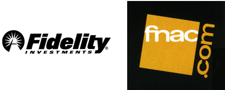
Not that all such ligaturizations (to coin a term) are bad. Figure 5 shows a couple of examples that pull it off rather well. In one case, the ligature formalizes what would have been a collision between characters in any case, due to tight spacing. In the second, the ligature not only binds the logo together but also acts as a pronunciation aid for a weirdly named book and media store.
I have one more example for you, in which tight and loose spacing combine in a single logo to create a remarkable distraction. Daedalus is the journal of the American Academy of Arts and Sciences, and it has chosen to use the ae diphthong in its masthead, an archaism once seen in words such as encyclopedia and pedagogy. Its logo appears in Figure 6.

Using the diphthong is arguably an affectation, but using it amid very loosely spaced type is a mistake. The ae diphthong is not a single character—it is the marriage through ligature of an a and an e, and as such needs to be considered as two characters. Two very closely spaced characters. By having them so tightly spaced and all the other characters around them so loosely spaced is a distraction that draws the eye directly to the dark knot they create.
The old kerning axiom that the character pair with the most intractable spacing problem must key the spacing for the surrounding text applies here. The very use of the diphthong argues for tighter rather than looser overall spacing. Figure 7 shows my fix.

You could argue that the eye-catching effects I’ve found noisome here are in fact effective gimmicks to make a logo more distinctive and memorable. They caught my eye, after all. To that I would answer that ugly is always eye-catching, and even though these are small uglinesses in the scheme of things, they are—assuming they’re intentional—at best cheap and unnecessary tricks. We suffer enough visual discordance every day, and in that environment, pretty things should be eye-catching too.
This article was last modified on November 21, 2025
This article was first published on May 4, 2011
Commenting is easier and faster when you're logged in!
Recommended for you

The CreativePro Weekly Top 10, vol. 4
More marvelous miscellanea for you to contemplate and click. 1. Need a place to...

Think You Know What OpenType Is? Think Again!
I have been teaching typography to both students and professionals alike for ove...

Scanning Around With Gene: The Signpost Up Ahead
I like things that change slowly and aren’t as subject to fashion as most graphi...


