
 Jan Tschichold (pronounced yahn chih-kold), 1902–1974, was a highly regarded German calligrapher, typographer, book designer, and educator. He is considered one of the most influential figures in typography and design of the 20th century. His foray into Modernism, and then his return to Classicism highlighted his constant exploration into the “proper” use and application of type, grids, and overall design. Tschichold’s masterful understanding of type, lettering and design led him to work as a designer, educator, author of several books, and typeface designer—including his highly regarded Sabon. His impact on the print industry in Europe and the USA is uncontested, and his typeface Sabon is still in use today.
His Early Years
Born in Leipzig, Germany in 1902, Tschichold was trained by his father, who was a signmaker and calligrapher. Thus he began his practical education in typography and lettering. Once he decided his goal was be a typeface designer, he attended the prestigious Academy for Graphic Arts in Leipzig. After studying the traditional typographic conventions of the day, a visit to the Bauhaus and its functional design, as well as the influence of “radical” Constructivists such as László Moholy-Nagy and El Lissitzky had a powerful influence on him. He then adapted Modernist design principles, which included the exclusive use of sans serif type; non-centered type on posters, book covers, and such; and other rigid guidelines.
1921
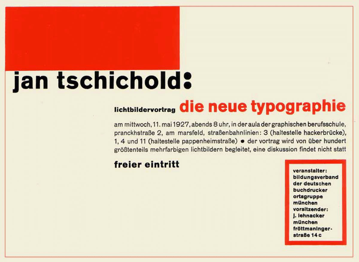
He first published his views in an article entitled Elemental Typography in 1925, which led to an uproar in the design world, but it eventually changed the course of what was considered traditional design with its centered type, “outdated” typestyles, and lavish ornamentation. His continuing work in this direction led to authoring his instructional book, The New Typography (Die neue Typographie), which was published in 1928.
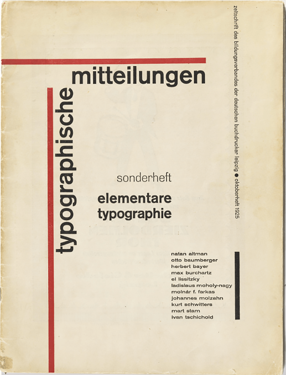
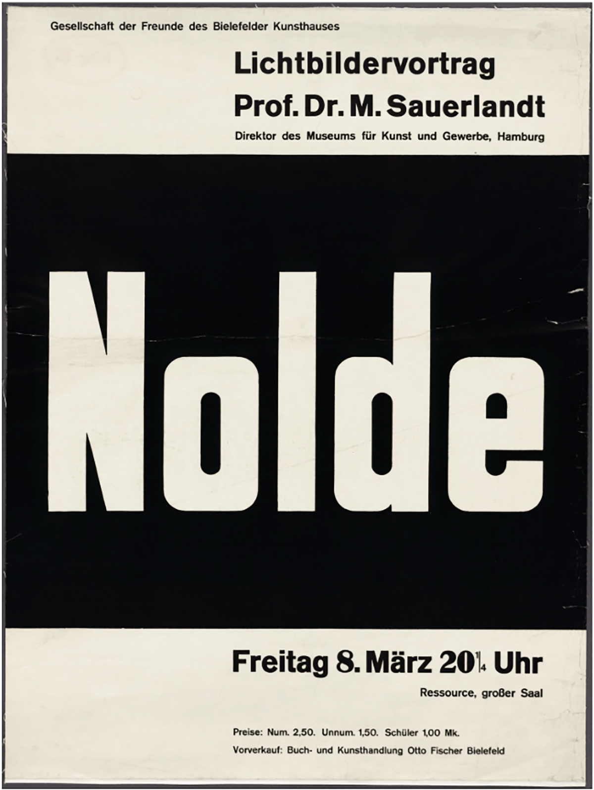
Elemental Typography, 1925
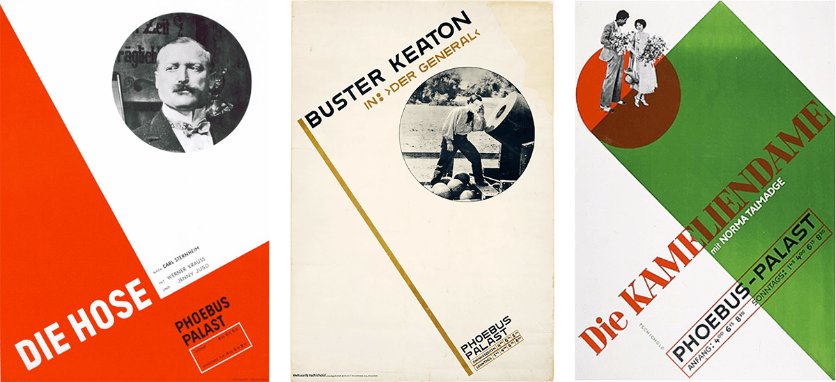
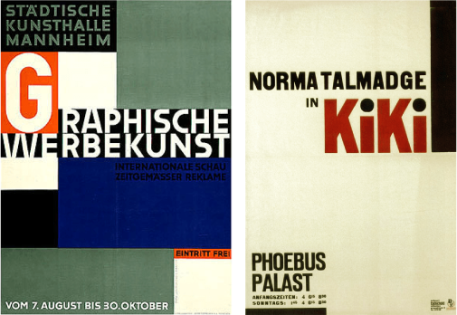
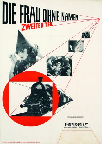
1926, 1926, 1927
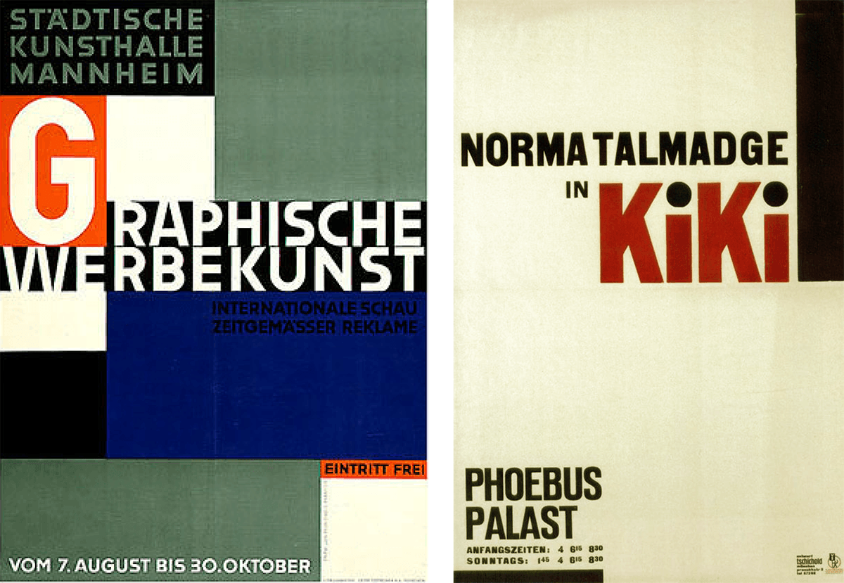
Both from 1927
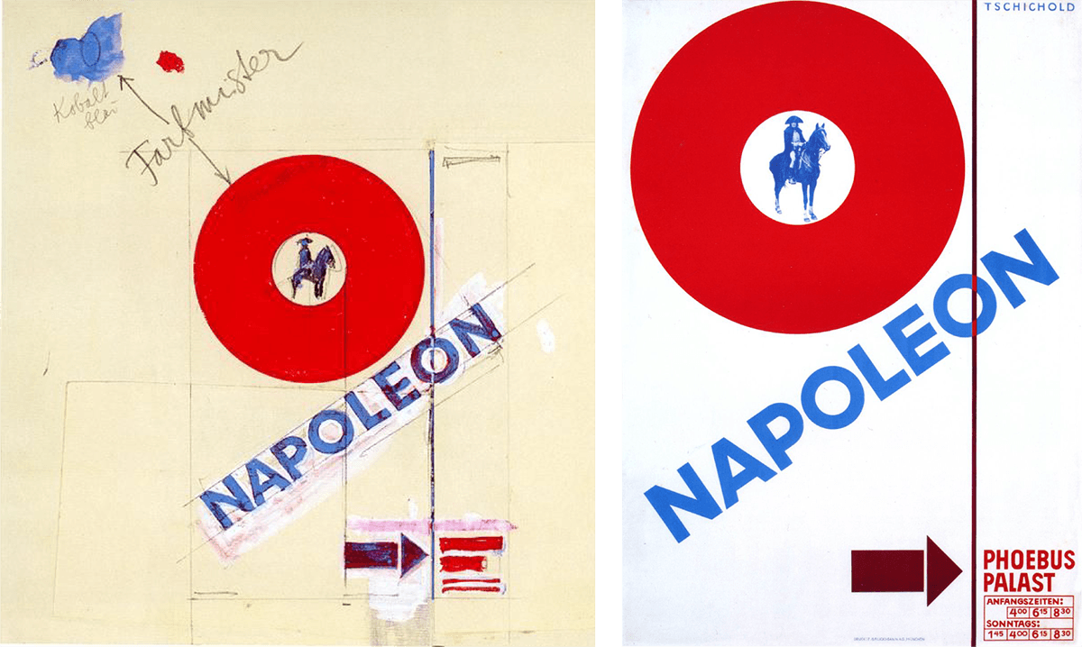
1927
In his own words, he believed that “the essence of the new typography is clarity. This puts it into deliberate opposition to the old typography whose aim was ‘beauty’… The aim of every typographic work [should be] the delivery of a message in the shortest, most efficient manner… White space is to be regarded as an active element, not a passive background period… Asymmetry is the rhythmic expression of functional design. In addition to being more logical, asymmetry has the advantage that its complete appearance is far more optically effective and symmetry.” Since its initial release, The New Typography has been recognized as the definitive treatise on book and graphic design in the machine age.
The New Typography, 1928
1929

1930, 1931
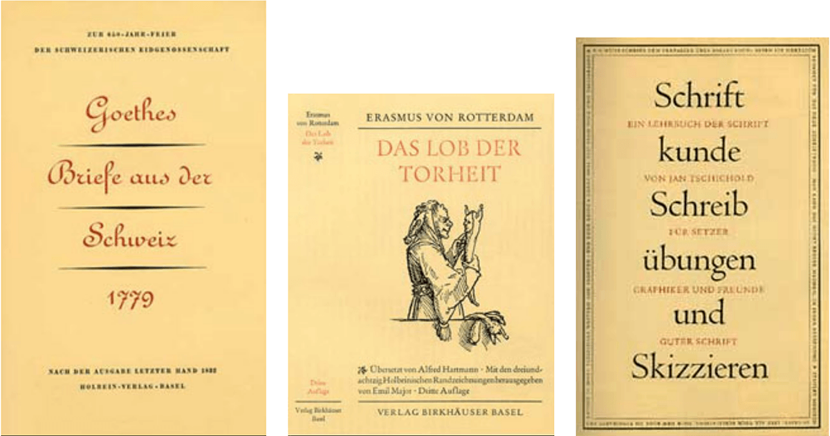
In the years up to 1933, Tschichold’s designs were in the style of the Bauhaus and “the new typography”. In that year, however, he fled from the Nazi government after a search of his house, temporary imprisonment, and the loss of his job. Tschichold then sought refuge in Switzerland, where he started working at the Basel School of Applied Arts, as well as part-time at the Benno Schwabe publishing house in Basel.
These years were another turning point for Tschichold, when he slowly abandoned his stringent design philosophies, the influence of the Bauhaus, as well as the asymmetrical arrangements of industrial typography, and returned to Classicism. He later condemned his own Die neue Typographie as being too extreme, denouncing his own Modernist design beliefs as being authoritarian with parallels to National Socialism and fascism and the more or less militaristic arrangement of lines. From 1938 on, he began to center align almost all his work. He then devoted himself completely to book typography. His quotes from this time include, “My errors were more fertile than I ever imagined… In the light of my present knowledge, it was a juvenile opinion to consider the sans serif as the most suitable or even the most contemporary typeface.”
1941, 1945, 1951
Penguin Books
In the mid-1940s, Tschichold joined the Penguin publishing house in London, where he began to redesign the template for their books, instituting designated typefaces and positions for the title and author’s name with a line between the two. His redesign incorporated different styles of Gill Sans to help focus on the simple and geometric shape of a sans serif typestyle. (Not all the books had a standard typeface, but Gill Sans was the primary type in many of the books.) This redesign led to the Penguin Composition Rules and King Penguin standard grids, which represent one aspect of the typographic revolution that Tschichold masterminded at the publishing house.
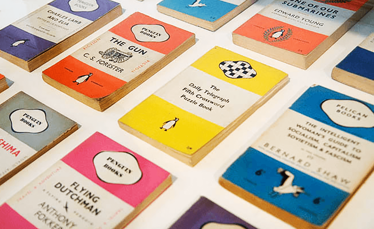
Penguin Books
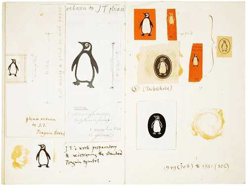
Penguin logo development
After Penguin, Tschichold returned to Switzerland in 1949, where he continued his work as a master typographer, writer, and educator. He did some traveling to the U.S. where he gave talks in Chicago as well as at Harvard and Yale universities. Jan Tschichold died on August 11, 1974, in Locarno, Switzerland.
Sabon and Other Typeface Designs
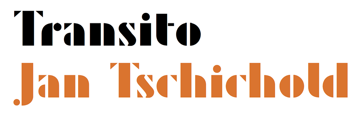
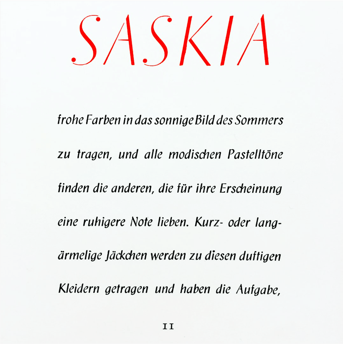
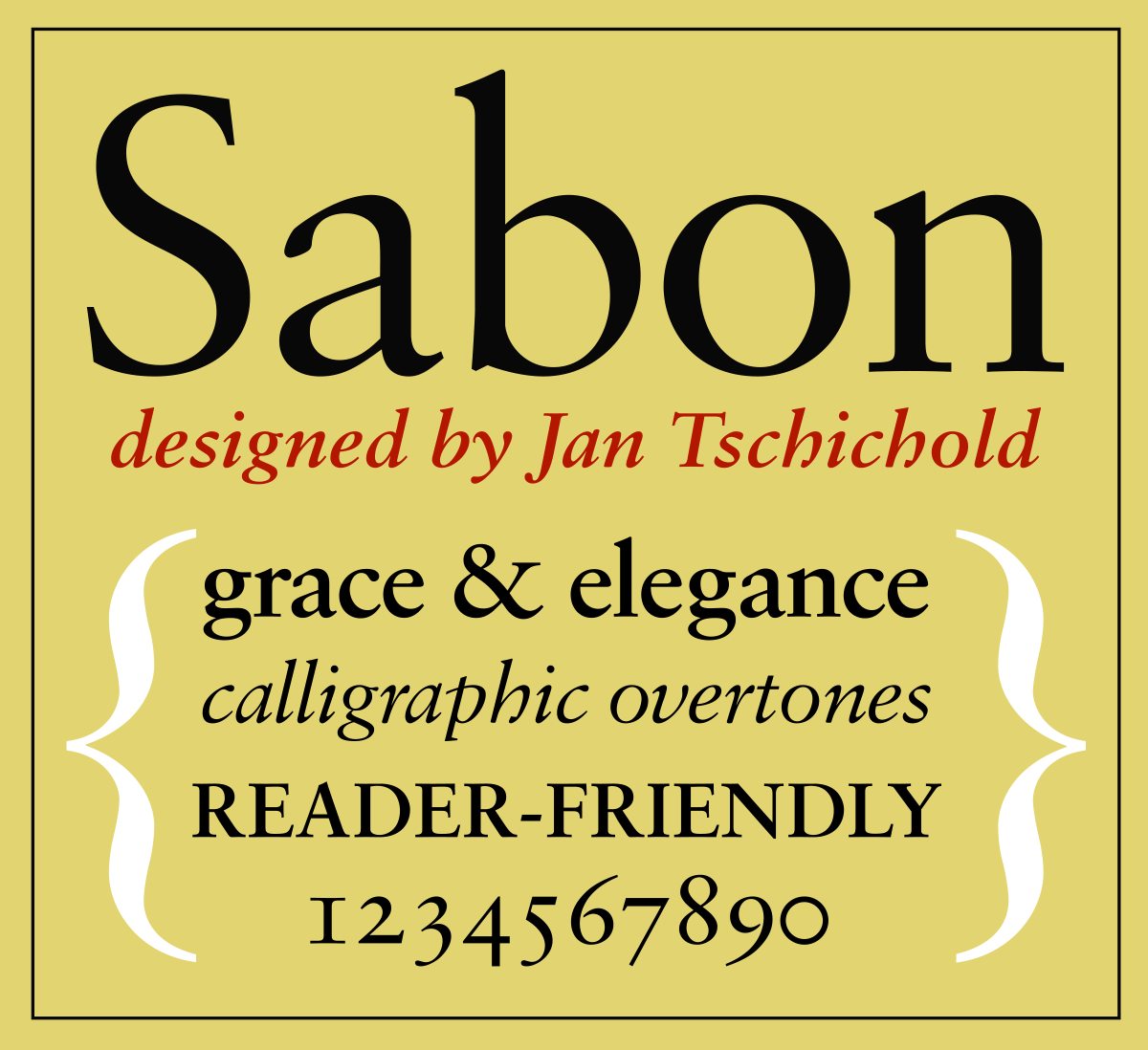
Tschichold’s typeface designs reflected his philosophies of the moment. The 1930s were a very fecund time for his types, and include Iwan Raschiniev (1930), Transito (1931), Saskia (1931–1932), Zeus (1931), and Tschichold (1933–1936). In spite of this spike in creativity in the ’30s, his most famous typeface, Sabon, was designed in 1967.


Tschichold typeface
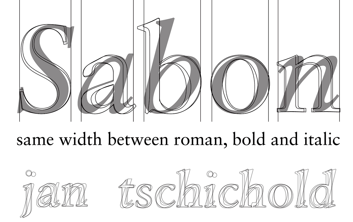
Sabon was Tschichold’s most important typeface creation, and was modeled after a 1952 Garamond interpretation. It was initially created in response to a request by a German type foundry for a face with equal spacing in the roman and italic versions, which would simplify the typesetting. They also wanted a font that would behave the same way across the three tangible forms of technology available at the time: single-type machine composition, foundry type for hand composition, and linecasting.
There were originally three weights: normal, italic and semibold. Later on, Linotype expanded the Sabon family in 1984 by adding a cursive semibold weight. Then came Sabon Next, a revival of a revival, so to speak. It was designed by Jean François Porchez, who improved the proportions of the existing digital Sabon while matching its alignments. So what did Tschichold have to say about deviating from his earlier rigid philosophy? “In the light of my present knowledge, it was a juvenile opinion to consider the sans serif as the most suitable or even the most contemporary typeface.”
From a poster by Cristiana Costin, 2014
Few have left deeper impressions on the typography of the last fifty years than Jan Tschichold. He cleared away the old approach to typography of pre-1925 and made room for a more modern approach.
This article was last modified on May 21, 2022
This article was first published on October 9, 2018
Commenting is easier and faster when you're logged in!

Recommended for you

New Handwriting Fonts from P22/Sherwood
Introducing two new handwritten style font sets from Ted Staunton’s Sherwo...
Airbag: A Free Headline Font
Airbag is free slab serif font created by Simon Stratford. Inspired by Trend by...
The Exquisite Stylings of deVicq Design
Roberto de Vicq is an award-winning designer who is known for his stylish, sophi...