Indic and InDesign
A primer on Indic scripts and how to create stunning documents with them in InDesign.
This article appears in Issue 128 of InDesign Magazine.
India is home to more than 1.3 billion people. Almost 18% of all people on Earth live in India. So it might not surprise you to learn that hundreds of languages and dialects are spoken there. The two official languages of the national government are Hindi and English.
Each state also chooses a scheduled language, of which there are 22 in all, including Bengali, Marathi, Telugu, Tamil, Gujarati, and Urdu (each of which boasts more than 50 million speakers). In written form, these languages use a diverse set of scripts. The base script used for the North Indian languages is called Devanagari, literally meaning the “city of the gods.” The act of committing knowledge to writing is believed to be a revelation in itself, and thus wisdom is glimpsed by this act.
Indic scripts are constructed around a method (such as a line in Hindi and Gurumukhi) that holds the syllables of a word together. Consonants (characters) and vowel sounds (called swaras) are combined to form syllables, which are then combined to form words. Complex-sounding syllables can be formed by joining multiple consonants together. These aspects make Indic scripts different from their Roman (or Latin) counterparts, which follow a simpler, linear model that is easier to type and compose.
Composing text with Indic scripts is itself a challenge, and this is the crux of the problem for creating editorial workflows in InDesign. Whether or not you are familiar with the languages themselves, the knowledge and techniques of using these language scripts in the design environment is essential as a first step to creating quality layouts. In this article, I will present some basic tips and techniques as well as foundational understanding of these scripts to help you create stunning design compositions with confidence.
The
Indic Language Scripts
Most South Asian scripts are descendants of the ancient and defunct Brahmani script. The notable feature in most of these scripts (Urdu being an exception, since it has evolved from Arabic and Persian, which are both right-to-left systems) is that the vowels are not necessarily separate glyphs, but are usually represented as appendages to characters with which the sound is associated (Figure 1). Such an appendage is called Matra. In addition, a small variance in the sound of a basic character is represented with symbols over or below the core character or consonant.

Figure 1. In most Indic languages (as shown here in Hindi) the vowels are appendages (illustrated in red) that can precede, follow, or sit over or below the base characters.
Such symbols are called diacritics in English and Nuqta in Urdu and Persian. The Devanagari—a composition style for Hindi, Sanskrit, and other North Indian languages—also uses these diacritics for representing sounds that are closer to, but not the same as, the basic character. Since Indian languages have an exhaustive set of representational sounds and characters, the huge list of glyphs also contains composite glyphs that are made up of one half or two halves of a glyph, or even multiple glyphs composed together.
Thus, composing in Indic languages involves the understanding of space and style necessary for the subject you are dealing with as well as ensuring that certain rules (elaborated below) are followed. InDesign offers some industry-leading composition solutions for Indic languages.
Compositional Basics
Here are some of the first things to consider when working with Indic text.
Setting the environment
For most left-to-right languages, if the fonts you are using have all the right glyphs, the regular version of InDesign will automatically work without any problem. However, since Indic languages require additional language-specific processing to compose the text properly and to detect and assemble the various glyphs and their diacritics, there is a need for special dictionaries that enable such heuristics while you type or compose. Indic languages also do not use in-word hyphenation except in special cases.
As a rule, right-to-left languages such as Urdu, Arabic, and Hebrew require additional compositional capabilities. To enable such core capabilities in composition, InDesign has had an alternate composition engine since CS4, called the World-Ready Composer, which enables support for “complex script” languages such as the Indic languages, Arabic, Persian, Hebrew, and Thai. Therefore, the most important practice for a designer creating documents in Indic scripts is to ensure that either “Adobe World-Ready Single-line Composer” or “Adobe World-Ready Paragraph Composer” is selected (in the menu of the Paragraph or Control panel) when composing text in these languages (Figure 2).
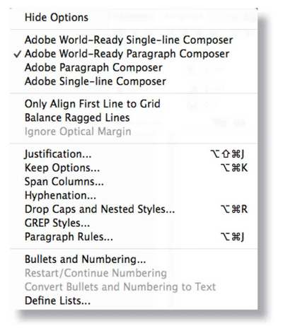
Figure 2. The Paragraph panel menu showing the Adobe World-Ready Paragraph and Single-line Composer options.
The other basic requirements for Indian scripts are:
- Set the Adobe World-Ready composer as the default composer for the document.
- Specify the Adobe World-Ready Composer for [No Paragraph Style] (this allows you to import content into InDesign without issues).
In InDesign, you can simply use the Indic Preferences.js script found in the Scripts panel (InDesign > Scripts > Scripts Panel) to enable these functions. The script also does more:
- Sets the font locking preferences. That is, if InDesign detects that you are typing in Indic script in a font that doesn’t support Indic, it will switch to a font that does.
- Turns on Missing Glyph Protection (in Advanced Type preferences), so if you try to change text that has Indic to a font that doesn’t support those glyphs, InDesign will show a warning (Figure 3).

FIGURE 3. The Indic Preferences script turns on Missing Glyph Protection so InDesign will warn you if you try to use a font that doesn’t contain the necessary glyphs.
- Changes the default page size to A4.
- Changes measurement units to mm (not a necessary requirement, and you can later change them to picas or anything you prefer).
To set up these preferences, do the following:
- Open the Scripts panel (Window > Utilities > Scripts).
- Double-click Indic Preferences.js.
To clear the Indic preferences, use the keyboard shortcut to revert to default preferences: hold Shift+Ctrl+Alt (Windows) or Shift+Cmd+Option+Ctrl (macOS) while you relaunch InDesign.
Fonts
There is an abundance of free and commercial fonts available for Indian languages. But it’s important to choose fonts that are not just well designed but also contain the exhaustive set of glyphs needed to compose all possible characters properly. Although common language may not require all those complex glyphs, they will be needed to correctly compose ancient texts in Sanskrit, for example—but it is always a good practice to use a well-designed font set, to minimize the chances of inadvertently missing a glyph or character in a typical workflow.
As a rule, I always use Adobe’s Devanagari (available with InDesign) for most Hindi compositions—not just for the brilliant design of the font itself but also for ensuring that most popular glyphs and diacritics are available to me. You might also want to compare the glyph set of other fonts you are planning to use with Adobe Devanagari to ensure that those fonts are as robustly designed.
Text inputs
Exercise care when placing/importing text into InDesign. Since detailing every situation is beyond the scope of this article, I suggest that the best method—especially if you are not a language expert—is to compare your original text visually with the final composed text in InDesign.
For example, sometimes you might take a word or a sentence and translate it with Google Translate, and then copy-paste the translated text back into InDesign. Often the word order, or the letter order, doesn’t go properly. In such cases, you might do well to take a screenshot of what that word looks like in Google Translate, and compare it to how it looks in InDesign. Just zoom in and look at the details.
Obviously, the font might not be the same, but focus on the shapes of characters. Are the dots/slashes in the same place? Are things connecting? Do the shapes look similar in terms of movement of the line? Are they connecting in the same places or not? There might be some variations because of the change in style, but you should at least be able to spot any big problems. Ensure that the Matras, the inter-character spaces and diacritic marks, are not shifted or disappearing and that there are no missing glyphs (sometimes appearing as rectangles). Usually, an initial exercise with a basic text input and close inspection of a paragraph composed in your chosen font in InDesign will work for the entire workflow thereafter.
Document types
Depending upon the project, you might be creating documents in different ways. These could be multi-language (Indic and Latin combined text, for example, in a dictionary or description/analysis of traditional text), a single-script book, or a single-script complex design (magazine, textbook, or scientific book). You might also be creating language-specific ebooks or mockups for web or phone apps. Depending upon the specific requirements, you should ensure that your document is always set up for optimum Indic composition. Since Latin composition will not be impacted by being in the Indic environment, your Latin text features will nearly always work as expected when you are geared to design the Indic texts. Running the Indic Preferences.js script before such a workflow will ensure that you are correctly set up before you start.
Compositional Features
The design of a language script is, in a way, an evolution of the cultural thought process. Since the South Asian languages evolved almost exclusively without the influence of the Latin scripts, almost all Indic scripts exhibit peculiarities in terms of compositional structure. The following issues should be considered and accounted for in your text styles and document setup when working with Indic languages.
Drop Letters
I know that designers are fond of using drop caps in Western text. But due to the very structure of the script and their visual character, drop letters rarely work for Indic language compositions. Hindi and other North Indian languages use a top line to join all characters of a word, and “dropped” characters tend to abruptly break that continuity, making the line too thick over the drop (Figure 4).

FIGURE 4. Dropped (or raised) letters do not go very well with Indic scripts because they break the structural unity of words.
Right-to-left languages such as Urdu, Arabic, or Persian combine the word’s characters to create unified composites; there, too, dropped and raised caps break the unity of the composition. Having said this, there are situations where using drop caps or raised caps can be a great idea. The main thing to understand is that for Indic languages, it is a “tread-with-care” territory.
Leading
In terms of compositional design, you should give Indic fonts a little more leading than their Latin counterparts because of the nature of the forms involved. Indic typography has a lot of action happening above and below the basic text block—the Matras and diacritics sit above and below the basic character space. You should avoid setting Indic typography as a compacted block. Always give it a little bit extra breathing space (Figure 5).

FIGURE 5. Indic scripts must be composed with more line spacing (leading) than Roman/Latin fonts to accommodate the ascending/descending Matras. (Shown here is a Tamil font composition by Aadarsh.)
For Latin and Indic hybrid compositions, it is recommended that the Indic is composed above the Latin; the open and organic nature of the Indic types tend to sit better on top of more solid and straight-line Latin characters than the other way round. When you compose the Latin under the Indic, you are essentially giving the composition extra stability.
Font size
The style of the Indic script typically has the effect of making the text seem smaller than the comparative Latin text if used in the same point size (just as many sans-serif typefaces seem larger than their serif counterparts in Roman scripts). Designers, thus, must take care to adjust and use sizes by visual experimentation (Figure 6). As a rule of thumb, 9-point Roman text and 12-point Indic text in commonly used fonts tend to look similarly weighted.
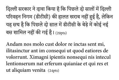
FIGURE 6. Indic scripts need larger font sizes to attain comparative Roman/Latin visual size and weight.
Story length
Indic text, composed according to the aforementioned rules, tends to accommodate fewer words per page than a Latin counterpart. This is an important consideration when you need to communicate the available space to a writer or an editor who needs to fill a specific amount of space on the page.
Hyphenation
In most compositional environments (except newspapers, where the need for crunching maximum words is most intense), it is best to avoid hyphenation entirely.
Limited stylistic variants
If you search for parallel font-style variants between Latin and Indic, you will be disappointed. Most Indic fonts will provide only normal and bold as stylistic variants, and if you are trying to use thin, italics, sans-serif, small-caps, or all-caps, you will find that Indic fonts have no such variants. Instead, you should select other fonts that might, due to their unique designs, fulfill the desired purpose for such applications.
Appropriate glyphs
Some characters that have traditional associations tend to be represented by special glyphs and may not be composed as such in the original texts (Figure 7). Using the Glyphs panel is a handy way to locate such characters and use them as design elements, especially when coordinating your design with the document’s subject.

FIGURE 7. The Om symbol available as part of the Adobe Devanagari font glyph set.
Bullets & numbering
Indic scripts can use Arabic numerals as well as native numbers. If you wish to use indigenous glyphs for your bullets and numbering, be aware that they will need to be applied manually (automatic numbering might not work).
Exploring new fonts
Established font repositories and vendors such as Linotype and Typekit are great resources for Indic fonts. Adobe provides a comprehensive set of Indic fonts (e.g., Devanagari and Gurmukhi) as part of your CC subscription. In addition, you can find innumerable fonts as free downloads from the internet, including Google Fonts. However, most of these need to be carefully evaluated before deciding to use. Some Google Fonts are not appropriate for your print projects because they are designed for web use and sometimes have limited glyph-set and compositional characteristics. But overall, if your font passes your compositional checks (compose a page of text using the font and get a language expert to glance through it for its proper reading), then you are good to go. Personally, I prefer OpenType fonts so that they will work well on both Mac and Windows environments.
Common Questions for Working with Indic Scripts
Q: How can I ensure that the language of the text I’m composing is correct?
A: Ideally, your client will give you the text that you need to set. You shouldn’t have to translate it yourself. You also need to select an Indic typeface carefully—this will be the most important choice you will make. Look for a typeface that has a comprehensive set of composite glyphs and one that has Latin characters that are matched with the same optical sizes and styles.
Q: What if I receive an InDesign document that is pre-filled with Indic text and has not been set properly using the Indic Preferences.js script?
A: If you expect to do a lot of work with the document, then I would recommend creating a fresh copy that is properly set up using the script, and then copy-pasting all objects into it from the old document. The results will be even better if you copy-paste first into a plain text-editing application to strip the text of its formatting before pasting it into your new InDesign document.
Q: Where can I learn more about Indic scripts and their typesetting?
A: Wikipedia has a lot of good information on the subject. You can learn about Devanagari (one of the many Indic language scripts) here.
Another useful source is the Acharya website, run by the Indian Institute of Technology Madras.
Commenting is easier and faster when you're logged in!

Recommended for you

TypeTalk: Introducing Gill Sans Nova
Gill Sans is distinctive, historic sans serif typeface designed in 1926 by the i...

InReview: iziExport
Plug-in gives you a head start in moving content from InDesign to WordPress.