Logo Smackdown! Apple vs. NYC

It’s more like a battle of the corporate attorneys than a lucha libre, but the lawsuits are flying between Apple Inc. and the Big Apple — and it’s all over a logo.
New York has a citywide initiative called GreeNYC that promotes 10 key goals, such as reducing global warming emissions by 30%, for giving New York a more sustainable future. That initiative has a logo:
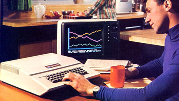
This is the Web 2.0 version of Apple’s logo:

Apple says that the GreeNYC logo is too close to the computer maker’s, which will confuse people and lead to them, I don’t know, composting their old iMacs or something.
Apple filed its suit in September 2007. Then New York City filed a counterclaim. Then there were challenges and protests. All legal, mind you — no taking over Times Square with banners or the like. Frankly, trying to unravel who’s claimed what is a little confusing. I just love that something graphic designers create all the time is getting this much attention.
Besides, New York must face a possibility more chilling than an irate Steve Jobs. Look at the GreeNYC mascot:
And compare it to this still from the opening credits of a 1970s TV show:
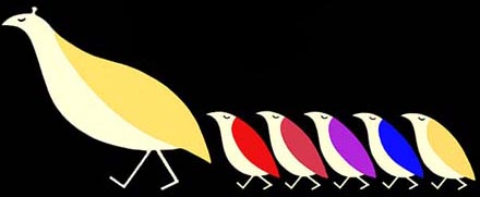
If I were Mayor Bloomberg, I’d be looking over my shoulder for a vengeful Shirley Partridge.
This article was last modified on June 19, 2020
This article was first published on April 4, 2008
It is very interesting how companies wanted to keep hold of copyright and all licenses. Winning the legal battle can be hard since it will take years to conclude a single case. law essay | buy essay
lol.. dont know why but more than the new 2.0 logo i liked the old one better :p
-faraz from best blu ray maker and blu ray ripper software
There is no confusion. They’re two different products. One has nothing to do with the other.
lisa from registry repair
they look nothing alike! So we can’t design logos with globes because AT&T has one or checkmarks because Verizon has a horrible logo.
I think I think voucher codes or coupons are more important than ever to people trying to save money on their shopping online.
To find information about View Articles By, you buy research paper or at the writing services. Some term papers writing services present the essay writing help just about View Articles By.
To find information about Logo Smackdown, you buy research paper or at the writing services. Some term papers writing services present the essay writing help just about Logo Smackdown.
I think that apple has much better looking logo. Mike
the jump manual – regcure license key – winter coats
In early 1980’s, Ogilvy & Mather created an advertising campaign for NYC – “You have to be crazy to live in New York, crazy about…” It incorporated “The Big Apple” logo, illustration of an apple with the city reflected in it. Does anybody have a copy of it?
I find myself drawn to the obvious line of literature. “He who controls the past, controls the future.” We all recognize this as the Party slogan from George Orwell’s infamous novel, 1984. Mac’s opposition to the GreeNYC logo is nothing short of Big Brotheresc. Sure they look similar in proportion, but come on! I personally appreciate GreeNYC’s creative use of the infinity sign within it’s “Big Apple”. The connection that they draw with recycling and eco-system flow is beautifully executed. Nice job GreeNYC…it’s time to throw the mallet back at Mac!
Being a designer, I decided to investigate just how close these 2 logos are to each other (Apple vs. GreeNYC). At first I thought Apple was being a bit foolish. But if you superimpose one logo onto the other, the apple shape shape of the GreeNYC log is exactly that of Apple’s apple. I mean it’s and exact fit! The little leaf off the top is similar, more stylized and of course pointing the other direction. But the apple outline is exactly that of Apple’s logo. So, yes, I would take issue with this logo.
Would never confuse those ‘Apples’ but sounds like the lawyers are having a sweet time with it. What a waste!
J@Birkwood
There is no confusion. They’re two different products. One has nothing to do with the other.
Can Apple not see what a corporate PR blunder this is? They are making themselves looking petty, short-sighted & stupid. Their logo is iconic — even non-MAC users out there readily recognize it. The NYC logo is completely different. Is MAC going to sue everyone, everywhere whoever deigns to use any sort of apple imagery in their brand identity?? Please… what’s next? Going after apple growers?
Don’t get me wrong I understand that plagiarism is nasty, but they look nothing alike! So we can’t design logos with globes because AT&T has one or checkmarks because Verizon has a horrible logo. I would understand if it had a bite out of the apple and no stem, but this is taking it too far.
Thanks for letting me rant.
Is there anyone at Apple that honestly believes that they are going to lose a customer becuase that person can’t decern between the Apple, Inc. logo and GreeNYC? As always, it’s time to give the public a little more credit and move on.
Apple needs to calm down. The last time I checked, they are doing reasonably well with their hardware, iPod domination, and overall cool-factor generating machine. NYC is actually trying to create something a little more wide-reaching and beneficial that consumer goods, and so the logo looks like a widely recognized piece of fruit. Great. Apple will continue to be cool. They will make money. And ultimately, NYC’s initiative will need to put more focus on executing well than just having an uber-mod logo war. How about Apple kick some cash and some press to the NYC plan, and launch some eco-informative podcasts to go with it, all pre-loaded on some minty green colored Nanos or something? Last time I checked, the “Big Apple” was around just a little longer than Job’s shop. Now if you’ll excuse me, I need to have my Apple sticker-plastered Prius serviced.