Members Only

InType: Type That Touches

Need an impactful type design? Try breaking the rules of word spacing.

This article appears in Issue 82 of InDesign Magazine.

What happens when letters connect…or don’t

Like much in life, good typography is as much about what to leave out as what to include. That special ingredient of space between the letters plays a key role in the way we respond to a message. Often “invisible,” good letterspacing, or tracking, is a key component of readability. It requires contrast between the letters and their background. It’s the background that gives form to the type. While consistency is usually the goal, does that mean consistently tight, consistently loose—or consistently “just right?” And how do we know the difference?

Why Does it Matter?

With loose letterspacing, we see more of the background. Too much, and the background gobbles up the type—letters lose their association with each other, and words lose their shape. With tightly-spaced type, we see less background—the words can look dense, possibly more impactful. But if there’s not enough background, the letters run into each other (Figure 1).

Figure 1: The same text with letterspacing “just right” (top), too tight, and too loose.

Figure 1: The same text with letterspacing “just right” (top), too tight, and too loose.

Here there’s the risk of an undifferentiated mass of type or creating unintentional meanings. We’ve all seen those funny (and not safe for work!) examples that do the rounds on the web, where carelessly-spaced letter pairs create a whole new level of unintended meaning. Certain letter combinations are known to be troublesome; hopefully the font’s kerning metrics address the problem up front, but this won’t always be the case, nor will you always agree with the prescribed metrics values (Figure 2).
Figure 2: Common letter pairs in need of kerning. Metrics
<!--more-- srcset=


kerning applied (left), and no kerning (right).” width=”200″ height=”144″ /> Figure 2: Common letter pairs in need of kerning. Metrics kerning applied (left), and no kerning (right).

At the micro level, you can employ manual kerning to adjust the spacing of particular letter pairs. Kerning is part of the fine-tuning of the spacing of a typeface, and you shouldn’t undertake it until the type style, size, and letterspacing (tracking) values have been decided. When it comes time to kern, be careful: you don’t want to end up keming instead of kerning (Figure 3).
Figure 3: A kern too far.

Figure 3: A kern too far.

Aesthetics Change

Exactly what constitutes good letterspacing is neither fixed nor universally agreed upon. It varies according to the method of typesetting, the size of the type, and typographic fashion. In Ye Olde Times, when type was made of metal, the space between the letters was fixed—the spacing literally being a part of the type (Figure 4).

Figure 4: With metal type, the spacing is incorporated into each piece of metal.

Figure 4: With metal type, the spacing is incorporated into each piece of metal.

While it was possible to add space between letters by inserting extra strips of metal, the only way to reduce space between letters was to cut away part of the metal in each piece of type. It wasn’t until phototypesetting in the 1960s and ’70s that it was practical to move letters closer together. With no metal to worry about—only photographic images that had no physical body—typesetters could set type as close as they wanted. The graphic designer most skilled at tightly spacing and overlapping letters was Herb Lubalin (1918–1981). He wrote: “ We’ve been conditioned to read the way Gutenberg set his type, and for five hundred years people have been reading widely-spaced words on horizontal lines Gutenberg spaced far apart… We read words, not characters, and pushing letters closer or tightening spacing between lines doesn’t destroy legibility; it merely changes reading habits.” [Quoted in Heller, Steven and Karen Pomeroy, Design Literacy: Understanding Graphic Design, Allworth Press 1997, p. 65] The “rules” of readability are the same whether it’s metal type, photo type, or digital: letters far enough apart to be distinct, but not so far they separate into individual signs; the space between the words equivalent to the width of the letter “i;” the leading greater than the space between the words. But these rules of thumb do not necessarily apply to display type. For display type—where the text is shorter and the type larger—gaining attention, not readability, is the most important thing (Figure 5). IDM_82_InType_5
Figure 5: The distinctive style of Herb Lubalin, using his signature typeface Avant Garde for the magazine of the same name. Lubalin took liberties with the traditional rules of letterspacing and leading to create tight-knit “typographic pictures,” to make the type more expressive. Of the digital reproductions of Avant Garde, only the OpenType Pro version contains the stylistic alternates necessary for producing type treatments like this.

Figure 5: The distinctive style of Herb Lubalin, using his signature typeface Avant Garde for the magazine of the same name. Lubalin took liberties with the traditional rules of letterspacing and leading to create tight-knit “typographic pictures,” to make the type more expressive. Of the digital reproductions of Avant Garde, only the OpenType Pro version contains the stylistic alternates necessary for producing type treatments like this.

Art directors and designers saw the intricate, closely fitted layouts of Lubalin and other pioneers and tried to imitate that look. The phrase they used when they spec’d the type for their ads and brochures was “tight but not touching.” In other words, set the letters as close together as you possibly can without their actually touching each other or overlapping. On the other hand, for special display projects such as posters and logos, they would sometimes allow their type to “kiss.”

Ligatures

There is, of course, a subset of characters—ligatures—where the letters touching is the whole point. If fact, everyone’s favorite glyph—the ampersand—started out as a ligature, combining E and t, forming the Latin word “et,” meaning “and.” Ligatures join two or three separate glyphs into a single unit to create the visual effect of the type intentionally touching—either for the aesthetic reason of avoiding a collision of characters, for ornamental purposes (discretionary ligatures), or to simulate the joined letterforms of handwriting (Figure 6).
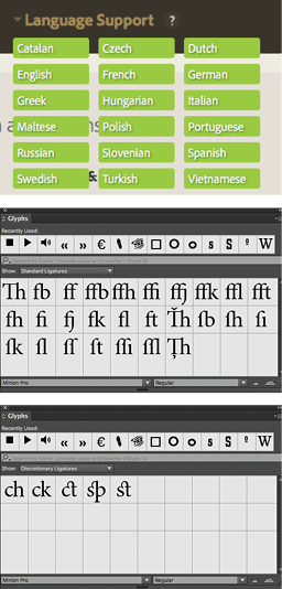
Figure 6: An example typeface with extensive language support, Minion Pro has a full range of ligatures.

Figure 6: An example typeface with extensive language support, Minion Pro has a full range of ligatures.

Beyond the obvious letter combinations of fi and fl, as English continues to create and absorb words, new ligature combinations are necessary. Words like fjord, hors d’oeuvre, and offjár place demands on the typeface that its original designer could not have foreseen. If you’re doing multilingual publishing, the range of available ligatures might be a factor in your choice of typeface (Figure 7).
Figure 7: Ligatures in logos and hand-drawn display type: The University of Sussex logo by Blast, and Try and Fail by Wells from the Tumblr blog “I Love Ligatures.”

Figure 7: Ligatures in logos and hand-drawn display type: The University of Sussex logo by Blast, and Try and Fail by Wells from the Tumblr blog “I Love Ligatures.”

While ligatures are often necessary for serif faces, they are unlikely to be needed for sans serif faces. Thankfully, InDesign is smart enough to substitute individual glyphs for the ligature when the letterspacing is increased. And what about the other end of the scale: spacing the letters far apart? While it is commonplace to open up the letterspace of caps or small caps, for lowercase letters the conventional wisdom is that if the spacing is too loose, the words don’t hold together. On this topic, the opprobrium of Frederic Goudy speaking in 1936 is often paraphrased: “Anyone who would letterspace blackletter would shag sheep.” Goudy’s pronouncement inspired the title of Stop Stealing Sheep, Eric Spiekermann and E.M. Ginger’s introduction to typography. While it is true that wide and inconsistent letterspacing hampers readability for book typography, when it comes to headlines and display type, designers have far more latitude. Widely spaced headings are a hallmark of postmodern typography, where even the spacing between different syllables within a word may be varied to make the type more expressive (Figure 8).
Figure 8: Normal rules do not apply.

Figure 8: Normal rules do not apply.

When it comes to signage, increasing the letterspacing can increase rather than diminish the legibility (Figure 9).
Figure 9: UK road signage: the loose spacing of the type is designed to increase legibility from a distance.

Figure 9: UK road signage: the loose spacing of the type is designed to increase legibility from a distance.

Take a Deep Breath

Tight or loose, the air you incorporate into your type is as important as the choice of type itself. A typeface’s personality will change depending on its letterspacing—the spaces around the letters functioning like intervals between notes of music. While consistency is usually desirable, when it comes to display type, even this tenet can be broken if done with bravado and confidence.

Bookmark
Please login to bookmark Close

Not a member yet?

Get unlimited access to articles and member-only resources with a CreativePro membership.

Become a Member

Comments (1)

Leave a Reply

Your email address will not be published. Required fields are marked *

Loading comments...