

Don’t worry; I promise this isn’t going to be a rant about the eyesight of the aging population and their impatience with type just getting smaller and smaller all the time. The fact is, there are many instances of design that call for the use of very small, if not tiny, type, and it’s not only on the geriatric prescription notifications. In print, these can include captions, credits, newspapers, dictionaries, manuals and directories, and instructions, as well as miniature books. Digital uses include ebooks, mobile applications, and just about anything that might be read on smartphones and small tablets. As more and more people—of all ages—use mobile devices to view digital matter, it is vital to consider how any text looks on these smaller screens. For this reason, fonts for small type in both print and digital usage need to maintain their clarity and readability at this range of reduced sizes.
One Size Does Not Fit All
Although some fonts work well at small sizes due to the characteristics of their design, others don’t. When selecting fonts for these instances, the best results frequently come from using those that are specifically designed for this purpose.
Typefaces designed or optimized for very small sizes need to have some or all of the following characteristics in order to display clearly and maintain their readability:
- Taller x-height
- Wider letterforms
- Open counters and interior spaces
- Conservative stroke contrast
- Generous letterspacing
Here is a sampling of fonts intended for tiny type for both print and digital usage:
The Font Bureau’s Reading Edge (RE) Series (Figures 1 and 2) are web fonts designed or adapted specifically for small sizes on screen. The collection consists of ten families, all of which provide reliable performance in the 9–18 px range. Some are optimized versions of designs originally created for print, while others are standalone web fonts. Although it is often believed that sans serifs have the highest degree of legibility on the web, this collection includes some excellent serif options that are extremely readable due to their skillful design. On the print side, Poynter Agate is a typeface designed to perform well when set at the smallest sizes on newsprint and printed at high speeds. This 20-version family is part of the Font Bureau Readability Series.

Figure 1: The effects of rasterization at 9 px in Mac OS X with Benton Modern (left) and its Reading Edge counterpart, Benton Modern RE (right), illustrating the value of screen-specific design variations.

Figure 2: Two of the Reading Edge Series fonts from Font Bureau.
Monotype’s e-Reading fonts (Figure 3) are preexisting designs that have been optimized specifically for very small sizes in digital environments. The series includes classics such as ITC Galliard, Baskerville, and Sabon, as well as newer designs such as Malabar and Ysobel. These “rebooted” typefaces have been specially crafted to display clearly on the full range of reading devices (Figure 4).

Figure 3: Monotype’s collection of eText fonts intended for small text on the web and other digital devices.
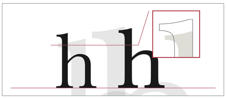
Figure 4: Lowercase characters for the eText version of Baskerville are taller, and hairline features and serifs are heavier.
Hoefler & Co. offers several Agate and Micro designs intended for sizes smaller than the average print text, including Chronicle, Mercury, and Gotham. Their ScreenSmart Fonts collection is designed for smaller than the average text sizes on the web. This group includes the previously mentioned Chronicle, Mercury, and Gotham as well as Archer, Whitney, and several others (Figure 5).


Figure 5: Both the Chronicle and Mercury families from Hoefler & Co. include Micro versions.
Gemeli Micro by Production Type is another font family designed for diminutive type. It was designed with an enlarged x-height, shortened extenders, a wider body width, loosened spacing, and simplified forms. While Gemeli Micro was designed for type smaller than 8 pt, it also works for headlines and wordmarks, as can be seen in their logo (Figure 6).

Figure 6: Gemeli Micro by Production Type
Freight Micro was designed for high impact at tiny sizes for both print and digital applications. As part of the Freight superfamily, this Micro design (Figure 7) has angular forms, asymmetrical serifs, and calligraphic italics, all of which create an appearance that “whispers very loudly.”
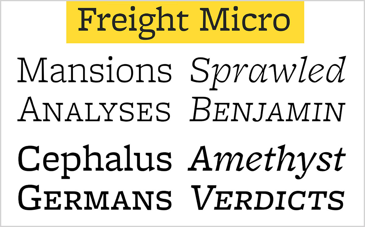
Figure 7: Freight Micro
Minuscule was inspired by Émile Javal, a 19th-century opthalmologist who was the first to analyze how we read. Thomas Huot-Marchand, the designer, describes Minuscule (Figure 8) as “a typeface for extremely small sizes that can be used under the commonly acknowledged threshold of legibility (around 7 points). At this stage, the loss is so important during the shift to a lower size that I quickly decided to design a master for each size.” For this reason, he created five versions optimized for use in 6 (Minuscule Six), 5 (Minuscule Cinq), 4 (Minuscule Quatre), 3 (Minuscule Trois), and 2 pts (Minuscule Deux).

Figure 8: Freight Minuscule
Bell Centennial (Figure 9) is a typeface designed by Matthew Carter in 1976 for AT&T as a replacement for their then-current telephone directory typeface, Bell Gothic. At the time, Carter was working for the Mergenthaler Linotype Company, which eventually licensed the face for general public use. This sans serif family maintains legibility at very small sizes while saving space with its condensed design. It is available in four variants: Number, Address, Listing, and Sub-caption.

Figure 9: Bell Centennial
Another good alternative for tiny type is the Caption fonts option (Figure 10) found in some font collections. These optically-sized fonts are size-specific versions whose details have been tweaked to maximize the legibility and suitability for very small type. Font families with Captions fonts include Adobe’s Arno, Brioso, Cronos, Chaparral, Fairfield, Garamond Premier, Jenson, Kepler, Minion, Sanvito, Warnock, and Utopia, Terminal Design’s Consul, and Google’s PT Sans.

Figure 10: When looking for a font to use with tiny type, don’t overlook the caption fonts you may already own.
To quickly locate fonts with caption styles, use InDesign’s font search feature by typing the word “caption” in the font family field (Figure 11). You might want to confirm first that the search preference is set to Search Entire Font Name by clicking the search button to the left of the font name field.

Figure 11: Use the font search feature to quickly locate your available caption fonts in InDesign.
Guidelines For Setting Tiny Type
Setting tiny type isn’t as simple as selecting a font and a size. Even when using a typeface designed for the smallest of sizes, there are still factors that will affect its sharpness, legibility, and readability. Here are some pointers for the best results:
Web and digital devices
- Review the appearance of your chosen font at the smallest size and the lowest resolution it might be viewed at so that there are no surprises.
- Be sure to see how your type looks in both a Mac and a Windows environment, as they each render type differently, especially at smaller sizes.
- Don’t forget the hardware: view the text in question on a variety of mobile devices, especially the predominant ones used by your audience.
- During the design process, be sure to print the project out at the highest possible resolution to get the most realistic idea of the results you’ll get when your work is professionally printed.
- When printing on surfaces that will affect how the ink is accepted, such as very porous or very glossy paper, plastic or acetate, glass, cloth, etc., check with your printer or supplier to see how your small type will behave when printed. In some instances the type will spread, and in others it might thin out—either of which might affect your chosen font and specs.
All Media
- Maintain generous line spacing for optimum readability.
- As type gets smaller, some fonts will need their letter spacing (tracking) opened to maintain optimum readability.
- Use colored type conservatively and with maximum contrast, especially when printed RGB or CMYK (rather than solid, spot colors), as the layered dots will reduce the sharpness of the letterforms, further decreasing legibility.
- The goal is to know ahead of time what your type will look like to all readers, whether the type is printed or on a screen. Research and total preparedness on your part are the best defenses against any unexpected surprises.
The fonts featured in this article are just a sampling of those designed or optimized for tiny type, with more and more being added to the mix all the time. Keep in mind that whether they’re used for print or digital, the smaller you go, the less readable some fonts will become—even those specifically intended for tiny type. For that reason, be sure to explore all fonts you are considering at the smallest sizes they might be used for. Although they may not thank you directly for it, it’ll be a service to your readers—yes, of all ages.
This article was last modified on June 21, 2023
This article was first published on July 19, 2021
Commenting is easier and faster when you're logged in!

Recommended for you

TypeTalk: Trending Fonts
Looking back at the past year’s most popular font offerings is a good way to vie...

Lost Type Recovered from the Thames
The tale of loss—and eventual recovery, a century later—of the Doves Type typefa...

Creating Instant Charts With Chartwell
You can create charts and graphs on the fly from live text with the ingenious fo...